Using Spatial Data in Retail Analytics Post COVID-19


With countries cautiously relaxing lockdown restrictions retailers are keen to understand how best to recover from the huge impact that COVID-19 has had on their business. Figures released by the US Department of Commerce show a decline of 8.7% in retail sales more than double experienced at the peak of the financial crisis of 2008. Given consumer spending accounts for two thirds of the US economic activity it's no wonder that there is a fierce debate on when and how the country should reopen.
We recently hosted a webinar with Unacast to discuss the return to retail post COVID-19 and it's clear that looking beyond sales and census data to leverage new data streams such as human mobility socio-economic & financial insights can play a big part in the recovery.
Retail Impact Scoreboard
Comparing current foot traffic to the pre-COVID-19 days can provide a deep understanding of the commercial and economic impact of the virus across different industries and geographies. Better still industry- or brand-specific traffic trends can help identify early signals of a potential recovery in different regions of the US.
For this reason Unacast developed the Retail Impact Scoreboard tracking which industries are seeing visitation changes as a result of COVID-19.
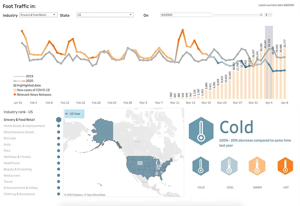
We don't know exactly what the return to retail will look like but one useful indicator is consumer confidence which drives activity and recovery. Two recent surveys have indicated that consumer confidence is very low: 58% of Americans are worried the US will move too quickly in loosening restrictions (source: NBC) and 45% expect to avoid shopping centers after lockdown ends (source: CNBC).
Detecting smaller and shorter trends and observing real time human behavior can enable us to start recovery planning. One of the first states to reopen was Georgia and a trend analysis was performed by Mathias Schläffer a Data Scientist at Unacast to better understand medium term trends and short term momentum.
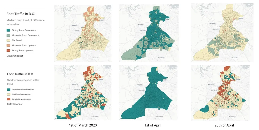
“The three columns represent different dates before and during the outbreak and lockdown restrictions and after the state started to reopen. The top row shows a medium term trend how 2020 is behaving compared to 2019 with the paler yellow label indicating a flat trend. We can see there is no gap widening or closing before the outbreak hits on 1st March. The bottom row is a very short term trend and typically when you see a flat trend in the medium term then the picture in the short term is also mixed with no clear signal visible.
Moving to 1st April we see the medium term trend changes to a downward trend in virtually all areas with even stronger changes in the short term momentum meaning each new data point describes a lower low.
25 days later the bottom is in there is a gap established between 2020 and 2019 but it is not widening or closing anymore they are moving in parallel showing a flat trend in the medium term. Looking at the short term momentum taking into consideration the 24th was when the state reopened some areas that are spatially very close to each other show an upwards momentum on the very short time horizon. It will be very interesting to keep looking at these areas and see if others also show the same trend perhaps reversing to a no clear or downwards momentum.
If the upwards momentum continues for a few more days then we should also be able to see it in the medium term trend and we can describe on a central block group level what is happening where are people back on the street and identifying differences in the time of day. This will help describe real time recovery as it is happening and contribute to recovery planning.”
Financial Spend Insights
Analyzing Mastercard transaction data during the COVID-19 pandemic allows us to gain insights into customer behaviour at times of widespread lockdown to determine response both during and following the crisis.
With the US becoming the epicenter of the outbreak we took a look at how and where customer levels of spending had changed across several cities with differing lockdown and reopening policies.
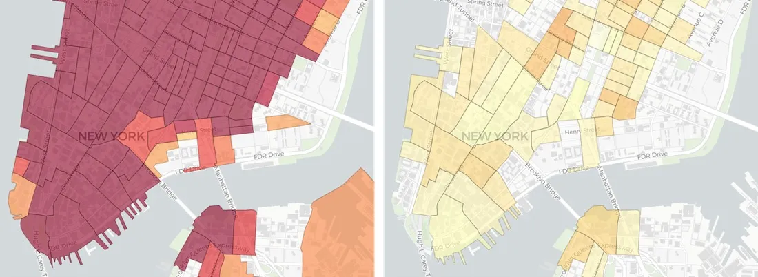
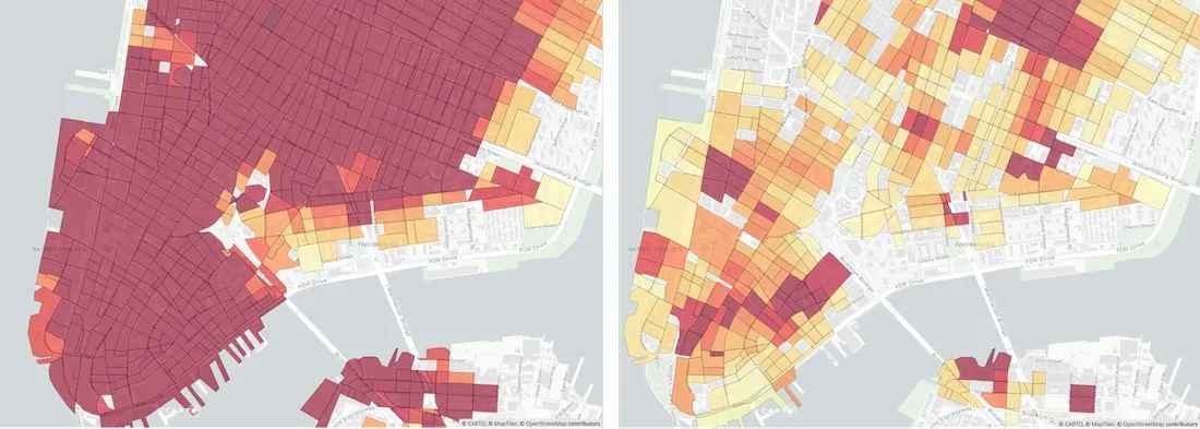
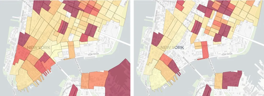
With the highest number of confirmed cases in the US New York City has seen significant impact from the virus. Comparing MRLI scores from two concurrent weeks in early April shows a corresponding impact on spending with an overall decrease of 73%.
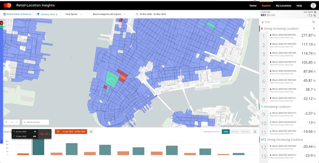
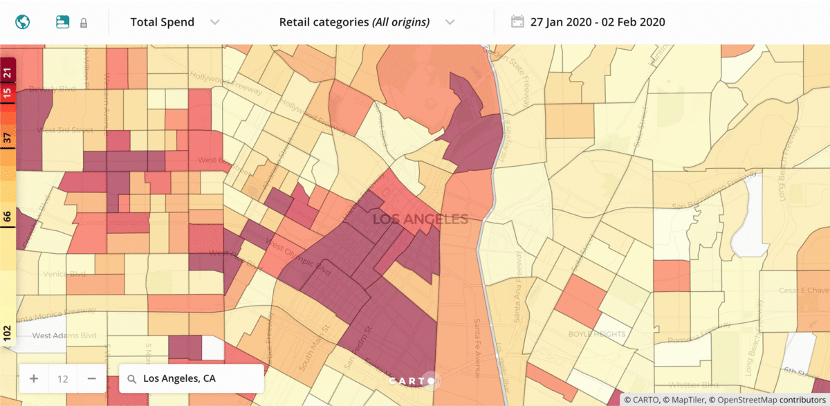
The solution also offers similar analysis for other cities and the animation below shows the decrease in spending in Los Angeles Chicago Houston and Phoenix.
The solution also enables us to analyze the impact on different sectors of retail. If we again look at New York we can see in the first pair of maps a large decline in the spend at Eating Places before and during lockdown with a much different picture when we filter by Grocery and Food stores.
Want to know more?