Magnify your Analysis: Statistical Downscaling to Enhance Spatial Resolution


From understanding the dynamics of a business to modelling physical and biological processes scale matters. For spatial data the concept of scale is closely related to that of shape. Point-referenced data like point of interests (POIs) are dimensionless and as such cannot be related to any scale. On the other hand when dealing with data associated to discrete units we typically need to account for their scale for example by choosing the most appropriate statistical units for Census data. In this case the scale might occur naturally as in satellite imagery where it is determined by the sensor's instantaneous field of view or as a result of a measurement process like for survey data that need to be aggregated to a fixed unit to provide meaningful statistics.
But the question is how do we choose the right scale? Or in other words what is the lens through which we should look at our problem? The choice of an appropriate scale is an extremely important one first because mechanisms vital to a process at one scale may be uninformative at another. Additionally inferences might depend on the aggregation level or even for the same scale on how we choose to aggregate: this source of aggregation and/or zonal bias is a well known issue the so-called Modifiable Areal Unit Problem (MAUP).
Usually however we do not have full control on this choice. As new sources of location data are becoming more available data scientists are frequently faced with the problem of how best to integrate spatial data at multiple scales. Think for example of site planning: here the focus is usually on summarizing the characteristics of a store location in terms of its clients' demographics (age population income) and some geographical characteristics of the surrounding area (density of POIs number of daily visitors etc.). How can we combine sources that because of the difference in scale not only represent misaligned geographical regions but also are associated with a different data "volume"? A solution to this problem seems to "transform" the data to a common spatial scale.
Transforming to a Common Spatial Scale
The problem of transforming the data from one spatial scale to another has a name in statistics: it is called a change of support problem (COSP) where the support is defined as the size or the volume associated with each data value.
Changing the support of a variable is a challenging task and one that we are constantly dealing with at CARTO. Our Data Observatory currently at version 2.0 contains a comprehensive collection of spatial data from different sources that data scientists can easily access using our APIs for a faster and more efficient integration in their workflows. Designing and building this repository presents some challenges: not only are data hard to find and come in different formats requiring lengthy and painful ETL processes but there is also the question of how we should serve data with potentially different geographical supports to our users. This is when we started thinking of COSP and how can we solve it. Our solution is to try to transform our data on the finest spatial scale useful for analysis. We can always then aggregate to produce inferences over coarser scales.
Here is when statistical methods come in handy: usually we cannot turn to data providers asking for finer-resolved data as the finest spatial scale might be limited by present technology as in satellite imagery by access to the raw sources as for Census data or by privacy regulations as in the case of GPS-derived data.
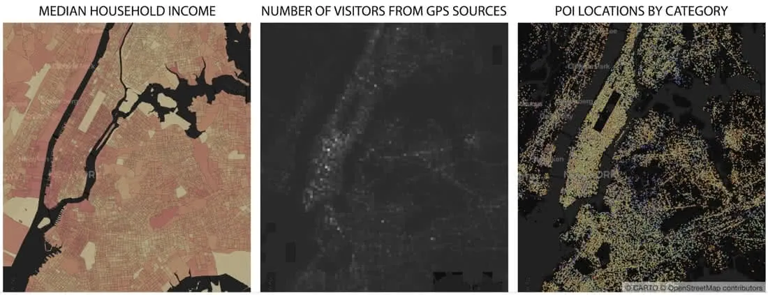
Census data are especially problematic in this regard: the high costs of gathering data through traditional surveying methods make it challenging to study population characteristics at fine spatial scales. For example Census data in the US are available at the finest scale at the block group level: block groups vary substantially in shape and size and especially in sub-urban and rural areas can represent large geographical regions as highlighted in this map:
To overcome this barrier international efforts have been developed to increase the spatial scale of the distribution of human populations. However these initiatives are only limited to demographic data (total population by age and gender categories) and have not been extended to the other socio-economic variables available from the Census. This limits the actions and insights that policy makers have available to improve resource allocation accessibility and disaster planning amongst others. But the assets are not limited to the public sector: from where to focus marketing campaigns to site planning and market analysis for retailers to client segmentation for utility companies or for the identification of new opportunities for investment funds being able to get a detailed picture of your population is crucial to uncover the relationship between location and business performance.
Spatial Scale for Political Campaigns
Consider for example the case of running a local political campaign: how well do you know your electorate? A striking result from recent Western European and North American elections is that politics seem to have increasingly turned into a struggle between urban and rural voters as well exemplified by the results of the last presidential elections in the US. While the reasons for this geographical divisions might be very complex fine scale demographic and socio-economic data could improve the planning of political campaigns and ease these differences that result in a sort of spatial segregation. The popular site planning mantra - location location location - could be easily applied here: from door-to-door canvassing to placement of billboards researching and understanding your electorate is crucial. To show the insights gained from a magnified view of the demographic and socio-economic characteristics of the population here we will:
- Use a statistical method to enhance the spatial resolution of Census data in the US (downscaling)
- Apply a multivariate analysis to compute a similarity score between a selected location and the rest of the territory
By comparing the results for rural and urban locations obtained from both Census data (by block group) and their downscaled version we show how detailed information about citizens can be used to inform electoral strategy and guide tactical efforts.
Before jumping into this analysis let's see in practice how statistical methods can be used to enhance the spatial scale effectively downscaling your data.
Building a Common Grid
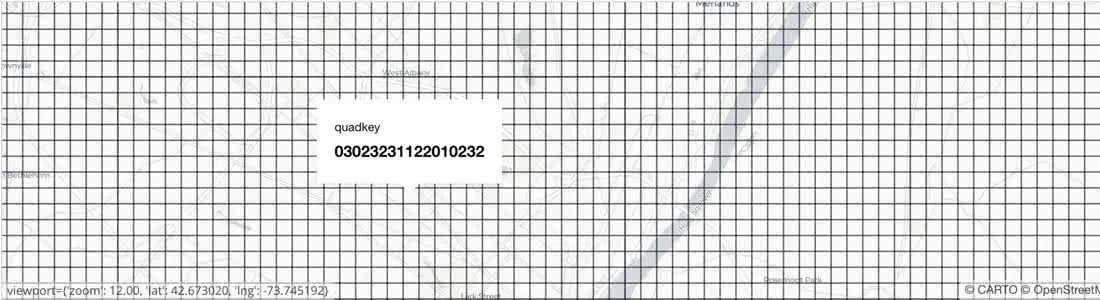
First we need to create a common grid which depending on the chosen scale might contain a huge amount of cells: data for a specific location need be retrieved quickly and stored efficiently. This is what quadkeys are used for: instead of storing polygons the Earth is divided into quadrants each uniquely defined by a string of digits with a length that depends on the level of zoom. Like Google S2 cells or H3 hexbins developed by Uber quadkeys capture the hierarchy of parent-children cells and are not locked to any specific boundary type allowing the same unit anywhere on the globe. This is what a grid built with quadkeys with zoom level 17 (about 300 m x 300 m at the Equator) looks like near Albany NY:
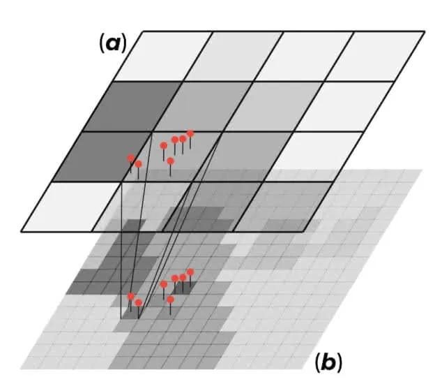
Next we need a downscaling model in order to transform a random variable $$y%0$$ from its $$source$$ support ($$a%0$$) to the $$target$$ support ($$b%0$$) the quadkey grid we just created where this variable is not available or has never been observed. For extensive variables (i.e. one whose value for a block can be viewed as a sum of sub-block values as in the case of population) the idea is to use data with extensive properties available at the point-level or at a finer-scale than the target support as covariates to model the variable of interest $$y%0$$. Using these finer-scale covariates (the red pins in the figure below) has the advantage that they are available both on the source and the target support since changing their support only requires a summation.
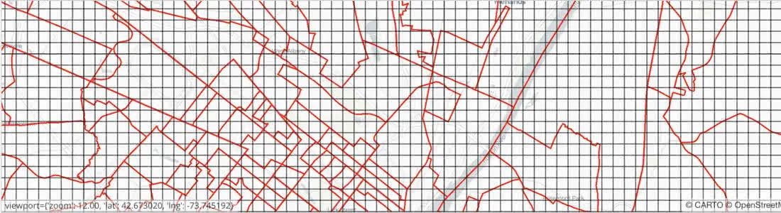
What we are assuming here is that this model is independent of scale which is not necessarily true. This could mean for example that when we transform the data back on the source support their aggregated value will not necessarily be equal to the corresponding actual value. If ($$a%0$$) and ($$b%0$$) are nested we can always restore the coherence between the two supports by "adjusting" the model predictions such that when we sum over all the unit cells on the target support we are sure to get the corresponding value on the source support. When the source and the target support are not nested for the prediction task we instead need to resort to a hybrid support ($$c%0$$) resulting from their intersection. For example if the source support is represented by block groups this hybrid support will look like this
To finally get the predictions on the target support we then just need to simply sum over all the unit cells on the hybrid support corresponding to a cell on the target support.
For non-extensive variables (e.g. the median household income) we can still use a similar approach based on fine-scale extensive covariates training the model on the source support and predicting on the hybrid support. However in this case the ad hoc adjustment is interpreted as a weighting scheme based on the model trained on the source support for “redistributing” the data rather than a correction for the change of scale. Additionally we also need to specify the relevant operation (e.g. the arithmetic mean) to transform the predictions from the hybrid to the target support.
What kind of finer-scale covariates are available to downscale Census data? We could imagine that at least some of the main socio-economic characteristics of the US population could be inferred from the population distribution plus the geographical characteristics of the area for example the density of roads or POIs for different categories as shown in this map:
In this map population distribution was obtained from Worldpop which provides gridded population data (total and by age and gender) at a fine scale (ca. 100 m x 100 m at the Equator).
In order to reduce the model dimension we started by selecting only a subset of these covariates by running for each Census variable a Generalized Linear Model with a Least Absolute Shrinkage and Selection Operator (or LASSO) regularization. Given the negative log-likelihood for observation $$i%0$$ $$l(y \eta)%0$$ and a parameter $$\lambda%0$$ which controls the overall strength of the $$L^1%0$$ penalty we can estimate the model coefficients by solving
$$\min_{\beta_0 \beta} \frac{1}{N} \sum_{i=1}^{N} w_i \ l(y_i \eta_i) + \lambda \; ||\beta||_1%0$$
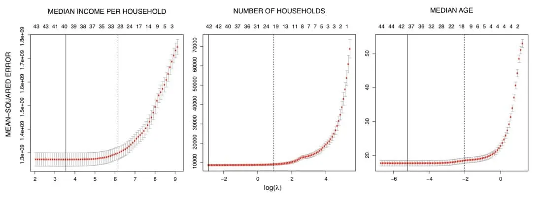
As we decrease the size of $$\lambda%0$$ more covariates are included up to the full model (or the largest identified model when we have more variables than observations). To identify the optimal regularization parameter we use K-fold cross validation and selected $$\lambda%0$$ such that the cross-validation mean-squared error is within one-standard deviation of its minimum as indicated by the dashed black lines in these plots where the sequence above indicates the number of covariates selected for each value of $$\lambda%0$$.
But how well are demographic and geographical covariates likely to predict the socio-economic characteristics of a location? Clearly the answer is variable dependent. While the population distribution POIs and roads might be expected to be good predictors for the number of households or the median age they show a much smaller predictive power for income-related variables. This is well exemplified by the panel on the left (a) in this figure:
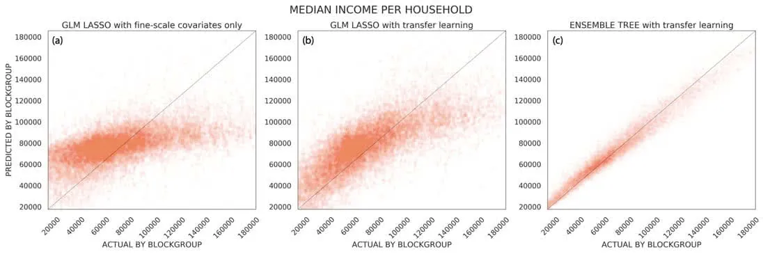
That panel shows the K-fold cross validation predictions vs. the actual values on the source support for the median household income. Clearly the model is not doing a good job as ideally all the points should be close to the diagonal line. Given that our aim is to derive predictions at a finer scale to overcome the unavailability of "better" covariates we adopt a transfer learning approach.
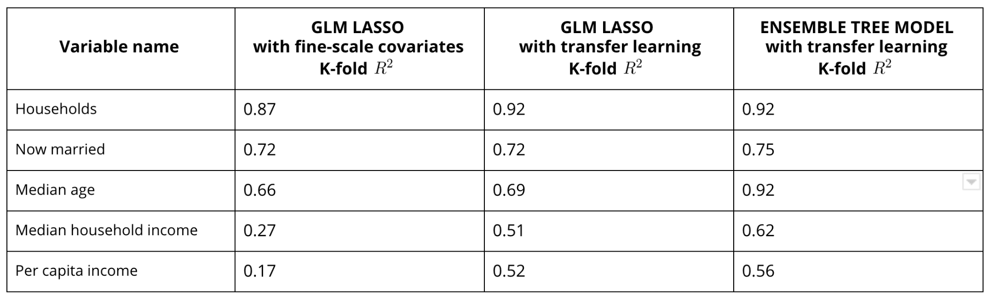
Within this framework we can add a second step where we add as covariates other response variables for which the model depending on the selected fine-resolution covariates has better predictive skills. For example we can train on the source support a model depending on fine-scale covariates for $$y_1%0$$ and then train a second model for $$y_2%0$$ with both the fine-scale features and $$y_1%0$$ as covariates. In this way we "learn" on the source support to transfer the fine-scale features that are predictive of the variations for $$y_1%0$$ to $$y_2%0$$ and we can then use these models to predict on the target support (under the assumption of independence on the spatial scale). Note that in order to reduce the model dimension we also apply a LASSO regularization on this second step. The results after applying this transfer learning approach to model the median household income are shown in the panel in the middle of the figure above (b): the cross-validation accuracy improved notably with a more than doubled pseudo $$R^2%0$$.
Finally to further improve our model we can account for non-linear dependencies of the response variable on the selected covariates using an ensemble tree model (e.g. Random Forest) as shown in the right panel (c) in the figure above for the median household income and in the table below for other selected response variables.
Assessing Prediction Accuracy
So far we tested the prediction skills of our model on the source support where the actual values for the variables we are trying to model are available. However how can we get a sense of the quality of the predictions on the target support where the ground truth values are not available? For extensive variables only we can compare the distribution $$\nu%0$$ of the unadjusted aggregated predictions on the source support (i.e. at the block group level) with the distribution $$\mu%0$$ of the actual values as shown in the figure below.
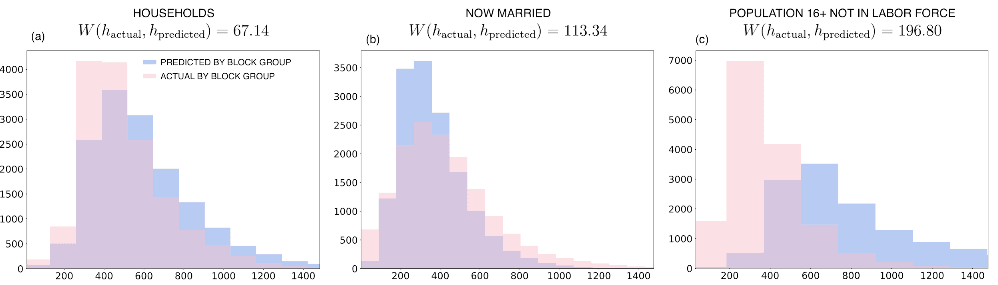
Ideally these two distributions would look very similar with any difference indicating possible over-predicting (under-predicting). For example looking at the plot for the population 16+ not in labor force (c) this comparison suggests that the model is not able to predict the lowest quantiles for the downscaled predictions despite a low bias for the cross-correlation predictions on the source support.
To quantify the similarity between the actual distribution $$\mu%0$$ and the distribution of the unadjusted aggregated predictions $$\nu%0$$ we can compute the (first order) Wasserstein distance which measures the minimal amount of work for transporting one unit of mass from $$\mu%0$$ to $$\nu%0$$
$$W (\mu \nu) = \inf_{\pi \in \Pi(\mu \nu)} \int_{\mathbb{R} \text{x} \mathbb{R} } \vert x -y\vert \; d\pi(x y) %0$$
where $$\Pi (\mu \nu)%0$$ is the set of probability distributions on $$\mathbb{R} \text{x} \mathbb{R}%0$$ of all couplings of $$\mu%0$$ and $$\nu%0$$. The larger $$W (\mu \nu)%0$$ the further away the two distributions are and therefore the larger the error on the target support due to the change of scale. For example as annotated in the previous figure we can see that the Wasserstein distance for the now married variable is larger than for the households variable suggesting for the latter more accurate predictions not only on the source support (c. f. the previous table) but also on the target support.
Finally we can plot the downscaled predictions as shown in the figure below for some selected Census variables
Going back to our analysis of the US electorate given the downscaled Census we can apply the results of a multivariate analysis to compare the similarity of two geographic locations as described in a previous post. The following map shows the similarity skill score near Albany (NY) with respect to a selected location in a rural area (identified by the purple dot): the score is positive if and only if a unit cell is more similar to the selected location than the mean vector data with a similarity skill score of 1 meaning perfect matching.
Based on the demographic and socio-economic characteristics of the US population only we find that for the selected location the most similar sites are all located mainly in sparsely populated areas without having included location explicitly in our analysis. Similarly if we instead select an urban neighbourhood characterized by a wealthier and younger population we only retrieve mostly urban sites
Looking at these maps it is clear that the model-based downscaled data are able to capture spatial clustering and heterogeneity which is essential for a better understanding of electoral behaviour and planning of political campaigns.
On the other hand these fine-scale local insights are lost when we apply the same analysis on the actual data simply transformed to match the target support by allocation proportional to area (area-interpolation) as a simple imputation strategy. This can be seen when we compare the following maps with those shown above
It is clear that the differences that we see between the two selected locations do not just reflect geographical differences but also the divergence of rural and urban economies. And using the model-based downscaled data we can for the first time capture this separation at a very fine scale. Fom setting up billboards to door-to-door canvassing local estimates of the demographic and socio-economic characteristics of the population might help to better target the relevant households and optimize the budget boost turnout and efficiently transform votes into seats.
Learn more about CARTO's location data streams today and get in touch with our team in case we can help you magnify your insights with CARTO's statistical downscaling models.
Special thanks to Mamata Akella CARTO's Head of Cartography for her support in the creation of the maps in this post.