Of The Most Clicked Location Intelligence Stories of 2018


Every Tuesday morning we deliver the CARTO 5 — our weekly roundup of news blog posts maps and other interesting odds-and-ends from and relating to the Location Intelligence space — to inboxes around the globe. Seeing what resonates with readers provides a unique insight into the minds of the LI community writ large a motley collection of Cartographers and Data Scientists Corporate Executives and Open Source Evangelists and many more.
As we approach the end of a year filled with industry changes and advancements newsmaking moments and of course cool maps we wanted to share some of those insights. Take a look below at 20 of the most clicked articles from the CARTO 5 this year and if you like what you see make sure to subscribe today!
Categories:
-Industry News
-Thought Leadership
-Lists
-Cartography & Design
-Cool Maps
Location Intelligence Industry News
"Fitness tracking app Strava gives away location of secret US army bases"
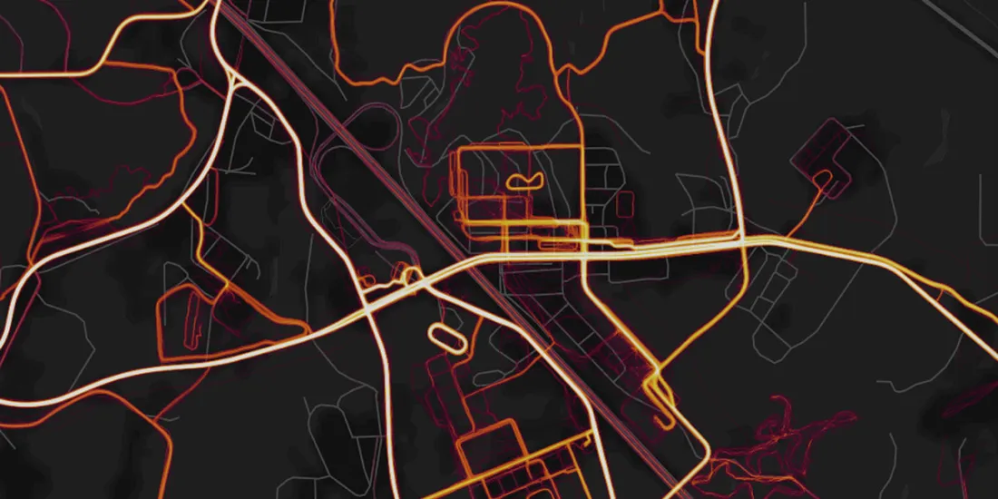
Back in November 2017 Strava's heatmap showing more than 3 trillion distinct points of GPS data reflecting every activity uploaded via their fitness app was one of the most clicked links in CARTO 5 history. The map found its way back into the news in late January when keen-eyed map viewers noted interesting patterns on the map in countries like Afghanistan Djibouti and Syria. That these locations turned out to be clandestine US army bases brought renewed scrutiny of data sharing and privacy policies for apps like Strava as well as the United States military.
"Developers react to changes in Google Maps API"
This article from Geoawesomeness documenting Google's pricing model change was our most clicked link of the year. Geoawesomeness explains the new pricing scheme which they describe as "draconian " and examine the impact on the thousands of applications that rely on Google Maps APIs for services like routing and POI data.
"An open source startup dies as mapping gets hotter than ever"
The year started with the news that open source mapping startup Mapzen was closing shop. Wired took a moment to eulogize Mapzen highlighting some of their higher-profile projects and noting that much of the work done on their platform would live on as open source projects. In the time since Mapbox brought engineers from Mapzen's Valhalla routing team on board and CEO Randy Meech jumped back into the Location Intelligence space in a big way with StreetCred a startup that aims to incentivize crowdsourced location data collection in a sort of Uber meets Pokemon Go mashup.
"Microsoft releases 125 million building footprints in the US as Open Data"
Using their Deep Neural Networks tool and CNTK their open source deep learning toolkit the team over at Microsoft Bing extracted footprint data for 124 million buildings from Bing Imagery. They kindly released the data to the public as well making it available via OpenStreetMap.
"Apple is rebuilding maps from the ground up"

Apple Maps the ubiquitous but underused map app needed fixing. Knowing that a revamp and rebrand was in order Apple and specifically the Apple Maps team set themselves to rebuilding their product this time leaning on their own location data and eschewing the patchwork of 3rd-party providers that the app had leaned on previously for their mapping services. This post from TechCrunch details the changes.
Thought Leadership
"Why should you care about PostGIS? — A gentle introduction to spatial databases"
Geographer and expert visualizer Topi Tjukanov provides an introductory overview of PostGIS the open-source spatial database why it's important and how to get started.
"There's a better way to measure population density"
In his post published in CityLab University of Sheffield professor Alasdair Rae uses Spain as an example of how country level population density statistics which treat cities and rural areas the same way can inaccurately convey living conditions in that country.
"Essential geospatial Python libraries"
Check out this guide from Christoph Rieke to learn about some essential Python libraries their distinct value and how these libraries interact and are connected. And while you're at it make sure to take a look at the recently updated CARTOframes our Python interface for integrating CARTO into data science workflows!
Don't miss our recent webinar showcasing CARTOframes! class="Button Button--cPurple js-Action--CTAmodule" target="_blank">Watch today!
"Geospatial Analytics will eat the world and you won't even know it"
Back in July Sparkgeo CEO Will Cadell wrote this piece in Forbes exploring how the Geospatial industry is becoming more pervasive but less visible with end users reaping the benefits of spatial analytics less in the form of maps and more in the form of quantitative business insight.
Lists
"23 Questions you've always wanted to ask (and the 11 datasets you need to answer them)"
Ever wonder where a person is most able to buy a beer in the U.S.? With their list Enigma shows off the power of Enigma Public their curated collection of public datasets and walks through the wide variety and range of questions ranging in complexity that public datasets like these can help to answer.
"Top 9 maps and charts that explain the Super Bowl"
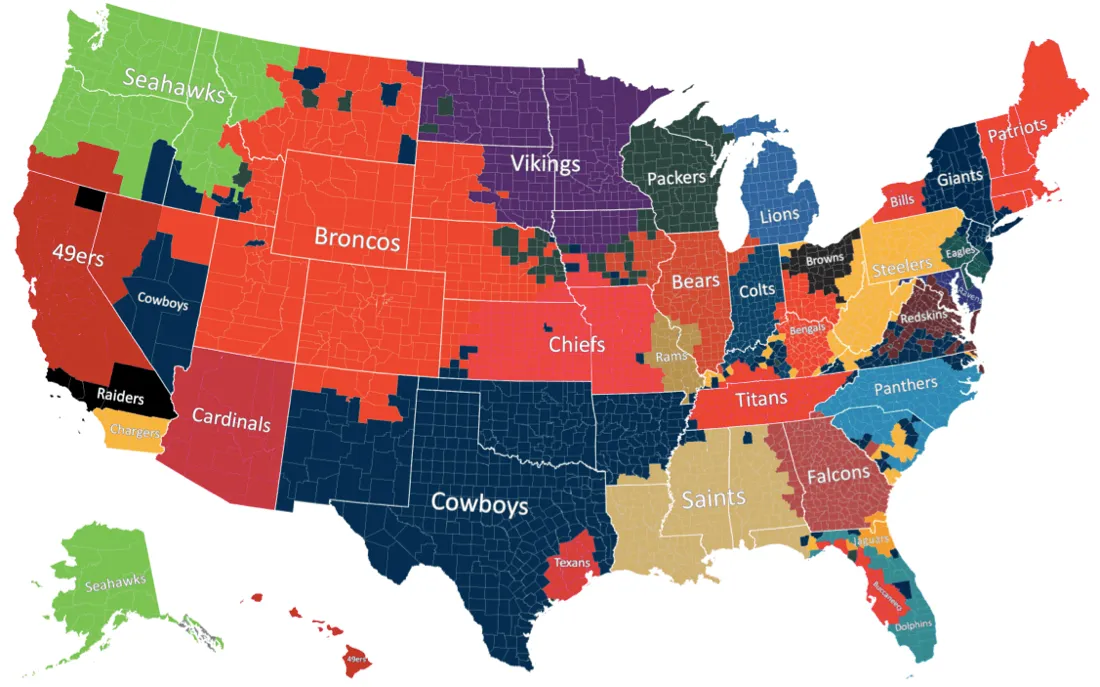
This year's Super Bowl between the New England Patriots and the Philadelphia Eagles was one for the record books (Craziest stat: most total offensive yards in a game in NFL history). Whether you are a fan of American Football or the sport is entirely alien to you these 9 maps provide some interesting insights on the big game.
"33 map elements to Include in cartographic design: A 'How To' guide to map making"
GISGeography.com created their list to guide aspiring mapmakers by providing some cartography best practices. The tips range from the basics ("Carefully Select Typeface") to the not-so-obvious ("Metadata is Your Map's Narrator").
"Comparing data visualization software: Here are the 7 best tools for 2018"
Seeking to provide some clarity in a data visualization tech marketplace that is constantly changing advancing and improving Author Bernard Marr and Forbes compiled their list of the top visualization tools that they recommend using to get the most insight from your data this year. (…CARTO is our favorite)
Cartography & Design
"The Laws of UX"

In this sleek guide designer Jon Yablonski outlines his 12 Laws of User Experience. These Laws including Hick's Law (the time it takes to make a decision increases with the number and complexity of choices) and the Serial Position Effect (users have a propensity to best remember the first and last items in a series) transcend fields and can be helpful guideposts on any project including the creation of maps and geospatial apps.
XKCD's "Map Age Guide"
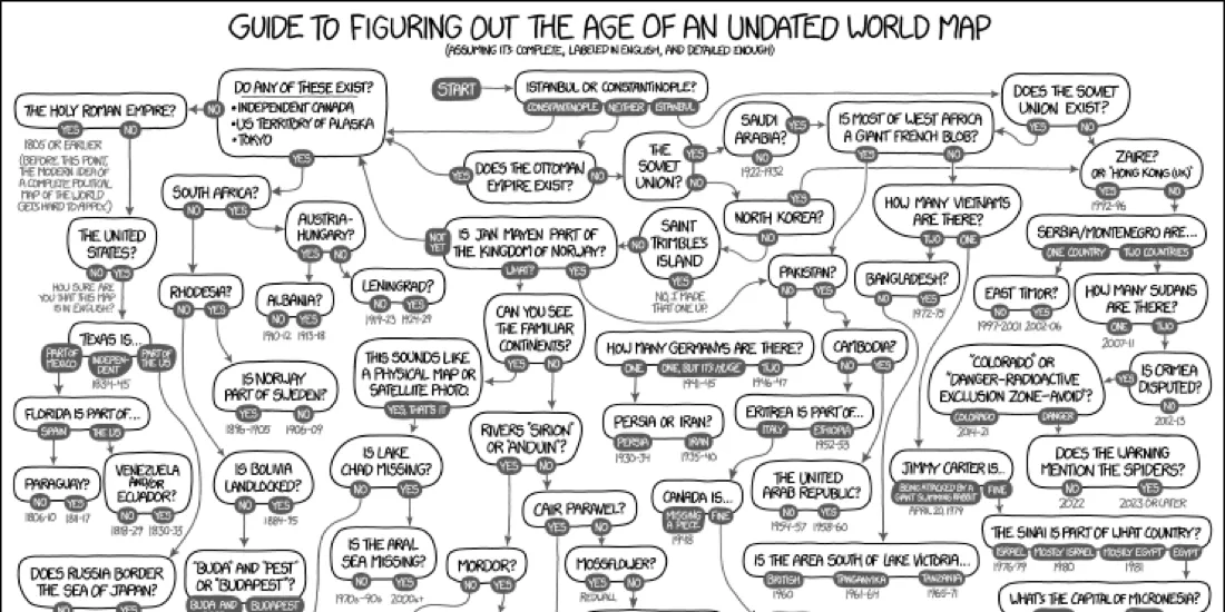
In what is (in our opinion) one of the most informative webcomics of the year XKCD's Map Age Guide is a massive flowchart that acts as the definitive reference for when you are looking at a map and wondering the time period it is showing. Who knew that the number of Yemens plus the number of Germanys could be so deeply informative.
The New Orleans Twitter rant
James L. Sutter is a fantasy author and role playing game designer but he stepped into the world of cartography when after looking at a map of New Orleans he questioned whether such a strangely designed city could possibly exist. "Did you seriously just label this thing as a LAKE? It is ATTACHED TO THE F'ING OCEAN STEVE. THAT MAKES IT BY DEFINITION NOT A LAKE."
Cool Maps
"All the buildings in Manhattan"
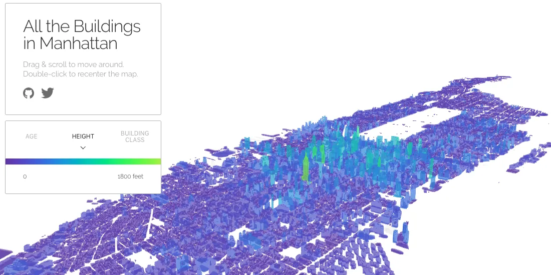
In this stunning interactive project Buzzfeed data engineer and creative visualizer Taylor Baldwin maps out Manhattan's buildings and lets users explore NYC and it's over a million residences offices commercial spaces and more by age building height and classification.
"A map of every building in America"
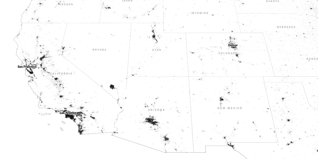
Not to be outdone in a sunday feature The New York Times mapped every building in the United States and investigated the patterns made by the impact of culture heritage and design. Their goal with the project was to provide an opportunity for readers to "connect with the country's cities and explore them in detail. To find the familiar and to discover the unfamiliar."
"All of the world's borders by age"
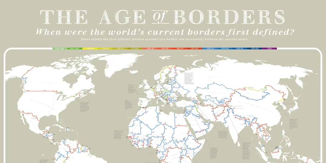
This post from Visual Capitalist highlights a truly beautiful visualization from Reddit's Data is Beautiful community. Creatively representing the age of the world's existing national borders the map provides interesting tidbits and trivia. Did you know the 120km border of Andorra is the oldest in the world at 740 years old?
"Commuting times across the entire planet"
Mapping out the state of transportation and transit infrastructure around the globe a team at Oxford's Big Data Institute visualizes the travel times to metropolitan areas painting a stunning picture of population density and access that is featured in this article from FastCompany.