

Map of The Month: Trajectories of Neighbourhood Change


Socio-economic inequalities in the UK have remained persistently high over the last forty years. In the UK the Gini coefficient a commonly used measurement of inequality has risen from 0.27 in 1970s through 0.41 in 1980s to 0.52 in 2010. The disposable income of the top 20% of the population is more than five times as high as that of the bottom 20% according to the Office for National Statistics.
The gap is widening as well with that lower fifth facing contracting income while the upper fifth’s rose by 4.7% in 2018. This growing inequality is a key reason behind the creation of the UK2070 Commission an independent inquiry into inequality across the UK which just released its first report this May and triggered The British Treasury Committee to launch a formal inquiry into regional imbalances in the UK economy the past Friday June 14th.
The goals of the Commission were found to dovetail nicely with (and thus include) some of the output from a team of researchers at the University of Liverpool’s Geographic Data Science Lab and their project exploring “Trajectories of Neighbourhood Change in Britain.” The project supervised by Dr. Francisco Rowe and Dr. Dani Arribas-Bel began as a PhD project by student Nikos Patias. The stated goal was to “assess the extent sequence pace and spatial pattern of neighbourhood change in Britain over a 40-year period from 1971 to 2011”
{% include icons/icon-bookmark.svg %} Want to learn more about introducing spatial components to your data models? Check out our webinar!
The project which continues to grow and develop produced a policy brief and created two interactive digital maps for the UK 2070 Commission.
Methods and Mapping British Neighbourhood Inequality and Trajectory
The first step towards establishing a deeper understanding of neighbourhood trajectories across Britain was to take British census data and begin to build classifications. As the team’s goal was to create a scalable temporal framework one of the main challenges was creating a consistent spatial unit for examining the data at a high spatial resolution. They chose to create a population grid based on 1km x 1km cells.
The team used census data to create geo-demographic classifications to apply to their grid including:
- Population
- Employment
- Occupation
- Housing (ownership and vacancy)
- Infrastructure
- Migration
- Number of Students
- Socio-economics
- Commute times and modes
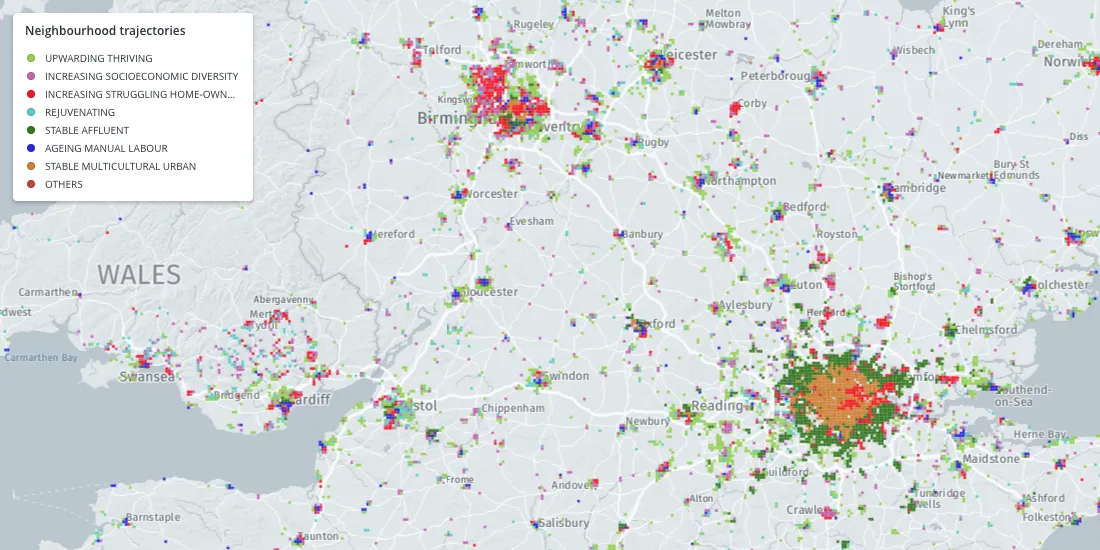
They examined data across 5 timeframes (1971 1981 1991 2001 2011) covering 40 years and created a typology based on feature prominence to identify the classifications that they made. The neighbourhood types that they came up with are:
- Blue Collar Families
- Older Striving
- Families in Council Rent
- Struggling
- Affluent
- Mixed Workers Suburban
- Thriving Suburban
- Multicultural Urban
The distribution of these distinct neighbourhood types can be seen in the above map. Viewers can use this map to examine the nature of inequality and how it has shifted over five decades. For example take a look at London's neighborhood type distribution has shifted.
But the goal of the project is also to examine the trajectories of neighbourhoods and how based on their socio-economic makeup we might expect them to change over time. In order to understand these trajectories the team ran a sequence analysis.
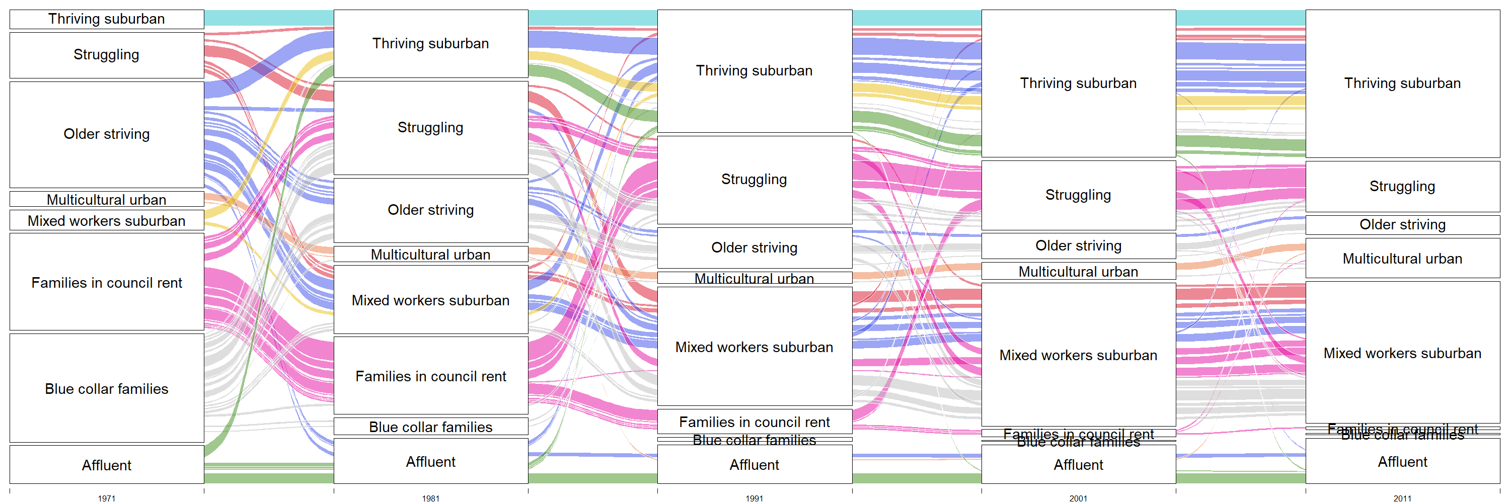
The above flow chart depicts how neighbourhoods have tended to change over the past forty years. Once again they created a typology based on the most prominent type of change for trajectory classification:
- Upward Thriving
- Increasing Socioeconomic Diversity
- Increasing Struggling Home-owners
- Rejuvenating
- Stable Affluent
- Ageing Manual Labour
- Stable Multicultural Urban
Why CARTO
When asked about the benefits of using CARTO to visualize their results Dr. Rowe noted that CARTO’s interactivity was critical allowing an audience of policy professionals many of whom may lack a background in data and data analysis to engage and explore the data. The CARTO maps allow those users to examine the structures and patterns that exist within Britain’s tapestry of economic trajectories and to understand the nature of change across the country.
What’s next
By examining and analyzing the census data and uncovering the trajectories of neighbourhood change the team from Liverpool reached a number of realizations. First that the face of deprivation in Britain has changed. Before the 90s it was more associated with families living in government housing close to where they work. Since then that ‘face’ has shifted to be more represented by areas of high unemployment but with people owning their houses. This may be the result of government policy selling that government housing to residents in the 90s. Despite the new ownership these areas are still facing high unemployment and similar economic struggles.
They also realized that while they expected inequality to increase the truth is a bit less pronounced. With struggling neighbourhoods transitioning into younger working-class neighbourhoods inequality is taking on different shapes understanding this can help develop more accurate assessment standards.
As for what’s next the project continues. Now that the team has created their consistent framework for analyzing inequality they aim to more deeply explore what substantive knowledge can be derived as to the nature and sources of inequality. They seek to improve prediction to see what inequality will look like in the next 10 years. They also are exploring opportunities to work with machine learning models and satellite imagery to see how these existing structures of inequality relate to the built world.
Using the latest spatial analysis techniques this research can help policy makers to more proactively examine the growing challenge of inequality addressing it at its source and improving future outcomes.


