US Protest Map & Visualizing Police Violence


A week ago African-American George Floyd tragically died whilst in police custody sparking a wave of unrest and protests in cities across the US. As with any societal issue to understand the scale of police violence we must analyze and visualize data - which is what Mapping Police Violence has done. If your organization needs to do the same you can apply for a CARTO grant to further raise awareness and create maps as part of the #BlackLivesMatter movement.
Mapping Police Violence
Police killed 1 099 people in 2019 in the US. Black people were 24% of those killed despite being only 13% of the population.
These figures were published by Mapping Police Violence a research collaborative collecting comprehensive data on police killings nationwide to quantify the impact of police violence in communities which has been featured on Hacker News today.
The data the collaborative collects is sourced from three of the largest most comprehensive and impartial crowdsourced databases on police killings;
In addition to this data they have also performed extensive original research to further improve the quality and completeness of the data; searching social media obituaries criminal records databases police reports and other sources to identify the race of 90 percent of all victims in the database.
The animated map below visualizes this data and shows killings that took place in 2019.
Mapping Social Media Response
In a recent post we have seen how location-based social media data (Geosocial data) from providers such as Spatial.ai can be analyzed and visualized.
Hashtags trending in the past week and beyond include #ICantBreathe #BlackLivesMatter and #HandsUpDontShoot which can be visualized as seen in the animated map below.
This visualization shows how happenings in the US cause uproar well beyond US borders. Something we have seen from numerous groups of citizens in other countries holding protests this week in Berlin London and Toronto to show their support of the #BlackLivesMatter movement.
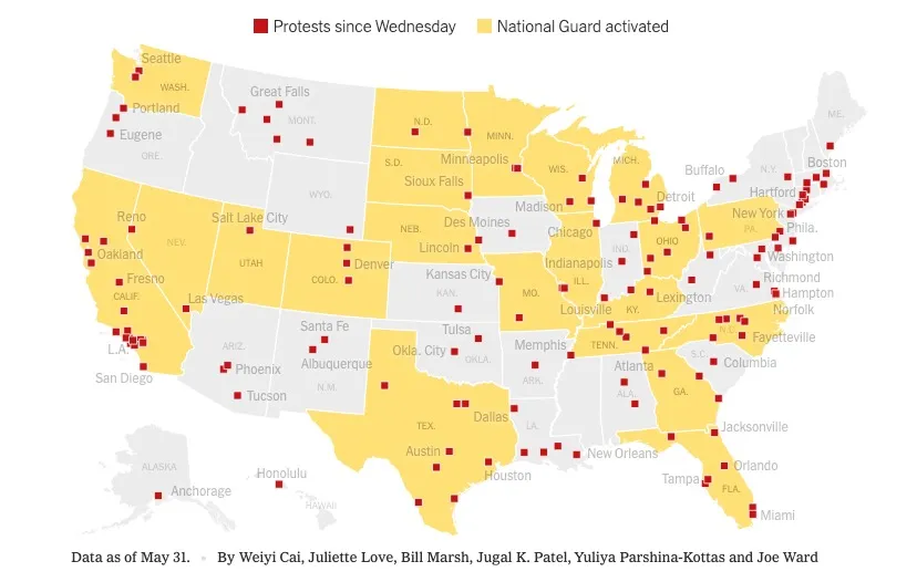
Mapping the Protests
The following map published by the New York Times shows the scale of the protests which at date of publishing have spread to 140 cities with the National Guard deployed in at least 21 states.
CARTO stands in solidarity with the community against racism hate and injustice. For that reason we would encourage any nonprofit organization looking to visualize data or perform similar geospatial analysis to achieve racial equality to apply to our grants program.