

How Google Cloud & CARTO power geospatial analysis at scale


As the volume of data with a location component continues to grow exponentially both geospatial analysts and data scientists are looking to scale their analytical workflows. Accessing massive spatial datasets securely and seamlessly running analysis on this data are key to driving more efficient business decisions.
Almost all data analytics workflows can be broken down into four primary components: Ingestion Storage Compute and Visualization. With the support of geospatial datatypes and functions in BigQuery Google unblocked geospatial workloads on the first three components.
CARTO’s BigQuery Tiler completes that effort by allowing visualization over datasets at scale.CARTO’s BigQuery Tiler is now available in General Availability as part of the CARTO Spatial Extension for BigQuery. The extension enhances the geospatial capabilities already supported by BigQuery using simple SQL.
Together CARTO and BigQuery support the components of an analytics workflow at scales impossible on any other system.
- Ingestion & Streaming: Users can stream geospatial datasets directly into a BigQuery table at speeds up to 10GB/sec per table using any number of geospatial data formats such as shapefiles KML GeoJSON etc. For batch loads customers routinely load in excess of petabytes per day.
- Storage: BigQuery's storage engine can automatically scale to support petabytes or exabytes of customer data containing spatial elements.
- Compute: BigQuery's native support for geospatial data types and ST_* functions allow rapid queries over terabytes or petabytes of stored data.
- Visualization: CARTO’s BigQuery Tiler releases geospatial visualization from the memory limitations of client-side applications. Users can now interactively visualize and analyze massive datasets right inside BigQuery.
{% include icons/icon-quotes.svg %} Using BigQuery Tiler the Intermx Data Enablement Platform® can eliminate complex batch data updates and reduce user downtime. Being able to rapidly process and analyze large population datasets empowers our customers through a fuller and more cohesive user experience.
Matthew Martimo Founder at Intermx.
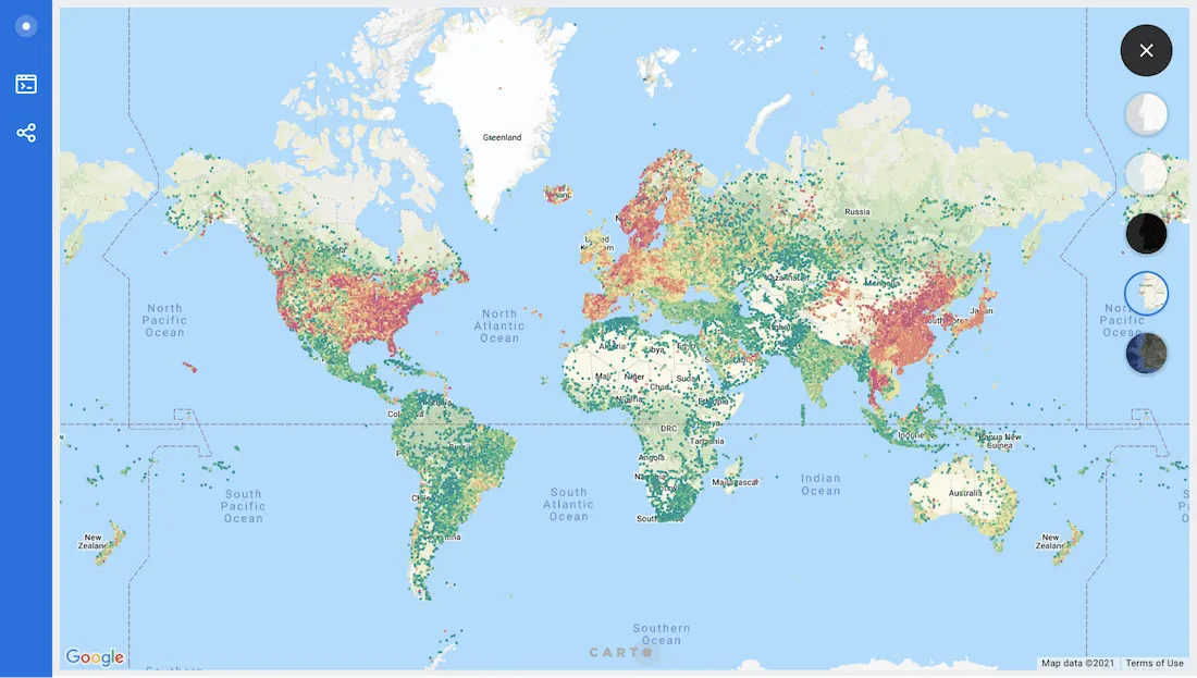
Analyzing Global Internet Connectivity
To demonstrate how BigQuery can support key stages in the geospatial workflow and also the visualization capabilities of BigQuery Tiler we have sourced a very large openly available dataset of global fixed broadband network performance data from Ookla®.
Ookla’s mission is to make the internet better faster and more accessible for everyone. Their Ookla for Good™ initiative provides data analysis and content to organizations that are seeking to improve people’s lives through internet accessibility. Hundreds of millions of people worldwide use their Speedtest® platform.
A noticeable difference in connectivity in rural areas vs. urban area across the US
How to visualize this data with BigQuery Tiler
As a CARTO Spatial Extension for BigQuery module the Tiler’s capabilities are available as SQL procedures that can be executed directly from the BigQuery console or client of choice after connecting your CARTO account to BigQuery.
The Tiler works by processing data directly in BigQuery and creating a table that contains the complete tileset. Each individual tile is stored as a row in this table with the tile coordinates and the encoded MVT stored in different columns.
Visualizing a tileset is straight-forward with a Map Viewer which will connect to BigQuery using your Service Account credentials in order to fetch and serve the tiles.
The CARTO API serves maps in a TileJSON standard format so they can be easily integrated with any web mapping library or desktop GIS application.
Internet speed comparisons across Western Europe
Creating the tileset from Ookla data
The source Ookla data is aggregated into quadkeys for zoom level 16 and contains more than 7 million points. This means that we’ll need to aggregate this data to be represented in lower zoom levels.
For that we’ll use the tiler.CREATE_POINT_AGGREGATION_TILESET procedure.
Take a look at these examples and the complete reference to get an idea of the different options available.
Creating a tileset is as easy as opening your BigQuery console and running the query there. Users have permission to call the Tiler’s functions with their Google account once they have:
- Signed up in CARTO using a Google account.
- Added a new BigQuery connection from your CARTO Dashboard.
CALL cartobq.tiler.CreatePointAggregationTileset(
  R'''
(
  SELECT ST_CENTROID(geom) as geom  avg_d_kbps FROM `carto-project.ookla.performance_fixed_2020q1_with_geom`
) _input
  '''
  R'''`cartodb-on-gcp-pm-team.demo.ookla_r8_z16_avg_d_speed`'''
  R'''
  {
      ""zoom_min"": 0
      ""zoom_max"": 16
      ""max_tile_size_kb"": 1024
      ""type"":""quadkey""
      ""placement"":""features-any""
      ""resolution"":8
      ""properties"":{
          ""agg_avg_d_kbps"": {
            ""formula"": ""avg(avg_d_kbps)""
            ""type"":""Number""
            }
       }
       ""single_point_properties"":{
           ""avg_d_kbps"": ""Number""
        }
  }'''
);
cartodb-on-gcp-pm-team.demo.ookla_r8_z16_avg_d_speed
By running the query above a new table is created containing our map’s tiles and the average internet download speed from the Ookla data that we’ll use to style the map.
Visualizing the Ookla data as a tileset
After connecting your CARTO account to BigQuery a new Your Tilesets tab will appear in the Data section of your CARTO Dashboard. This new tab shows the tilesets available to your account in a specific BigQuery project and some useful metadata.
Click on one of the tilesets to access the Map Viewer: a new tool to visualize and publish your tileset maps.
Map Viewer uses CARTO for deck.gl’s style language which makes it easier to create data-driven visualizations. Take a look at the documentation to start using it.
In addition creating color ramps for data-driven visualizations is straight forward using helper functions for different types of classification.
Google Maps is also available as a basemap within this tool. Add “google”: true in the Map Style section or just use the basemap selector on the top right corner of the screen.
Thailand’s internet connectivity is much faster than neighboring countries
Sharing map visualizations
Tilesets can be used as data layers with many web mapping libraries. Take a look at the Development tools section in our documentation to learn about different options.
For quick sharing and publishing on the web we can use the options from the Share menu in the Map Viewer.
Clicking on Publish will grant permission in BigQuery to the CARTO Maps API service account so it can directly fetch and serve the map tiles. Use the Unpublish toggle to revoke this access.
Copy the link or the embed code to share or publish the visualization.
Why try BigQuery Tiler?
BigQuery Tiler is a powerful tool that can be used to bring massive enterprise datasets to life and enhance our spatial understanding of complex analytical use cases such as cellular network deployment IoT Analytics or mobility analysis through stunning map visualizations. To find out more about our Location Intelligence solution contact hello@carto.com.
Concentration of populations and the demographic deserts of the Middle East
Want to discover more?


