

Map of the Month: City Health Dashboard


The mission of the City Health Dashboard a program created in a partnership between NYU Langone Health and NYU's Robert F. Wagner School of Public Service is to "Equip cities with a one-stop resource for comprehensive reliable data to help them build healthier and more equitable communities."
The idea for the dashboard came about from a recognition that most health data in the U.S. turned out to be organized at the county or state level. City leaders and community leaders lacked the granular data about health and its determinants at the level that they are responsible for or living in.
Marc Gourevitch MD MPH
The dashboard was originally piloted in 2017 measuring urban health across 26 measures or indices for the cities of Waco Flint Providence and Kansas City. Based on that pilot and feedback from cities themselves on usability a full dashboard was custom developed by Forum One a CARTO partner and full service digital agency headquartered in Alexandria VA. The new full version of the dashboard was launched earlier this month and has vastly expanded on the pilot featuring 36 distinct measures of urban health across 500 American cities.
The 36 metrics tracked in the City Health Dashboard were chosen for their utility in helping cities to measure health and factors that impact health and are broken out into five categories:
- Social and Economic Factors - Graduation Rate Literacy School Absenteeism Poverty and Income Inequality Housing Costs Segregation and Diversity Unemployment Violent Crime
- Physical Environment - Park Access Walkability Air Pollution Lead Risk Healthy Food Access
- Health Behavior - Drinking Smoking Physical Inactivity Teen Birth Rate
- Health Outcomes - Death and Disease Rates Obesity Mental Health Opioid Deaths
- Clinical Care - Primary Care Dental Care Prenatal Care Uninsured Rate Preventative Services
Data on each of these measures in the dashboard has been collected within the last four years is updated regularly and has been vetted for accuracy. Datasets represented in the dashboard come from trusted state federal and non-governmental sources such as the U.S. Census Bureau the Centers for Disease Control and Prevention and the Environmental Protection Agency.
Mapping and Comparative Analysis
Upon first arriving at the dashboard users are prompted to select their city bringing them to a city view where they can choose a metric to explore.
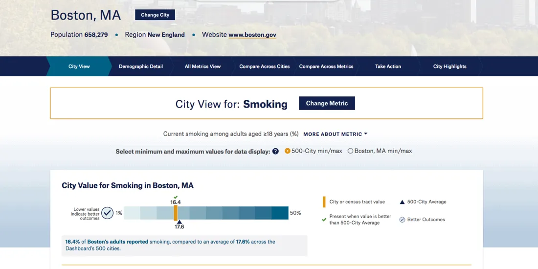
The selected metric in this case 'Smoking' (or more specifically current smoking rate among adults aged ≥18 years) is first presented on a chart representing both the measure for the selected city and the average measure across every city in the dashboard. This provides officials with a clear view of where their city measures up against national averages across each metric.
The color scale used in the chart is consistent across every metric and view within the dashboard creating a unified aesthetic for users to quickly interpret the data that they are viewing. This color scheme is carried into the map view for each metric so that city health officials can interpret and analyze health in different parts of their city differ without a totally new legend.
A choropleth map is available in each city view allowing for a granular understanding of each measure at the census tract level:
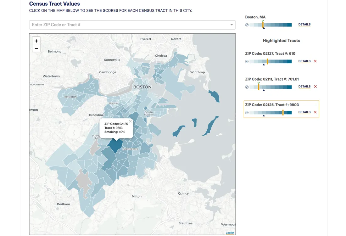
Tabs at the top of the page allow for greater detail and analysis. A Demographic Detail view breaks down certain metrics by gender and ethnicity showing communities that face greater risks and impacts from varied factors. The All Metrics view provides a snapshot view of all 36 indexes for the selected city with dropdowns providing greater detail.
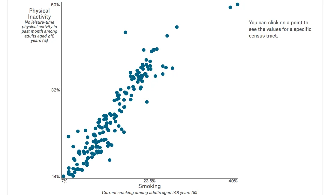
The two comparison views are useful for city officials trying to understand the relationships within the data. By selecting two metrics the dashboard can create a scatter plot showing each census tract and helping analysts to find correlations between health indicators and behavioral patterns. The below plot shows the correlation in Boston between smoking rates and physical inactivity:
Lastly they dashboard points users to resources that can help cities to address health challenges and continue to improve the lives of its citizens.
National View Local Understanding
80% of the US population lives in cities. But until recently few measures have been available for cities to assess health the factors that shape it and the drivers of health equity. Using the City Health Dashboard city leaders are empowered by regularly refreshed data and the tools to visualize and analyze that data.
With comparative analysis available against national datasets combined with granular views of local health metrics the City Health Dashboard provides an unprecedented and holistic view of American cities. The dashboard will power a new wave of data-driven decision making by cities looking to improve citizen health around the country.
Learn how Smart Cities are innovating to boost local collaboration Check out the Webinar!


