Telco dashboards: Turning accessible data into actionable insights


What does it mean to make data truly accessible? Not just to analysts and experts, but to the people who need it most – decision-makers and, ultimately, the communities they serve. In this blog, we showcase how CARTO, our powerful cloud-based platform for creating interactive spatial applications, can serve both as a tool for increasing network accessibility for senior citizens and also as a powerful example of how open data, dashboards, and accessibility intersect.
We're talking about more than just numbers on a screen. Did you know that nearly 25% of adults aged 65 and older in the United States do not use the internet?
(Source: Pew Research Center). This isn't just a statistic; it's a barrier to healthcare, social connection, and essential services. According to the CDC, social isolation significantly increases a senior citizen's risk of serious medical conditions such as dementia, and heart disease. Internet access can provide a lifeline to those who are isolated. (Source: CDC). To address this, we need to find a way to make the data surrounding this not just available, but understandable.
This is where dashboards can be so valuable.
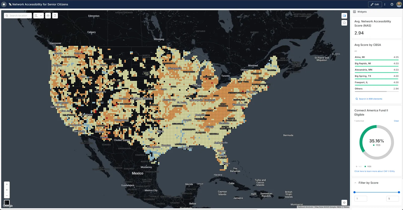
The above dashboard 'Network Accessibility for Senior Citizens'* (open in full screen here) was crafted in CARTO Builder - our data visualization tool for generating rich insights natively in your lakehouse.
This tool visualizes network accessibility priorities for senior populations across different areas. It uses a mix of synthesized network accessibility data and actual open data to enrich the accessibility score with crucial context. By combining these datasets into one comprehensive dashboard, we can provide a more nuanced understanding of the challenges seniors face while making the data more accessible and actionable to policymakers, Telco companies, and other stakeholders.
So, how did we go about building this? Keep reading to find out!
*Please note that the network accessibility data used in this application is synthetic, designed to illustrate how such a tool could be applied with real-world data to drive informed decisions.
Building a dashboard for accessible insights
Want to build your own dashboard? Sign up to a free 14-day CARTO trial here!
Preparing the data for the dashboard
Step 1: Enriching the data
The initial step involved gathering and enriching the pre-calculated synthesized network accessibility dataset with Core-based Statistical Areas from the U.S. Census Bureau and Connect America Funding (CAF) Phase II zones. This process was carried out with the below process in CARTO Workflows, our low-code data processing and analytics solution that runs inside your Data Lakehouse.
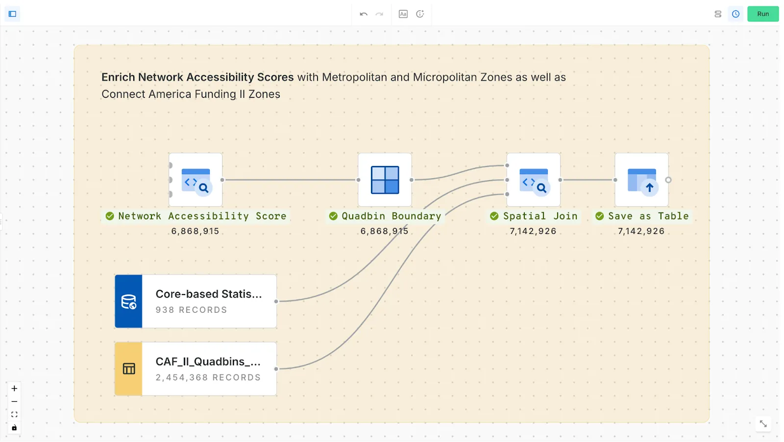
The CAF II zones had previously been converted from polygon to Quadbins to create an consistent (apples-to-apples) coverage map that could be mapped onto the Network Accessibility Score table.
What are Quadbins?
A Quadbin is a type of Spatial Index—multiresolution, hierarchical grid systems. Each “cell” is identified by a short ID - rather than a long, heavy geometry field - making the data incredibly lightweight and efficient for analyzing and combining large datasets. This system allows for significantly faster rendering and analysis, enabling dynamic adjustments as you zoom in and out of the map. For example, in this dashboard, when you zoom in, the map can quickly recalculate and display data at a higher resolution, providing a more detailed view. Learn more about Spatial Indexes in our free ebook Spatial Indexes 101!
Step 2: Calculating a Network Accessibility Score
Once the enrichment The network Accessibility Score (NAS). This was calculatedthrough a predictive model that uses:
- Synthetic network speed and antenna data
- Building heights from USGS
- Sociodemographic data from the American Community Survey
- Human mobility data from Unacast to assign
These inputs were used to calculate a normalized network accessibility score (NAS) for each quadbin.
The lower the accessibility score, the higher the priority for a location is for network enhancement. As part of this process, AI-generated labels were created to describe how the model inputs affected the score, making the results more interpretable and actionable. You can read more about the process in this blog post: Create a Spatial Priority Score to Improve Network Access.
Designing the Dashboard
This is where the power of dashboards became apparent. Building the 'Network Accessibility for Senior Citizens' dashboard wasn't just about visualization; it was about translation. On one hand, the power of cloud-native geospatial analytics is that we can compose a US-wide network accessibility score complete with AI-generated labels. But having access to a dataset this far and wide, can be daunting and difficult to engage with for most decision-makers. Perhaps you’re working for a local government agency and need to easily focus your analysis on specific communities? Or maybe, you’re a policy maker trying to determine the next wave of eligible projects from Telco companies looking to expand broadband and mobile 5g access.
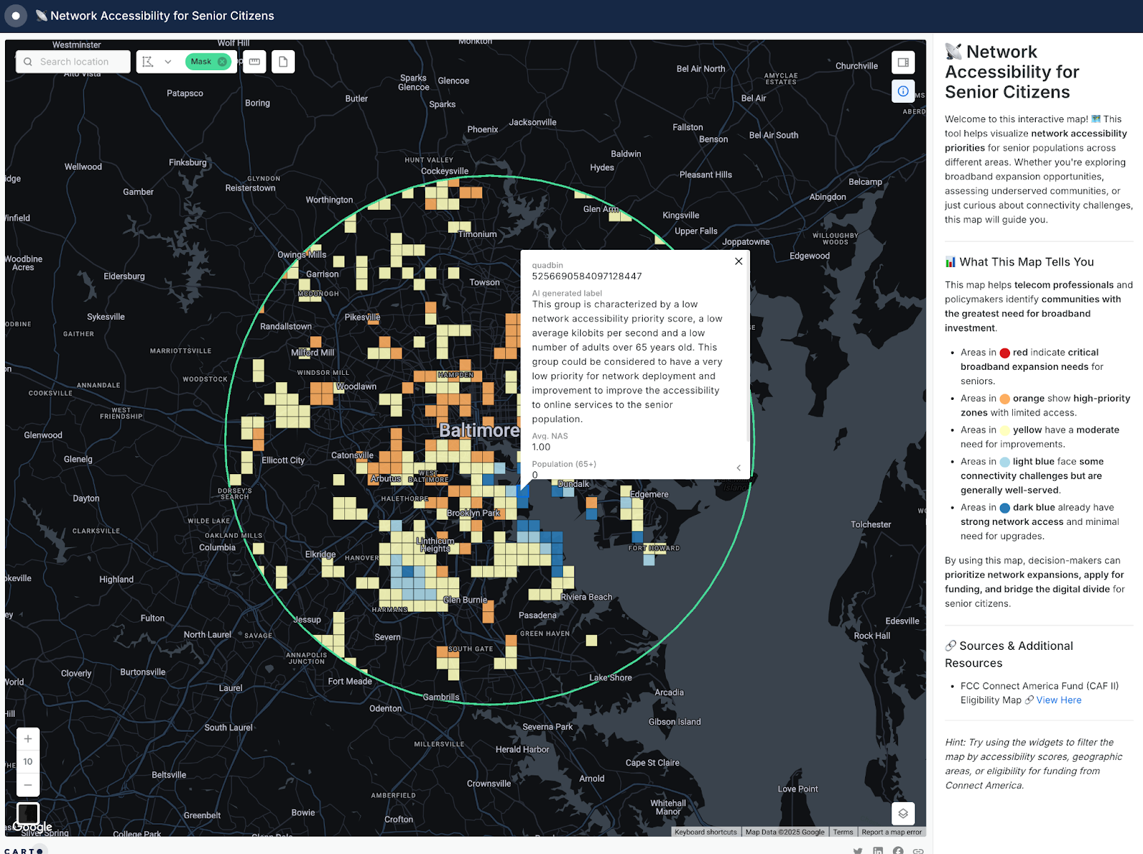
CARTO was used to design an interactive and shareable map that enables users to filter metropolitan and micropolitan areas by their average network accessibility score, toggle CAF II eligibility, view the population count of seniors, and examine aggregated download speeds.
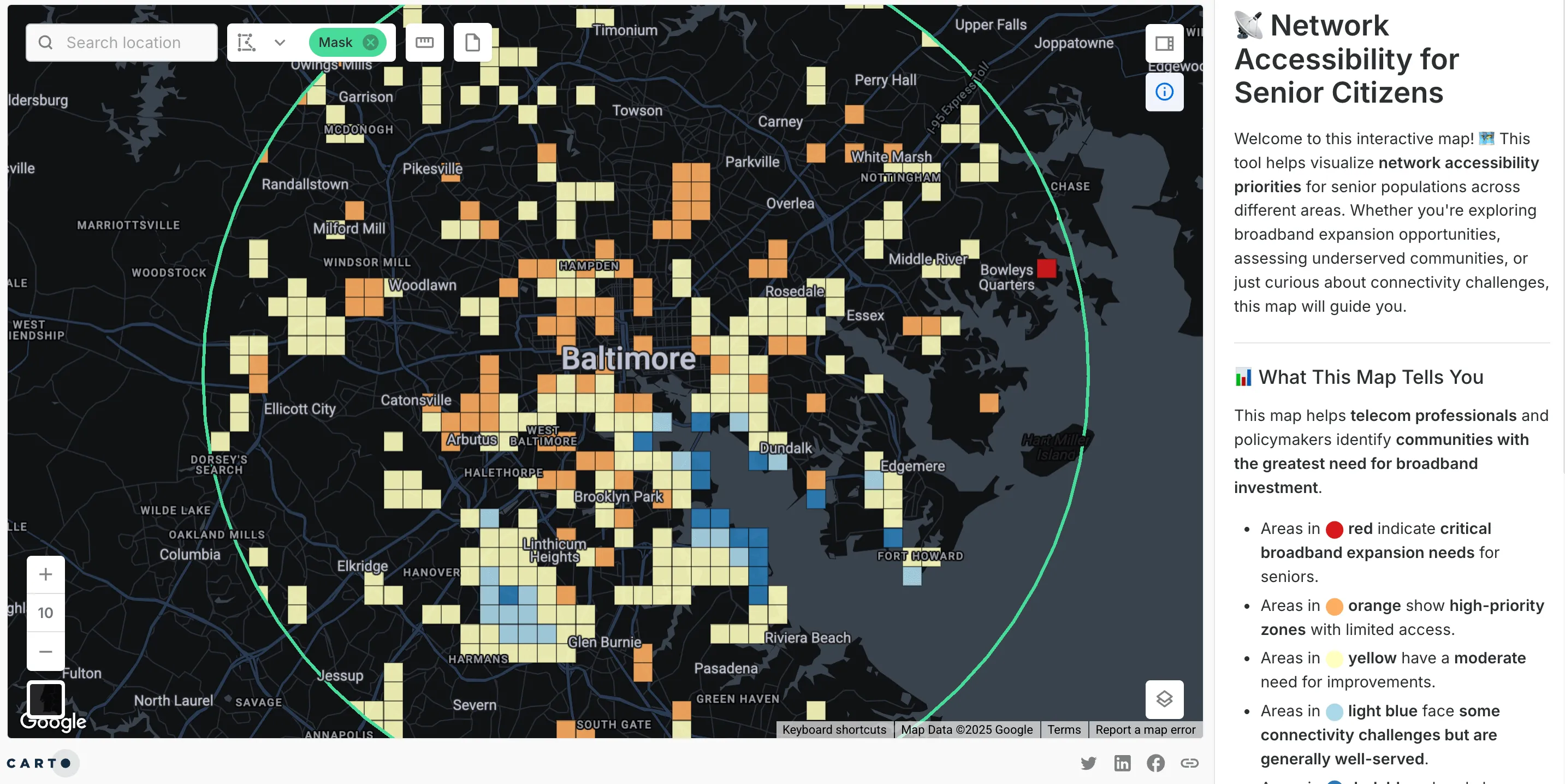
The dashboard is designed to transform complex data into an easily accessible format for users of all technical backgrounds. For example, eligible areas with low average scores can be located by either searching for a specific metropolitan area in the widget or using the search location tool in the top left corner of the map to apply a mask around an area of interest. This customized view can also be shared with colleagues through URL Parameters, which are special codes appended to a web address that automatically adjust the map’s filters and settings when the link is opened.
The example below demonstrates how a predefined geographic boundary can be encoded as a URL parameter to modify the map’s display. By appending a mask parameter, a specific polygon shape is applied, restricting the visible data to the selected area. URL parameters provide a simple way to preconfigure views and share customized map settings with others.
So, for example, this URL...
https://clausa.app.carto.com/map/d0d68925-2206-4f93-8da7-1a0fb8a05466?zoom=10&lat=39.284455&lng=-76.623775&mask=POLYGON+%28%28-76.600661+39.478546%2C+-76.625537+39.4776%2C+-76.650172+39.474771%2C+-76.674326+39.470087%2C+-76.697765+39.463594%2C+-76.720261+39.455353%2C+-76.741597+39.445446%2C+-76.761567+39.433968%2C+-76.779976+39.421031%2C+-76.796649+39.40676%2C+-76.811424+39.391293%2C+-76.82416+39.37478%2C+-76.834735+39.35738%2C+-76.843048+39.339262%2C+-76.849022+39.320601%2C+-76.852599+39.301577%2C+-76.853749+39.282373%2C+-76.852461+39.263174%2C+-76.848751+39.244166%2C+-76.842655+39.22553%2C+-76.834234+39.207446%2C+-76.823571+39.190088%2C+-76.81077+39.173622%2C+-76.795955+39.158207%2C+-76.779269+39.143989%2C+-76.760872+39.131105%2C+-76.740943+39.119679%2C+-76.719673+39.109819%2C+-76.697264+39.10162%2C+-76.673933+39.09516%2C+-76.649901+39.090502%2C+-76.625399+39.087689%2C+-76.600661+39.086748%2C+-76.575922+39.087689%2C+-76.55142+39.090502%2C+-76.527389+39.09516%2C+-76.504057+39.10162%2C+-76.481649+39.109819%2C+-76.460378+39.119679%2C+-76.440449+39.131105%2C+-76.422053+39.143989%2C+-76.405367+39.158207%2C+-76.390552+39.173622%2C+-76.37775+39.190088%2C+-76.367087+39.207446%2C+-76.358667+39.22553%2C+-76.352571+39.244166%2C+-76.34886+39.263174%2C+-76.347572+39.282373%2C+-76.348722+39.301577%2C+-76.3523+39.320601%2C+-76.358273+39.339262%2C+-76.366587+39.35738%2C+-76.377162+39.37478%2C+-76.389898+39.391293%2C+-76.404673+39.40676%2C+-76.421345+39.421031%2C+-76.439755+39.433968%2C+-76.459724+39.445446%2C+-76.48106+39.455353%2C+-76.503557+39.463594%2C+-76.526995+39.470087%2C+-76.55115+39.474771%2C+-76.575784+39.4776%2C+-76.600661+39.478546%29%29
Translates to this map...
Accessible and Actionable Data Insights
Dashboards like these do more than present information—they empower action. Even with a synthetic accessibility score, disparities are clear: rural areas lag behind urban centers. By integrating CAF II overlays, we can pinpoint where funding can have the greatest impact.
For instance, high senior populations don’t always correlate with strong internet access, highlighting the complexity of the digital divide. Universal solutions won’t work—targeted, data-driven interventions are essential. With telehealth becoming vital for older adults, broadband affordability remains a major barrier.
Collaboration is key:
- Policymakers can visualize disparities to prioritize funding.
- Planners can leverage CAF II overlays for effective resource allocation.
- Telecom companies can make data-driven infrastructure investments.
- The public benefits from transparent insights that foster trust and accountability.
Start your journey towards accessible insights
Access to information, services, and opportunities shapes daily life—whether through broadband, transit, or climate resilience. Raw data alone isn’t enough; true accessibility comes from making insights clear, actionable, and available to decision-makers.
Ready to learn how you can start transforming your spatial data into more accessible insights? Request a demo from one of our experts today!