What Geospatial Analysis tells us about Meatpacking & COVID-19


Given the large number of open source spatial analysis libraries available today it can often be difficult to understand how best to combine the strengths of each tool - especially at a time when spatial analysis has never mattered more in increasing awareness and informing public policy around COVID-19.
This post written by one of our partners makepath details how they took on this challenge and utilized some of their favorite spatial analysis tools (including CARTOframes in conjunction with two of their own libraries Xarray-spatial and Datashader) to assess the impact of the pandemic on the American meat industry.
Indeed meatpacking plants have become COVID-19 hot spots with low temperatures cramped conditions and long hours putting workers at higher risk. One of our grantees The Food & Environment Reporting Network (FERN) has been tracking COVID-19 outbreaks in the food system and is keeping the map below updated on a regular basis.
Using CARTOframes with Open Source Libraries
Before our analysis we hypothesized that distance to meatpacking plants and confirmed COVID-19 cases would have a negative correlation.
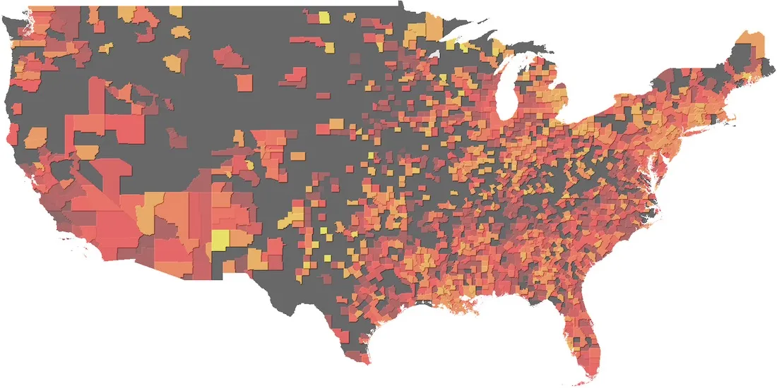
This map illustrates COVID-19 fatality rates by county. Lighter colors represent higher fatality rates.
To test this we obtained COVID-19 case data from Johns Hopkins and meatpacking plant location data from the USDA. We combined these datasets using CARTOframes and Datashader for our analysis.
CARTOframes takes away much of the pain of data analysis by cleaning and organizing datasets. This accelerates "time to value" and ensures greater accuracy.
Using CARTOframes we were able to easily create an interactive map as seen below. To build this we first geocoded meatpacking plant addresses which is the process of turning addresses into latitude/longitude coordinates. This allowed us to derive new datasets which we saved to our CARTO account to create this map.
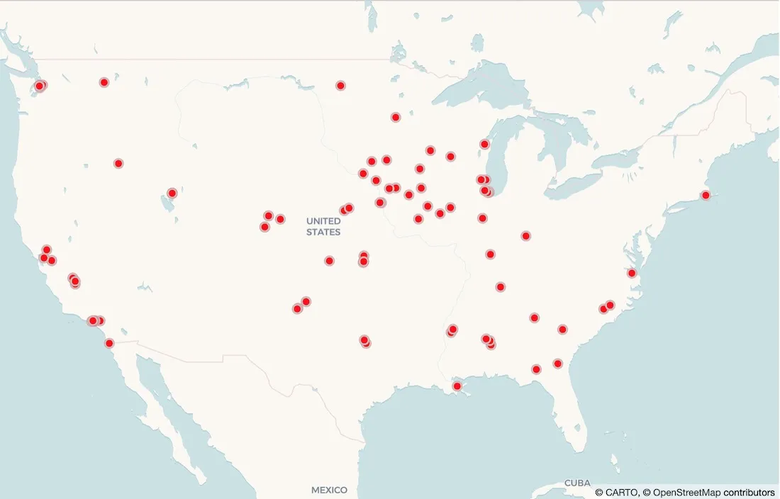
A map of meatpacking plants based on CARTOframes geocodes.
Xarray-Spatial is an open source raster analysis library for Python sponsored by makepath. Using Xarray-Spatial's proximity tools we created a grid illustrating the distance between meatpacking plants. Because our location coordinates are in latitude and longitude we used Great Circle Distance an optional argument in Xarray-Spatial's proximity tool to calculate distance over a spherical surface. We can see the distance grid below with darker colors indicating a greater distance to the closest meatpacking plant.
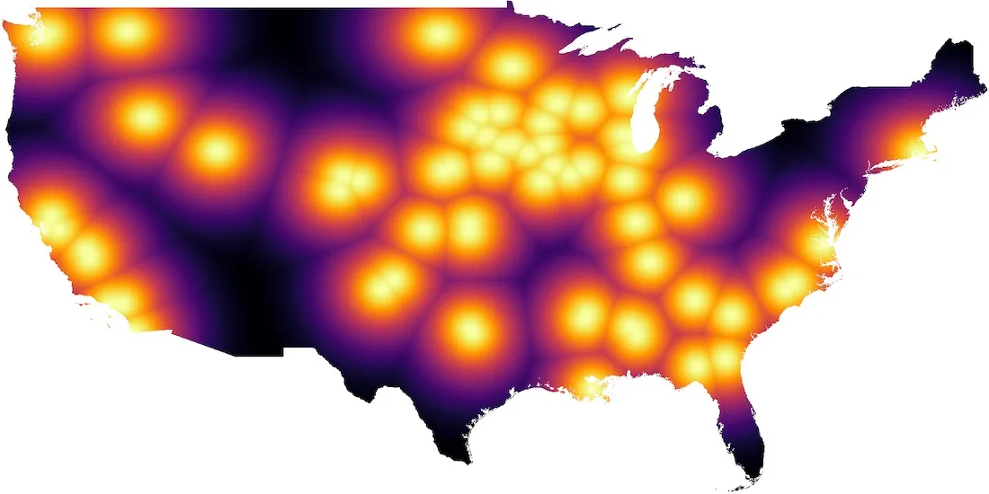
Proximity grid that illustrates the distance between meatpacking plants. The darker the color the greater the distance. Source: USDA
What Does This Analysis Tell Us?
To test our hypothesis we ran "Pearson Correlation" between the distance and confirmed COVID-19 case variables. Our hypothesis was that we would find a negative correlation between the two variables meaning that as distance from the plant increases< (independent variable) confirmed COVID-19 cases decrease (dependent variable). Pearson Correlation calculates an r value which ranges between -1 and 1 which indicates the strength of positive or negative correlation.
Before computing the correlation using Pandas we first needed our variables to be normally distributed. The confirmed cases rate was not normally-distributed so we applied a log function. The resulting r value from correlation was -.25 which is considered "weak negative" correlation.
As a next step we would obtain higher resolution data on confirmed Coronavirus cases and specific COVID-19 counts for each meatpacking plant.
CARTOframes makes it easy to combine data from multiple sources modify it using analytics programs and publish interactive maps to CARTO.
Using CARTOframes as a back-end and Xarray-Spatial and Datashader as analysis tools we were able to explore the relationship between meatpacking plants and COVID-19 outbreaks within a Jupyter notebook (which can be viewed here). We used Xarray-Spatial’s zonal statistics function to calculate mean distance from meatpacking planet for each county. To further explore this relationship we could aggregate additional demographic attributes to each county while also obtaining higher-resolution confirmed case data.
CARTOframes solves two key problems for our organization: security and integration. With our data in CARTO we can manage user data access while still easily integrating with open source spatial analysis tools via CARTOframes. Having security and integration solved means we can direct surplus energy towards asking more insightful analysis questions.
How have you used spatial analysis to tell your data story?
Reach out at contact@makepath.com
Citations
Dong E Du H Gardner L. An interactive web-based dashboard to track COVID-19 in real time. Lancet Infect Dis; published online Feb 19. https://doi.org/10.1016/S1473-3099(20)30120-1
Livestock & Meat Domestic Data. (n.d.). Retrieved June 15 2020 from https://www.ers.usda.gov/data-products/livestock-meat-domestic-data/