

Using Data & Maps to Analyze England's Response to COVID-19


Across the globe real-time dashboards to understand COVID-19 trends are not just reaching data analytics or spatial analysis audiences - they have also become a key part of decision-making processes for a range of organizations in both the public and private sector.
Recently cases of Coronavirus have been increasing rapidly in countries around the world particularly within Europe with lockdown measures being reintroduced in France Germany and the UK. We are likely to see such measures until an effective vaccine is widely available and therefore efforts to reduce transmission will continue for some time. An important part of these efforts is having in place a well-functioning Test Trace and Isolate system which have had varying success rates worldwide.
Public Health England National Health Service (NHS) and the Office of National Statistics (ONS) publish daily or weekly data related to the pandemic response. This data is often difficult to interpret to understand how effectively the system is running.
Researchers from i-sense an Interdisciplinary Research Collaboration funded by the Engineering and Physical Sciences Research Council (EPSRC) have developed a dashboard to evaluate the performance of the ‘Find Test Trace Isolate Support’ system by collating publicly available data into a single place. This work received mapping support from the CARTO Grants for Good program.
i-sense COVID Response Evaluation Dashboard
Development of the COVID Response Evaluation Dashboard (COVID RED) was led by experts from University College London (UCL) and the University of Leeds and looks into England’s overall performance against five important stages: Find Test Trace Isolate and Support.
Find
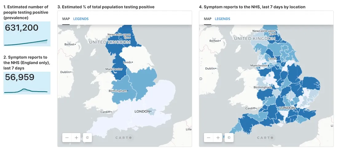
Find is about finding as many people as possible who have been newly infected with COVID-19 and encouraging them to have a test. At the moment the strategy in England is focused on finding people with new symptoms but this is being expanded to include some people who don’t have symptoms as well (e.g. health care workers and teachers).
This section of the dashboard includes two interactive maps. The first shows the estimated percentage of the total population testing positive with the second displaying symptom reports to the NHS from the last 7 days by location. Understanding where COVID-19 is spreading is crucial to quickly control new outbreaks and reduce transmission.
Test
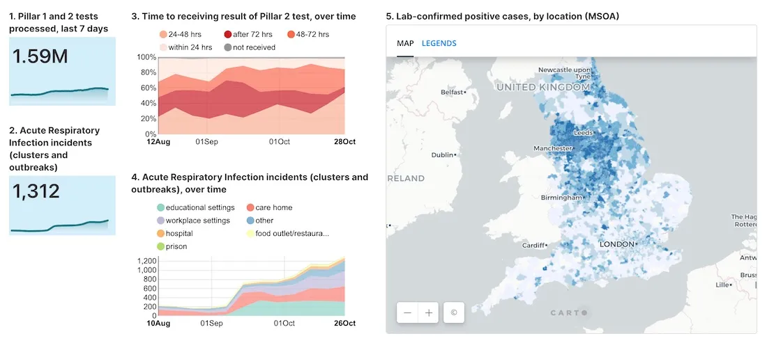
Test involves confirming positive COVID-19 cases through diagnostic testing.
This section includes a map showing lab-confirmed positive cases by location. Here the geographic hierarchy Middle Layer Super Output Areas (MSOA) is being used as it was designed to improve the reporting of small area statistics in England.
Trace
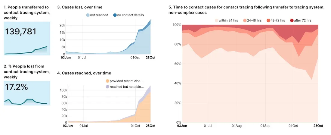
Trace is about reaching people who have newly tested positive for COVID-19 advising them to self-isolate and identifying their recent close contacts for isolation (next tab).
Isolate
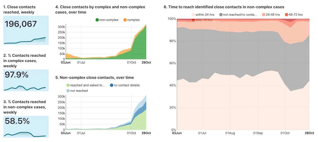
Isolate involves contacting identified close contacts of infected people (from “Trace”) and asking them to isolate for two weeks to help suppress COVID-19 and break chains of transmission.
Support
A Support system is important to ensure people who need to isolate can do so for the required time (currently 14 days).
There is currently no publicly available data on support provided to isolating individuals.
Building COVID-19 Dashboards
In a recent white paper we detailed how governments and corporate organizations are using Google Cloud Platform with CARTO to create intuitive dashboards in the cloud.
Whether you are building dashboards such as this running PPE supply chains planning returns to the workplace or involved in economic recovery use cases - having the right tools in place to make data-driven decisions is fundamental. You can explore other potential initiatives here.
Want to get started?


