CARTO and SafeGraph Team Up for Behavior Pattern Insights


Today perhaps more than ever before people are on the move. Transitioning between roles as consumers parents employees tourists and more means making a lot of stops in a day. As millions of people go about the routines of their lives patterns inevitably emerge underlying our behaviors. But it is only now with modern technology that these patterns can be understood and analyzed.
Looking at these patterns in aggregate can help cities and governments to boost infrastructural efficiency and help companies and brands to more effectively engage with customers. These patterns have implications for investment decision making public health environmental efforts event management and security and so much more.
It is for these reasons that we are thrilled to announce the inclusion of premium datasets from SafeGraph in our Location Data Stream Catalogue. SafeGraph is a geospatial data company aiming to build the most accurate source of truth for understanding the physical world. They do this by providing not only complete business listing information for over 5 million Points-of-Interest (POI) in the U.S but also by surfacing the visitor patterns registered at these locations. SafeGraph aims to help urban planners retailers marketers investors academic researchers and many more professionals interested in understanding anonymized population movement patterns. Now you too can start enriching your data with SafeGraph's Patterns data in CARTO.
SafeGraph Patterns data is derived from anonymized aggregated device events generated by their partner network of mobile applications. SafeGraph ensures that those applications obtain opt-in consent from users to collect the anonymous data. Data is not associated with any name or email address; SafeGraph processes the latitude and longitude information and determines visits to points of interest then they aggregate these anonymous visits to create the Patterns dataset.
Exploring the different dimensions of SafeGraph's Patterns data
Built into SafeGraph's Patterns dataset is information about when POIs are visited — by time of day and day of the week length of visit bucketed into intervals and the median length of a visit. Besides the time dimension the dataset includes patterns of visits from home and work locations to a venue creating something similar to an origin-destination matrix aggregated at the census block group level. A final dimension included in the dataset is related brand visits within the same day or same month as a POI visit. In the remainder of this post we will provide some insights after having explored sample data from SafeGraph from the month of July 2019.
Exploring the Patterns Over Time
In our efforts to examine the "visit time" dimension of the data we started out by exploring the patterns for coffee shops and hotels two of the thousands of POI categories available in the dataset. Going into this analysis we expected coffee shops to have very low visit numbers in the early hours of the morning with a sudden uptick during common commuting hours of 7-9 AM that sustained past lunchtime with another surge later in the day.
For our examination we looked at Starbucks locations in Manhattan because there are a lot of them (~190) and they tend to have predictable store hours. New York is also a notoriously difficult place for GPS data work due to signal scattering leading to lower precision and the high density of POIs leading to difficulty assigning visits to specific locations.
Reviewing visits by hour of the day for the locations we selected we get the following graph:
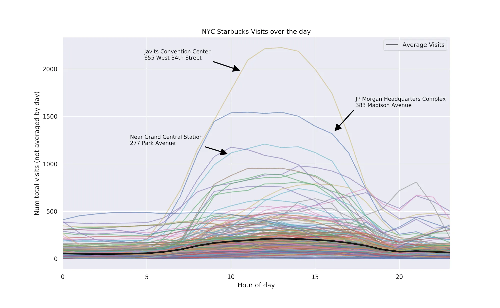
There are some interesting patterns in this graph:
- A clear signal that at ~7 AM people generally start getting coffee (or whatever they do at Starbucks) and keep getting coffee throughout the day
- Some of the POIs have a background noise that is probably attributable to some other type of visit -- e.g. hotels atop the Starbucks
- Some of the visit data shows very high usage in the early hours of the night (see the line that's around 2500 visits from midnight through 6am)
- The Javits Center which hosts conventions and other high-attendance events unsurprisingly has a clear and high signal
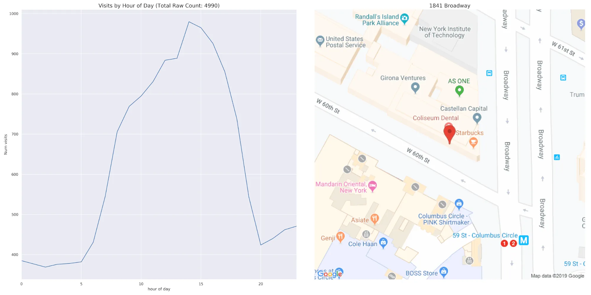
Pairing the diurnal patterns of one POI with a map we get:
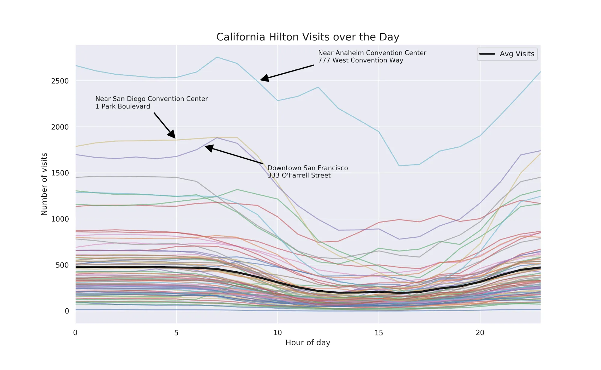
In terms of visit patterns a near opposite of coffee shops are hotels. For this section we chose Hiltons in California.
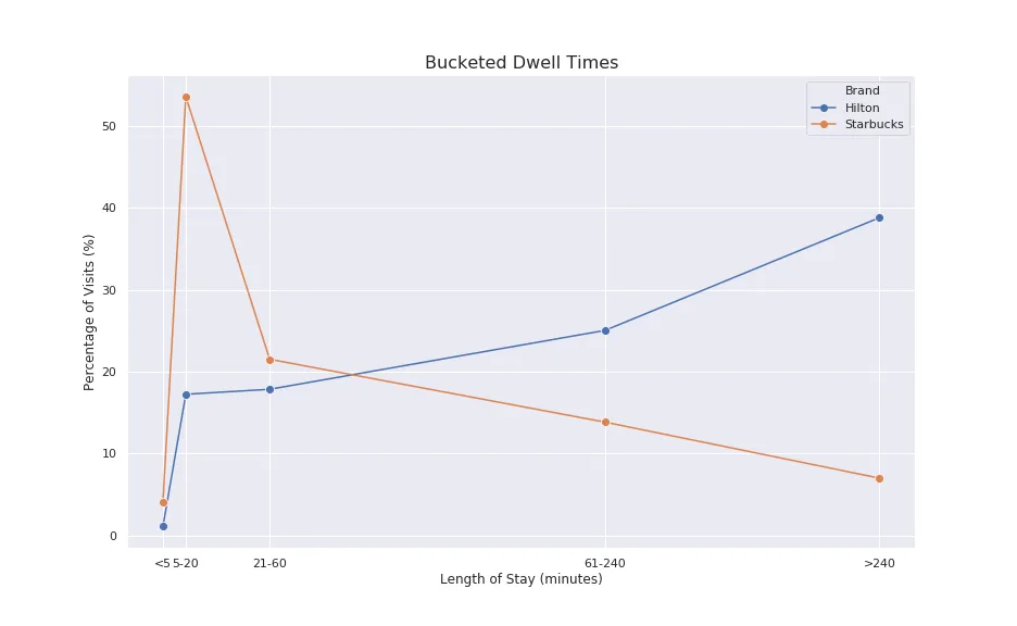
Examining Dwell Time Data
Digging further into the difference between Starbucks and Hilton customer behaviors we can look at the distribution of the median dwell time for all locations in the United States. Dwell time is the length of a visit.
Predictably Starbucks customers tend to have short stays with the vast majority of visits lasting 10-20 minutes. Hilton on the other hand shows more complicated behavior perhaps as a function of the different types of services hotels perform. Besides being a place to sleep for the night many hotels also host events and have restaurants potentially explaining why there are roughly as many visits less than three hours (180 minutes) as there are greater than three hours.

Digging more into the time dimension we can look at the length of stay 'fingerprints' of our two different venue types. We see that the majority of Starbucks visits tend to be 5-20 minutes in length (mostly standing in line then waiting for your order to be called). The Hilton POIs also match our intuition: longer stays are more likely but shorter visits are not uncommon because of the aforementioned services hotels provide.
The Space Dimension of SafeGraph Data
The visitor_work_cbgs and visitor_home_cbgs features of the Patterns dataset allow one to construct something similar to an origin destination matrix as the census block groups from the visitors home or work locations can be paired with the location of the POI.
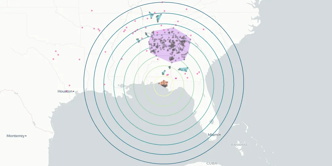
Going further we can even create 'catchment areas' of POIs to see how far afield visitors came to visit a POI.
To get started we can look at the visit behavior of a function of distance of home from a POI. In this case we are looking at two of the most visited Walmarts in the SafeGraph Patterns dataset for July 2019. These two locations have a similar number of visits but their visit behaviors versus distance are drastically different.
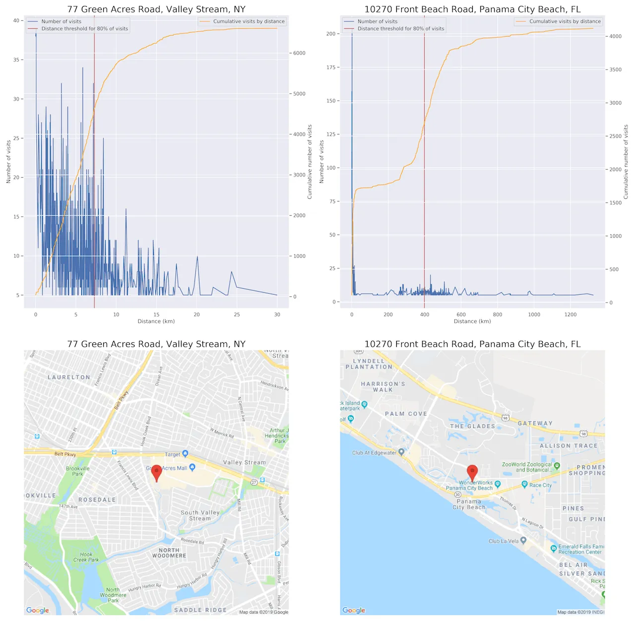
The Walmart in Valley Stream NY is located close to a large number of single family homes while the one in Panama City Beach FL doesn't seem as close to as many households although a large proportion of visits are from census block groups within a few kilometers of the store. The rest of the visits are 200+ kilometers away especially a band from 200 to 600 kilometers. This type of visit behavior is consistent with areas that have a high number of out-of-town visitors (e.g. tourists). Looking closer at the area where the Walmart is located that seems to be true for this location as it is a popular beach destination.
The Valley Stream NY location on the other hand has a very local visit behavior with visit numbers quickly decaying with moderate distances (e.g. ~30km). 80% of all visits are within about 7.5 kilometers (~4.5 miles) of the store.
For our purposes we originally chose a distance that represented 80% of all visits and calculated the convex hull around those census block groups to define visit regions. While that worked for some areas others have very different local versus visitor behaviors so it didn't end up making sense to parse the data that way to create catchment areas. Instead as we will show later we turned to geographic clustering to define visitor regions.
Given the complex and interesting visit behavior of the Panama City Beach location we will focus on that for the rest of this section.
Representing the census block groups as points on a map using CARTOframes we get the following distribution of visits.
Finding Regional Clusters
Now that we have an idea of where people are coming from to visit this one POI we can find natural regions within all of the home census block groups. This can be done by applying a clustering technique called DBSCAN which works well with spatial data because it can calculate geographic distances or even take pre-calculated ones like an origin-destination matrix or the results of a routing engine. We also used HDBSCAN and it showed similar results.
To get started with our clustering we aggregated the visits for all POIs in the city limits of Panama City Beach so that we have a larger sample.
For the clustering with DBSCAN we chose a threshold of 30 kilometers (~19 miles) for nearby block groups to be considered as part of the same cluster. At the same time we set four block groups as the floor for what can define a cluster.
Given that our data is for July 2019 and Panama City Beach is a popular beach destination in the Panhandle region some interesting patterns emerge:
- There is a large but distinctly dense cluster in northern Alabama and Georgia that defines a region from which people are likely to travel to Panama City Beach
- There is a strong pattern of local visits from the Panama City Beach area
- There are scattered smaller clusters. If given more data these may or may not expand or be lumped into other clusters
- There are a couple dozen locations that are not a part of any regional cluster
- The majority of visits are from rural lower population areas instead of more dense urban areas like Atlanta Birmingham or Huntsville
Given this last point we can start to make guesses about demographics but since we have the census block groups we can retrieve that data fairly easily.
POI Catchment Demographics
Using our new picture of home census block groups that have visits to a POI we can start asking questions about the demographics of visitors to that POI. Depending on the threshold for percentage of visits we will get different types of visits in different locations. Like in the example above tourists seemed to leave a large visit imprint at the Panama City Beach Walmart while the Valley Stream NY location seemed to be dominated by locals.
Going further we can enrich the underlying block groups with demographics from CARTO's Data Observatory. To get a sense of the different demographic segments that could be represented we used AGS' Consumer Profiles dataset.
Breaking down the dominant demographic segments within each catchment area we see very different pictures of the types of visitors:

Use Cases for Visit Pattern Data
Now that we can identify these areas and make some strong inferences about the demographic segments geomarketing decisions can be based on our findings. For example resorts can advertise with some confidence in certain areas in northern Alabama and Georgia to entice people to come to Panama City Beach.
Drawing Deeper and More Detailed Spatial Insights
There are additional ways in which we can draw further insights from our data:
- Explore more deeply by looking at POIs by different industry classifications (NAICS codes) to filter by types of places one would expect to see tourists visiting
- Use an origin-destination matrix based on road distances to do the clustering
- Aggregate multiple months of data over a season to get a larger sample of behaviors
- Look at places like Panama City Beach in March to see the signals if any that show up for Spring Breaks allowing us to ask for example if college towns in the South show a strong signal on the map
Exploring Cross Brand Affinity
"Brands Visits" are a third major dimension in the SafeGraph Patterns dataset. SafeGraph offers two different ways to explore brands: same day visits or same month visits. Here we'll focus on same day visits.
While there is a lot more to explore we've simply compared the nationwide profile of top 10 brands visited by Gold's Gym and SoulCycle visitors. Gold's Gym is more of a budget gym while SoulCycle is more expensive (e.g. two classes can cost more than a 1-month membership at Gold's). While we can use the Home/Work census block group analysis to better understand the demographics of these visitors we can further try to segment the visitors by their brand relationships.
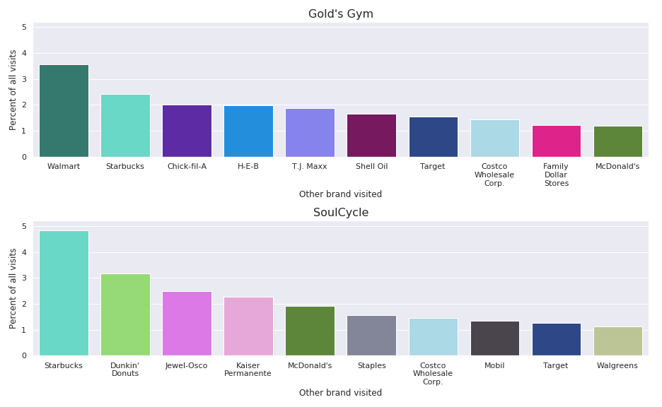
Comparing Gold's Gym and SoulCycle we can see some patterns already:
- Coffee places were highly visited for visitors of both
- Regional imprints like visits to Jewel-Osco indicate a high percentage of Chicago-area visits
- Fast food places are visited by visitors of both
- Discount stores like T.J. Maxx and Family Dollar aren't uncommon for Gold's Gym users
Comparing the same brand between different states yields some insights as well.
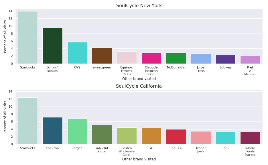
- California SoulCycle visitors probably get gas for their cars frequently as three of the top ten visited brands are gas stations accounting for roughly 1 in 7 visits
- A large percentage of SoulCycle visitors in different states visit Starbucks the same day as going to SoulCycle
- 3.5% of recorded SoulCycle NYC visitors also go to Equinox another high-end fitness venue owned by the same individual
Gaining Further Insights from Visit Data by Brand Relationship
With access to a rich pattern dataset like Safegraph's business decision makers can delve further into brand relationships in several ways.
A retail and industry trend analyst could break down brands by their industry classification (NAICS) code and aggregate by that instead of brand names like above. This would allow them to for example aggregate all coffee shops pharmacies etc. to get a clearer picture of the venues visited.
For a geomarketer for a big-box retailer looking at the proximity of important POIs to other brands can provide a better understanding of one company's impact on and relationship to others for example exposing how SoulCycle customers tend to interact with Walmart vs. Target vs. Costco.
Get Started with Modern Up-to-Date Data Streams
In this post we've barely scratched the surface of this data -- there are countless insights to be drawn and applications for nearly every conceivable business model and industry. By leveraging this data in your analysis you can create a deeper understanding of your customers and uncover previously unforeseen growth opportunities.
Learn more about CARTO's location data streams today and start incorporating data from SafeGraph and other high-quality curated data sets into your models and spatial analyses today.
Special thanks to Mamata Akella CARTO's Head of Cartography for her support in the creation of the maps in this post.