

Visualizing COVID-19 Vaccination Progress at the Individual Level


This time last year the race to create a COVID-19 vaccine began. Many experts including Dr. Anthony Fauci the Director of The National Institute of Allergy and Infectious Diseases (NIAID) predicted it would take around 18 months to develop. Bill Gates agreed in a piece written last April and remarked that it could take as little as 9 months or as long as two years. Since development of a vaccine usually takes around 5 years these estimates would be ‘the fastest scientists have created a new vaccine’ by quite a margin.
As of this month a total of 13 vaccines have been authorized by at least one national regulatory authority for public use representing a historic achievement. Likewise over 800 million doses of the COVID‑19 vaccine have been administered worldwide based on official reports from national health agencies since vaccination began in December 2020. In the US close to 50% of the adult population have received at least one dose with nearly 80 million Americans fully vaccinated.
Of course all eyes are focused not only on the performance of the vaccines themselves but also on their effective rollout to ensure we can return to a degree of normality as quickly as possible. Having the ability to quickly analyze vaccination data can give important insights to the general public governments policy makers pharma companies health professionals and broader business communities (retail travel public services etc.). As an example visualizing where and how the rollout is progressing can be used as an important indicator for relaxation of strict confinement measures.

A number of COVID vaccine trackers already exist ranging from simple graphs to choropleth maps but we wanted to present an alternative representation by providing the first visualization of the progression at an individual level within the US.
Taking inspiration from Ryan McCullough’s excellent map visualizing big census data we built an app able to dynamically represent the vaccination status of each citizen and give the ability to project how the rollout is likely to progress.
Want to view vaccination progress in your area?
With all Americans eligible for vaccination by May 1st the goal of the US government is to ‘get back to normal by July 4th Independence Day.’ This can be represented within the app as seen below.
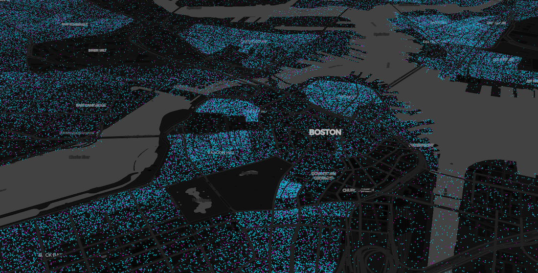
The situation in Boston today
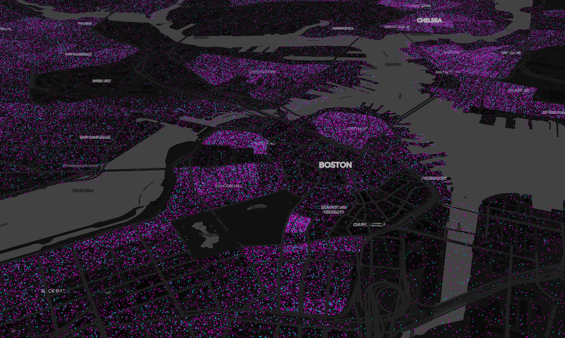
Modeled situation in 3 months time at 75% vaccination rate
Within this dynamic app it will be possible to track the continuing progression of this historic vaccination effort with a goal to reaching herd immunity and ensuring the country is able to return to a degree of normality.
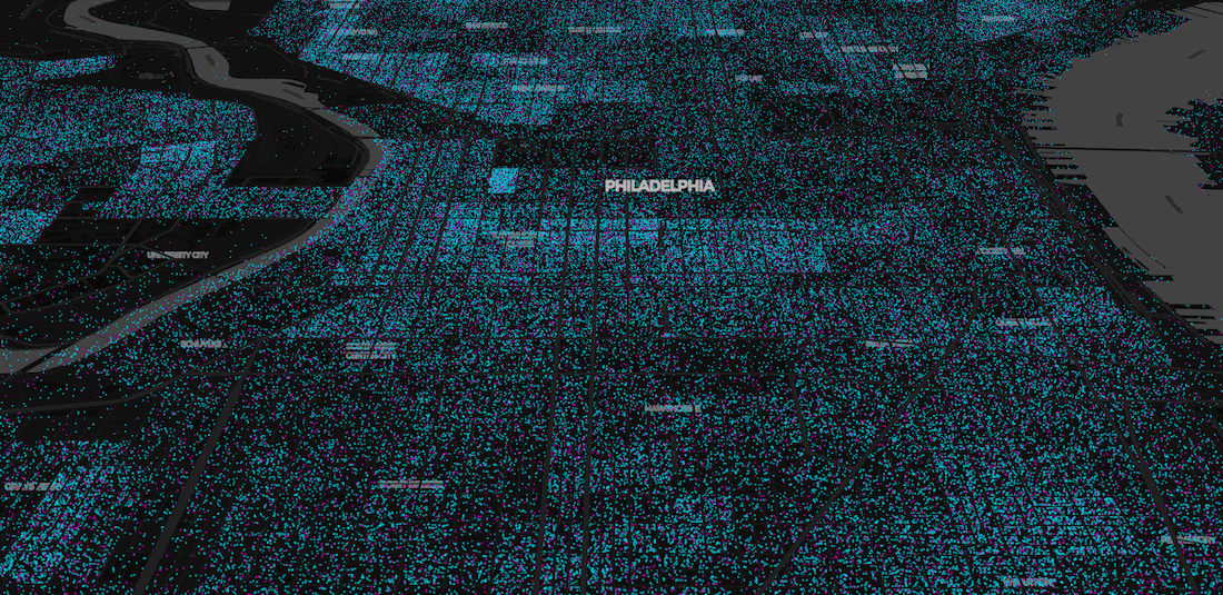
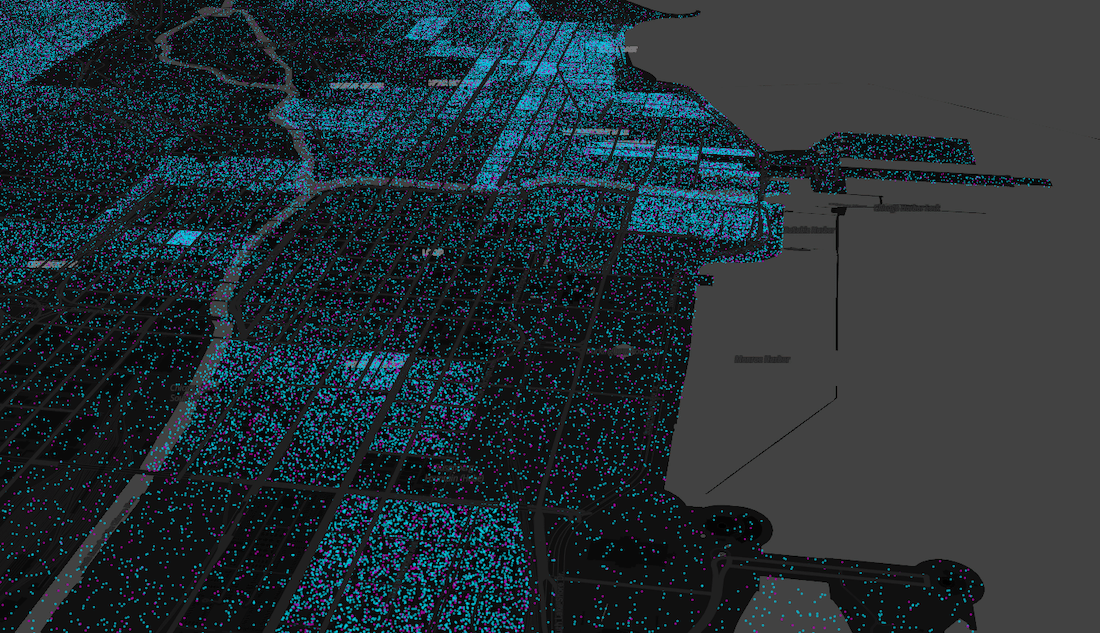
The situation in Philadelphia today
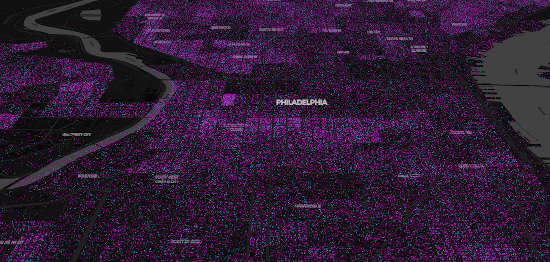
Modeled situation in 3 months time at 75% vaccination rate
Data Sources & Methodology
This visualization has been achieved using the CDC vaccination data. We have used both data by state and by county since coverage data at the county level appears artificially low. Therefore for higher zoom levels of the map we present the data aggregated at state level.
In addition we have incorporated socio demographic population data from the 2018 American Community Survey expressed at the block group level.
Want to learn more about how the app was made?
Technology
By combining these data sources and performing dasymetric analysis it is possible to calculate a percentage of individuals vaccinated per block group. By leveraging our BigQuery Spatial Extension random points are generated and filled within the cells with the correct proportional amount marked as vaccinated. BigQuery Tiler is then used to create a Tileset for the map and visualization app. We will follow up in a future post detailing in depth how our core technologies were used in the creation of this app.
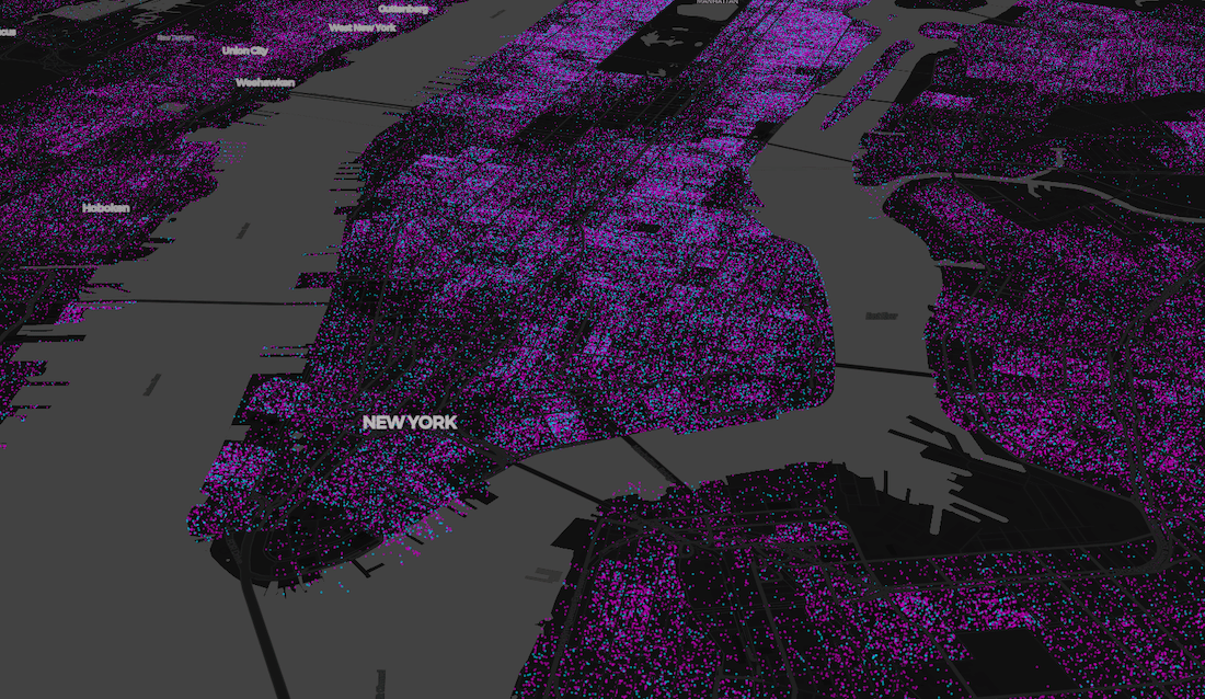
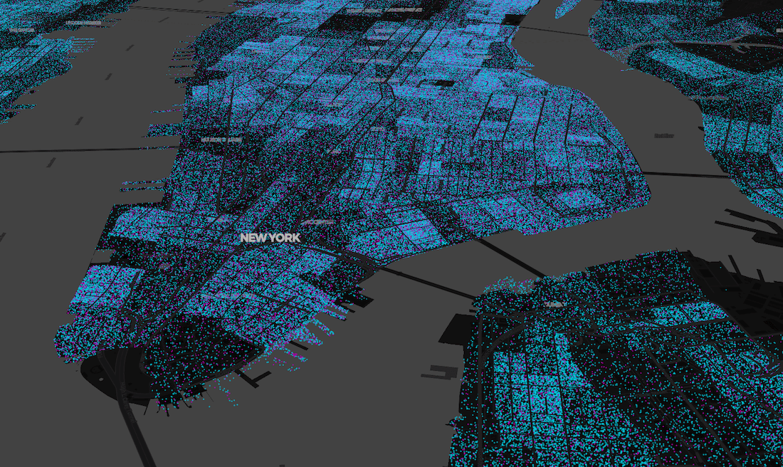
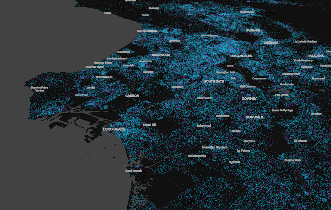
A representation of how New York will look at 80% vaccination rate
This spatial application provides a unique way of visualizing the speed and efficacy of the vaccine rollout across the US. Insights derived from this type of analysis can be invaluable for citizen visibility guiding vaccine distribution and wider health authority policy decision-making.
Want to enhance the geospatial capabilities of BigQuery?


