Visualizing the spread of current fires with CARTO VL


Using synced data streams and CARTO VL this map shows active fire perimeters and their growth since the beginning of July.
The initial goal of the map was to animate the growth of fires over time. Through the design and development process other patterns began to emerge like the speed at which some fires are growing compared to others and the spread pattern of fires over different geographic areas.
Read on to learn more about how we are leveraging synced data feeds powerful visualization capabilities and dynamic UI elements to power this near real-time fire map.
Data
The fire polygons displaying on the map are a derivative of two datasets from GeoMAC Wildland Fire Support: active fire perimeters and all (active and inactive) perimeters for the 2018 fire year. In order to display only active fires the two fire datasets are intersected where any perimeter tagged as "active" in the first dataset grabs only the polygons within its boundary from the all 2018 perimeter dataset. Once a fire perimeter is declared inactive it no longer displays on the map.
In the background smoke patterns produced from the fires are displayed using smoke perimeter data from NOAA's Fire Products.
Each dataset syncs to the source every hour.
This means any time the data are updated so is the map.
Cool right?
Keep reading for more… :)
Animation and Visualization
There are so many visualization capabilities inside of CARTO VL and lately one of my favorites to experiment with is [animation].
In the active fires map there are two different polygon animations happening.
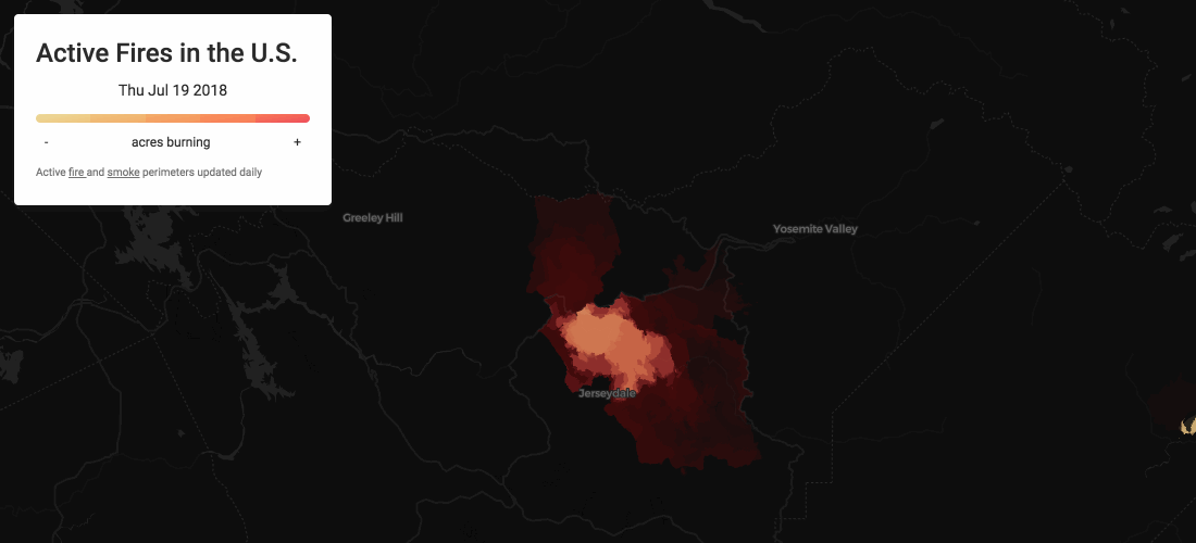
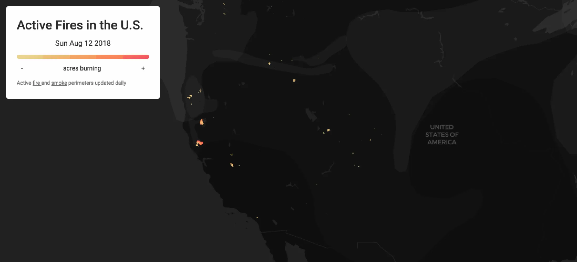
First is the visualization of how fires grew over time inside of their current perimeter. The polygons draw in according to the date the perimeter was collected (datecrnt) and each is colored based on its reported acreage (gisacres). The animation begins on July 1 2018 and plays through until it reaches the polygon with the most recent date in the table. The animation cycles through all of the data in 30 seconds. The polygons have no fade-in effect but fade-out based on reported acres. This means that larger polygons stay on the map longer than smaller ones and given that most fires spread from a small area to a larger one this provides a way to gradually fade out where a fire began and bring the larger consecutive polygons to the foreground.
filter: animation(linear($datecrnt time('2018-07-01T00:00:00Z') globalMAX($datecrnt)) 30 fade(0 $gisacres))
Each polygon is colored according to its reported acreage using one of our CARTOColor schemes (OrYel) where yellow is assigned to smaller areas through orange to red for the largest. The opacity of a polygon blends between 0.1 and 0.6 based on its area.
color: opacity(ramp(linear($gisacres viewportMIN($gisacres) viewportMAX($gisacres)) oryel) blend(0.1 0.6 linear($gisacres)))
Combining these animation and visualization techniques gives the visual impact of a growing and burning fire:
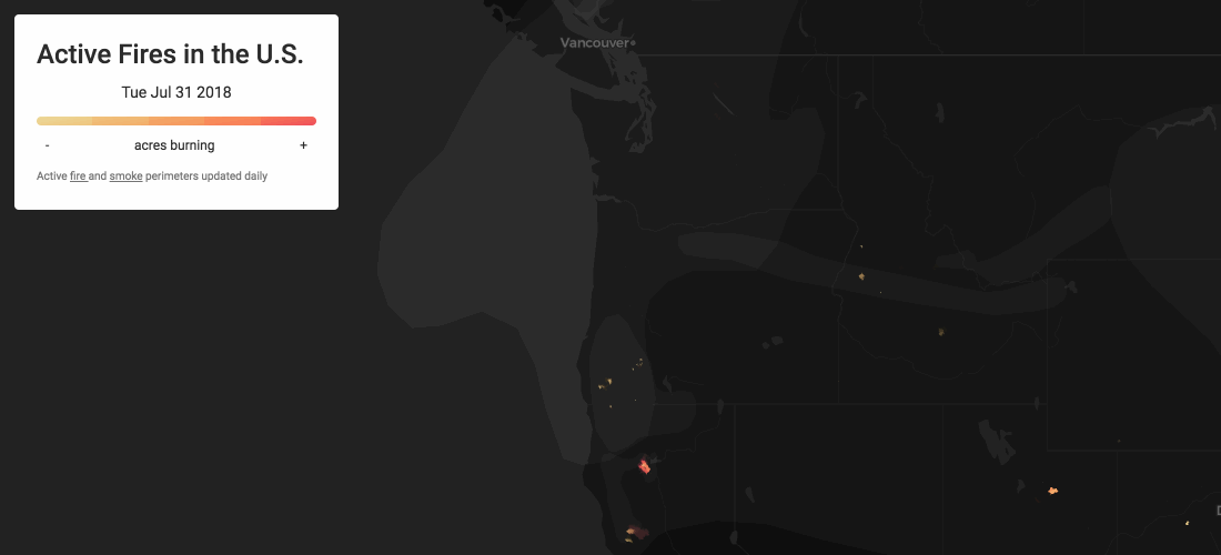
The second animation of smoke plumes is a more subtle one and so is the style. Unlike the fires the smoke is not animating over time (since NOAA serves a new dataset each day). Given that smoke has a natural flow-like movement I wanted an effect where on any given day we could see which fires are generating the most smoke and get a sense for how the plumes are traveling. This is a fun technique to experiment with.
Viewport Based Styling
Another favorite CARTO VL feature of mine is the ability to do viewport-based styling versus globally over an entire dataset.
You might have noticed that in the color styling above we are ramping linearly across the viewportMIN and the viewportMAX.
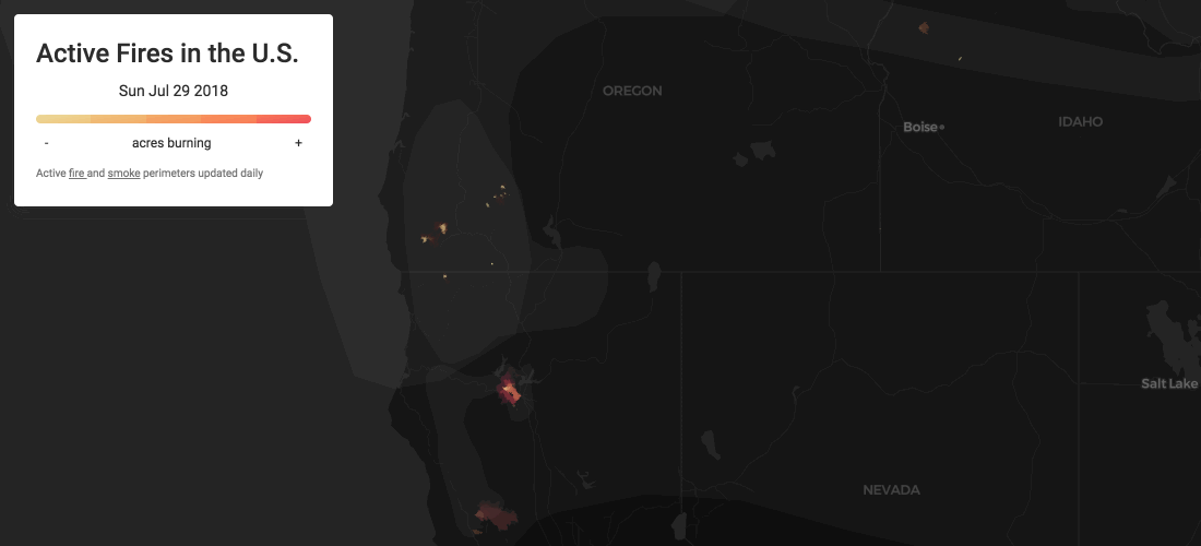
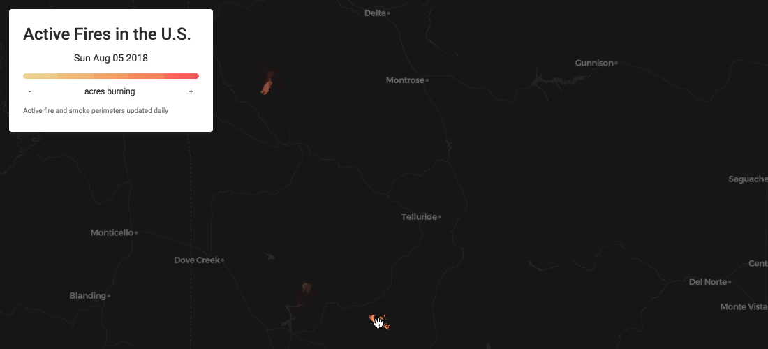
With viewport-based styling we get a better understanding of fires at both the national and more localized levels.
In the image below when the map is zoomed out to the western United States the fires that really pop out are the Mendocino Complex and Carr fires in Northern California. We can see there are many other fires burning in different states but since those are two of the largest in the current view and polygons are colored according to their size the other comparably smaller fires are colored more along the yellow to orange range.
If we zoom into the series of fires in southern Oregon removing both Mendocino and Carr from the view the symbology dynamically updates to take into account only the fires in the current viewport. In this case we can see that the Klondike and Taylor Creek fires are the largest burning fires in this area.
Legend and Interactivity
Of course no map is complete without a legend and hover or pop-up components.
Our Head of Design Emilio created an informative yet unobtrusive legend that hierarchically presents the different levels of information. The dynamic time stamp that cycles through the animation and the color scale legend are key to understanding the patterns seen on the map.
And since we can't fit all of the information in a legend or map symbol Front-End Developer Jesus created hover-based interactivity that dynamically fetches the name and acreage of the current fire polygon.
Take a look!
You can find this map and associated code here !
We hope this map gets you even more excited about CARTO VL and we can't wait to see the maps that you make!
Happy mapping!