Analyzing NYC Caffeine Deprivation through Location Intelligence


How does the city that never sleeps keep moving so fast? Coffee of course! In this article we investigate the spatial patterns of coffee shops across New York City and show you how to do the same.
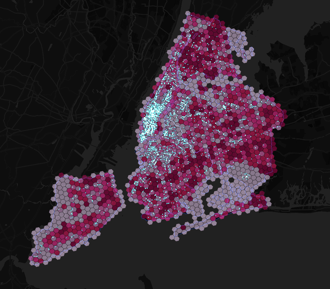
Insights
Explore the map below to find out more about caffeination deprivation across New York City! Darker pink areas indicate where residents are suffering from greater caffeine deprivation while lighter areas have better caffeine provision.
How can we understand caffeine deprivation through Location Intelligence?
Caffeine deprivation is a (CARTO-coined) measure which assesses how hard it is for residents to get a coffee. It takes into account three spatial measures - population distance to the closest coffee shop and how many residents have to share their local coffee shops. The insights from this type of location-based analysis can help coffee brands and retailers unlock their potential through more data-driven site selection.
Where are the most caffeine deprived areas in NYC?
According to our calculations the five most caffeine deprived areas in New York City are as follows:
- West Bronx / Fordham Heights the Bronx: 34 085 residents no coffee shops.
- Claremont Village the Bronx: 26 101 residents no coffee shops.
- Mt Eden the Bronx: 24 232 residents no coffee shops.
- Parkchester the Bronx: 23 870 residents 1 coffee shop.
- West Mott Haven the Bronx: 22 372 residents 1 coffee shop.
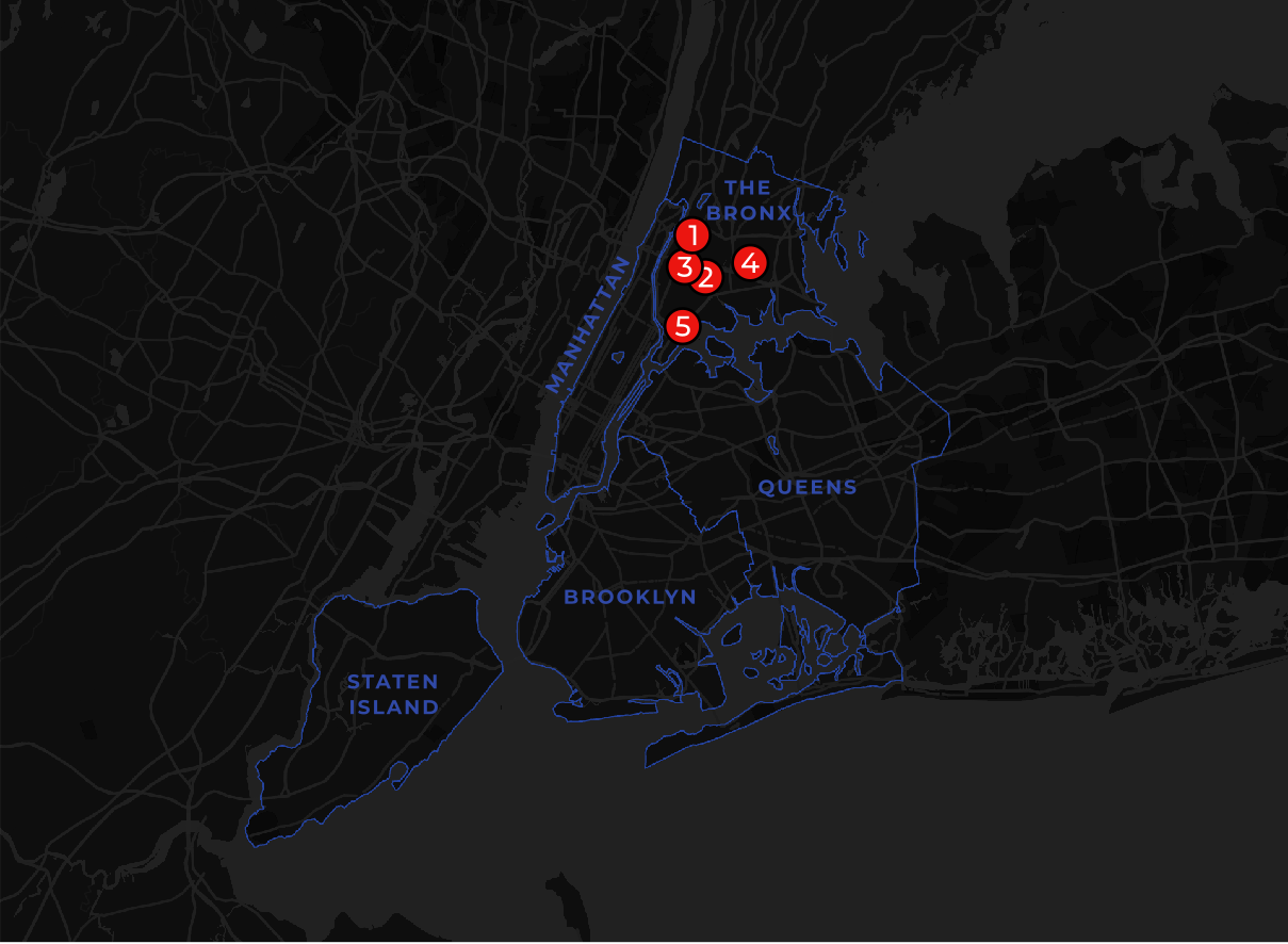
As well as all being located in the Bronx a common trait amongst these areas is their proximity to major highways. The top three areas straddle the Grand Concourse Cross Bronx Expressway and 3rd and Webster Avenues respectively. Whilst busy streets are not the most obvious location for enjoying a quiet cup of coffee by avoiding these locations could retailers be missing out on the caffeine-craving commuter crowd?
Where are the least caffeine deprived areas?
At the opposite end of the scale the five least caffeine-deprived locations are:
- Midtown / Bryant Park Manhattan: 1 770 residents 72 coffee shops 1 coffee shop for every 25 residents.
- Garment District / Herald Square / NoMAD Manhattan: 6 595 residents 108 coffee shops 1 coffee shop for every 61 residents.
- Midtown East Manhattan: 6 356 residents 50 coffee shops 1 coffee shop per 127 residents.
- Stapleton Staten Island: 1 461 residents 7 coffee shops 1 coffee shop per 209 residents.
- Downtown Flushing Queens: 8 691 residents 41 coffee shops 1 coffee shop per 212 residents.
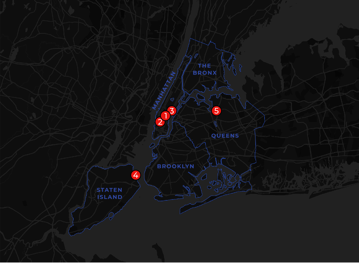
It probably won’t come as a surprise to anyone that Manhattan is the most well-provisioned when it comes to caffeine supplies with three of the top five most caffeine-soaked areas located here. With 1 767 coffee shops on the island alone residents of Manhattan rarely have to travel far for a coffee. There are spatial patterns within this however with areas midtown and downtown generally experiencing less caffeine deprivation than neighborhoods uptown of Central Park.
Another complexity to consider is that Manhattan typically experiences higher numbers of inbound tourists and commuters than other New York City boroughs with 664 000 inbound commuters traveling from outside the NYC area (NYC Planning 2017). It’s not just their neighbors they’re queuing up against to get their morning latte!
If I wanted to open a coffee shop in New York where should it be?
Our analysis shows there are a number of locations across New York City just crying out for extra caffeination! Areas with a large population but a lack of coffee shop provision include Arden Heights and Grasmere both on Staten Island and large parts of southeast Brooklyn and Queens.
There are a large number of factors which go into the decision-making process of where to place a coffee shop. As well as population and existing services other demographic and economic factors should be considered. This could include market profile tourist and commuter numbers and footfall (keep reading to find out more specifics!).
Whether it’s expansion consolidation or performance monitoring - location data is critical to avoid million-dollar mistakes in site selection. Leading retailers such as Decathlon, Gap and Group Dynamite use our solutions to identify whitespace understand catchments locate customers and - ultimately - pinpoint the most successful locations. You can read more about this here.
How could I use this analysis?
Did you know that in the U.S. it can cost more than $1 million to open a McDonald’s Taco Bell Burger King or Wendy’s restaurant?
Measuring the provision of services is a fantastic way to gain insights when selecting new locations for your business or service whether that’s a coffee shop an apparel store or student dorms. This type of analysis can tell you a lot about your market and competitors. For example Experian market segmentation data can be used to assess the location and size of target markets which could be combined with Mastercard Geographic Insights to understand spend frequency and volume. Walk cycle and drive-time catchments could also be incorporated into the analysis to understand brand whitespace.
The utility of provision analysis data isn’t just limited to site selection; it could be used to inform housing developments sustainability assessments and equity analysis.
At CARTO we’re big coffee fans which is why we focused on caffeine but your solutions and analysis could look at… well anything! Check out our recent ”Uncovering Site Selection Strategies using Point of Interest Data” blog post where we took a deep-dive into competitor location analysis for fast food restaurants. For both this and our caffeination analysis we used our Core Places dataset – an expansive dataset including everything from car dealerships to supermarkets to clinics – to identify POI locations.
Make this map!
In this section of the blog we’ll walk you through how to recreate this analysis yourself using CARTO builder so grab a coffee and let’s get mapping! If you don’t have access to CARTO get yourself a copy using our 14-day free trial.
After this tutorial you will be able to…
- Filter data from the CARTO data warehouse into your map based on their attributes and spatial relationships
- Use CARTO's Analytics Toolbox for BigQuery to perform SQL-based analysis to understand caffeine deprivation in NYC
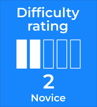
This tutorial is rated 2 / 5 and is suitable for novices meaning a good understanding of basic GIS and SQL concepts and skills will be helpful.
The data
All of the data used in this analysis can be accessed directly from our Spatial Data Catalog. For this specific map we’re using data for the United States but the datasets exist for a large number of countries meaning this analysis could be recreated virtually anywhere in the world… well maybe not Antarctica (technically you could make this map but it may not be the most interesting…).
- Coffee shops: This analysis will utilize SafeGraph Core Places dataset which includes information on location name category brand and much more. This is a CARTO premium dataset which you can request a subscription for through our Spatial Data Catalog.
- Hexagon grid: The benefits of aggregating data to a regular - and particularly a hexagonal - grid are numerous. Without going into too much of a sidebar the key thing to know is that they are incredibly effective at eliminating the perceptual and design bias of administrative zones such as Census Blocks. For this analysis we’ll be using the H3 grid which is a global hexagonal grid with a resolution of approximately 0.7x0.7sqkm. This is accessible on the CARTO Spatial Data Catalog and is free to all users.
- New York City boundary: The rest of the data we’ll be using covers the entire USA so trimming it down to a smaller area enables speedier rendering. TIGER coastline-trimmed county boundaries which can be accessed for free from CARTO’s Spatial Data Catalog here.
Take a moment to subscribe to all of these datasets before we get started.
The analysis
.webp)
Step one: load your data
When performing any analysis it’s always a good idea to load and inspect the source data you’ll be using. Familiarizing yourself with the data will help you to understand the results of your analysis and spot any errors. This also means you have early versions of your SQL code to refer to in case of errors.
1.1 Load the borough boundaries
First of all create a blank map then click Add source from > Custom SQL Query… Let’s start off by loading our county data as we’ll be using it for all of our other queries. The below simple SQL query loads in the USA county boundaries (“sub_carto_geography_usa_county_2019”) filtered to only those which comprise New York City.
SELECT * FROM `carto-data.ac_7xhfwyml.sub_carto_geography_usa_county_2019` where do_label In ("New York" "Queens" "Kings" "Richmond" "Bronx") and geoid LIKE "36%"
1.2 Load the hexagon grid
The code below first joins the geometry of the hexagonal grid (do_geo) to the all-important demographic data which relates to them (do_data). We’ll also apply the ST_Intersects() function to limit the hexagons to only those which intersect with New York City.
WITH NYC AS (SELECT * FROM `carto-data.ac_7xhfwyml.sub_carto_geography_usa_county_2019` where do_label In ("New York"  "Queens" "Kings" "Richmond" "Bronx") and geoid LIKE "36%")
/*Load the hexagons  joining the geometry to the associated data */
SELECT
 do_geo.geom as geometry  do_data.population
 FROM carto-data.ac_7xhfwyml.sub_carto_derived_spatialfeatures_usa_h3res8_v1_yearly_v2 do_data  NYC
 INNER JOIN carto-data.ac_7xhfwyml.sub_carto_geography_usa_h3res8_v1 do_geo
 ON do_geo.geoid = do_data.geoid
 WHERE st_intersects(NYC.geom  do_geo.geom)
You could of course emulate this for any state or any geographical area for that matter! All you would need to do is replace the “NYC” selection with your geographic area of choice and replace the “USA” section of the H3 dataset name with the 3-letter country code required.
1.3 Load the coffee shops
Finally let’s load in our coffee shops. The Core Places data we’re using for this is enormous but luckily CARTO’s MO is big data. However it’s also good practice to streamline SQL queries to make your processes faster and more efficient which we can do with the following steps:
- The Core Places dataset includes multiple versions of each feature from different time periods which is helpful in many cases but not necessary for our analysis so we need to apply the “group by” function to remove duplicates.
- Only include certain fields of interest such as “location_name” and “brands.”
- Filter the “sub_category” and ”category” fields to only show features that we’re interested in i.e. all things coffee-related!
- As we did with the hexagon grid we are also filtering this data to only include coffee shops within the New York City area using the st_contains() predicate.
Many of the datasets in our analysis have the “geoid” field so to avoid confusion let’s rename this “ID.” The final code for this is below. You can change the contents of your “where” filter to focus on any other topics within the Core Places dataset - there are a lot!
WITH
/*Load the states */
NYC as (SELECT * FROM carto-data.ac_7xhfwyml.sub_carto_geography_usa_county_2019 where do_label In (“New York”  “Queens” “Kings” “Richmond” “Bronx”) and geoid LIKE “36%”)
/Load the cafes  joining the geometry to the associated data and filtering by relevant fields and geography/
cafe as (SELECT do_geo.geoid as ID  do_data.region do_data.city  do_data.sub_category  do_data.location_name  do_data.brands  do_data.latitude  do_data.longitude
 FROM carto-data.ac_7xhfwyml.sub_safegraph_pointsofinterest_coreplaces_usa_latlon_v3_daily_v2 do_data  NYC
 INNER JOIN carto-data.ac_7xhfwyml.sub_safegraph_geography_usa_latlon_v3 do_geo
 ON do_geo.geoid = do_data.geoid
 WHERE st_contains(nyc.geom do_geo.geom) AND sub_category = “Snack and Nonalcoholic Beverage Bars” AND category_tags LIKE “%Coffee%”
     GROUP BY do_geo.geoid  do_data.region  do_data.city  do_data.sub_category  do_data.location_name  do_data.brands  do_data.geoid  do_data.latitude  do_data.longitude)
SELECT ID  region  city  sub_category  location_name  brands  latitude  longitude  st_geogpoint(longitude  latitude) as geom FROM cafe
At this point I’m going to export my coffee shop query to a new table called cartobq.maps.coffee_ny to streamline my later query but this is optional.
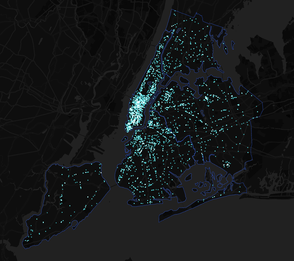
If you’ve followed this example you should now have a map with 3 layers; the New York state boundary h3 hexagon grid and all coffee shops in the state - it might look a little something like this!
CARTOgraphic tip: when using a dark basemap turn on additive blending modes and watch your features glow!
Spend a bit of time familiarizing yourself with your data and looking through the data tables to prepare for the analysis we’re about to do - it’ll make your life a lot easier in about five minutes’ time! Also take the time to rename your layers something meaningful - you don’t want to end up confused with layer names like “Layer 1” and “Copy of Layer 3.”
3 Step two: analysis
The next step of this analysis is to turn our hexagon grid into a heatmap showing areas of caffeine deprivation. To do this we need to find out four things about each hexagon.
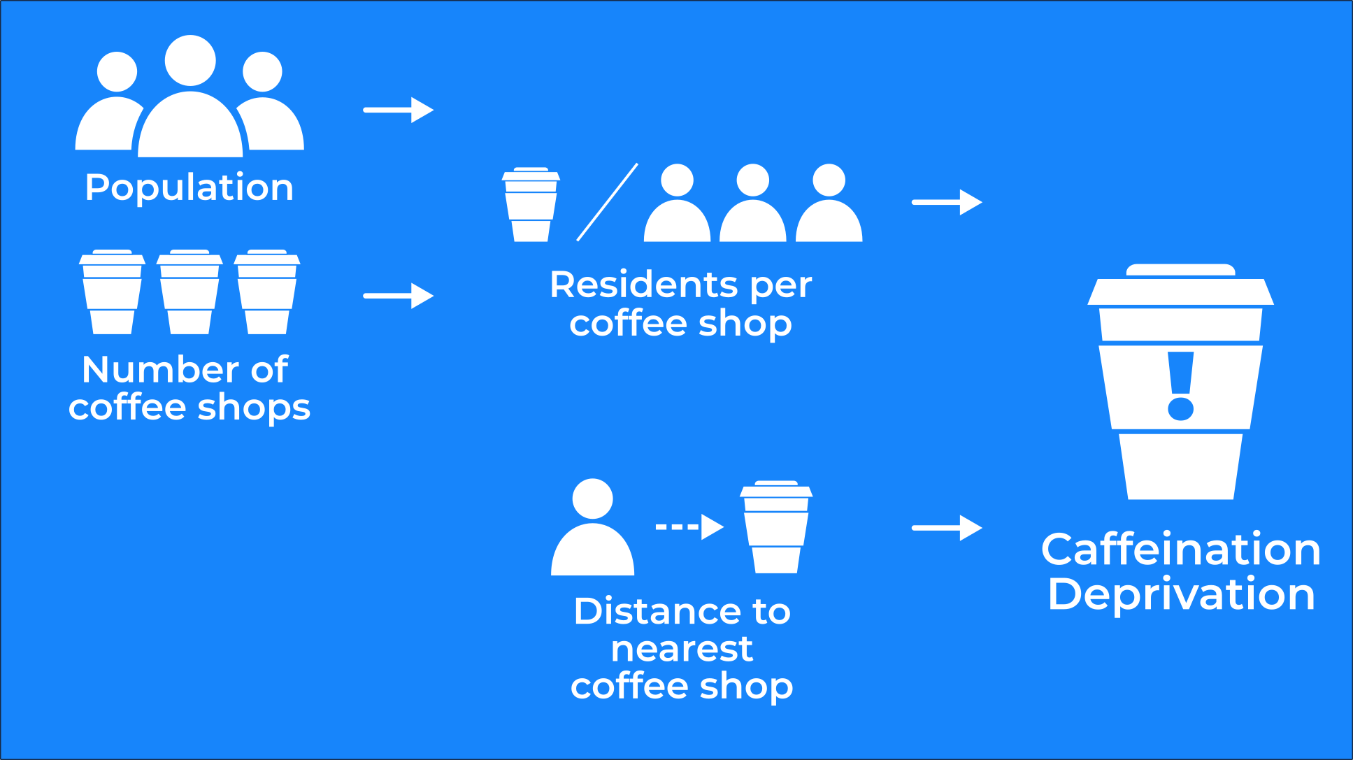
- Population: as the old proverb goes can an area be suffering from coffee deprivation if no-one lives there to drink it? Our H3 hexagon grid already has population data attached to it so… part one complete!
- Number of coffee shops.
- The number of people who have to share each coffee shop: 1 000 residents sharing 1 coffee shop will be much thirstier than those sharing 100.
- Distance from the nearest coffee shop.
With this information we can build our caffeination deprivation index! For this we will normalize the results of points 3 and 4 on a scale of 0 to 1 from most to least deprived. We’ll add these results together giving each hexagon a score of between 0 and 2 (2 being the most caffeine-deprived being furthest from a coffee shop and/or having to share their coffee shop with the most other people).
Ready?
We’ll be utilizing the CARTO Analytics Toolbox for BigQuery for this analysis which is a set of UDFs and Stored Procedures to unlock Spatial Analytics. There are two types of modules within the toolbox: core modules that are and free to use for anyone with a BigQuery account and advanced modules only available with a CARTO account. You can find out more about unlocking the power of spatial data with our Analytics Toolbox.
2.1 Load the source data
Create a new custom SQL query. This will be quite a long query as we’ll essentially be combining everything we’ve done before - but we’ll break it down step by step. This could be done much more efficiently in fewer subqueries but as this is a tutorial it can be helpful to break things down into bite-size pieces of code rather than novels of SQL.
Just like we did previously load in the New York state boundary coffee shops and hexagons. We now have tables called “state ” “cafes” and “hexnyc” which we can quickly refer to for the remainder of our analysis.
WITH
/*Load the states */
NYC as (SELECT do_label  geom as geometry FROM carto-data.ac_7xhfwyml.sub_carto_geography_usa_county_2019 where do_label In (“New York”  “Queens” “Kings” “Richmond” “Bronx”) and geoid LIKE “36%”)
/*Load the cafes  joining the geometry to the associated data and filtering by amenity type */
Cafes as (SELECT geom FROM cartobq.maps.coffee_ny  nyc where st_contains(nyc.geometry  coffee_ny.geom))
/*Load the hexagons  joining the geometry to the associated data */
hex as (SELECT
 do_geo.geom as geom  do_data.population  do_data.geoid
 FROM carto-data.ac_7xhfwyml.sub_carto_derived_spatialfeatures_usa_h3res8_v1_yearly_v2 do_data
 INNER JOIN carto-data.ac_7xhfwyml.sub_carto_geography_usa_h3res8_v1 do_geo
 ON do_geo.geoid = do_data.geoid)
 /Filter hexagons to New York City/
 hexnyc as (SELECT * FROM hex  nyc
     where st_intersects(nyc.geometry  hex.geom))
2.2 Calculate distance to closest coffee shop
The next short snippet of code creates a field called “distance” which calculates how far each hexagon is from its closest coffee shop. Where a coffee shop falls inside the hexagon it is given the distance 0.
/Calculate distance to the closest coffee shop/
hexdist as( select hexnyc.*  (select min(st_distance(hexnyc.geom cafes.geom)) from cafes) AS distance from hexnyc)
2.3 Calculate coffee shop density by hexagon and population
In this next section of code we calculate the field “joincount” as the number of cafes contained by each hexagon by performing a left join and again using st_contains(). Now we have the join count calculated we can work out the number of residents per coffee shop. As we can’t divide zero by zero we also need to override the values for when either the “population” or “joincount” equals zero.
/Calculate number of coffee shops in each hex  and population per coffee shop/
hexagg as (select hexdist.geoid  hexdist.population  hexdist.distance
       count(cafes.geom) as joincount  /Count number of cafes inside hex/
case when count(cafes.geom) = 0 then hexdist.population
when hexdist.population = 0 then 0
else hexdist.population/count(cafes.geom) end as countperpop /Calculate population per cafe/
                     from hexdist
LEFT JOIN cafes on st_contains(hexdist.geom  cafes.geom) /Join cafes to hex when contained by them/
group by hexdist.geoid  hexdist.population  hexdist.distance)
2.4 And finally! Calculate the caffeination deprivation index
Now we have all of this data in one table we can calculate the index! The query section below creates a field called “index” where each hexagon has a score between 0 and 2 with 2 being where areas experience more deprivation being further from coffee shops and with higher populations. This code also excludes areas with extremely low populations (<1 000) from the index.
select hexagg.geoid  round(hexagg.population 0) as Population  round(hexagg.distance 0) as Distance hexagg.joincount as JoinCount  round(hexagg.countperpop 3) as PopulationPerCoffeeShop
case
when hexagg.population < 1000 then 0
else
 round((1.00*(hexagg.distance-(SELECT min(hexagg.distance) from hexagg)))/ ((SELECT max(hexagg.distance) from hexagg)-(SELECT min(hexagg.distance) from hexagg))+
 (1.00*(hexagg.countperpop-(SELECT min(hexagg.countperpop) from hexagg)))/ ((SELECT max(hexagg.countperpop) from hexagg)-(SELECT min(hexagg.countperpop) from hexagg)) 4) end
 as index
from hexagg
Now is also a good time to do a bit of data cleaning with your end user’s experience in mind. You can see in the section where we’re selecting our fields that the fields have all been rounded to a sensible number of decimal places with more legible names given. We’ve included the full code for the index query at the bottom of this post in case you’d like to see how all the sections fit together.
And that… is it! If you’ve followed these steps you should now have a hexagon grid layer which contains a field called “index” where higher numbers indicate more caffeine deprivation - congratulations!
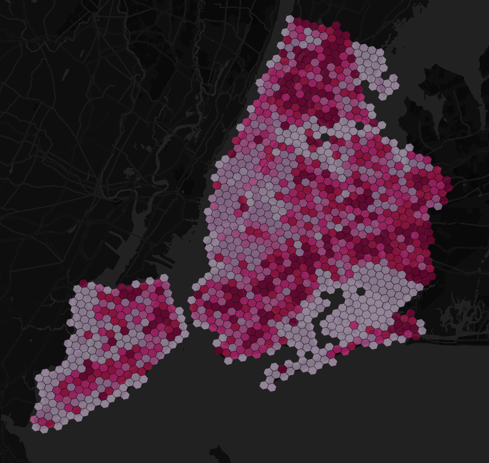
The Caffeination Deprivation Index
Mapped against the raw data
Troubleshooting
Having some problems? You can find a full copy of the code used to create the index layer below. We also have a range of support available for our CARTO users which you can explore here including our fantastic user community!
WITH
/*Load the states */
NYC as (SELECT do_label  geom as geometry FROM carto-data.ac_7xhfwyml.sub_carto_geography_usa_county_2019 where do_label In (“New York”  “Queens” “Kings” “Richmond” “Bronx”) and geoid LIKE “36%”)
/*Load the cafes  joining the geometry to the associated data and filtering by amenity type */
Cafes as (SELECT geom FROM cartobq.maps.coffee_ny  nyc where st_contains(nyc.geometry  coffee_ny.geom))
/*Load the hexagons  joining the geometry to the associated data */
hex as (SELECT
 do_geo.geom as geom  do_data.population  do_data.geoid
FROM carto-data.ac_7xhfwyml.sub_carto_derived_spatialfeatures_usa_h3res8_v1_yearly_v2 do_data
 INNER JOIN carto-data.ac_7xhfwyml.sub_carto_geography_usa_h3res8_v1 do_geo
 ON do_geo.geoid = do_data.geoid)
 /Filter hexagons to New York City/
 hexnyc as (SELECT * FROM hex  nyc
     where st_intersects(nyc.geometry  hex.geom))
/Calculate distance to the closest coffee shop/
hexdist as( select hexnyc.*  (select min(st_distance(hexnyc.geom cafes.geom)) from cafes) AS distance from hexnyc)
/Calculate number of coffee shops in each hex  and population per coffee shop/
hexagg as (select hexdist.geoid  hexdist.population  hexdist.distance
       count(cafes.geom) as joincount  /Count number of cafes inside hex/
case when count(cafes.geom) = 0 then hexdist.population
when hexdist.population = 0 then 0
else hexdist.population/count(cafes.geom) end as countperpop /Calculate population per cafe/
                     from hexdist
LEFT JOIN cafes on st_contains(hexdist.geom  cafes.geom) /Join cafes to hex when contained by them/
group by hexdist.geoid  hexdist.population  hexdist.distance)
select hexagg.geoid  round(hexagg.population 0) as Population  round(hexagg.distance 0) as Distance hexagg.joincount as JoinCount  round(hexagg.countperpop 3) as PopulationPerCoffeeShop
case
when hexagg.population < 1000 then 0
else
 round((1.00*(hexagg.distance-(SELECT min(hexagg.distance) from hexagg)))/ ((SELECT max(hexagg.distance) from hexagg)-(SELECT min(hexagg.distance) from hexagg))+
 (1.00*(hexagg.countperpop-(SELECT min(hexagg.countperpop) from hexagg)))/ ((SELECT max(hexagg.countperpop) from hexagg)-(SELECT min(hexagg.countperpop) from hexagg)) 4) end
 as index
from hexagg
Feedback
Did you make this map or adapt this tutorial to do something different? We love seeing your mappy creations! Share it with us on Twitter or LinkedIn using the hashtag #cartocreations 🗺️.
We’re always looking for ways to improve how we share knowledge with you and would love it if you took the time to send us your feedback using the form below.