5 maps you didn't know you could create with SQL


What is SQL “for?”
The majority of people would probably say it’s a language designed to manage and manipulate databases and the data stored within them. This is true, but there’s so much more to it.
Spatial SQL is the extension of SQL that deals with spatial data. Beyond being an excellent data management tool, it also has fantastic utility for spatial data analytics and visualization.
In this post, we’re going to run through 5 types of spatial data visualization and how to create these with SQL. But first… why?
Why SQL for mapping?
.webp)
Spatial data often requires some manipulation to its geometry to produce the best possible visualization. That manipulation might be as simple as converting a city polygon to a point, so it’s easier to visualize when zoomed out - or something more complex (which is what we’ll be covering later on!).
With traditional, desktop GIS platforms, any changes to the geometry of a dataset will generate a new copy of the original file. In our original example, we would now have a polygon AND a point file. There are two problems here.
- You no longer have what is called a “single source of truth.” What this means is that if one of these datasets gets edited, and the other doesn’t - how is anyone supposed to know which is the right version? (Well, that depends how honestly confident you are in your metadata!).
- If there are any changes to the source data or analytical parameters, you would have to rerun this data geometry conversion (generating MORE additional files). Nightmare.
SQL is a query-based language. That means that you can work with temporary subsets of a dataset, rather than having to constantly generate new files every time you wish to change something. It also means that any changes to the source data will iterate in the query. Perfect!
So now you know why SQL… let’s move on to what and how.
Please note that all examples below are based on Google BigQuery SQL, and may need to be tweaked if you are using a different SQL-based platform. Make sure you grab a free two-week CARTO trial so you can have a go at these yourself! You can also take advantage of CARTO Workflows to build these into your wider analytical processes - we’ll highlight how throughout the post.
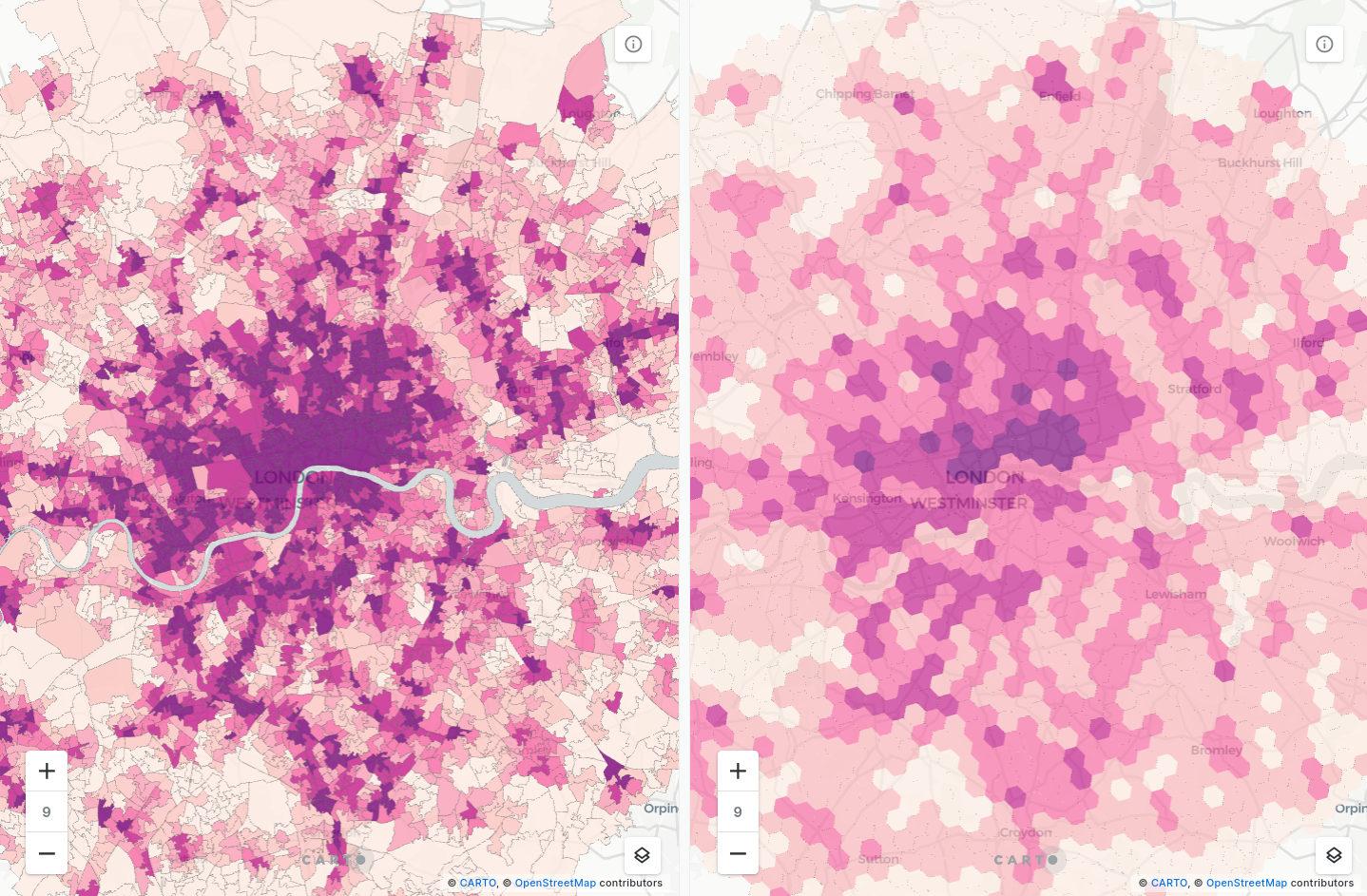
1. Dasymetric map
Thematic, choropleth maps - in which color denotes a quantitative variable - are some of the most common types of spatial data visualizations.These types of maps are commonly based on administrative geographies such as counties or census areas in which features are sized and shaped irregularly. These types of maps can often portray a certain amount of perceptual and data bias, which may cause the viewer to draw conclusions from the map based on which zones cover the greatest area. This is explored more fully in this post.
One way of dealing with this area bias is to create a dasymetric map. These maps refine choropleth maps by visualizing the data based on a separate spatial variable. A common example here is clipping zones to just densely populated areas, such as cities or buildings.
Open the map full screen here.
You can see this illustrated in the maps above. Both show the same data source; median income in 2018 in Manhattan, New York (which you can access from our Data Observatory here). The first map shows this at its original Census Block geography. This map is dominated by the expanse of Central Park, where we know the population density is very low. By clipping this data to just buildings (the second map) we can get a much more representative picture of income distribution in the area.
Want to try it yourself? You’ll need to use ST_INTERSECTION to find the overlapping areas, and ST_ISEMPTY to filter out everything else.
Here’s the sample code!
WITH
--Select your original data
 original AS(
   SELECT geom, variable FROM yourproject.yourdataset.your_original_table),
--Select the data to clip it to, e.g. buildings, urban areas
 clipping AS (
   SELECT geom FROM yourproject.yourdataset.your_clipping_table)
–Use ST_INTERSECTION to create a geometry where the two intersect, and then use ST_ISEMPTY to filter out non-overlapping areas
SELECT
ST_INTERSECTION(original.geom, clipping.geom) AS geom, original.variable
FROM original, clipping
WHERE
ST_ISEMPTY(ST_INTERSECTION(original.geom, clipping.geom)) IS false
Looking for building data? We sourced this from OpenStreetMap which is a fantastic, free resource for building outlines, particularly in urban areas. Check out our guide to OpenStreetMap - including how to access the data from Google BigQuery - here.
Remember dasymetric maps - we’ll be revisiting these later!
2. Regular grid map
Another method to combat area bias in your maps is to convert the data to a regular grid, consisting of shapes such as hexagons or squares. As well as eliminating bias, these types of maps are simpler for the human eye to interpret.
While there are many ways of creating regular grids, we advocate for using Spatial Indexes such as H3 and Quadbin. These are global grid systems available at multiple resolutions; what makes them really special is that their features are geolocated using a short reference string, rather than a long geometry description. You can find out more about Spatial Indexes in our free ebook!
You can create these grids using SQL-based functions from our Analytics Toolbox. Most commonly, you’ll be using either H3_POLYFILL or QUADBIN_POLYFILL (both of which can be found as components in CARTO Workflows if you prefer a low-code process) which generate a grid covering the extent of an input polygon. Then you can use our enrichment tools like ENRICH_GRID to aggregate variables from an irregular grid to the index. Sample code for this entire process is below.
CALL carto-un.carto.ENRICH_GRID(
 ‘h3’,
 R’’’
 –Create a H3 grid (resolution 9) using H3_POLYFILL
  SELECT h3 FROM unnest(carto-un.carto.H3_POLYFILL(
  (SELECT st_union_agg(geom)
  FROM yourproject.yourdataset.your_study_area), 9)) h3
 ‘’’,
 ‘h3’, –Select index type
 R’’’
 –Query your irregular zones
 SELECT * FROM yourproject.yourdata.your_irregular_zones
 ‘’’,
 ‘geom’, –Select zone geometry fields
 –Select aggregate variables & operators
 [(‘var1’, ‘sum’), (‘var2’, ‘sum’), (‘var2’, ‘max’)],
 –Specify output table
 [’yourproject.yourdata.your_enriched_grid’]
);
3. Dot density maps
Dot density maps are a type of thematic map which places points to convey a numeric data field. To illustrate, if a zone has a population of 100, you might place 100 dots randomly inside the zone, rather than simply using a color to convey this.
Like regular grid and dasymetric maps, these types of maps are helpful in preventing area bias for the map reader. In fact, by combining the concepts of dot density and dasymetric maps you can double up on these benefits.
Dot density maps are also super useful for modeling, as they allow you to estimate the locations of individual data points, rather than utilizing a less precise polygon.
Let’s see how! We’ll be using the function ST_GENERATEPOINTS to generate a random array of points inside a polygon, based on a specified variable. In this example, we’ll be looking at the number of residents with a bachelor’s degree in Washington, D.C. You can grab this data from our Data Observatory here.
WITH
–Select the source data from the Data Observatory, filtering to census blockgroups where the geoid starts with “11” which is the FIPS code to Washington, D.C.
blocks AS (
SELECT do_data.bachelors_degree,do_geom.geom, do_data.geoid
FROM carto-data.ac_lxxxxxxxx.sub_usa_acs_demographics_sociodemographics_usa_blockgroup_2015_5yrs_20142018 do_data
INNER JOIN carto-data.ac_xxxxxxxx.sub_carto_geography_usa_blockgroup_2015 do_geom ON do_data.geoid=do_geom.geoid
where do_data.geoid LIKE ‘11%’
),
–Use ST_GENERATEPOINTS to create a random point for every person with a bachelor’s degree inside each census block group
point_lists AS (
SELECT carto-un.carto.ST_GENERATEPOINTS(geom, CAST( bachelors_degree AS INT64)) AS points,bachelors_degree, geoid
FROM blocks
)
–The output of this is an array; to map this we need to unnest it
SELECT points as geom, bachelors_degree, geoid FROM point_lists cross join point_lists.points
And here are the results!
Check this out full screen here.
The first map (orange) illustrates the results of the standard dot density creation, whilst the second map (blue) illustrates a dasymetric dot density map, where locations are placed only inside buildings.
4. Desire line / spider map
Spider maps are a type of visualization which illustrate the link between origins and a destination. This could be merchants to their closest warehouse or customers to their closest store.
The function ST_MAKELINE() can be easily employed to create these types of visualizations, with example code below. A geometry is drawn between the centroids of both the original and destination tables, with an additional “distance” field created using ST_DISTANCE(). Note that the input geometries for this must always be single lines or points, so we’ve also converted all geometries to single points using ST_CENTROID(). The final row of the code starting with QUALIFY… retains only the link which is closest to the origin.
WITH
origins AS (
SELECT id, geom FROM yourproject.yourdataset.yourorigins),
destinations AS (
SELECT id, geom FROM yourproject.yourdataset.yourdestinations)
SELECT
origins.id, destinations.id,
ST_DISTANCE(origins.geom, destinations.geom) AS distance,
ST_MAKELINE(ST_CENTROID(origins.geom), ST_CENTROID(destinations.geom)) AS geom
FROM
origins, destinations
QUALIFY ROW_NUMBER() OVER (PARTITION BY origins.name ORDER BY distance) <= 1=""  ="" <="" code="">
Here’s an example of that in action! The origins we’ve used are cycle hire locations in London, which we’ve sourced from Transport for London’s fantastic Open Data collection. We’ve then created a line to link each of these to their closest station, sourced from OpenStreetMap.
Open in full screen here.
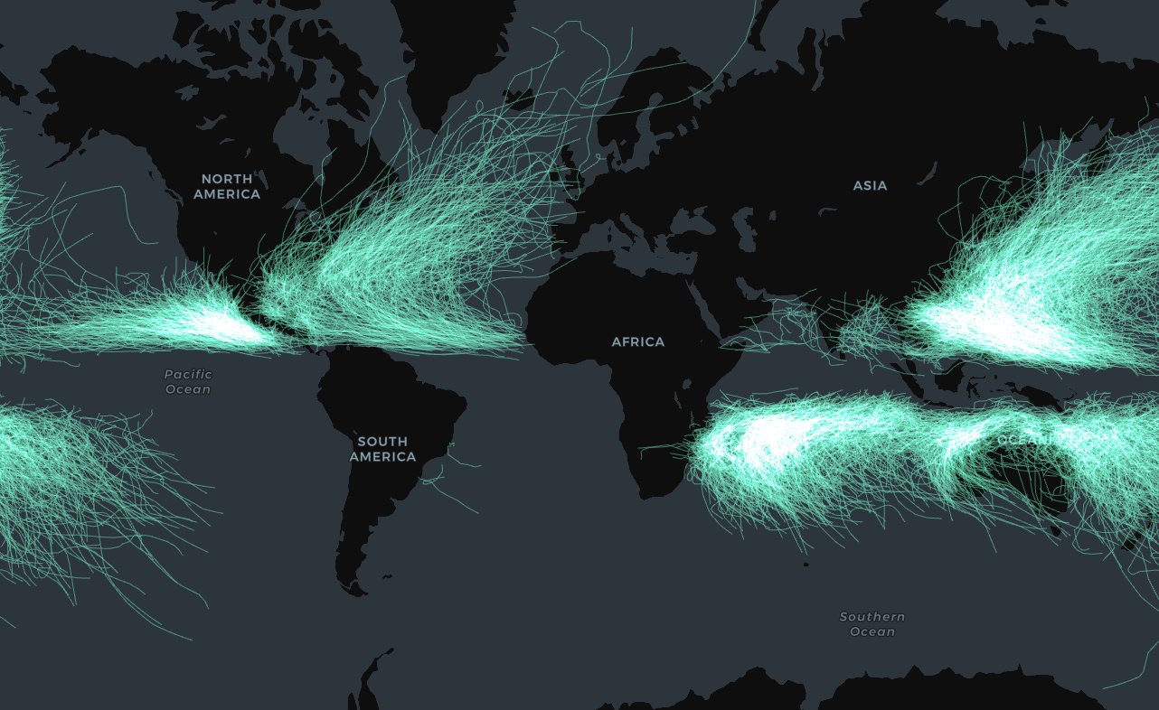
This is also a great method for constructing other “points-to-lines” geometries with multiple vertices. This edition of our LinkedIn newsletter shares how to do this, focusing on the more complex geometries of hurricane paths.
5. Great Circle Map
Great circles are circular lines which run around the edge of a sphere - or spherical-ish globes - to bisect them into two equal halves. Examples of this include the equator or lines of meridian. If drawn on a spherical object, they would look flat. However, when reprojected to a 2D plane, they appear as arcs. You can take advantage of this concept to create beautiful arc-style visualizations.
The longer the distance between origin and destination points the greater the effect will be, and so this type of visualization is best employed for visualizing data at a global scale. An example of this is below which displays the 20 flights with the most predicted annual passengers from London Heathrow and Gatwick Airports, with data sourced from WorldPop.
Open this full screen here.
As with ST_MAKELINE before, all we really need to know here is the start and end geometry points for each line. We can then use ST_GREATCIRCLE from our Analytics Toolbox to construct the great circles - and it’s as easy as that!
SELECTcarto-un.carto.ST_GREATCIRCLE(start_geom, end_geom), 20) AS geom, * FROM yourproject.yourdataset.yourtable
If you don’t have a start and end geometry, check out the range of constructor and transformer SQL functions available to create them.
—
We hope we’ve opened your eyes to some of the visualizations that it’s possible to easily create with SQL! Make sure to grab a free CARTO trial so you can start impressing your colleagues and clients with these next-level data visualizations.