Google Analytics Spatial Data Visualized with BigQuery


This post was written by Liveli our master reseller in Australia and New Zealand and featured by Google.
--
Google Analytics is a core component of any business intelligence team's decision making process. It answers several questions about sources of traffic to your website tracks the success of your paid ad campaigns and monitors the purchase behavior of your buyers.
But despite the wonderful insights you can glean using Google Analytics the location data attached to each prospect's activity is generally underutilized and hidden beneath dashboards and reports. The 'out of the box' geovisualization offered in Google Analytics shows no more than a single map of the geographic spread of your website visitors.
However when you're willing to dig a little deeper - your Google Analytics data has enormous potential when it is ingested into BigQuery and visualised in CARTO.
The results can show powerful stories about your customers and prospects that were previously undiscoverable. Want to understand what is possible? We have outlined the top three key considerations for analyzing your Google Analytics data in CARTO.

Understanding how you can drill down in Google Analytics in terms of location
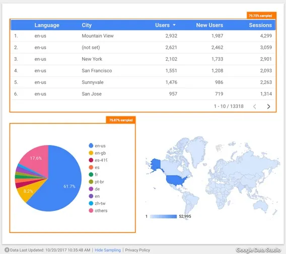
Google Analytics provides geographic data at a city region country and sub continent level. For the purposes of being able to perform meaningful spatial analysis on your data the 'city' level is the most worthwhile dataset you can obtain from your Google Analytics console.
City data is useful because it allows you to see how users within a city area are engaging with your content or products. When coupled with your own supplementary data the insights can be quite compelling.
The Big Red Group a group of businesses focused on selling travel experiences around the world uses product location data from their CRM with Google Analytics purchase data to display the unique number of purchases of experiences by city.
Using CARTO Builder you can simply click on a product location and see lines forming out to the purchase cities - demonstrating how far customers are willing to travel for an experience and how popular these experiences are.
Want to start your spatial analysis journey?
Preparing your data for spatial analysis in Google BigQuery
BigQuery is the key interlocker between Google Analytics and CARTO. If you're using the standard Google Analytics platform an API is required to bring your data into BigQuery. The good news for Google Analytics 360 users (Google's advanced business analytics tool) is that your Google Analytics data is automatically ingested into BigQuery as a part of the subscription model.
Once the data is organised in BigQuery it is then ready for spatial analysis. Using CARTO's Google BigQuery connector you can simply enter a SQL query to connect your data & make it available on the CARTO platform - allowing you to easily visualize perform spatial analyses & build applications.
Performing spatial analysis: What questions are you trying to answer?
Performing spatial analyses on your Google Analytics data and supplementary data sets from your business can provide you with incredible insights. Red Balloon a Big Red Group organization used CARTO Builder to answer several questions about their online audience.
What are your questions?
Request a live personalized demo
- From which cities do we see the most demand for our products?
In this example you can see purchases by city styled with size-scaled bubbles showing the amount of website purchases made in that city. This shows the cities where your website is most popular and how that converts into sales.
- In which cities do we see high cart abandonment rates?
Using this method you can see the difference between website visits and actual purchases made helping you to calculate an average cart abandonment rate. In this example the cart abandonment rate is denoted by a color ramp - with darker colors denoting a higher cart abandonment rate.
- Which product type is most popular by city?
This view allows users to see which product categories by city and product type are the most popular. In this example from Red Balloon you can select a city and understand what travel experience type is most popular. For example website purchases may show that wine region tours within a three hour driving distance are the most popular experience type for people based in Sydney Australia.
Want to know more about visualizing Google Analytics data?
Liveli hosted a webinar showing what is possible when you bring your Google Analytics data into CARTO. The results shown in the webinar are beneficial to many industries including food delivery retail government and more.
Want to see additional spatial analysis performed on Google Analytics data?