A Guide To Using GTFS Data


Public transit systems are the beating heart of cities, and can be a lifeline for rural communities. They are a vital contributor in the global drive to Net Zero, and can drive the success or failure of a business.
Are you identifying the optimal CPG merchants for your brand? Sales may be stronger near public transport like a rail station. Are you trying to attract more staff across your supply chain? You may be more successful if you know the stop locations of a bus route that runs nearby.
Despite the need for reliable spatial transit data, it remains a difficult type of data to source and wrangle. Transit networks are complex and fragmented; their data are no different.
Enter GTFS.
What is GTFS data?
The General Transit Feed Specification - or GTFS - is a specification for transit data. This specification allows holders of transit data - such as transport departments, councils and transit providers - to publish their data in a way that is interoperable and consistent.
GTFS Schedule or GTFS Real-Time?
If you’re looking to use GTFS data as transit information for analysis and prediction, this guide is for you as we’ll be focusing on scheduled GTFS data (as opposed to the alternative; real-time).
Where can I access GTFS data?
GTFS data is not maintained or published by one individual provider, but by individual transit organizations. This means GTFS data isn’t published by one definitive source, but on local or organizational data hubs, such as Metro’s developer portal.
You can also find some great sources which catalog these below:
You’ll see that each GTFS feed consists of a number of tables. Confused? You’re not alone; this system isn’t the most clear or intuitive… but that’s what this guide is for!
What does it all mean?
Key tables for spatial analysis
If you’re working with spatial data there are only a few GTFS tables that you will work with frequently. These are:
- Stops: contains data on a stop, station, entrance or boarding area, defined in the field “location_type.”
- Trips: the Trips table is the glue that binds together the geometry and variables behind transit lines. Trips are essentially all of the variations of a route. A route may have a different journey, frequency and schedule depending on whether it is a weekday or weekend; daytime or night time; or inbound or outbound. It describes each of these variations and it can help build a trip planner.
- Routes: a transit route. How does this differ from a trip? Trips are essentially variations of a route, which may vary in schedule, direction and frequency. So the route might be the bus line 29, and a trip might be the inbound, night time variation of route 29.
- Shapes: a geometric description of a trip.
- Stop_times: the schedule data of a trip.
Other tables
In addition to these tables, you may see the below tables as part of your GTFS package, which may be useful to you depending on what you’re trying to achieve.
- Agency
- calendar
- calendar_dates
- fare_attributes
- Fare_rules
- frequencies
- transfers
- pathways
- levels
- feed_info
- translations
- Attributions
You can learn more about these tables here.
Want to learn more about the new geospatial landscape? Download the free report: Modernizing the Geospatial Analysis Stack today.
How to use GTFS: an example
In this example, we’ll be using the NYC bus GTFS feed, which we’ve sourced from this catalog. You’ll see a number of tables are included in this feed, but we’ll just be using our 5 key tables.
We’ll be using our cloud-native platform to illustrate how you can quickly and flexibly work with GTFS data - if you don’t have an account, you can sign up to a free 14-day trial here. You will also benefit from having a cloud data warehouse connected to your CARTO account (find out how to do this here or watch the video below), but if you don’t have one you can use the CARTO Data Warehouse which is offered with every every account, including trials.
Before you start, it’s best to convert the downloaded GTFS files to CSVs - you can just rename them from their native .txts to .csvs, as they’re already formatted for this.
Loading GTFS data to the cloud
We’ll start by loading our five key GTFS tables (stops, trips, routes, shapes and stop_times) to our chosen cloud data warehouse. You can either do that in your selected cloud console, or directly in the CARTO Workspace:
- Once you’re logged into CARTO at app.carto.com, navigate to the Data Explorer on the left hand panel
- At the top right of the screen, you’ll see a button to import data. Click it!
You’ll now be able to select the table from where it’s saved locally, and choose a data warehouse destination. And it’s that easy! You can also use this interface to load data directly from a URL.
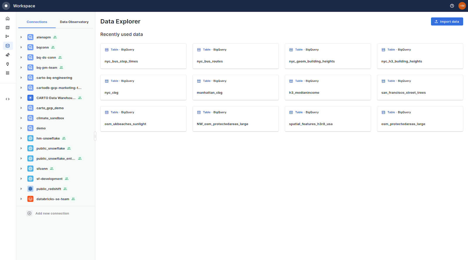
Repeat this for all 5 of your key tables.
Processing the data
We’ll be using Workflows to process our data into formats usable for spatial analysis. Workflows is a low-code visual tool for streamlining and automating analytical processes. If you’re a Spatial SQL fan you can also run all of these commands by code, directly in your cloud provider console or in the Builder visualization tool in the CARTO Workspace.
To get started, you’ll need to create a new workflow. Do this from the Workflows tab of the main Workspace, and select the cloud connection which you loaded the GTFS data into previously.
When you open your blank Workspace canvas you will see two options on the left of the screen; Components - which is your suite of analytical tools - and Sources, which is your data. Navigate through your connection to where your GTFS data is saved, and then drag and drop them onto the canvas.
You will be able to see the number of records in each table, a preview of the data table and preview of the data on a map. The latter of these will only be possible if your data has any geometry associated with it - which ours currently doesn’t. Let’s fix that!
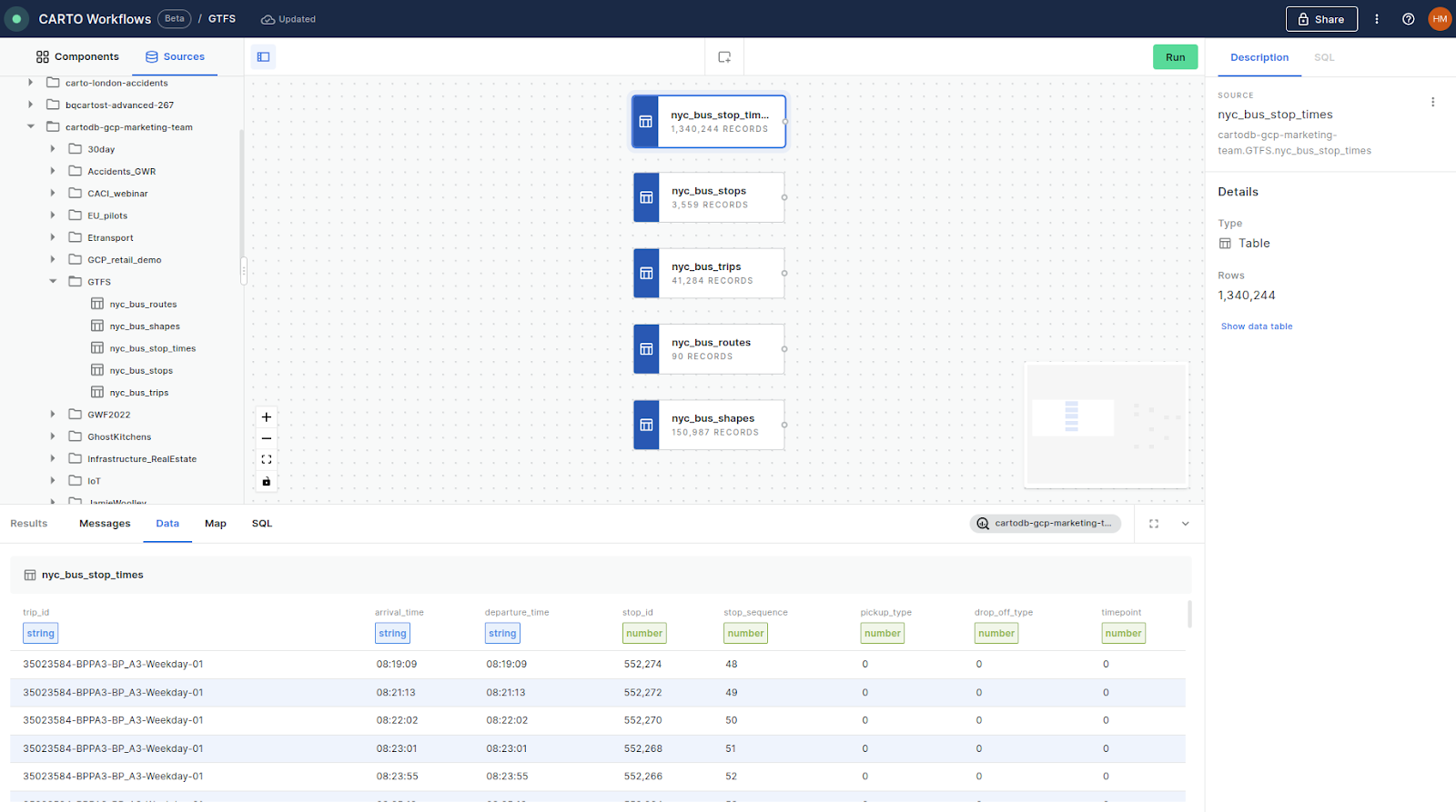
In the next section, we’ll create three spatial layers from these five GTFS tables.
- Transit stops
- Transit lines
- Transit movements
Step 1: Creating transit stops
Let’s start with transit stops, as these are the most straightforward.
GTFS tables required: stops
We’ll use the tool ST_GEOGPOINT for this, which you can find under the Parsers module or just by searching. This function takes a latitude and longitude column (stored in stops as stop_lat and stop_lon respectively) and creates a point geometry with them.
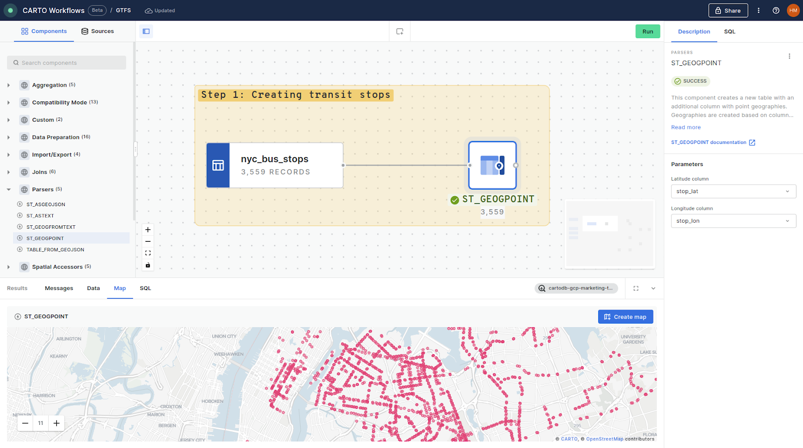
You can see the results for this above - and now we have geometry, we can preview our stops on a map!
Top tip! It’s great practice to use the “Add a section” functionality (center-top of the screen) to group and annotate your Workflow. This will help you stay organized, and make it easier to share work with colleagues.
Step 2: Creating transit lines
GTFS tables required: trips, routes and shapes
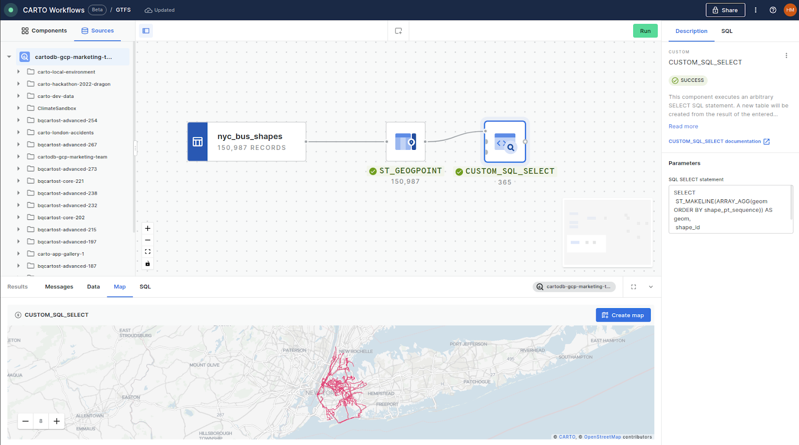
The GTFS shapes table contains the latitude and longitude of each vertex (i.e. corner point) of a trip. Our first step here is to convert each of these to a geometry, like we did before with ST_GEOGPOINT. Next, we want to use the function ST_MAKELINE to link these together to create a trip line geometry.
However as our table contains hundreds of unique trips, we need to use some custom SQL to do this rather than the ST_MAKELINE component. We can use the CUSTOM_SQL_SELECT component to do this, which can be connected to up to three input components or sources. These can be referred to in your code $a, $b and $c for ease of use.
SELECT
ST_MAKELINE(ARRAY_AGG(geom ORDER BY shape_pt_sequence)) AS geom,
shape_id
FROM $a
GROUP BY shape_id
In this query, we create a column called “geom” which contains an array (using the function ARRAY_AGG) of the vertex geometries, which we pass to the ST_MAKELINE function. These are ordered by the shape_pt_sequence column to ensure our points are connected in the correct order, and are also grouped by shape_id to ensure only vertices from the same trip are grouped. You can preview these lines in the map panel at the bottom of the Workflows canvas.
The only other variable contained in the shapes GTFS table is the shape_id, which isn’t super descriptive. By joining the geometry we’ve just created with the data in the trips and routes table we can create some really useful data - so let’s do that!
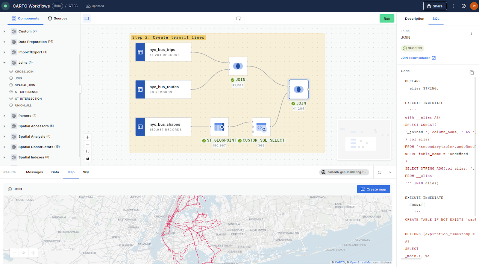
We’ll use the JOIN component to join the bus trips to the routes via route_id, and then again to our created trips shape via shape_id - and we’re done! You can also see in the screenshot above how you can preview the SQL driving your Workflow on the right of the screen.
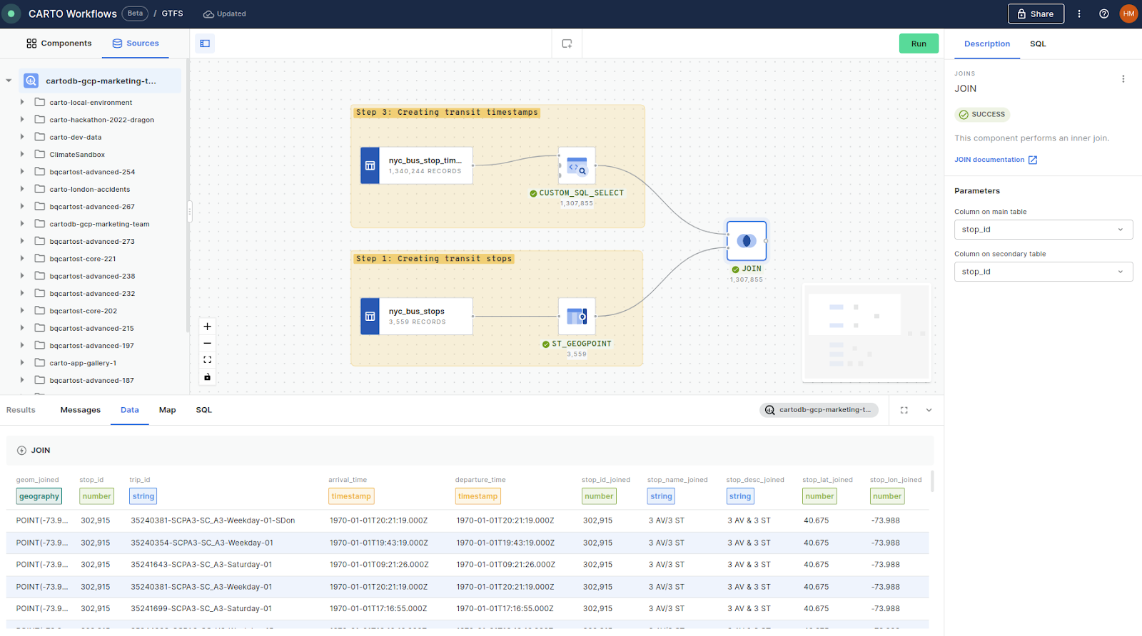
Step 3: Creating transit movements
GTFS tables required: stop times, stops
The final section of this guide looks at transit movements - i.e. when vehicles arrive at specific stops.
First, if your GTFS stop times didn’t automatically register with the field type “TIMESTAMP” then we’ll need to convert them. We can do this easily by adding the CUSTOM_SQL_SELECT component and linking this to our stop table. In this query, we’ll use the function PARSE_TIMESTAMP to convert both our arrival and departure times to our required field type.
💡#protip - make sure to add a unique ID to each row to take advantage of some great visualization options later on! We’ve used ROW_NUMBER() OVER() to do this.
SELECT
 ROW_NUMBER() OVER() as stoptime_id,
 stop_id,
 trip_id,
 PARSE_TIMESTAMP('%H:%M:%S', arrival_time) AS arrival_time,
 PARSE_TIMESTAMP('%H:%M:%S', departure_time) AS departure_time
FROM
 $a
💡 Please note, some GTFS providers provide early morning times as “24:31” rather than “00:31.” If you have this issue try using the TIMESTAMP_SUB function to subtract 24 hours from these erroneous times.
With our timestamps created, all we need to do is add a join function to access the stop geometry (remember - we created this earlier in step 1). The join field here is stop_id.
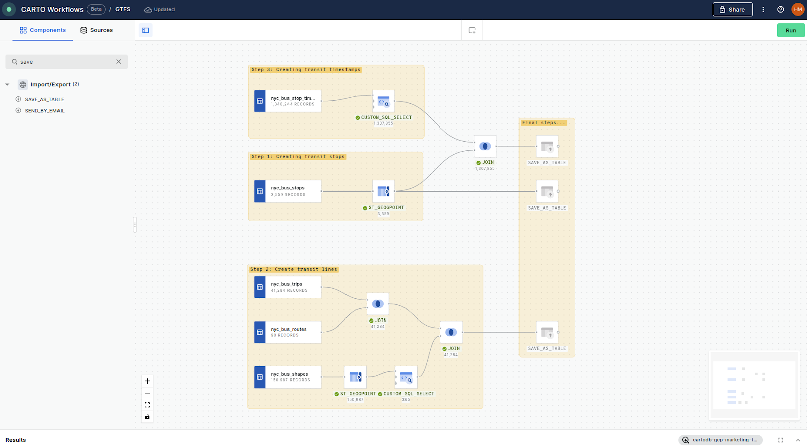
The final step is to connect the component SAVE_AS_TABLE to each of our outputs so we can use them in the future! Alternatively, you can use the SEND_BY_EMAIL component to drop a copy of your data straight into your colleague or client’s inbox!
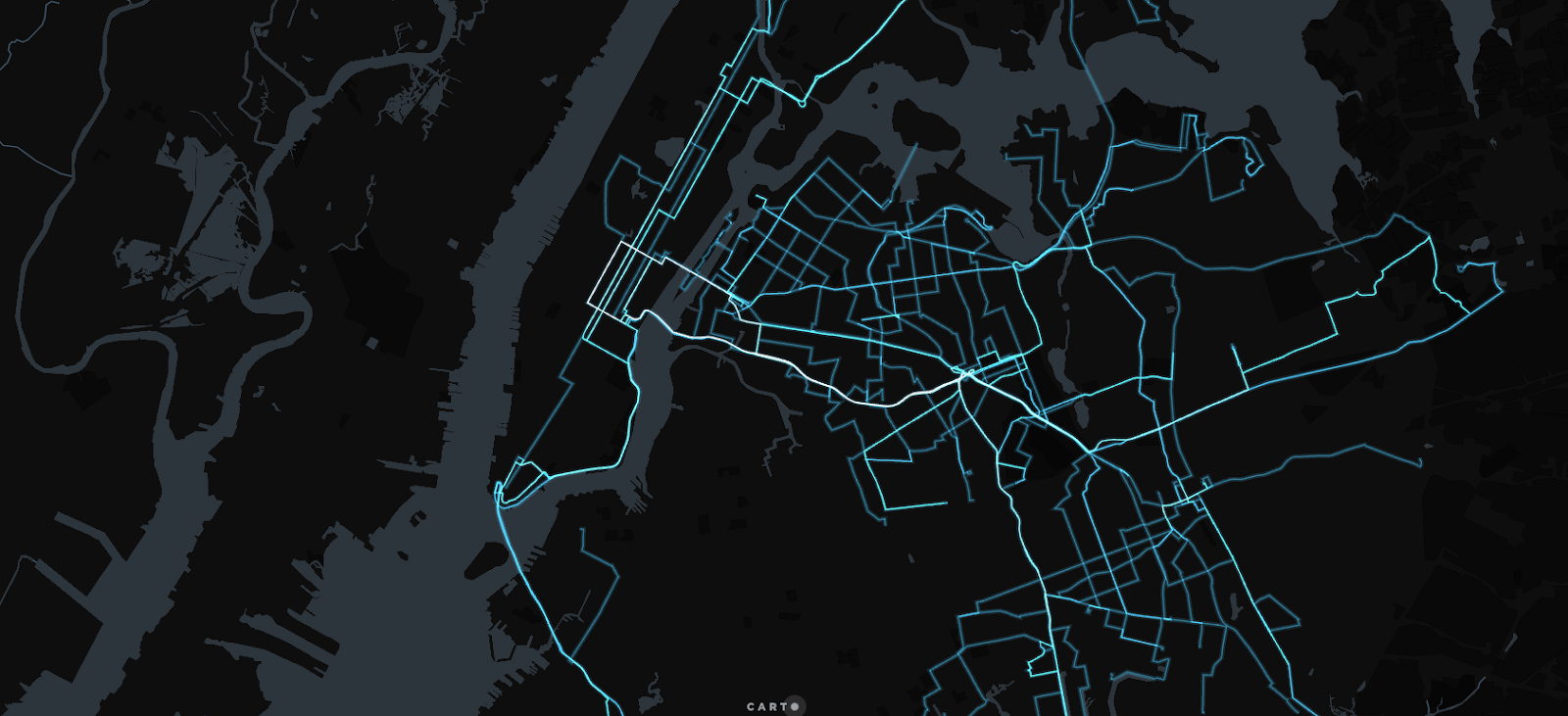
Here’s what this workflow looks like altogether!
…And finally!
You didn’t think we’d go through all of that without creating a map did you?
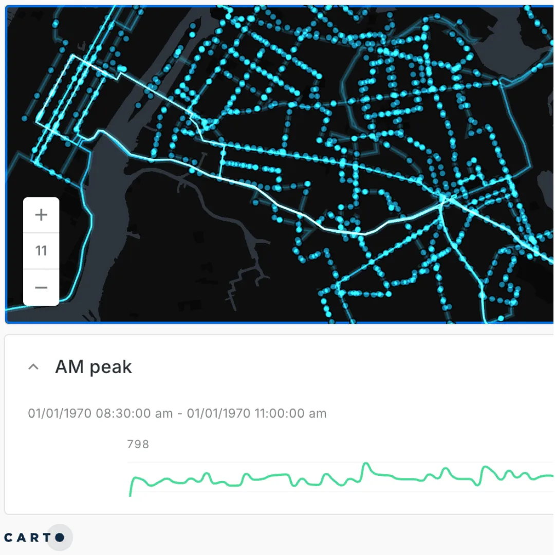
Open this in full screen here.
Here you can see the outcome of our workflow-ing! The star of this map is the stop times data. We’ve used a time series widget to allow us to animate the AM peak bus movements - make sure you hit “play” on the widget to watch them buzzing around the city! You could take this further by modeling transit movements between stops too - we’ve done something similar in this post (which also uses GTFS data!).
To give more context to these movements we’ve included the bus lines that we just created. Want to emulate the “glowing” effect we have here? Just switch your map to use additive layer blending! We’ve also removed a lot of the layers from the dark matter basemap to really highlight our data, which you find out more about doing here.
🚌 🚆 ⛴️
We hope you’ve enjoyed having GTFS data demystified for you! Looking for more resources to help you analyze transit and mobility data? Our 14-day free trial comes packed with tutorials and resources so you can start your journey straight away!