IoT Analytics & Geospatial Data: How It Works


If you’re reading this, there’s a big chance you’ve already heard about the Internet of Things. IoT has been a big tech industry buzzword for the past years. With promises of billions of connected devices, we’ve all imagined how by 2022 we would have connected and digitally transformed pretty much every industry, from retail and logistics to healthcare and agriculture. Even though the IoT industry hasn’t exactly lived up to its promise, with 74% of companies considering their IoT projects to be unsuccessful, one can dare to argue that, it’s all a matter of perspective and definitions.
Let’s start with the associations related with IoT. Most people when thinking about IoT think mainly of two things: smart cities & smart homes.
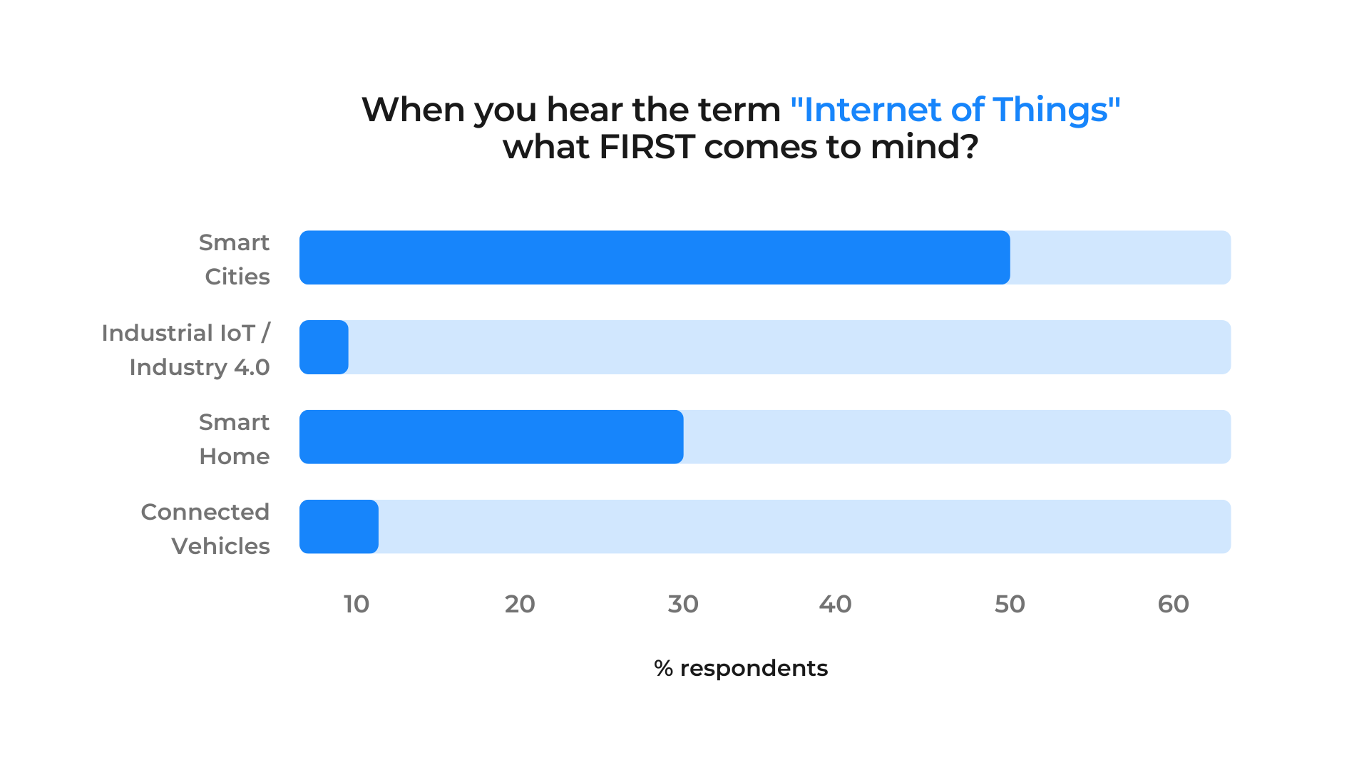
Source: LinkedIn poll launched in 2022.
Smart city and smart home are use cases where the concept of Internet of Things is very prominent, there’s no doubt about that. But does IoT = smart city or smart home? Certainly not! There’s so much more to this fascinating tech landscape. Before we dive all in let’s start with going back to the basics with a definition of IoT by Gartner:
The Internet of Things (IoT) is the network of physical objects that contain embedded technology to communicate and sense or interact with their internal states or the external environment
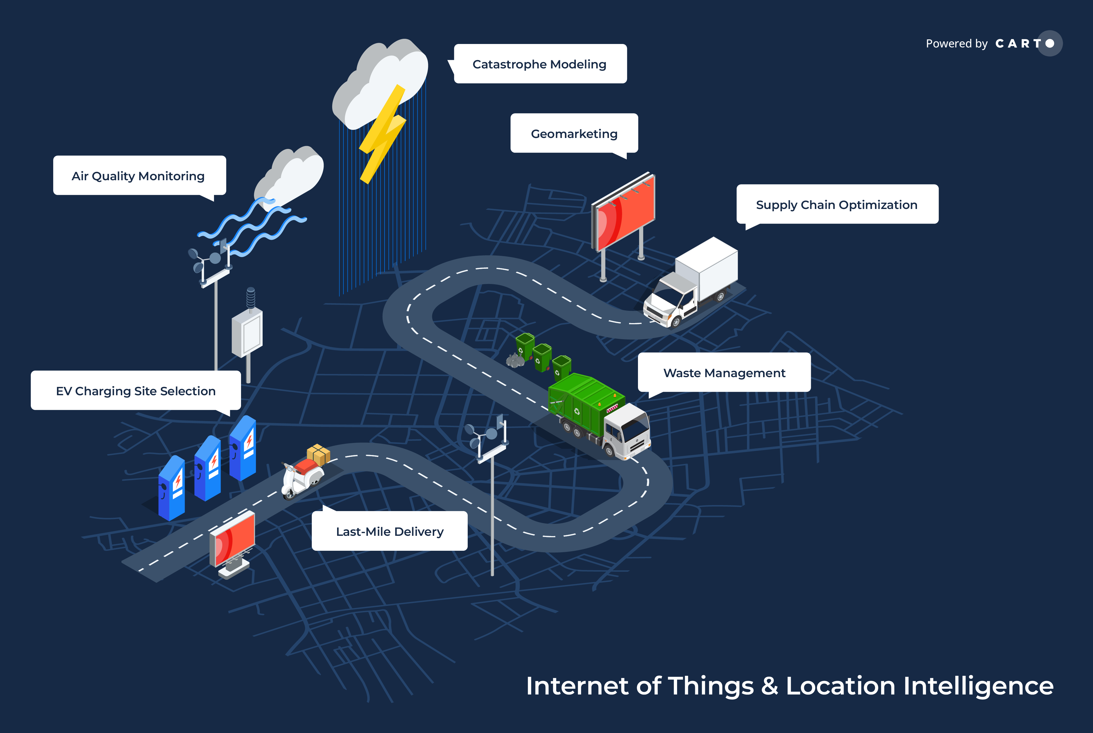
Internet of Things & Location Intelligence use cases
Essentially this means that devices are connected to the Internet to share some kind of information. But before we get excited about all the cool tech stuff out there, we need to start with the “why” behind all of this. Why do we start looking at IoT projects in the first place? This article sums up IoT’s leading business goals very well. Basically, there are 3 main “buckets'' that these goals fall into:
- Increasing revenue.
- Reducing operating costs.
- Mitigating business risk.
We’ve covered the “what” and the “why” now let’s get a bit into the “how”. If we’re speaking about using devices data and analysis of these large volumes of data to increase revenue, reduce costs, and mitigate risk, there’s certainly an area that comes to mind – Spatial Data Science. If you’re interested in finding out more about what Spatial Data Science is first, we already have some great resources out there about that.
IoT use cases with a geospatial component
Although these two worlds might be quite disparate at first thought, they are actually much more linked than one may think. What’s key to remember is that for almost all IoT devices there is a location component involved. And that means there is ample room for benefiting from spatial analytics.
Let’s look at some examples of IoT use cases that have a geospatial component, starting with the logistics space.
Supply Chain Optimization
One of the key IoT opportunities in this area is supply chain optimization where profit is derived from route optimization and fleet management. To identify optimal routes, companies need to take into account multiple variables such as road conditions, depot status, and driver & vehicle profile. These dynamic conditions are perfect examples of where data can be sourced from both IoT devices and geospatial datasets (e.g. road traffic data).
By combining disparate sources of information on everything from average traffic density to real-time information on the fleet, logistics planners can improve efficiency and customer satisfaction while reducing operational costs. Many of these data sources can be found on our Spatial Data Catalog, such as TomTom Speed Profiles and Traffic Density datasets.
A great example of these optimizations in action is CARTO’s deployment for SEUR a pioneering parcel delivery company that delivers more than 300 thousand parcels every day. SEUR improved its supply chain processes for cold chain transportation, taking advantage of combining historical data with current data on the location and capacity of its distribution centers and business territories.
Catastrophe Modeling
Another completely different IoT and geospatial example is catastrophe modeling, a critical use case for both the public sector and insurance industries. New IoT sensors can be used to predict everything from volcano eruptions to floods and avalanches. Imagine the possibilities of combining these indicators of potential real-time risk with data on human mobility housing and sociodemographics. This type of insight can be used to influence - for example - governmental decisions on infrastructure investments or help insurance companies make more accurate risk assessments to minimize their losses caused by extreme weather events.
Other examples of combined use cases for IoT & Location Intelligence include delivery optimization (like our story with Deliveroo) waste management EV charging site selection, or geomarketing. Read on to see the last one of these in action!
Location Intelligence & IoT in action
Let’s take a look at how Location Intelligence can be used to better inform IoT business decisions! In this example, we’ll be focusing on Geomarketing.
Geomarketing refers to processes which aim to pinpoint the optimum locations for advertising campaigns to ensure they have the optimum impact. This means being seen by the most amount of target customers.
In this example, we’ll be looking at an advertising type that you probably see multiple times a day. You may even be sitting on one as you’re reading this… We’re talking about the bus!
Buses have been referred to as visual billboards and have wide ranging appeal as a form of advertisement. They’re visually unavoidable to pedestrians and other motorists, as well as having a “captive audience” both on buses and at bus stops. They will also often be seen time and time again by the same person. Buses cover large areas, but move slowly enough to give potential customers time to absorb the advert’s message.
This mobility presents both a challenge and opportunity to drive the greatest return on investment for bus advertising strategies and being able to connect data streams from devices which measure bus and human mobility are key to this.
The Orlando Bus Network
To illustrate this let’s look at the bus network in Orlando. GPS telemetry from each bus means we can easily visualize when each bus arrives at which stop using a timeslider widget in CARTO Builder.
Want to recreate a visualization like this? Our cloud-native analytics and visualization tool CARTO Builder lets you to take advantage of the time series widget to animate and filter data by time period. Your data will need a field with the type timestamp to be able to use this. Why not sign up for a free two-week CARTO trial so you can try recreating some of this analysis?
Bus route stop and schedule data can be accessed for all parts of the world from in a format known as General Transit Feed Specification (GTFS). This data is often big; the “stop_times” table - for example - contains around 280 000 records and this is just one component of GTFS. This means that working in a cloud-native environment like CARTO which is designed for big data analytics is ideal for efficient and scalable analysis.
Optimizing bus-based advertising
So now we know where our buses are from the GTFS data - how can these insights be translated into a high performing advertising campaign?
Well one way is location-based analytics i.e. delivering the most relevant ads in optimal locations and at the right time.
In this example, let’s get utopian and imagine all of our buses in Orlando have GPS-enabled digital advertising panels and screens installed inside them enabling them to display different campaigns at different times and - crucially - in different locations. This would allow for advertisers to display or even tailor ad contentas the bus approaches their location displaying messages such as “Alight here for a coffee - only a two minute walk away!” This is already something taxi and logistics companies are taking advantage of. This is not only engaging for the audience but has the added benefit of companies only paying for advertising when it is most relevant to them.
Let’s check out an example!
Alight here for a Big Mac
.png)
The above map shows the locations of McDonald’s (available via the Safegraph Places dataset in our Spatial Data Catalog) across Orange County Florida along with 15-minute walk isochrones. Eagle-eyed CARTO blog followers may recognize these isochrones from our recent blog on how to create isolines - check this out here!
We can assume that adverts which are displayed in buses within these 15-minute isolines will have the greatest return on investment. We can easily assess this by running a spatial classification on the data using the “CASE” statement in the sample query below.
WITH
--Load source data
 catchments AS (
   SELECT ST_UNION_AGG(__iso_geom) AS geom
   FROM yourProject.yourDataset.tradeareas_McDonalds_15minwalk)
 buses AS (
   SELECT *
   FROM yourProject.yourDataset.bus_stop_time_series)
–Classify data by if it intersects catchments
SELECT
buses.*
CASE
  WHEN ST_CONTAINS(catchments.geom  buses.geom) THEN “Play advert”
  ELSE “No advert”
END AS Advert
FROM buses  catchments
And what does that leave us with? Well hit play on the time series visualization below to find out for yourself!
In this visualization, bus locations turn pink when they enter a 15-minute radius of a McDonald’s, indicating a prime location for advertisement.
Next steps: Geosegmentation
Want to take this further? A great way to do this - and another use case of Location Intelligence for the Internet of Things - is to integrate Geosegmentation into this analysis. Geosegmentation is a technique of defining the characteristics of residents of an area generally for geomarketing purposes.
In this use case, we could further enhance our understanding of how powerful an advert would be in different locations by including a measure of how interested residents are in fast food restaurants like McDonald’s - enter Spatial.ai Geosocial Segments.
Available via our Data Observatory, this dataset assesses activity on local devices on platforms such as Twitter, Instagram, Meetup and Eventful to understand how much they align with different groups. Areas are scored from 0-100, with a score of 100 indicating residents are within the top 1% alignment with that group. In this instance, we’re interested in the segment “Fast Casual Affinity.” Highly scoring areas indicate a strong local market for fast casual joints like McDonald’s!
To obtain these scores for our bus movement data, we’ll use our DATAOBS_ENRICH_POINTS() tool from our Analytics Toolbox Data module. This module contains a suite of functions designed to make transferring data between geographies - a really common requirement in Location Intelligence - easier and more efficient.
An example SQL code block for running this function is below. You’ll need to know:
- Your Data Observatory Connection. Access this by clicking “access in” on any subscription you have in your Data Explorer. It should start with “ac_…”
- The enrichment variable ID. Again you can access this in the Data Explorer under your chosen enrichment table > Data tab > Variable ID (in the list of variables beneath the sample data table).
As the index is an intensive property (i.e. its value is not dependent on the size of a geographic area) we’ve chosen to aggregate this by averaging the data.
CALL carto-un.carto.DATAOBS_ENRICH_POINTS(
 ‘yourProject.yourTable.orlando_bus_adverts’
 ‘geom’
 [(‘index_fast_casu_229f9738’  ‘avg’)]
 NULL
 [‘yourProject.yourTable.orlando_bus_geosocial’]
 ‘carto-data.yourDOconnection’
);
So what do we get from this? We’ve replicated our original visualization but included this additional level of intelligence. We’ve done this by sizing the radius of our bus GPS locations by their index - bigger points indicate a stronger interest in fast casual joints. Check this out below - make sure you hit play to watch the animation!
Combining the data streams from the sensors on buses and mobile phones - as well as other forms of geospatial analysis like isochrones - has the power to create powerful insights which can drive revenue-building business decisions.
Next-level IoT analytics
The power of IoT to connect real-time information between sensors opens up a huge range of opportunities. Following on the theme of transport and quick service restaurants, some further examples of how analysts could deliver better business outcomes by exploiting IoT data include:
- A cafe chain could take advantage of near real-time weather data to advertise hot drinks on cold days and iced beverages in warmer weather.
- A quick service restaurant could advertise different menus at different times of the day.
- A local food delivery service could drive local engagement by sharing statistics about popular local dishes.
- Transport companies could encourage pedestrians to use the bus with near-real time air quality or traffic data with advertising such as “Traffic is 1.5x worse than average in this area: get the bus instead!”
- For advertisement space providers the fee for advertising space could be higher at busier times or when you know a bus is due to arrive.
The possibilities are endless!
Have we inspired you to embrace the power of IoT and Location Intelligence? Why not sign up for a free two-week trial with CARTO and explore what’s possible!