

How to Analyze & Visualize Spatial Data in Databricks


Recently as part of our ongoing mission to empower Data Scientists with the best data and analysis we announced the integration of our platform with Databricks using either our Direct SQL Connection feature or CARTOframes our Python package.
Last week Raela Wang and Borja Muñoz hosted a webinar to explore examples where Databricks and CARTO come together as part of this collaborative Data Science process. This post summarizes the key points covered in the webinar including:
- How to visualize spatial data within a Databricks notebook using CARTOframes rapidly creating stunning data visualizations of Big Data sets.
- How Data Engineers are using the two platforms via our Direct SQL Connection creating an ETL pipeline to manipulate CARTO datasets.
- Case studies focusing on how such workflows can be used in Telco Financial Services CPG Health/Pharma and Logistics.
CARTO + Databricks
Spatial Analytics at Scale
Data Science teams often have to perform spatial analytics over very large datasets. With CARTO’s spatial analysis functionality and the Databricks Unified Analytics Platform data scientists can run spatial analysis on very large datasets.
Increased Collaboration and Access to Data
Data is usually stored in siloed database systems making it challenging to enrich and combine your datasets. The CARTO Direct SQL Connection feature allows you to access your spatial data from the Databricks platform and combine it with your Delta Lake.
Interactive Exploration of your Spatial Data
When you are working with a dataset with spatial information you need to have a way to explore the data interactively on a map. The use of CARTOframes within Databricks notebooks allows you to generate insightful map visualizations from your spatial data.
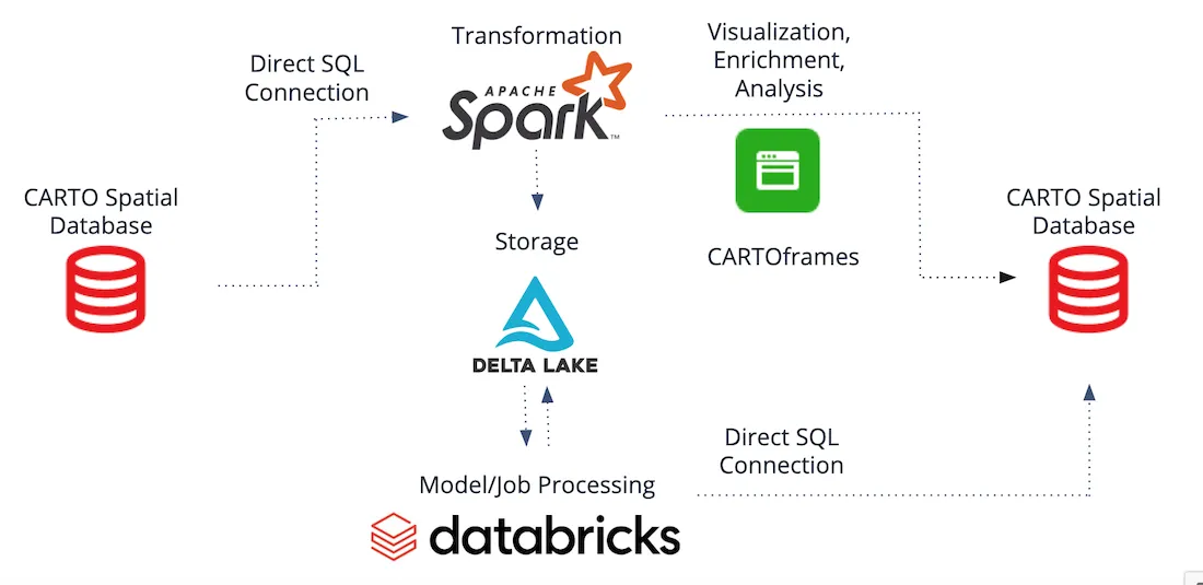
Architecture
Existing tables from the CARTO Spatial Database can be read in as a data source to the Databricks platform where transformations can be run on the Apache Spark cluster. The data can also be ETLed and stored within a data lake (in the example below Delta Lake is being used) where advanced analytics and machine learning models can be performed. Likewise visualization data enrichment and analysis can be performed using CARTOframes. At any step of the pipeline data can always be persisted back into the CARTO Spatial Database.
Integration Options
Direct SQL Connection
CARTO is based on PostgreSQL and PostGIS and due to it being a managed service there is no direct access to the PostgreSQL server. Instead the database and datasets can be accessed using the Direct SQL Connection feature we announced earlier this year which can be used within a Databricks notebook to read and write data utilizing Spark dataframes. In our post announcing Databricks integration we walked through an example of this process.
The Direct SQL Connection method should be used when performing data engineering or manipulation tasks that are not suitable for relational databases. For example when switching rows or columns (wide-to-long transformations). It is also recommended when scalability is an issue because you can scale and distribute the computation within your Databricks cluster.
CARTOframes
CARTOframes can be used for enrichment analysis and visualization of geospatial data directly within Databricks notebooks.
CARTOframes should be used when you want to:
- Visualize your geospatial data.
- Enrich your data with premium datasets (human mobility credit card transactions or behavioral datasets for example).
- Perform advanced spatial analysis (calculating isochrones or complex geocoding operations for example).
Again in the announcement post we stepped through a simple example of this and during the webinar a more detailed walkthrough using the notebook shown below and linked here was demonstrated.
Use Cases
- Data Engineering: Use Databricks for collecting and preparing your datasets for visualization and/or spatial analysis with CARTO.
- Data Visualization: Visualize in a CARTO map within your Databricks notebook the data you are working with.
- Data Analysis: Take advantage of CARTO features for spatial data science within your Databricks notebooks.
How to get started
These features are available right now to all enterprise customers. To start using the Direct SQL Connection just go to the settings page in your dashboard and follow the instructions to set up a new connection. To get started with CARTOframes you can read the Quickstart guide. If you encounter any issues just reach out to your Customer Success Manager.
Want to learn more?


