How to use COVID-19 Public Data in Spatial Analysis


For the past few months we have been making our platform freely available for those working on COVID-19 analysis regularly adding public data sets from a wide range of providers to our Data Observatory (DO) and featuring use cases from a multitude of affected industries in order to support businesses governments and the spatial community in the battle against this pandemic.
In this post adapted from a recent webinar given by our Founder & CSO Javier de la Torre and one of our Data Scientists Miguel Álvarez we walk through the process of how you can use COVID-19 public data within Spatial Data Science.
For reference and to help you replicate this type of analysis the code and notebook referenced throughout this post can be found here.
Setup
In this example we are using our Python package CARTOframes within a Jupyter notebook on the Google Cloud Platform.
To set up CARTOframes we first need to install the library and then set the credentials of our account.
!pip install cartoframes
my_base_url = 'https://[user].carto.com/'
my_api_key = 'XXXXX'
set_default_credentials(
   base_url=my_base_url
   api_key=my_api_key
)
Data Discovery
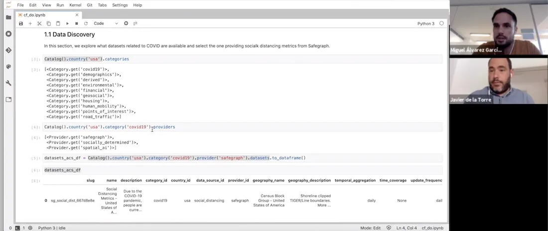
Next we can explore the DO to determine what types of data sets are directly available to us without the need to source clean and normalize. Within the DO we have a new category entitled ‘covid19’ covering all available datasets relating to the pandemic.
Catalog().country(‘usa’).categories
[<Category.get(‘covid19’)>
<Category.get(‘demographics’)>
<Category.get(‘derived’)>
<Category.get(’environmental’)>
<Category.get(‘financial’)>
<Category.get(‘geosocial’)>
<Category.get(‘housing’)>
<Category.get(‘human_mobility’)>
<Category.get(‘points_of_interest’)>
<Category.get(‘road_traffic’)>]
We can also query which providers are within this category enabling us to determine which data set is of most relevance to our analysis. Here we can see two providers Safegraph and Spatial.ai.
Catalog().country(‘usa’).category(‘covid19’).providers
[<Provider.get(‘safegraph’)>
<Provider.get(‘spatial_ai’)>]
For this example we are interested in human mobility metrics in the city of New York so let’s take a look at Safegraph’s data in a bit more detail including the columns description and geographic coverage.
Please note that Safegraph’s data is publicly available to researchers non-profits and governments around the world working on COVID-19 related projects. In order to have access to their data you first need to sign their Consortium Agreement.
datasets_acs_df = Catalog().country(‘usa’).category(‘covid19’).provider(‘safegraph’).datasets.to_dataframe()
datasets_acs_df

datasets_acs_df.loc[0 ‘description’]
‘Due to the COVID-19 pandemic people are currently engaging in social distancing. In order to understand what is actually occurring at a census block group level SafeGraph is offering a temporary Social Distancing Metrics product.’
dataset = Dataset.get(‘sg_social_dist_667d8e8e’)
dataset.geom_coverage()
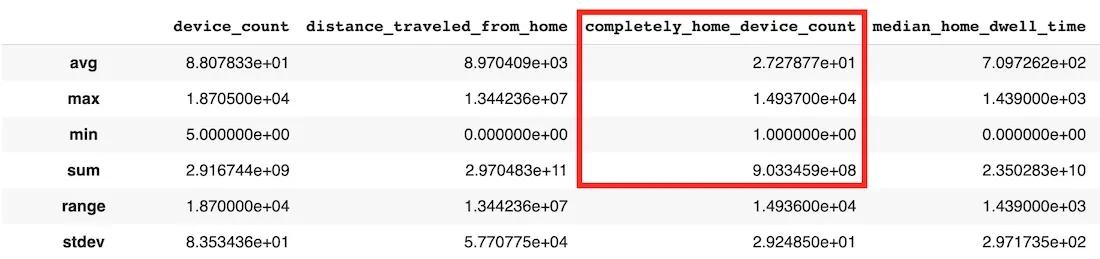
We can further describe the data set in order to view the variables within as well as check the first 10 rows of the aggregated data. The ‘completely_home_device_count’ variable is the one which we are most interested in since this will give us an indication of how many people have stayed at home to work. We can see that the temporal resolution of the data is daily with a spatial resolution at the census block level.
dataset.describe()
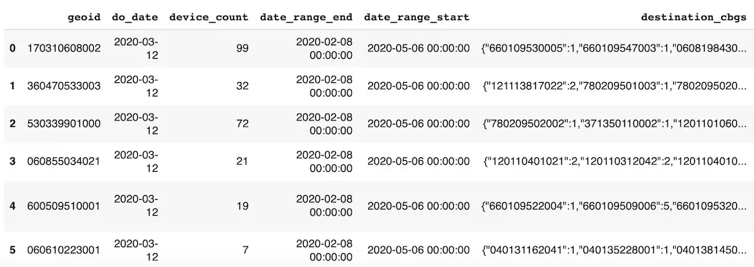
dataset.head()
Now we have determined that this is the data that we want to use next we need to download it. However since we are only interested in the City of New York over a specific time period we need to filter the dataset by bounding box and date using a SQL query. The bounding box has been determined using bboxfinder.com with the week commencing 16th February before the pandemic hit as a baseline.
sql_query = “SELECT * FROM $dataset$ WHERE ST_IntersectsBox(geom -74.274573 40.484984 -73.453345 41.054089) AND do_date >= ‘2020-02-16’”
We can visualize the geographic coverage of this data as shown below.
Map(Layer(dataset_df[dataset_df[‘do_date’] == ‘2020-02-16’] geom_col=‘geom’))
Spatial Analysis
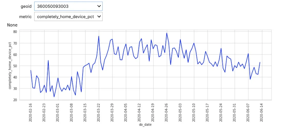
The first analysis we can perform is to process the data in order to build a time series (refer to the notebook for the full code).
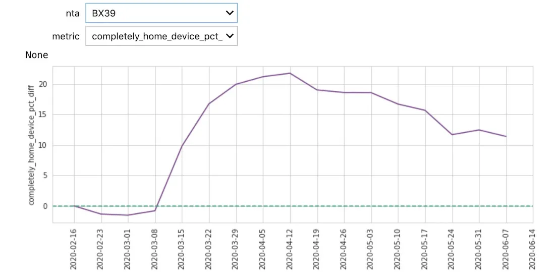
We can see a general trend both in the chart and visualization in more people staying at home which is what we would expect. At this stage though the data is noisy due to the high granularity of the census blocks and daily sample rate.
Since we are interested in the change with respect to the pre COVID baseline we defined earlier we first need to aggregate the data to reduce the noise temporally at the week level and spatially at the Neighborhood Tabulation Area (NTA) level (an area which New York City uses itself for statistics).
def aggregate_spatiotemporal(df):
   wavg = lambda x : np.round(np.average(x  weights=df.loc[x.index  ‘device_count’])  2)
   df_aux = df.groupby([‘date_range_start’  ’ntacode’]).

               agg({‘device_count’:‘sum’
                    ‘distance_traveled_from_home’:wavg
                    ‘completely_home_device_pct’:wavg
                    ‘median_home_dwell_time’:wavg}).reset_index()
   nta_counts = df_aux[’ntacode’].value_counts()
   nta_to_rm = nta_counts[nta_counts < nta_counts.max()].index.tolist()
   df_aux = df_aux[~df_aux[’ntacode’].isin(nta_to_rm)].reset_index(drop=True)
   wavg = lambda x : np.round(np.average(x  weights=df_aux.loc[x.index  ‘device_count’])  2)
   return df_aux.groupby(’ntacode’).resample(‘W-SUN’  closed=‘left’  label=‘left’  on=‘date_range_start’).

                   agg({‘device_count’:‘max’
                        ‘distance_traveled_from_home’:wavg
                        ‘completely_home_device_pct’:wavg
                        ‘median_home_dwell_time’:wavg}).reset_index()
Alongside this aggregation we calculated a new metric ‘completely_home_device_pct_diff’ giving the difference between each day’s percentage of time at home compared to the baseline.
df_agg = df_agg.merge(df_agg.groupby(’ntacode’).agg({‘completely_home_device_pct’:‘first’}).

                     reset_index().rename(columns={‘completely_home_device_pct’:‘completely_home_device_pct_bl’})
                     on=‘ntacode’)
df_agg[‘completely_home_device_pct_diff’] = df_agg[‘completely_home_device_pct’] - df_agg[‘completely_home_device_pct_bl’]
With less noise it is now possible to see distinct patterns between different neighborhoods and identify spatial patterns. For example at the end of March we can see a disparity between the neighborhoods in Queens and Manhattan during a time when many in Manhattan left the city to stay at second homes. Towards the end of May we see more movement outside of home especially in the Bronx and Brooklyn.
Data Enrichment
To take the analysis further and to try and explain some of the differences in the trends that we are seeing we can enrich with additional data sets. Since we already have a data set downloaded with distinct geometries one of the great features of CARTOframes is the ability to keep exploring the DO to enrich the data frame we are already working with.
For this example we enriched with sociodemographic data from Applied Geographic Solutions to determine if there is a correlation between the increase in % of devices at home and average income.
Since this is a premium data set it can be subscribed to from within CARTOframes for use in this and other analyses.
If we look at the variables available within the sociodemographic dataset the column names don’t give us much of an indication as to the type of data.
dataset_dem.head()
To help determine what data would be best for us to use in this case we can get a description of each column header.
dataset_dem.variables
[ <Variable.get(‘VPHCYNONE_3b864015’)> #‘Households: No Vehicle Available (2019A)’
<Variable.get(‘VPHCY1_98166634’)> #‘Households: One Vehicle Available (2019A)’
<Variable.get(‘VPHCYGT1_815731fb’)> #‘Households: Two or More Vehicles Available (2019A)’
<Variable.get(‘INCCYPCAP_70509bba’)> #‘Per capita income (2019A)’
<Variable.get(‘INCCYAVEHH_3e94053c’)> #‘Average household Income (2019A)’
<Variable.get(‘INCCYMEDHH_b80a7a7b’)> #‘Median household income (2019A)’
<Variable.get(‘INCCYMEDFA_5f55ef51’)> #‘Median family income (2019A)’ ]
Since we are interested in how income influences working from home we picked ‘Average household Income’ to enrich with our pre existing data.
Variable.get(‘INCCYAVEHH_3e94053c’).to_dict()
{‘agg_method’: ‘AVG’
‘column_name’: ‘INCCYAVEHH’
‘dataset_id’: ‘carto-do.ags.demographics_sociodemographics_usa_blockgroup_2015_yearly_2019’
‘db_type’: ‘INTEGER’
‘description’: ‘Average household Income (2019A)’
‘id’: ‘carto-do.ags.demographics_sociodemographics_usa_blockgroup_2015_yearly_2019.INCCYAVEHH’
’name’: ‘INCCYAVEHH’
‘slug’: ‘INCCYAVEHH_3e94053c’
‘variable_group_id’: ‘carto-do.ags.demographics_sociodemographics_usa_blockgroup_2015_yearly_2019.household_income’}
Now we can enrich our original dataframe with the average household income of each NTA as easily as shown below.
enriched_df_agg = enrichment.enrich_polygons(
   df_agg
   variables=[‘INCCYAVEHH_3e94053c’]
   aggregation=‘AVG’
)
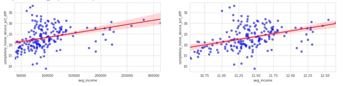
We then calculated the correlation between the average household income and the percentage of people staying at home with regards to the baseline. Selecting the week starting May 10th and using a log scale for the average income we can see that the increase of people staying at home is larger in those areas that have a higher income.
This again shows us that COVID-19 is not affecting everyone equally with demographics in this example playing a key role.
fig  axs = plt.subplots(1  2  figsize=(18  4))
sns.regplot(x=‘avg_income’  y=‘completely_home_device_pct_diff’
           data=enriched_df_agg[enriched_df_agg[‘date_str’] == ‘2020-05-10’]
           scatter_kws={‘color’:‘blue’  ‘alpha’:0.6}  line_kws={‘color’:‘red’}  ax=axs[0])
sns.regplot(x=np.log(enriched_df_agg.loc[enriched_df_agg[‘date_str’] == ‘2020-05-10’  ‘avg_income’])
           y=enriched_df_agg.loc[enriched_df_agg[‘date_str’] == ‘2020-05-10’  ‘completely_home_device_pct_diff’]
           scatter_kws={‘color’:‘blue’  ‘alpha’:0.6}  line_kws={‘color’:‘red’}  ax=axs[1])
Get Started
To try out this or other analysis for yourself there are a number of actions you can take:
- Sign up for a free account
- Watch the full webinar
- Request a demo from one of our experts
- Explore the data sets available in our Data Observatory
- Continue your learning in our Help Center
Want to see this analysis in action?
 | This project has received funding from the European Union's Horizon 2020 research and innovation programme under grant agreement No 960401. |