Cost of Living Crisis: Location Intelligence for Energy Efficiency


Read any news website in 2022 and there’s one phrase you can’t escape; the “cost of living crisis.” In the UK living costs have been rising at their fastest rate in 30 years driven by the rising costs of energy and fuel amongst other things. The energy price cap - which UK energy regulator Ofgem sets as the maximum amount energy companies can bill households for their energy supplies - has been increased by £708 (54%) in April 2022 and is set to rise by another £800 in October. This is a trend being felt globally.
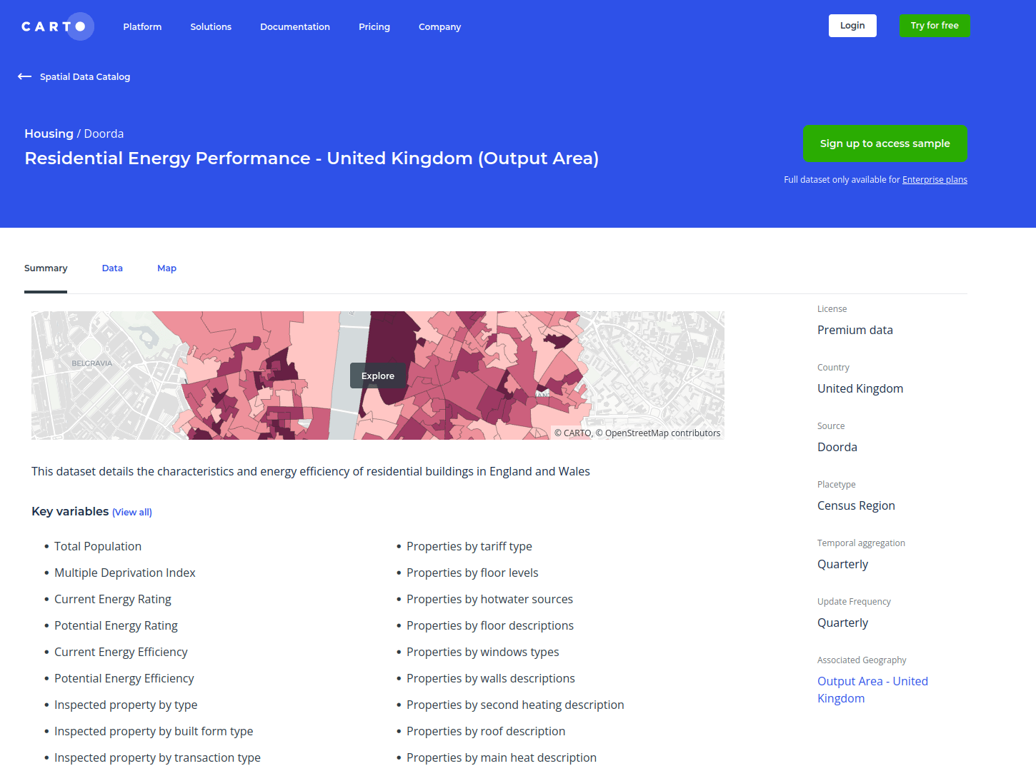
Improved availability and analytics of energy data will be one of the most powerful tools to help the most vulnerable through this crisis to say nothing of the role of energy consumption in sustainability. CARTO’s data partner Doorda has recently shared the “Residential Energy Performance” dataset which provides data on energy consumption efficiency costs and CO2 emissions - all linked to demographic insights.
Keep reading to learn more and see this powerful dataset in action!

About Doorda
Doorda is a data provider which provides business-ready GDPR-compliant on-demand location data. With a focus on the United Kingdom their data spans categories such as crime housing demographics and residential as well as commercial real estate. CARTO currently hosts twelve of Doorda’s expansive datasets on our Data Observatory and today we’re here to talk to you about their most recent addition - Residential Energy Performance!
Behind the Data
A key source for this dataset is Energy Performance Certificates (EPCs) which - if you’re a UK resident who’s moved house in the last few years - you may be familiar with. EPCs rate building energy efficiency from A (very efficient) to G (very inefficient) telling you how expensive your heating and lighting costs are likely to be as well as likely carbon dioxide emissions. They also contain guidance on how a building’s score can be improved. The Residential Energy Performance dataset is based on EPCs issued for domestic and commercial buildings constructed sold or let since 2008.
Doorda has aggregated the EPC-derived data to output areas; the smallest UK administrative geography which typically contain around 40 households and 100 residents. This has been combined with two other demographic data sources. The first of these is Output Area Classification which classifies areas into groups which share similar characteristics such as “Comfortable Cosmopolitan'' and “Urban Professionals and Families.” The second is the Index of Multiple Deprivation which scores areas across the UK by how relatively deprived they are across seven domains including income and health.
The combination of these elements is an extremely granular dataset with 169 individual variables allowing analysts of the Residential Energy Performance dataset to gain location-based insights which are both detailed and holistic. Explore this data in our Spatial Data Catalog!
Residential Energy Performance Data in Action
.webp)
With 169 variables the potential uses for this dataset are enormous. We’ll explore just a couple today to help spark some ideas! We’ll focus on Liverpool - a city district in northern England with the highest number of zones which fall in the 10% most deprived in the country - as well as its neighboring district Knowsley.
Where Does Energy Performance Have the Greatest Potential to be Improved?
As mentioned earlier every property is rated from A to G depending on the actual and potential energy efficiency of their house. A more efficient (higher scoring with a rating nearer A) home should have lower energy bills and lower carbon emissions. The map below (explore the interactive version here) shows the difference between the average and potential energy scores in each area. Yellow areas have little difference between the two ratings and red the most potential for improvement.
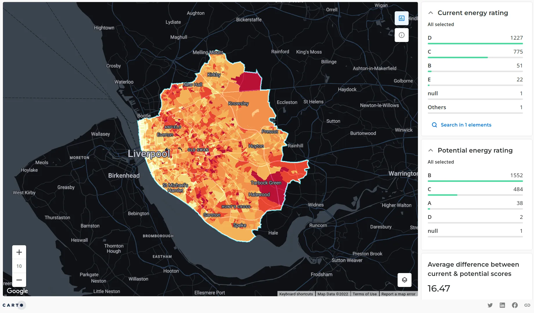
We can see that there aren’t really any sweeping geographic trends we can take away from this map. While there are many areas with a large potential for improvement down the center of the study area to the outskirts of Liverpool this is not a uniform trend and these areas are interspersed with some areas with lower potential for improvement.
Want to make this map? Adapt the code below to do this (you’ll need to be subscribed to the Retail Energy Performance dataset).
SELECT
 do_geo.geom
 do_data.geoid
 do_data.lsoa_description
 do_data.avg_oa_potential_energy_efficiency
 do_data.avg_oa_current_energy_rating
 do_data.avg_oa_potential_energy_rating
 do_data.avg_oa_current_energy_efficiency
 do_data.avg_oa_potential_energy_efficiency-do_data.avg_oa_current_energy_efficiency AS difference /*Calculate this difference between current and potential energy efficiency*/
FROM
`carto-data.ac_lqe3zwgu.sub_doorda_housing_residentialenergyperformance_gbr_outputarea_v1_quarterly_v1` do_data /*Load the data table  replacing the “ac_…” with your connection details  found in the data explorer*/
INNER JOIN
 `carto-data.ac_lqe3zwgu.sub_doorda_geography_gbr_outputarea_v1` do_geo /*Join this to the geometry table (output areas)  replacing the “ac_…” with your connection details  found in the data explorer*/
ON
 do_geo.geoid = do_data.geoid
WHERE
 do_data.lsoa_description LIKE '%Liverpool%'
 OR do_data.lsoa_description LIKE '%Knowsley%' /*Replace these with the local authority names of interest*/
Where Should Certain Building Improvements be Targeted?
Let’s say you were a government body or partner planning on rolling out a scheme to provide support to households wishing to improve their building’s energy efficiency. To establish the greatest “return on investment ” you’d want to know not only where the greatest potential for improvement is but what improvements are needed in certain areas. Let’s look at two specific areas which could improve a home’s energy efficiency:
- Potential to upgrade from single-glazed windows.
- Potential to insulate cavity walls.
We’ll use a spatial statistic called Getis-Ord to work out where high values of these three variables (all of which can be found in the Residential Energy Performance dataset) are clustering. CARTO has developed a multi-variate tool for assessing where high values across multiple variables are clustering which we can use to identify target areas for key improvements. The tool is called Commercial Hotspots but it’s in no way limited to commercial applications.
Before running this we first need to convert the data into a continuous regular spatial index. Using spatial indexes in this case H3 a global hexagonal system is a fantastic way of speeding up data analytics and mitigating bias found in administrative geographies like output areas (read more about using hexagons here). To do this we created a resolution-10 H3 grid (with a hexagon side-length of approximately 60 meters). We then used CARTO’s Data Enrichment tools to quickly aggregate the REP data to each cell based on the area of each output area that falls within each hexagon cell.
Once aggregated to H3 we can run our hotspot analysis! The simple bit of code below achieves this assigning a GI (Getis-Ord) value to each cell with higher values indicating the likely presence of a hotspot.
CALL
 `carto-un`.carto.COMMERCIAL_HOTSPOTS(
   /*Input table*/ 'cartodb-gcp-marketing-team.EU_pilots.doo_livh3_rep'
   /*Output table*/'cartodb-gcp-marketing-team.EU_pilots.doo_livh3_singleglaze'
   /*Cell index column*/'h3id' /*Index type*/'h3'
   /*Variables to analyze*/['efficiency_diff' 'n_oa_windows_description_single_glazing_sum']
   /*Weighting for each variable*/[0.5 0.5]
   /*Search distance*/3
   /*Significance threshold*/0.01 )
Repeating this process for the cavity wall variable (n_oa_walls_description_cavity_wall_sum) allows us to compare the patterns of the two potential improvements.
Click here to open the map in a new window.
Blue peaks are combined hotspots for areas with the greatest potential for energy efficiency improvements as well as with the highest number of single-glazed homes with pink areas being hotspots for homes with cavity walls.
There are many areas with strong opportunities to improve both glazing and wall insulation such as Cronton Haywood and Knowsley to the east of the study area. The highest potential for both types of improvement can be found in Central and Inner Liverpool with the potential for wall insulation peaking around the Docks and improved glazing peaking slightly to the east around the Knowledge and Georgian Quarters. While these are some of the areas with lower overall potential for improvement the high number of homes in these densely populated areas means that the market is larger overall.
So we know where would be good locations to target for cavity wall and glazing upgrades - now what happens? Well if I was a contractor offering those services I’d be thinking about increasing my marketing activities in these areas. If I was in real estate I could be planning how to improve the value of properties in certain areas. If I were involved in planning schemes to help residents improve their energy efficiency I’d know where to target. I’d maybe even be incorporating elements such as deprivation and number of elderly residents into my analysis to make sure any programmes help the most vulnerable in society.
Understanding Residential Energy Usage with CARTO & Doorda
With the cost of living crisis - not to mention sustainability and climate change - there has never been a more crucial time for us to be thinking about household energy performance. We hope that the release of this dataset from Doorda will further empower CARTO users to take their socio-demographic and sustainability analytics to the next level.
Want to learn more? Attend our "Understanding Residential Energy Usage with CARTO & Doorda" webinar on Thursday July 7 at 11am EST/ 5pm CET.
This work has been made possible through the European Union’s Horizon 2020 programme. Follow our blog over the coming weeks to find out more about how CARTO has been working with this programme to democratize access to Spatial Data Science with the next generation of our spatial data platform.
Ready to Start Your Spatial Data Science Journey?
Ready to get started with CARTO? Sign up to our free two-week trial to explore our Data Observatory and try your hand at cloud-based Location Intelligence.