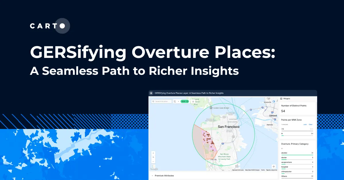
Vision Zero in the New Era of Location Data Streams


Vision Zero a popular initiative aiming to eliminate traffic fatalities and injuries emphasizes the need for more traffic data analysis. In understanding past mobility and movement patterns cities and municipalities can better predict and prevent future accidents. As increased urbanization drives the need for more of these studies let's take a look at working with location data streams to measure monitor and manage traffic and mobility safely.
Traffic impact studies typically examine volume patterns and peak hours distribution of trips and travel mode often using manual and analog methods for data collection. However this approach results in high costs lost time and more often than not studies that cannot be replicated or scaled.
As a cost-effective scalable alternative our Vision Zero inspired analysis works with four types of location data to estimate the impact a hypothetical car ban along a busy street segment would have on local residents and businesses in Cambridge Massachusetts. For this scenario our three objectives will be to:
- Find a time for our car ban that would have greatest impact on reducing traffic accidents
- Identify drivers and pedestrians whose travel would most likely be disrupted during a car ban
- Estimate commercial activity generated from a car ban and what type of businesses would benefit most
Although our goal is answering these specific questions the step-by-step workflow below can be replicated when working with location data in other situations.
Starting with open municipal data
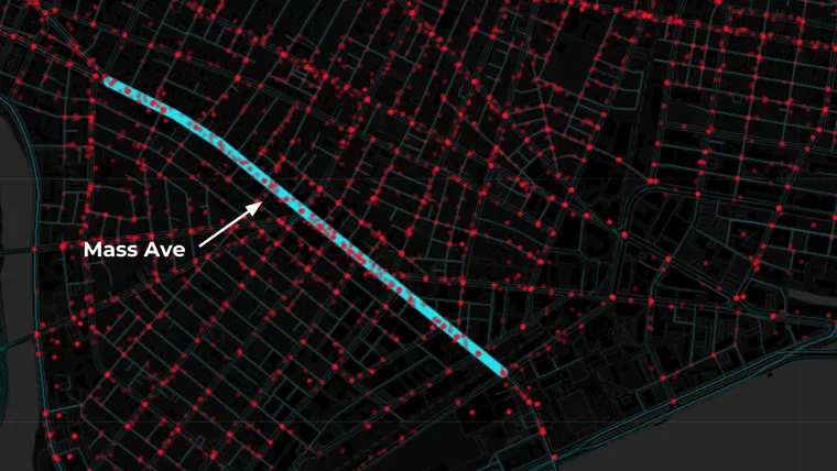
For this scenario we're proposing a two-hour car ban running between MIT and Harvard Square one of the busiest street segments along Mass Ave. and quite possibly in all of Cambridge. First to understand traffic fatalities in this area we'll look at traffic accident data from 2010 to 2015 provided by the Cambridge Police Department.
In working with this data our goal is to identify (1) the day of the week with the highest traffic accident count and (2) the time of day that has the highest traffic accident count.
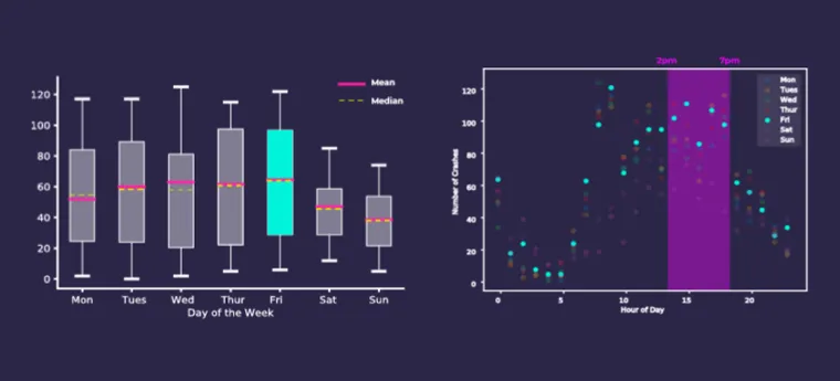
We can see in the charts above that Fridays from 2pm to 7pm on Mass Ave. see the most traffic accidents which allows us to conclude that a car ban during this time would have the greatest potential impact on reducing the number of traffic accidents.
When and where to add mobile data
Next to identify who the ban will impact we're using foot traffic derived from anonymized GPS mobile data which as the chart below displays is quite representative of our population.
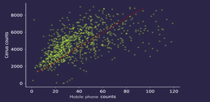
While datasets in the Data Observatory are calibrated with more advanced techniques to reduce bias and noise here the linear relationship found from comparing mobile device counts with census counts confirms our assumption.
An advantage when working with foot traffic data is the added dimensions it introduces to standard traffic impact reports. Instead of just building counts on where people are located mobile data can be viewed from several perspectives and altitudes allowing us to create counts based on (1) travel mode (2) socio-demographic profile and (3) travel time trip patterns.
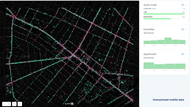
Our traffic impact study categorized travel modes by car pedestrian and stay. This final group stay will be discussed later on and the map above shows our first two groups with green points representing vehicular travel and pink points representing pedestrian travel.
We extracted travel modes based on:
- Travel speed
- Temporal patterns from mobile timestamps
While some mobility patterns related to hour of day and day of the month are discernible this pre-aggregated mobile data doesn’t give us much insight on trip volume counts along Mass Ave.
Aggregating point data to road segment lines on and around Mass Ave. yields more meaningful insights as the animations below display. The varying length and thickness of the line segments corresponds to the number of vehicle and pedestrian trips occurring each hour for four consecutive Fridays in February 2018 between 2pm to 7pm.
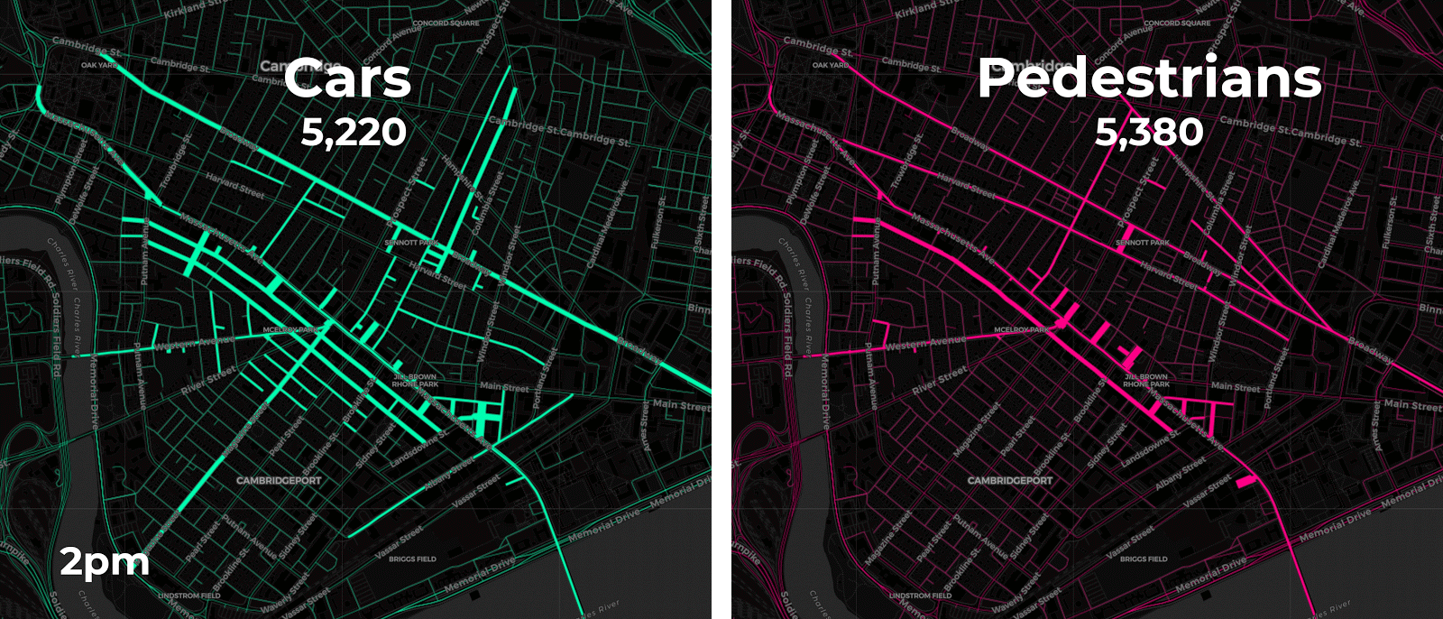
A closer look at each travel mode reveals further insights on mobility patterns.
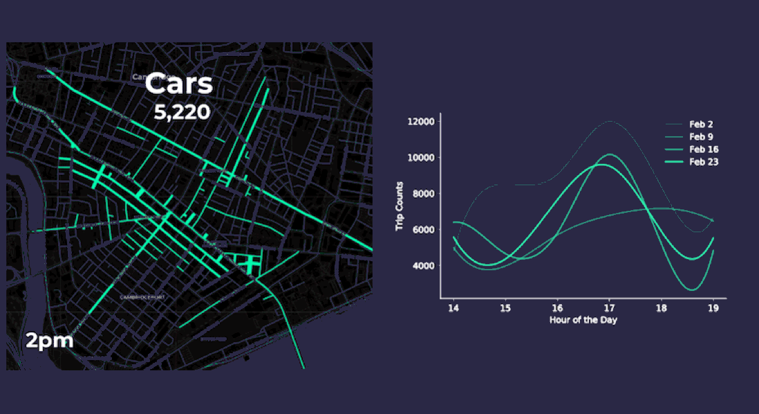
Both our animation on the left and the chart on the right approximate vehicle traffic counts across four consecutive Fridays by the hour. By aggregating the anonymized mobile point data patterns appear more clearly. For instance it seems like traffic peaks occur around 5pm when people are probably commuting home from work. Our pedestrian charts and animation show similar 5pm peak traffic as well.
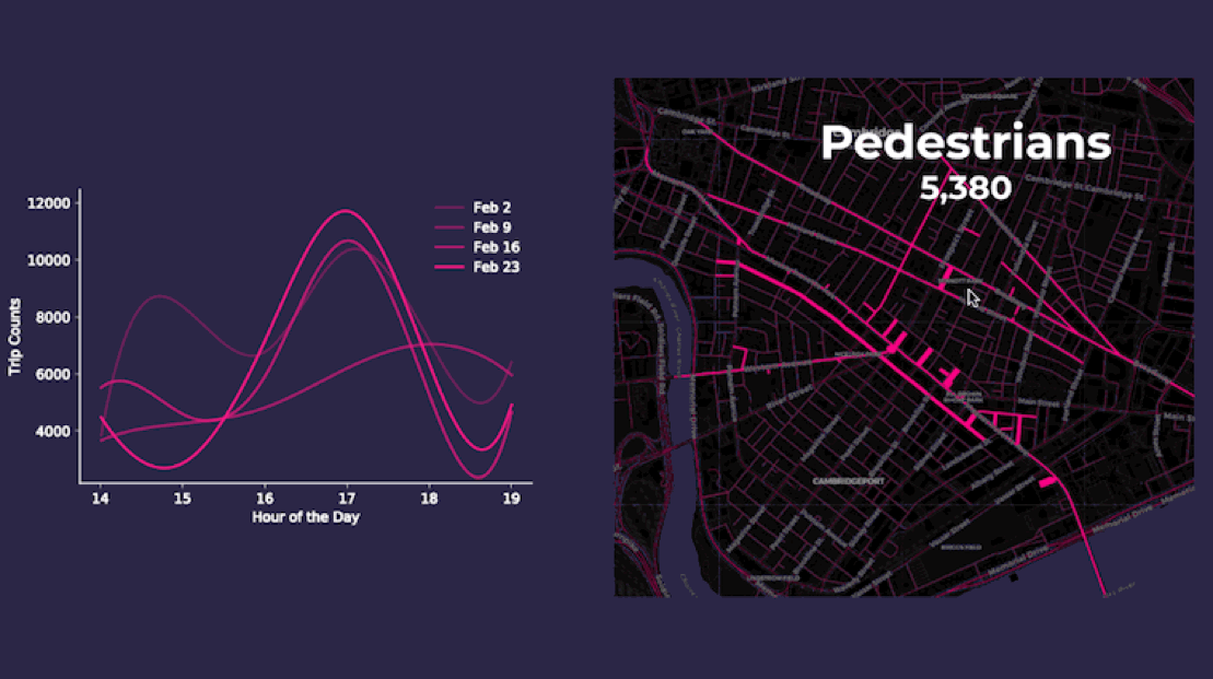
These steps produced estimations on pedestrian and vehicle trip counts along Mass Ave. providing us with the following figures:
- There are an average 7 800 pedestrian trips per hour
- There are on average 7 500 vehicle trips per hour or about 125 car trips per minute along Mass Ave
Mobile location data also helps us identify streets that would see traffic pattern changes as a result of our car ban. These larger effects can be discovered by looking at traffic along Mass Ave segments two hours before and two hours after a trip.
The animation above shows the two hours before and the two hours after a trip for approximately 15 000 trip trajectories. Every point represents someone who traveled on Mass Ave during the four consecutive Fridays in February between 2PM and 7PM. As the map radiates out from Mass Ave. (highlighted in yellow) we see the spatial distribution of our car ban’s effects across the Greater Boston area.
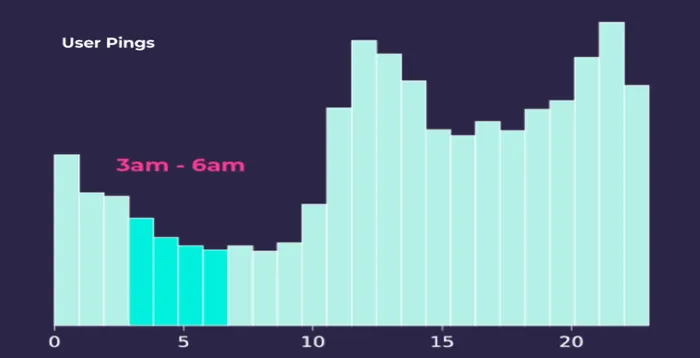
Since this data provides 24 hour insights on mobility patterns we've drawn socio-demographic inferences on user locations. We don't know where these mobile users reside and for good reason. However the 24 hour distribution of user pings from mobile devices which the histogram below shows let's us detect user locations between 3AM and 6AM which we've classified as their "homes."
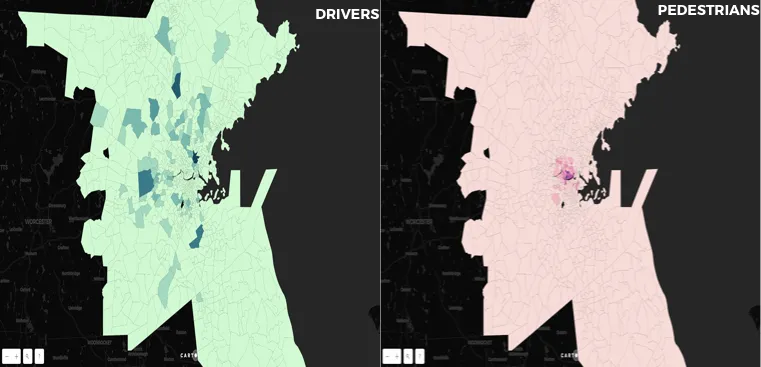
Aggregating and joining the 3AM to 6AM bucket of users to census tracts reveals that drivers on the whole are more dispersed than pedestrians who are more clustered in and around Mass Ave. It may seem obvious that pedestrians traveling along Mass Ave also tend to live on and around Mass Ave. but we actually want to confirm the obvious here.
Our next step is to refine our population segments beyond traveler type to consider what if any impact our ban would have on different groups of local residents.
Learn about changes in the mobile data market from seasoned professionals in our recent webinarWatch Today!
Hello census my old friend
We're going to segment census data using the Singleton-Spielman algorithm a popular clustering procedure for segmenting census categories into more robust multi-dimensional groups. We’ve bundled socio-economic and demographic similarities together in the three-dimensional graph below but notice when we placed them on a map the clusters correspond to various regions across the greater Boston area.
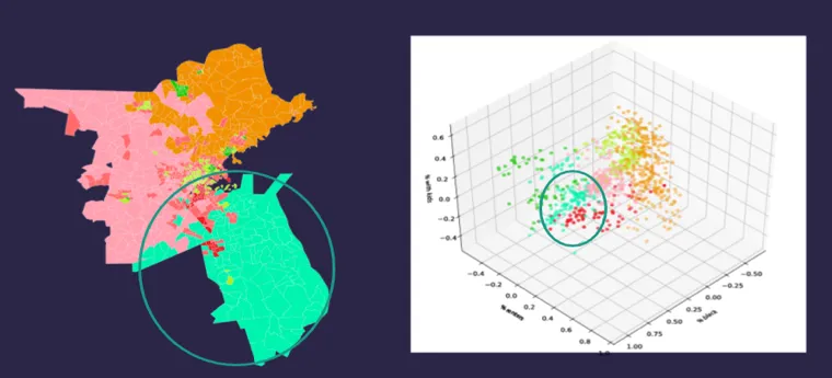
These clusters represent more descriptive groupings than individual categories provided by census data alone. In addition this method yields a smaller margin of error in each census estimate than if we hadn’t grouped them.
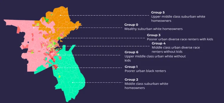
Mass Ave. drivers and pedestrians were bucketed into seven different groups. Some groups like group 0 “wealthy white suburban homeowners ” are obvious but again confirming intuitions and common sense understandings is an important part of the analysis. Similarly group 4 “middle class urban renters ” seems like a recognizable group of people of various races without children. And it follows that most of our pedestrian population would fall into group 4 while drivers primarily belong to group 0.
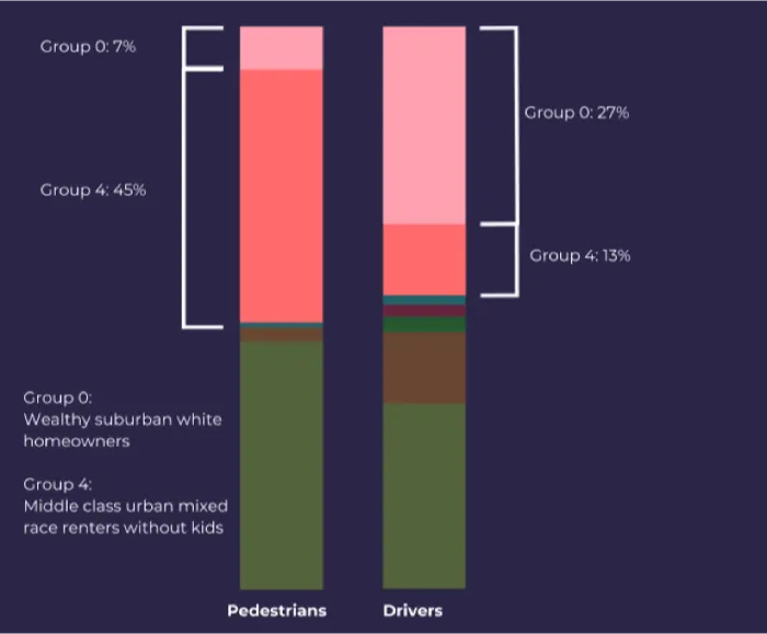
It appears the car ban would have a differential impact on drivers and pedestrians frequenting Mass Ave. Will disruptions to vehicle traffic be felt among businesses along Mass Ave.? And if so by how much?
Quantify spend and mobility patterns
Whereas foot traffic data told us how people access Mass Ave. insights from transaction data help us understand what people are doing once they’ve arrived. It's no coincidence that a large portion of our descriptive capabilities refer to people's movement patterns and spending habits.
The map below shows the locations of Boston area business venues (in white) that we’ve clustered to find commercial micro-regions using Mastercard spend scores.
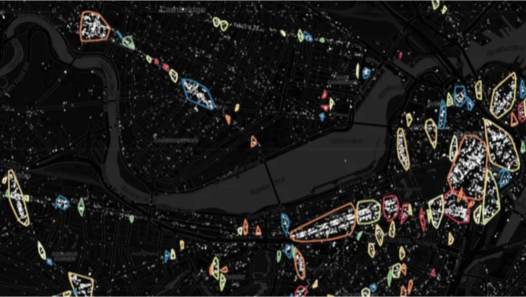
Mastercard Retail Location Insights enables the categorization of business venues by industry and then calculates each industry's market share per cluster. The graphs below present our findings:
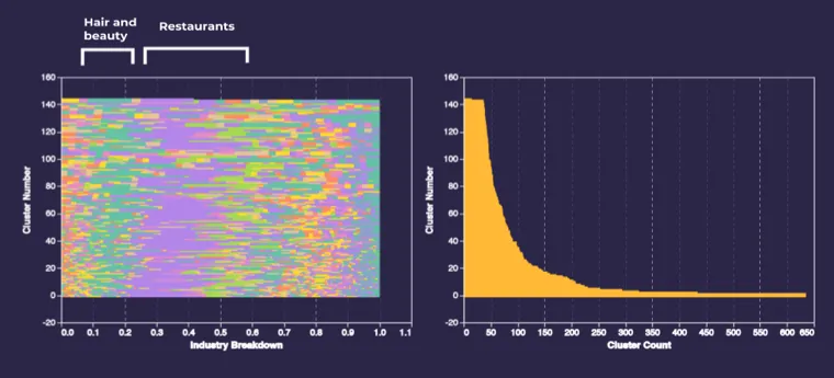
We can see that across clusters of all sizes restaurant and food venues (purple) generally make up about 25% of the cluster. Another pattern involves hair and beauty salons which make up a larger portion of the cluster industry mix when we have increasingly smaller clusters.
The image below shows the number of venues in each cluster represented with proportionally sized circle charts that show the industry mix as well.
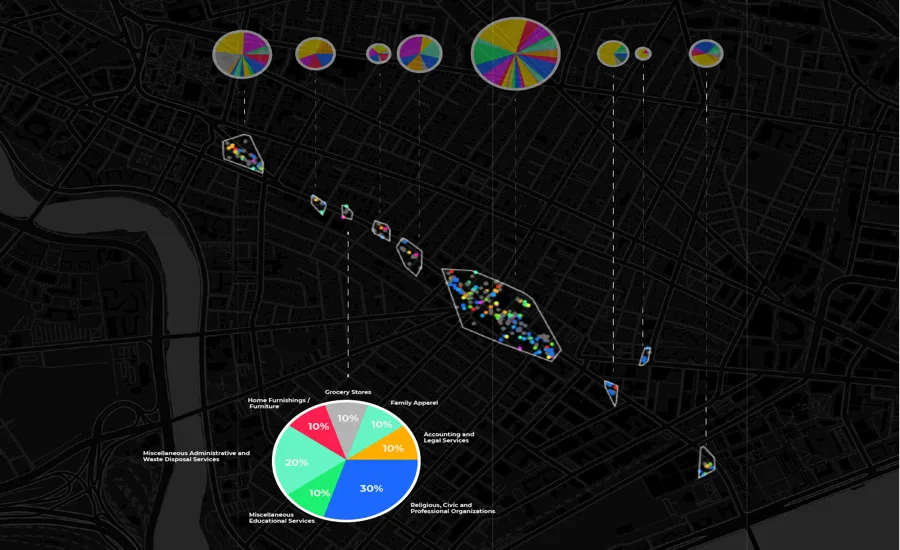
Since the car ban would eliminate driver visits we want to identify micro-regions that pedestrians are most likely to visit as well as the likely lift in store visits that venues can expect to see.
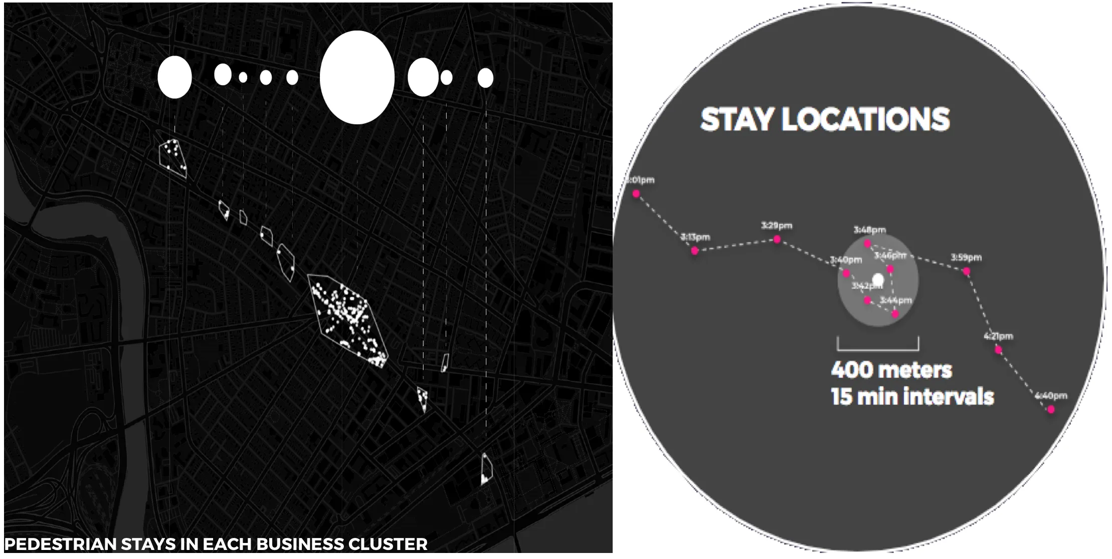
Proportional circles in the image above correspond to each business cluster and its number of “stays ” the third travel mode category mentioned earlier. We've defined “stay locations” based on distance and time thresholds where user pings falling within both thresholds are (1) grouped together and (2) represented as a stay location based on the centroid of the cluster geometry.
We can start teasing out some relations between the number of business venues in a cluster and the number of foot traffic visits a cluster receives. Our final step will be to quantify this relationship by establishing a visits multiplier. The logarithmic scale below displays a linear relation between the number of venues and the number of visits a cluster receives at about 36 venues.
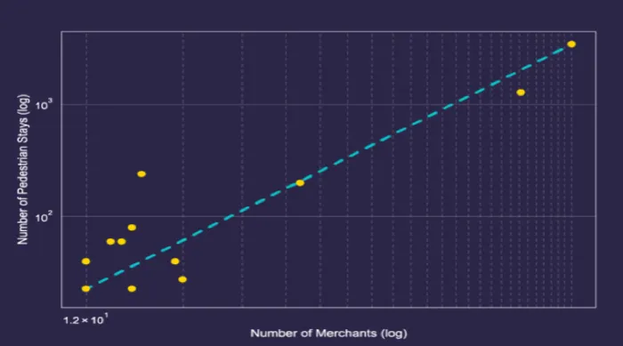
Dividing the number of visits (100) by the number of venues (36) we end up with a visit multiplier of 2.7 visits per venue which provides an estimate on lift in store traffic per venue.
The visit multiplier establishes a measure for comparing differences. Whether it’s the number of venues in a cluster and foot traffic a cluster receives or comparing lift in store visits and potential revenue we're now able to quantify the added benefits our car ban would have on the local community in and around Mass Ave.
New solutions to old problems
This traffic impact analysis is only a starting point and would requires further analysis in reality. At the same time in a matter of days and without traveling to Mass Ave. we created a traffic analysis featuring new dimensions and counts not found in standard studies and reports. And in finding these new dimensions counts and methods with location data we can start finding new solutions to old problems like traffic accidents.