Driving Decisions with Spatial Analysis: Vacation Rentals


The vacation rental industry enjoyed a huge post-pandemic boom in demand and revenues. More recently, in a landscape of reportedly falling revenues and growing competition, it has also never been so important to properly understand the opportunities. Quite often, the fundamental question is the ‘where’: a data-driven strategy to investment and operation positions you for the greatest return on investment.
An introduction to vacation rental data
Transparent shares the most comprehensive and granular short-term rental database in the industry and, through public and proprietary data, can build unparalleled visibility of various supply and demand trends. RevPAR (revenue generated per room) in given zip codes, who is visiting, what the competitive landscape looks like, ratings, how prices or occupancy are trending - to name a few - can guide your decision-making and fuel improved returns. When combined with geospatial analysis, this data tells a whole new story.
Let’s check out an example! We’ve analyzed vacation rental supply data, identifying patterns behind that all-important ‘where’ question.
Vacation rental data in action
We’re going to be examining what might be influencing spatial patterns in vacation rental properties across the Hovedstaden region of Denmark, which are the blue points on the map below (open in full screen here).
So now we know where the vacation rentals are, wouldn’t it be interesting to know why they’re there?
Relationships between land use and vacation rentals
You can use the map below to explore the relationship between the number of vacation rentals and:
- The number of hospitality locations such as bars, restaurants and cafes
- The number of tourist attractions such as museums, art galleries and viewpoints
- The proximity to rail stations
Pink areas indicate a positive relationship between the vacation rentals and the indicator (i.e. there is either a high number of - or short distance to - both). Green areas indicate a negative relationship, and white areas - or areas with no data - indicate that there is no statistically significant relationship between the variables.
Open in full screen here.
You can click on individual “cells” on the map to see the data behind this and toggle between the layers in the legend.
Spatial relationship analysis can play a key role in decision-making across a range of industries, including:
- Real Estate Investment: identify lucrative investment opportunities by focusing on areas with high demand and low competition - find out more here.
- Tourism Industry Planning: tourism organizations, travel agencies, and hospitality businesses can use this intelligence to develop targeted marketing strategies for vacation rental hotspots.
- Pricing Strategies: understand the market dynamics and adjust their pricing accordingly to maximize profitability.
- Urban Planning and Development: Understand the visitor population of an area to drive decisions regarding zoning regulations and infrastructure development.
- Business Expansion: Businesses can target locations with high short-term rental activity to capture the attention of tourists and visitors.
Want to recreate this analysis? Keep reading to find out how!
Technical note
Before we get started, you’ll need a CARTO account to recreate this analysis - sign up for a free 14-day trial if you don’t already have one!
Step 1: Access the data
There are two types of data you’ll need to recreate this analysis.
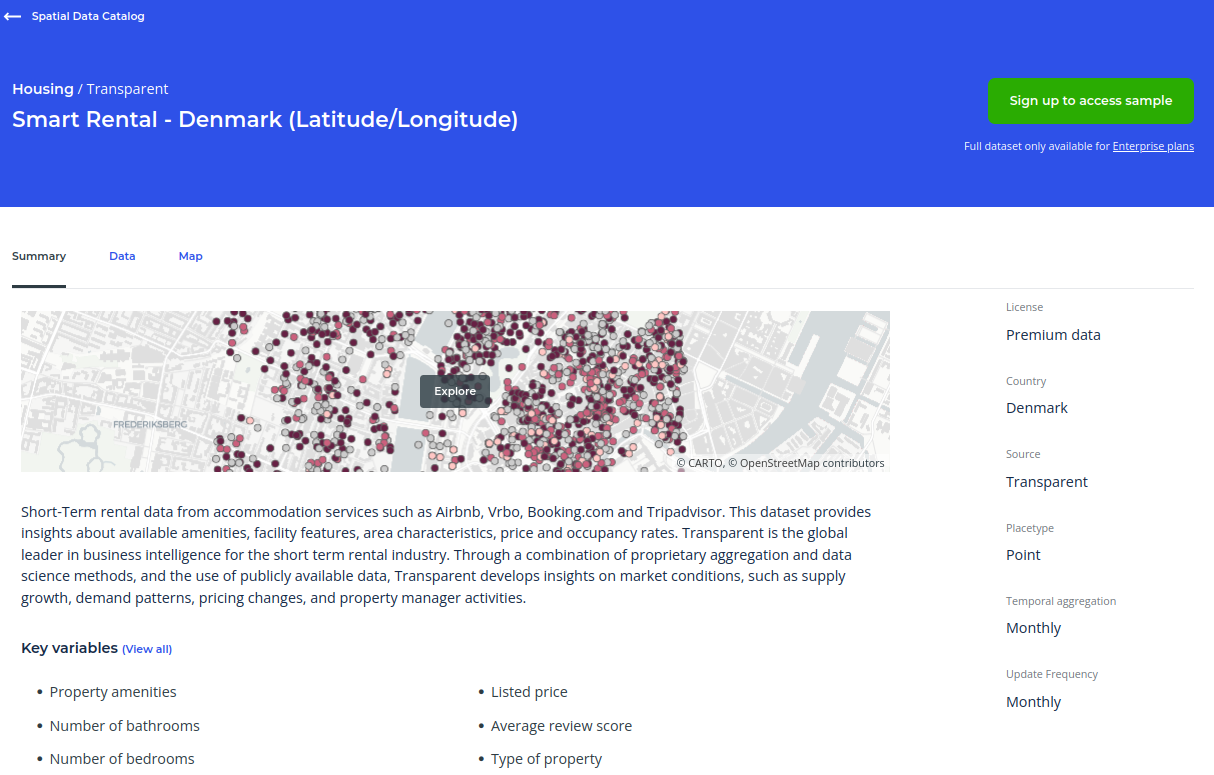
Firstly, you’ll need the vacation rental properties data from Transparent. You can request a subscription of this data for any country in the world from our Spatial Data Catalog; in this case, we’re looking at Denmark.
Secondly, you’ll need the locations of the facilities we are investigating; for us that’s hospitality locations, tourist attractions and stations. We used OpenStreetMap in this instance, but you can use any POI (Point of Interest) dataset that contains the information you need.
OpenStreetMap (OSM) data can be easily accessed via the Google BigQuery Public Marketplace with a simple snippet of Spatial SQL. The example query below extracts all OSM amenities as points where they extract with a defined area of interest (“aoi”), which in our case is the Hovedstaden region from the Natural Earth provinces table (access here). You can read our full guide to accessing OpenStreetMap data from Google BigQuery here.
WITH aoi as (SELECT geom FROM carto.ac_xxxxxxxx.sub_natural_earth_geography_glo_admin1statesprovinces_410` where name = 'Hovedstaden'),
osm AS (SELECT
(SELECT osm_id) osmid,
(SELECT ST_CENTROID(geometry)) AS geometry,
(SELECT value
       FROM   unnest(all_tags)
       WHERE  KEY = “amenity”) AS amenity,
(SELECT value
        FROM   unnest(all_tags)
        WHERE  KEY = “name”) AS name
FROM   bigquery-public-data.geo_openstreetmap.planet_features)
SELECT osm.* FROM osm, aoi
WHERE ST_INTERSECTS(aoi.geom, osm.geom)
AND osm.amenity IS NOT NULL
Once extracted, save the table(s) in your data warehouse (or use the CARTO Data Warehouse if you don’t have your own). Explore all of these inputs in the map below (or open in full screen).
Step 2: Convert to a grid
To analyze the relationships between vacation rental count and input variables, we need to aggregate them to a lightweight global grid system called H3, which is a type of Spatial Index. Learn more about H3 and spatial indexes in our ebook “Spatial Indexes 101."
We need to perform this aggregation in two ways; count and proximity. Let’s start with count.
Step 2.1: Count-based aggregation
In the CARTO workspace, go to Workflows and create a new workflow. This tool enables code-free multi-stage analysis. Use the connection with access to the OpenStreetMap data saved in step 1.
You only need two components to convert your data to a count-based Spatial Index.
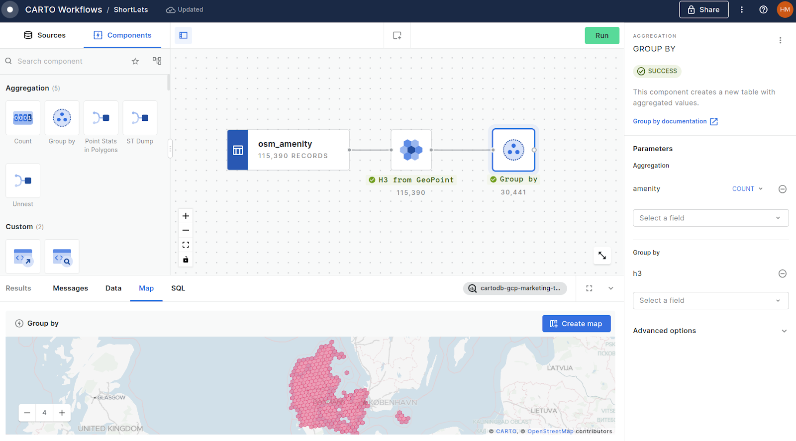
- Connect your OSM layer (here we’re looking at amenities) to a H3 from GeoPoint component, to create a H3 cell for each of the ~115k input points - we’ve used a resolution of 9. Run your workflow (note you can do this at any stage of this process).
- This will create some duplicate H3 cells where multiple amenities fall inside that cell - we can use this duplication to count our inputs. Connect H3 from Geopoint to a Group by component, setting the aggregation parameter to amenity - count (this can be any column from your input table) and the Group by field to H3.
This step should then be repeated for tourist attractions, and the vacation rentals themselves.
Step 2.2: Proximity-based aggregation
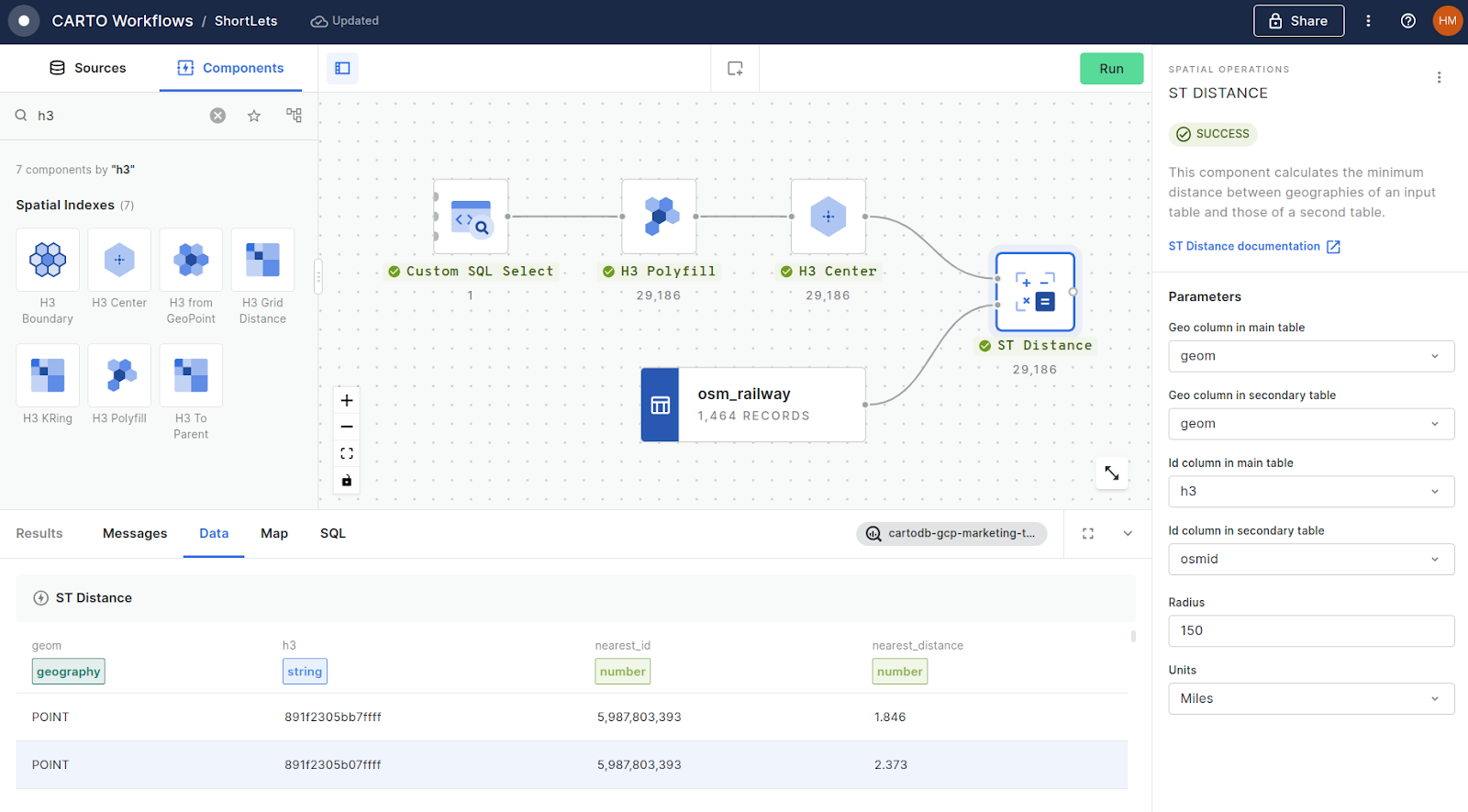
- Drag a Custom SQL Select component onto the canvas, and use this to define a study area with any polygon; we’ve used a filtered Natural Earth provinces table. As this data is heavily simplified, we’ve used the SQL functions ST_BUFFER and ST_UNION_AGG functions to create a 1km merged buffer for complete coverage. See the code below:
SELECT st_union_agg(st_buffer(geom,1000)) FROM carto.ac_xxxxxxxx.sub_natural_earth_geography_glo_admin1statesprovinces_410` where name = ‘Hovedstaden’
-
Connect this to a H3 Polyfill component; make sure to set the resolution to the same as the H3 from Geopoint component in step 2.1.
-
Next, drag your station table (or the table of whichever facility you are measuring a distance from) onto the canvas.
-
To perform a distance calulcation, we need to convert the H3_Polyfill results into a geometry - we’ll use H3 Center for this.
-
Now, drag an ST DISTANCE component onto the canvas. Connect the output from H3 Center to the top-left input, and stations to the bottom-left input. This will calculate the distance from the center of each cell center-point to the nearest station. The default search distance here is 0 - you’ll want to change that to ensure you cover your entire search area; we changed ours to 150 miles.
- Drag an ST DISTANCE component onto the canvas. Connect H3 Center to the top-left input and stations to the bottom-left input. Set the search distance to cover your entire area (we’ve used 150 miles). This will calculate the distance from each cell center-point to the nearest station.
Step 2.3: Joining the tables
Finally, you’ll want to tie all of that together into one single H3 table.
To ensure we retain all cells across our study area, we’ll need to perform a LEFT JOIN in a Custom SQL Select component. These allow for a maximum of three inputs which are given the alias’ $a, $b & $c, depending on the order of input. As we are joining four tables, we’ll need to repeat this step.
See below for how this all fits together, along with the custom SQL code to adapt to your use case!
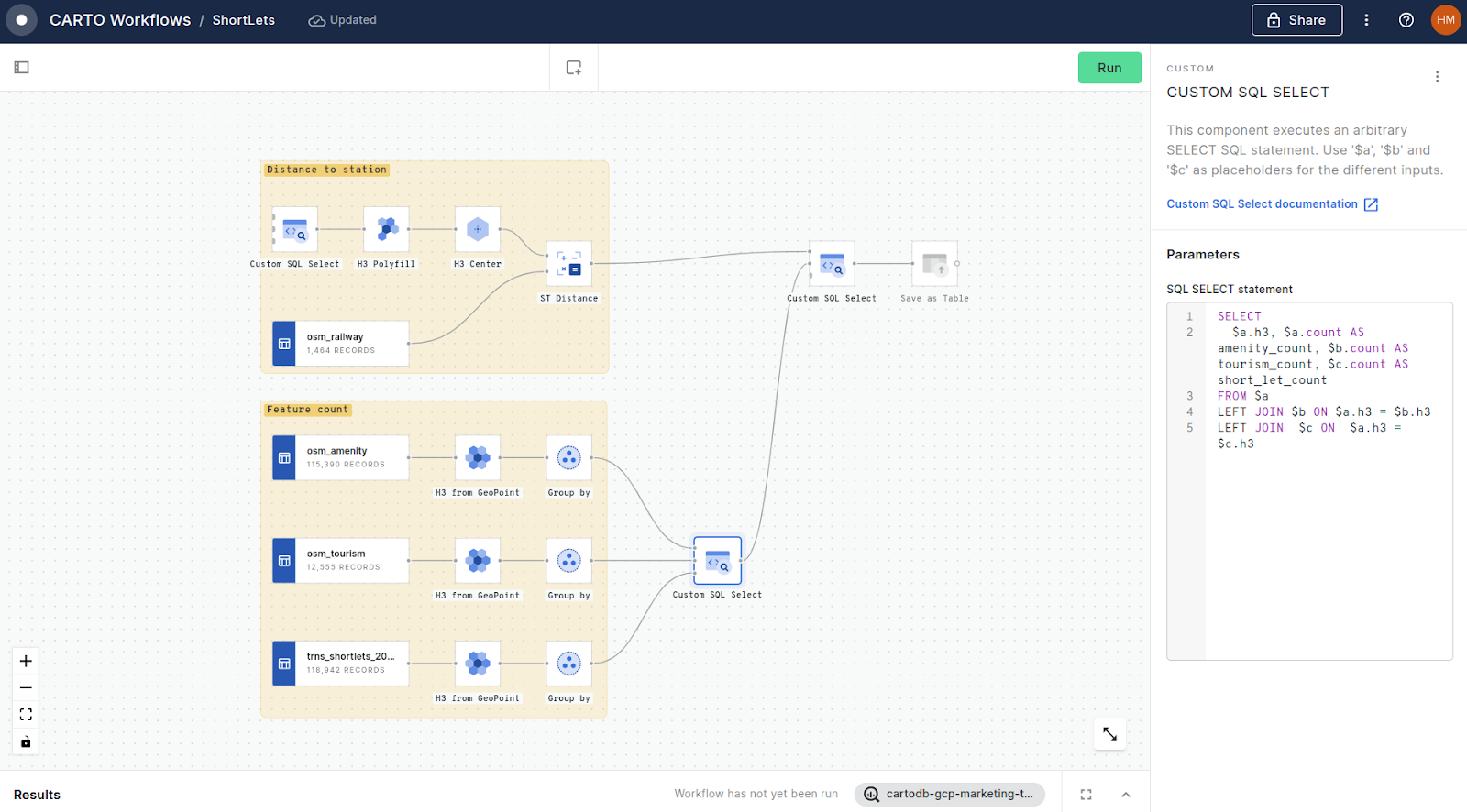
SELECT
 $a.h3, $a.count AS amenity_count, $b.count AS tourism_count, $c.count AS short_let_count
FROM $a
LEFT JOIN $b ON $a.h3 = $b.h3
LEFT JOIN  $c ON  $a.h3 = $c.h3
Finally, add a Save as Table component to save the output - now we’re ready to start investigating those relationships!
Step 3: Running Geographically Weighted Regression
To examine localized relationships between variables, we’ll be running Geographically Weighted Regression (GWR). GWR quantifies the spatial strength of relationships between a target and correlation variables.
How does GWR work?
GWR performs local least squares regression on each input cell using a user-defined neighborhood. Neighboring cells further from the origin cell are assigned lower weights based on a user-defined kernel. The analysis produces coefficient variables for each cell, with positive values indicating a positive relationship, negative values indicating a negative relationship, and 0 indicating no relationship.
Check out our full guide to this process in our full guide 👇

Running GWR
.webp)
You can run this using the GWR Grid function in the statistics module in our Analytics Toolbox. This module also contains a range of other spatial data science tools, such as interpolation & hotspot tools - so definitely check it out!
The code for running this is below - you can either run this in your cloud’s console, or in Workflows using a Call Procedure component. You can read a full explanation of this code in the documentation.
CALL `carto-un`.carto.GWR_GRID(
 'yourproject.yourdataset.h3_enriched',-- [input table]
 ['amenity_count', 'tourism_count','station_distance'], -- [predictor variables]
 'shortlets_count', -- [target variables]
 'h3', 'h3', 3, 'triangular', TRUE,-- [index id, index type, kernel,]
 'yourproject.yourdataset.h3_gwr'
);
The time this will take to run will depend on the number of predictor variables and H3 cells - ours only took a few seconds to run against three predictor variables on 33,834 input cells.
Now you’re ready to see the results!
Mapping GWR
- Load the resulting table into CARTO Builder.
- Select the layer and turn the stroke color off.
- Select Fill color > More options and select Color based on… and choose one of your coefficient variables.
- We recommend using a divergent color scheme, where a negative coefficient is depicted in one color, moving through a neutral color for no relationship, and then turning into another color for a positive coefficient.
- Make sure you change the color bands to custom, and manually adjust the bars so the neutral color (normally white, grey or yellow) is centered on 0. You could also query the table (under sources) to filter out any low coefficient values, e.g. > =0.01 and < 0.01.
The analysis generates cell-specific coefficient variables, with positive values indicating a positive relationship, negative values indicating a negative relationship, and 0 indicating no relationship.
Open in full screen here.
It should look a little something like the below! Repeat this for as many predictor variables you have, and make sure you head to the Legend Options and enable Layer selector so users can toggle between them.
💡#protip: query the table and join it to the source table that we created in step 2.3 - and then enable relevant fields in the Interactions panel. This will help users understand what’s driving the results of this analysis.
Finally, select Share at the top right of the map, and choose the appropriate sharing level (private, organization only, public with/without password protection). Keep learning with our quick-start mapping guide here!
Now you’re ready for your users to start using your analysis to drive decisions!
🌐 🌐 🌐
Conclusion
Understanding the spatial trends and relationships in vacation rentals is crucial for making data-driven decisions in the industry, helping you to optimize your investments and stay ahead of the competition.
Ready to try this yourself? Sign up for a free 14-day trial of CARTO to explore spatial analysis, conduct your own research, and uncover valuable insights that can drive your vacation rental strategies.