Spatial Scoring: Measuring Merchant Attractiveness & Performance


In the Consumer Packaged Goods (CPG) industry, understanding merchant attractiveness and performance is a crucial aspect of achieving success. However, this can be challenging due to the interplay of factors which can be used to define these concepts, such as potential brand revenue, available market size and consumer footfall.
To combat this, data-driven businesses are using spatial scores as a powerful tool to assess and prioritize merchant points of sale.
In this post, we will guide you through a step-by-step process to use spatial scoring for Merchant Prioritization Analysis. We'll demonstrate how to create spatial scores to measure both merchant attractiveness and performance using our Analytics Toolbox for Google BigQuery.
Spatial Scoring: what is it and how does it work?
Spatial scores provide a unified measure that combines diverse data sources into a single score. This allows businesses to comprehensively and holistically evaluate a merchant's potential in different locations.
By consolidating variables such as footfall, demographic profiles and spend, data scientists can develop actionable strategies to optimize sales, reduce costs, and gain a competitive edge.
So, shall we check this out in action?
A step-by-step guide to Spatial Scoring
In this tutorial, we’ll be scoring potential merchants across Manhattan to determine the best locations for our product: canned iced coffee!
This tutorial has three main steps:
- Data Collection & Preparation to collate all of the relevant variables into the necessary format for the next steps.
- Calculating merchant attractiveness for selling our product. In this step, we’ll be combining variables into a meaningful score to rank which potential points of sale would be best placed to stock our product.
- Measuring merchant performance to detect if merchants are performing as expected for that location.
But first, we need to define our input data!
Step 1: Data Collection & Preparation
The first step in any analysis is data collection and preparation. For this analysis, we’ll be needing:
- Potential Points of Sale (POS). These are grocery stores and food markets across Manhattan from which we could possibly sell our iced coffee. In this example, we’re using grocery stores from our data partner SafeGraph, which is available for subscription via our Spatial Data Catalog.
- Scoring variables which will be used to score merchants on attractiveness. You could use any variables which are relevant to your use case. For our example, we’ll be using:
- Average daily footfall sourced from our data partners Unacast, with higher footfall being associated with more potentially thirsty customers!
- Population within a 10-minute walk sourced from our Spatial Features dataset, which contains a range of variables on the local population, economy and environment. As with footfall, more residents = more people to drink our coffee!
- Distance to a station - stations are hubs for both commuters and visitors, both of which are often thirsty for caffeine! We’ve sourced station locations from OpenStreetMap via the Google BigQuery Public Data Marketplace. OpenStreetMap is a crowdsourced dataset and so it should be used with caution with regards to its quality and consistency. However, it is typically accurate for a use case like this - frequently used features in a dense urban area. Check out our Ultimate guide to OpenStreetMap for tips on navigating and accessing this complex but incredibly valuable dataset!
Before moving on to scoring, let’s quickly run through how to bring all of these different elements together using CARTO Workflows.
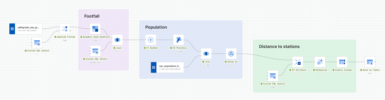
You can see from the image above that there are four main steps to this workflow - let’s look at each step individually.
- Filter grocery stores to Manhattan using a Spatial Filter.
- Join footfall data to the store locations. In its native format, Unacast footfall data is available as a Quadbin, which is a type of Spatial Index (if you aren’t sure what this is - find out in our free ebook!). To join the two together, we first convert each store to a Quadbin grid cell using Quadbin from GeoPoint. This makes for an incredibly efficient join, as this calculation is done by matching the Quadbin ID strings rather than a geometric calculation.
- Calculate the population within a 10 minute walk of each store, first by creating an 800-meter buffer, converting this to H3 (another type of Spatial Index) and then summing the population for each store’s catchment with the Group by component.
- Calculate the distance to stations with the ST Distance component. Finally, we want to invert this distance, as a low distance is ideal - and so should score highly. To do this, we normalize the distance variable that we just calculated, then create a new column with the formula “1-normalized_distance.”
So, with that complete we now have a table that includes a variable for average footfall, total population and inverted distance - and we’re ready to start our scoring!
Step 2: Calculating merchant attractiveness
In this next section, we’ll create our attractiveness scores! We’ll be using the CREATE_SPATIAL_SCORE function to do this; you can read a full breakdown of this code in our documentation here.
The really key elements of this code can be found in the Scoring parameters section, in which we define the weights for our input variables which should add up to 1, and also the number of buckets to help us characterize our results into attractiveness levels. So, shall we check out the results?
CALL `carto-un`.carto.CREATE_SPATIAL_SCORE(
   -- Select the merchant's unique identifier and the input features to be aggregated - this is the table created in step 1
   'SELECT geom_any as geom, geoid, population_sum,footfall, station_distance_norm_inv FROM `yourproject.yourdataset.scoring_potential_POS`',
   -- Merchant's unique identifier variable
   'geoid',
   -- Output table name
   'yourproject.yourdataset.scoring_attractiveness',
   -- Scoring parameters
   '''{
     "weights":{"footdall":0.5, "population":0.3, "station_distance_norm_inv":0.2 },
     "nbuckets":5
   }'''
);
In this map (open in full screen here) we can see the results of our scoring analysis, with the dark pink locations having “very high” attractiveness.
Step 3: Measuring merchant performance
In this final step, we’ll be assessing where merchants are performing lower than expected based on their location. As a CPG brand, this may deter you from placing products in an underperforming location - or help you to push for a better deal in that same location!
To conduct this analysis we’ll be using the CREATE SPATIAL PERFORMANCE SCORE to assess merchant performance using the KPI of revenue, which in this instance we have simulated. This function runs a regression model that estimates the expected performance of each Point of Sale and then compares the results with the actual (but here - simulated!) sales volumes. The result will allow us to detect over and under-performers.
This analysis can be run using the following SQL code. We’ve used the default regression model of 0.5; an R2 value lower than this will throw an error. As before, we’ve also categorized our output into 5 performance buckets. Check out our documentation for a full explanation.
CALL `carto-un`.carto.CREATE_SPATIAL_PERFORMANCE_SCORE(
   -- Select the merchant's unique identifier and the input features to be aggregated
   'select geoid, geom, population_sum, station_distance_norm_inv, footfall, revenue  from yourproject.yourdataset.scoring_performance_input',
   -- Merchant's unique identifier variable
   'geoid',
   -- Business KPI variable
   'revenue',
   -- Output table name
   'yourproject.yourdataset.scoring_performance',
   -- Optional parameters
   '''{
     "r2_thr":0.5,
     "nbuckets":5
   }'''
);
The locations highlighted in green are merchants which are fictionally underperforming - i.e. that their simulated revenue is lower than would be expected for the input variables (footfall, population and proximity to a station). Remember that the revenue data is entirely fictional; these results are just intended to illustrate how these tools can be used. These are locations which a CPG company may wish to avoid stocking their product, or - on the other hand - may be able to negotiate a better distribution deal.
Spatial Scoring for optimizing CPG merchant selection
In the dynamic world of Consumer Packaged Goods (CPG), spatial scoring offers a way of measuring merchant appeal and performance to give your brands a strategic edge.
Ready to start making more data-driven decisions? Sign up for a free 14-day trial and start your spatial journey today!