Tableau vs Power BI: Why you should stop using them for spatial analysis


When comparing Tableau vs Power BI alongside other business intelligence tools, you will find that they have revolutionized and helped many companies and organizations to become more data-centric. These tools uncover clear business insights within the data they often already have available, and they do an amazing job showcasing that data.
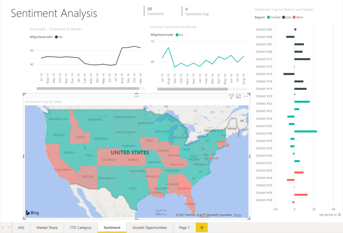
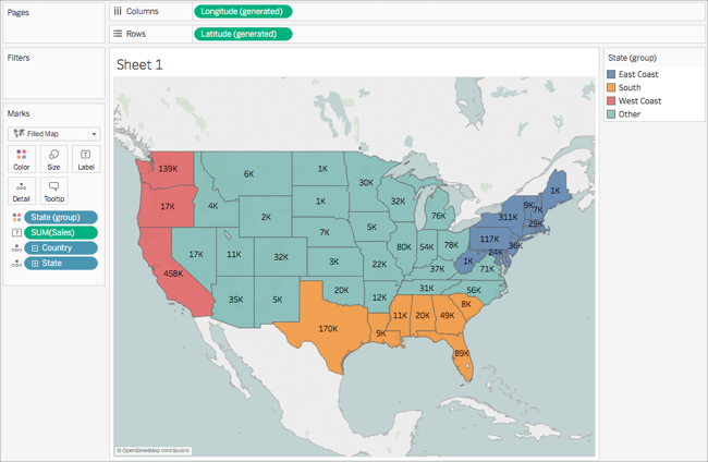
Often, this data may contain a location component such as a state, county, address, or other geographic feature - or more importantly, something that can be shown on a map. In many cases, if you create a dashboard with a map, you might show something like this:
These BI tools are perfectly suited for something like this, so if this is the extent of your analysis, you can probably stop reading now.
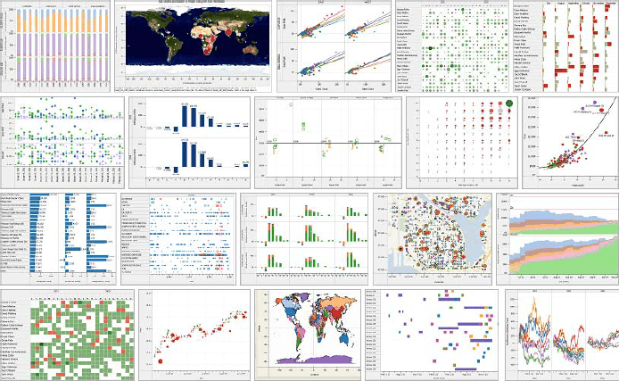
But if you are aiming for something more complex and insightful like this…
…You likely know the pain of actually having to create something like this with BI tools. Tons of data prep balancing data size and loading times linking spatial to non spatial data figuring out some of the geospatial functions in Tableau.
If this sounds familiar then you are in the right place. So what are the key challenges of working with geospatial data in a generic BI tool and how can you overcome them?
History of BI and Maps
To understand why BI and maps aren’t a great fit, we need to understand a bit about where maps or geospatial data and tools like Tableau or Power BI intersect. Below is an example from Tableau in 2005.
Whether you are comparing Tableau vs Power BI, maps have always been a part of these platforms in one way or another because inevitably most data has some location attribute to it. Think of a dataset or spreadsheet you have worked with recently. Did it have any of the following?
- State or province name
- Address
- Postal code or zip code(don’t use these by the way)
- Coordinate pairs such as Latitude & Longitude
- Country
- Street name
- State or province name
- Census ID like Census Tract
- City name
So much data contains a location element of some form, so alongside your bar charts and other graphs you might want to see that location data on a simple map. For example if you have a table of customer information with a state name you might create a map visualization that looks something like this.
For simple data visualizations like this, BI tools provide a great interface. You can quickly see your data in a location context, and learn something about the spatial arrangement of your data alongside your other data. However…
Spatial data wasn’t made for Power BI or Tableau
If you want to go beyond a map of states or provinces you certainly can, but you are likely to hit roadblocks if you are:
- Using custom geospatial data, or anything that goes beyond commonly used boundaries like states (for example latitude and longitude points would fall into this category.
- Large volumes of data. Either large number of rows or features, or complex geometries (take a look at the coast of Norway if you need an example).
- If you need to translate data formats. While there are a few common data types like Shapefiles and GeoJSON, there are close to 200 individual formats of geospatial data.
- Using multiple layers on a map. Want to add a few more layers like points or demographic data to your map? You likely won’t be able to as there are data layer limits in both tools.
In short, geospatial data has added complexity compared to non-geospatial data, and even if you keep comparing Tableau vs Power BI, these tools are built, primarily, for tabular data that is not geospatial in nature. This presents a number of issues when trying to move geospatial data into Tableau. You can see the problems illustrated in videos like this one and this one. Have you ever had to deal with the EPSG projection in data before? Welcome to geospatial analytics.
These are just some of the issues with doing spatial analytics in a business intelligence tool:
- You often have to use a data preparation tool like Alteryx (which has its own limitations and additional cost).
- The tool’s native spatial functions (like a spatial join or intersect) don’t run on the data itself they run in memory, in the tool (more on this later).
- There are visualization limits on the total number of features you can show on a map. Users of Power BI have hit limits around 35k features and in Tableau it's closer to 65k features (more here in a Tableau community post). Some data types won’t render such as lines in Power BI.
- You are limited to predefined boundaries such as postal codes or states and this all depends on your data perfectly matching the naming in the BI tool.
- If you need to turn an address into a geographic point you need geocoding tools and will have to again depend on an external service or go through a complex process like this in Tableau.
This is why it's really difficult to explain to a stakeholder when comparing Tableau vs Power BI why their data can't be mapped in, even though they have seen maps in them before. Once you see a map, many times you assume all maps can be delivered using these BI tools.
Of course, many organizations often equate Tableau or Power BI dashboards with data, or this is the only tool they have to present data in. This quote from a post titled The Tableau Era is Over” by Taylor Brownlow states this plainly:
To many business users data is now synonymous with dashboards. While a seemingly benign misunderstanding this, actually causes a whole slew of downstream effects…Since Tableau is the only tool many teams have to present data, they are forced to turn everything into a dashboard which significantly reduces the impact a more nuanced, thoughtful analysis could have.
There is one main limitation that actually makes spatial analysis difficult and not suitable for universal business intelligence tools.
The single fundamental issue
All these tools can visualize data quickly because they store the visualized data and analyze the spatial data in memory. Those spatial functions you use run on that data also run on the data in memory.
If you are not familiar with the concept of data in memory, it basically means data that is being stored or rendered in the application, in this case the BI tool that lives on your computer or in the cloud. Traditionally, these tools actually don’t store any data, they pull it from another source, anything from a spreadsheet to a big data system or data warehouse.
The fact is that there are natural limits to the amount of geospatial data you can render in any application. For example, at CARTO our Maps API renders data up to a certain point (30MB for ~200k features) directly via the data source, beyond that we rely on map tiling to take care of the rest.
And that summarizes the number one reason why not to use a business intelligence tool for mapping. At a certain point the performance will always break down since they only have access to the compute resources, or CPUs, where they are installed (be it on your computer or in the cloud - see the last section for why this is important).
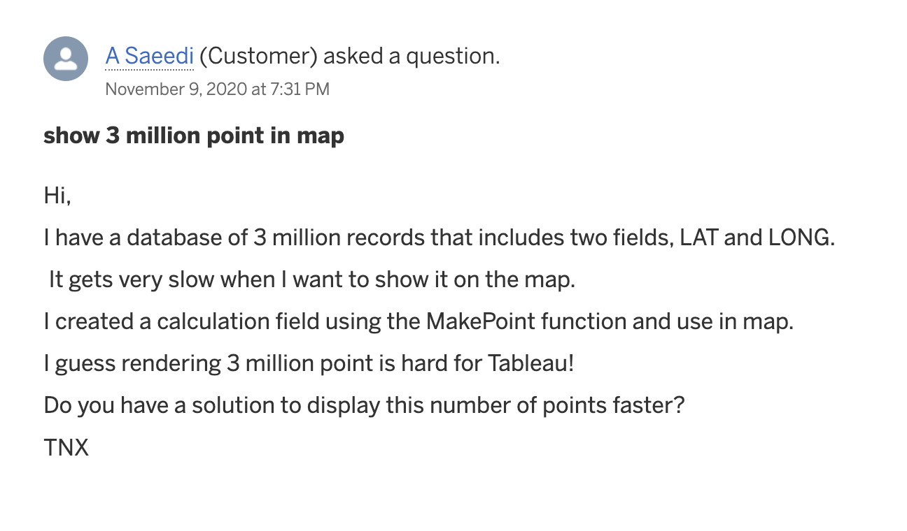
There are plenty of instances of this taking place. This customer of Tableau asked how to render millions of points.
Same with Power BI, and they gave a more direct answer:

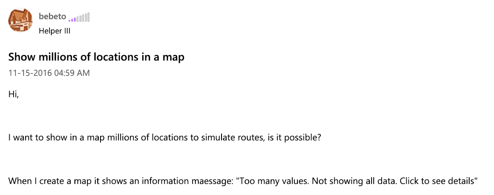
Tableau recommends data aggregation as a method to combat this, an approach we use as well in our tiling systems that are integrated into all the major cloud data warehouses. Even then, there are still limits of how many bins of data and how granular you can render the data.
Tableau vs Power BI: Why do we keep using BI tools?
While there are plenty of great reasons to use business intelligence tools, I think it comes down to the fact that it is hard to explain why BI tools just can't handle geospatial data. Yes many times these tools are what is available, widely used, and understood, and that is a big part of the decision as well.
But if your data is complex or large enough, you will inevitably hit limits in visualization and data processing. If you need to go beyond these thresholds outlined in this post, you will need a better toolkit, a modern data stack, for analyzing geospatial data.
Geospatial data is growing, and that is not going to change anytime soon. Cloud data warehouses are at the center of solving this issue for large scale geospatial data. And yes you can still connect and query data from a data warehouse from a BI tool, but even when you bring that data into Tableau or Power BI, you are going to hit the visualization limits. You just can’t show that much data.
There are no hard and fast limits to this as the limits can vary based on factors such as if you have point data or polygons and the complexity and size of that data. But as you have seen point rendering in these tools tends to stop working when you cross beyond the high 6 figures of points and polygons will start to stop working between 35 and 70k features.
So what do we do?
At the end of the day when you reach the geospatial limits in a business intelligence tool, you really need to use a system that leverages the power of the database or data warehouse where your data is hosted.
This requires two systems, the first is the data warehouse and the second is the application layer to do that. There arel ots of options to do this. You can use a traditional database system which has many advantages, or taking that a step further a GPU accelerated database which is fast, but has many massive cost implications.
Addressing these limitations is what we have been focusing on at CARTO for the past several years to become the firstcloud-native Location Intelligence platform for the modern geospatial data stack. We do this by leveraging the built-in processing power of the data warehouses for the processing and querying of data and then enhancing our platform to manage and handle the visualization and analysis of that much data.
Geospatial analytics is evolving with tools that make analyzing data easier, faster, and more secure. Stay ahead by understanding how these changes can impact your organization with our free report Spatial Analysis in 2025: Key Trends
.webp)
Let’s focus on visualization. If you have a large number of features to show on a map, you are going to have to use map tiles. Have you ever wondered how Google can show so much data on their maps so fast? Map tiles is the answer. NowGoogle has billions of users and the data is pretty consistent.
What we have done is take that same technology and applied it to your data, but also allowing you to dynamically change your query and still gain the resulting performance benefits. And the queries you run are processed directly in the data warehouse, which are massively performant for these operations due to the fact that they scale in parallel to run very large queries extremely fast.
Our next big step in this direction is called CARTO Workflows, which brings the power of spatial analysis into a familiar modeling or data prep interface, all focused on geospatial analysis, but running directly in the data warehouse to enable spatial analytics without writing a single line of SQL. We also embed tools in the data warehouse like geocoding, trade area and routing calculations through our Analytics Toolbox, once again harnessing the power of the data warehouse.
A practical and simple example of this is the map below. This shows all 7.2 billion points from OpenStreetMap in a visualization.. This map took about an hour to make from querying and creating the tables in my data warehouse, to creating the map tiles, building, styling, and publishing the dashboard.
At the end of the day, if and when you move beyond spatial analytics of a certain scale, your current toolkit is bound to be pushed to its limits, and more and more time will be spent on working out how to make that system work, rather than producing valuable business insights. Using a spatially enabled data warehouse and some system that can support this will benefit your insight generation and ultimately your business, as well as giving data analysts more time to work on solving the next big analytical problem.