Climate Change & Extreme Weather: Hurricane, Wildfire, & Flood Maps
This summer has witnessed several extreme weather events including heatwaves flash floods and wildfires. With average temperatures having risen by 1.2C since the industrial era it is clear that the increasing frequency of extreme weather is linked to the uneven distribution of this additional energy as a direct result of climate change.
Protecting our world against climate change requires spatial storytelling & sophisticated environmental analysis. In fact CARTO was founded since after several years of working on Conservation and Environmental projects it was decided that it was time to improve the technology available to analyze and visualize large amounts of environmental location data.
In this post we take a look at how such spatial storytelling has been used by media organizations around the world to build awareness of recent events and how public and private organizations are analyzing large amounts of location data in order to mitigate the devastating and often deadly effects of extreme weather.
Note: since many of the maps and visualizations referenced in this post are of historical events data shown may not be current or real-time and often static images are used to represent conditions at the time.
Hurricanes & Tornados
Each year the United States averages some 10 000 thunderstorms 5 000 floods 1 300 tornadoes and 2 Atlantic hurricanes as well as widespread droughts and wildfires.
Hurricane Ida was a deadly and destructive Category 4 Atlantic hurricane that became the second-most damaging and intense hurricane to make landfall in the U.S. state of Louisiana on record behind Hurricane Katrina in 2005.
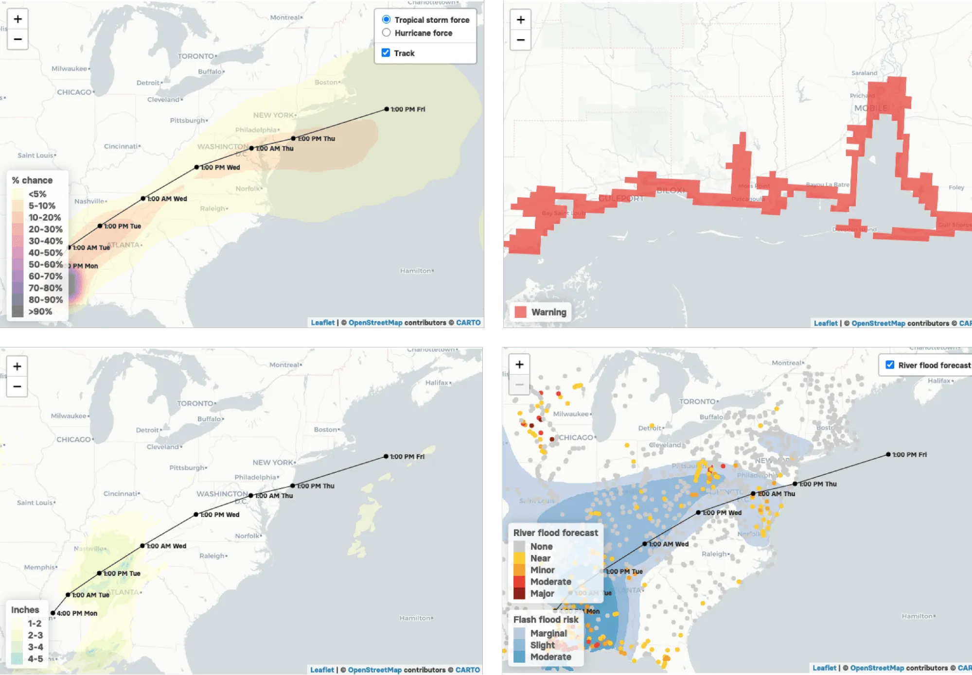
Before Ida made landfall BuzzFeed News created a series of maps using data from the National Weather Service (NWS) forecasting the track winds rain and flooding alongside areas with storm surge warnings and watches. Maps such as these allow authorities to make decisive emergency decision making with New Orleans Mayor LaToya Cantrell ordering the mandatory evacuation of all areas outside of the levee protections system.
Hurricane Irma was an extremely powerful Cape Verde hurricane that caused widespread destruction across its path in September 2017. Using two publicly available datasets — the National Hurricane Center’s wind speed probabilities for Hurricane Irma and the Center for Disease Control’s Social Vulnerability Index (SVI) — our team created a map that shows:
- probability that a census tract (between 2 000 and 8 500 people) will bear hurricane-force winds
- that census tracts ranking on nine measures of social vulnerability.
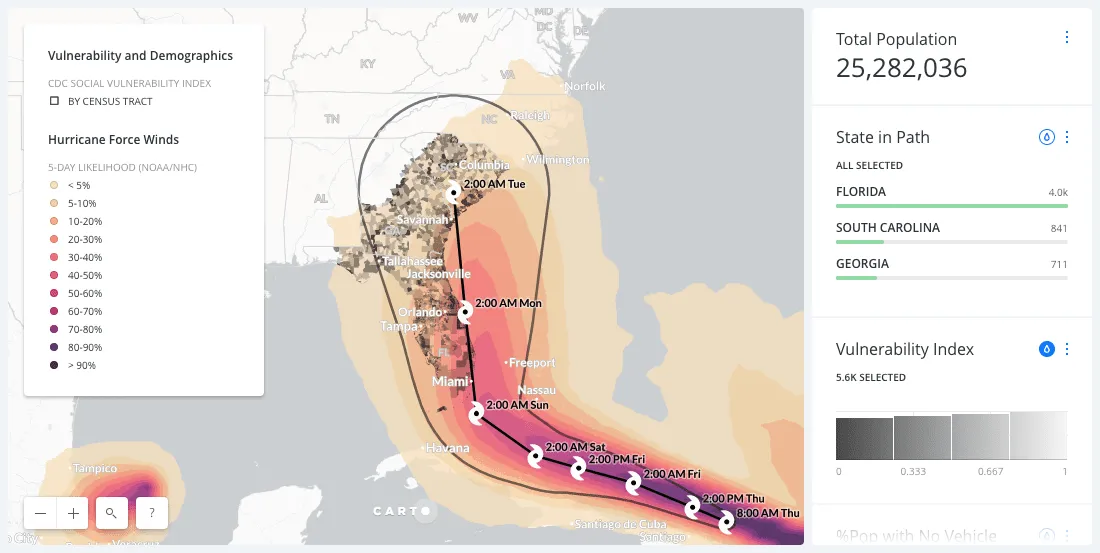
The map was created to help public officials relief organizations and other support personnel to identify the most at-risk neighborhoods and deliver them life-saving resources before and after the disaster struck.
Also making landfall in 2017 was Hurricane Harvey a devastating Category 4 hurricane that caused catastrophic flooding and more than 100 deaths. Our team produced a series of maps analyzing not just rainfall totals but also gasoline transactions and overall financial spend before during and after the hurricane.
During Hurricane Harvey individuals collected data about the status of shelters within Houston in a Google spreadsheet and mapped that data to show where shelters were and weren’t accepting evacuees.
Whilst smaller and usually shorter in duration tornadoes can have a significant impact with flying debris being the biggest threat to human life. Canada ranks as the country with the second most tornadoes per year after the US and CBC News produced the following animated map cataloging tornado incidents in the country.
Wildfires
California has dry windy and often hot weather conditions from spring through late autumn that can produce moderate to severe wildfires. Wildfires in California are growing more dangerous because of the accumulation of wood fuel in forests higher population and greater electricity transmission and distribution lines. The Dixie wildfire which started in July of this year was the largest single source wildfire in California history covering nearly 1 million acres and to date is 94% contained.
Using data from the California Public Utilities Commission (CPUC) ABC7 News created an interactive map showing areas the agency deemed especially at risk during this year’s wildfire season. The orange and red areas on the map below are found to have an "elevated hazard for the ignition and rapid spread of powerline fires due to strong winds abundant dry vegetation and other environmental conditions". The map also includes a Google Geocoder for residents of the area to determine the risk level where they live.
In terms of property damage 2017 was the most destructive wildfire season on record in California at the time surpassed by only the 2018 season with a total of 9 560 fires burning 1 548 429 acres (6 266.27 km2) of land.
At the time traditional forecast models relied on data related to vegetation type humidity temperature and terrain but as reported were outdated and did not take into account the volatile weather conditions.
With that in mind our team created maps to visualize active fire perimeters density of smoke levels nearby vulnerable populations and property risks to local agricultural businesses in order to help disseminate vital information to residents rescue agencies and relief organization while also raising awareness of the long term health hazards exposure to high levels of smoke.
In December of 2017 wildfires continued to rage in Ventura and LA County burning over 307 900 acres (1 246 km2) and causing traffic disruptions school closures hazardous air conditions and massive power outages. We produced a map showing real-time data of the perimeter of the wildfires as well as the streets most impacted in order to assist disaster relief efforts and for residents to help get resources.
For the 2018 wildfire season our team created an animated map to show the growth of fires throughout the region using data from GeoMAC Wildland Fire Support and NOAA’s Fire Products. The datasets were synced every hour and showed patterns such as the speed at which some fires are growing compared to others and the spread pattern of fires over different geographic areas.
Wildfires are also common in southern Europe during the hot dry summer months. But they have been particularly numerous around the Mediterranean Sea this year worsened by the intense August heat waves.
In Spain over 75 000 hectares of forest and bush areas have burned in the first eight months of this year according to Spain‘s Ministry of Ecological Transition.
The animated map below shows fires across Spain over a period of 15 years as well as showing key metrics on the impact of the fire (e.g. cost and time to put out the fire people injured or deceased and the surface area affected).
Fires in Galicia represent 50% of the area burned each year in Spain and the map below depicts a visual history of fires in the region. It is possible to see the municipality where the fire started which municipalities were worse hit and the cause of the fires. You can also see the land use as well as the type of trees in these areas.
The 2019–20 Australian bushfire season colloquially known as the Black Summer was a period of unusually intense bushfires in many parts of Australia.
The animated map below produced by BBC News using data from the National Aeronautics and Space Administration’s (NASA) Fire Information for Resource Management System (FIRMS) shows the spread of wildfires during the peak of the outbreak. Points represent any detection of fire not actual area burned. Heat sources which are not bushfires make up less than 1% of data shown.
Droughts & Floods
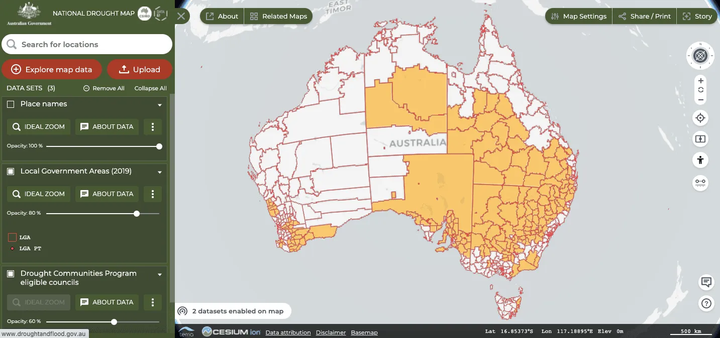
The National Drought Map provides access to spatial data from Australian government agencies. Its aim is to ensure people and communities are given the support and information they need to be better prepared for droughts and floods now and into the future. The map helps users find a range of information on drought conditions and associated support measures in one useful platform.
Increasing evaporative demand is escalating summertime drought severity in California and the West according to climate researchers. The meteorological summer of 2021 in the contiguous United States which runs from June through August tied the extreme heat of the Dust Bowl summer in 1936.
Using historical drought data from the US Drought Monitor our team created an interactive visualization in order to help identify sustainable solutions that better prepare cities counties and municipalities for future water shortages.
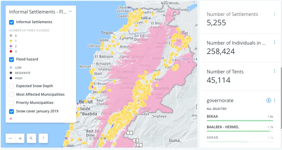
When Storm Norma hit Lebanon in January 2019 the United Nations High Commissioner for Refugees (UNHCR) Inter-Agency Coordination Unit used CARTO in conjunction with their well-maintained data sets and live storm data to visualize and project impact.
The storm lasted 5 days blanketed areas of higher elevation with up to 2 meters of snow and caused severe flooding across the country. Auto-filtering allowed the team to see exactly how many refugees were likely to be impacted in every region of the country allowing for prioritization of support services and proactive emergency response.
Spring snowfall and heavy rain caused floods in southern Quebec in May 2017 and one of the hardest hit regions was that of Pierrefonds on the island of Montreal. CBC News produced a map detailing flood zones in the region and highlighting areas with low or high currents.
Mitigating Loss
The examples shown within this post have demonstrated how maps and Location Intelligence can help inform decision making during extreme weather events. On top of the tragic loss of life often caused by these events the financial implications are significant.
A report from ClimateWise a coalition of insurance industry organizations has identified a huge jump in “the protection gap” or the difference between the total costs of natural disasters and the amount insured against the damage which has quadrupled since the 1980’s to $100 billion/year.
During a disaster event it is imperative for insurance companies to be as informed as possible.
By viewing data and risk exposure in real-time a company is best equipped to adapt and quickly address the needs of the policyholders that are most adversely affected.
The map below shows a projected hurricane track off the coast of Florida paired with policyholders data. The map (which could be updated with NOAA data in real-time during a real hurricane event) shows which policyholders are at risk of hurricane damage and the amount of that damage.


