How to Visualize Urban Growth with Spatial Analytics in BigQuery
The urban growth of metropolitan areas around the world can be affected by a number of factors. During the industrial revolution the explosion in job availability fueled much of the growth in housing commercial development and roads across our cities. To date 55% of the world’s population currently live in urban areas with the UN predicting pre-pandemic that by 2050 this figure would increase to 68%.
Location Intelligence can be used within our cities to tackle societal and environmental challenges linked to such growth including sustainability gentrification and healthcare. With changing urbanity levels caused by the pandemic the question is now whether this growth will be maintained?
The New York Times visualized how the city emptied during the early days of the outbreak (as seen below) and we have previously looked at how spatial analysis can be used to identify walk to work hotspots and the effect of remote working on the retail industry.

Many believe that as inherently social creatures and with our innate desire for experiences only cities can offer urban growth will recover again especially as COVID-19 cases continue to trend downwards as a result of the vaccine rollout.
In order to get a sense of this rebound it can be helpful to look at historical trends of urban growth. With that in mind and inspired by the work of Dominc Royé we created the following visualization depicting historical urban growth within New York.
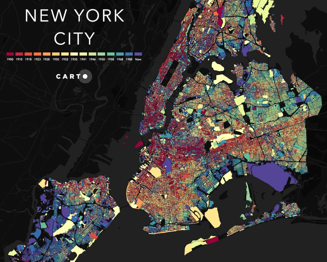
The visualization (download as PDF) was created using our recently released CARTO's Spatial Analytics in BigQuery and this post serves as a guide to how you can create your own for other cities and urban areas around the world.
Sourcing the Data
The first step is providing BigQuery with the data in a way that can be ingested. To recreate this visualization you need the buildings footprints as well as their construction date. There are a multitude of sources for this kind of open resource on the Internet, often provided by public administrations such as the Service of Cadastral Cartography of Spain or The Department of City Planning of New York City.
The data for New York City is provided in .shp format so we can use any open source tool such as QGIS or GDAL to export the data into a BigQuery compatible format (CSV or GeoJSON). Once our data is stored in BigQuery we are ready to start our spatial analysis.
Building the Visualization
CARTO's Spatial Analytics in BigQuery boosts the geospatial capabilities of BigQuery and allows it to work with large amounts of spatial data in a very straightforward way. In order to effectively visualize the more than 800K polygons that contain the dataset a vector tileset is produced.
This tileset is a standard format that can be imported by most of the map visualization tools and of course by CARTO Builder. Builder connects directly to BigQuery in an agnostic way for the user fetches their data and gives the user the possibility of styling it using any column included within the tileset. In this case the column dedicated to the construction year is used giving more red hue to older buildings and blue to more recent constructions. Below is the interactive map from which the visualization was created:
We’ve had a lot of fun creating these striking visualizations with team members even looking into their own home towns with fascinating results. Where will it take you?
Want to try it yourself?


