Using Location Intelligence to combat The Great Resignation in Logistics


The Great Resignation The Big Quit or The Big Reshuffle? The employment landscape has been given many names since early 2021, but they all have one thing in common. They all describe an economic trend where employees have been leaving their jobs in enormous numbers. Causes for this are speculated to include a desire for more flexible and remote working practices, low wage growth vs a rising cost of living and a resignation lag following the economic uncertainty of the COVID-19 pandemic and lockdowns.
More than 47 million people quit their jobs in the United States in 2021 (Source: The United States Labor Statistics Bureau). However, we can see from the visualization below that the resignation rate is not a uniform trend. Whilst resignations have remained fairly constant throughout “The Great Resignation” across industries such as Government and Mining & Logging it has greatly increased in other areas. Over 11 million resignations came from the supply chain; in logistics, transportation, retail and wholesale trade industries.
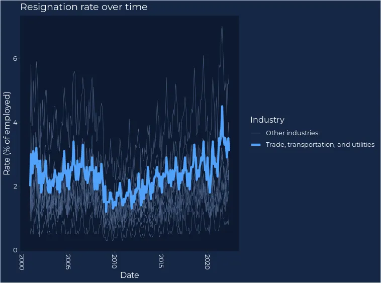
This visualization also shows a temporal pattern in resignations, with the rate (percentage of employees) peaking in the summer months (typically August) and dropping in the winter.
As well as showing temporal variation, resignations also aren’t geographically uniform. In August 2021 - when resignations peaked - most states were experiencing between 3-4% resignation rates. However, the range in this was large starting at 1.9% (District of Columbia) and hitting a maximum of 5.6% (Vermont). This tells us that national-level statistics are overly simplistic when it comes to decision-making.
Open the map in full screen here (recommended for mobile viewers).
How to combat The Great Resignation in Logistics
With resignations sometimes rising to over 5% of all employed residents, The Great Resignation presents a huge challenge for companies to attract - and retain - staff. With over 11 million resignations coming from the supply chain, this is of particular concern for logistics businesses.
One way of approaching this for logistics companies is to locate new distribution centers in areas of high relative unemployment. In these areas the ratio of potential staff to job openings is less competitive for employers. This strategy can be advantageous to logistics businesses in particular, as in many (but not all cases) the key “human” element in distribution center site selection is proximity to an available workforce. There are of course other factors involved in Site Selection for logistics - keep reading for more on that!
Unemployment is inherently spatial. Factors behind it can be global and structural (e.g. global recessions) but they can also be local; a large local employer may close down or relocate or the skills of local residents may be mismatched with the requirements of local businesses. With this in mind, it’s important to delve deeper than state city or even county-level statistics. Let’s look at an example.
Logistics and Tennessee
According to the Tennessee Department of Economic & Community Development (TNECD), Tennessee is uniquely positioned to offer huge advantages to logistics businesses:
“With our natural geographic advantage, a deep pool of highly skilled logistics workers and a robust transportation infrastructure the transportation distribution and logistics industry thrives in Tennessee.”
Tennessee also has an unemployment rate of 3.3 which is approximately the state-level average (May 2022 National Conference of State Legislatures). This makes it an excellent case study for how distribution center location strategies can be informed by unemployment insights.
Unemployment in Tennessee
First of all, let’s take a look at unemployment data in its raw form. CARTO holds a wealth of demographic data in our Spatial Data Catalog, with large numbers of these datasets available to users for free. For instance we hold 281 datasets from the American Community Survey (ACS) which captures annual data on population housing and employment.
Let’s take a look at ACS unemployment data for Tennessee for the smallest most detailed geography available (census block groups which typically contain 600 - 3 000 people) and the most recent 5-year survey results (2018). The advantage of the 5-year surveys over the 1-year (both of which are available in our Spatial data Catalog) is that they have increased statistical reliability for more sparsely populated areas. This means that block groups don’t need to be dropped if they don’t meet a specified population threshold (see the US Census Bureau for more details on the differences between the two survey types).
You can subscribe to this dataset here and use the code below to load the data into your CARTO map. Filtering the block groups to geoids that begin with 47 limits them to just Tennessee. Find the full list of state codes from the United States Census Bureau here.
SELECT
/*Load fields*/
 do_geo.geom,  do_data.geoid,  do_data.total_pop,  do_data.employed_po,  do_data.unemployed_pop
/*Join data table to geography table*/
FROM
`carto-data.ac_lqe3zwgu.sub_usa_acs_demographics_sociodemographics_usa_blockgroup_2015_5yrs_20142018`  do_data
INNER JOIN
 `carto-data.ac_lqe3zwgu.sub_carto_geography_usa_blockgroup_2015` do_geo
ON do_geo.geoid = do_data.geoid
/*Filter to Tennessee*/
WHERE do_data.geoid LIKE '47%'
Note: if you’re copying this SQL you’ll need to remember to change your data observatory connection after “carto-data.ac_…” to your personal connection (find this under Data Explorer > Data Observatory datasets > click “access in”).
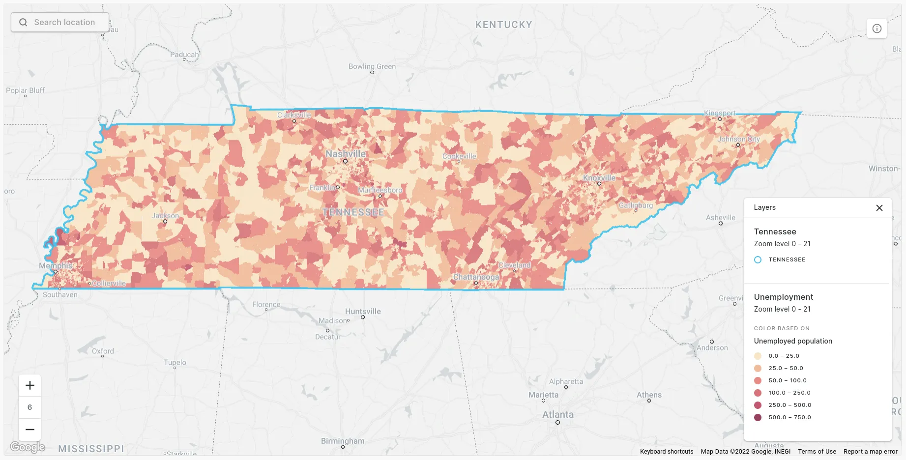
So what does this map tell us about unemployment in Tennessee? Yeah, I don’t know either. It looks like there are lots of areas of high unemployment mixed in with low unemployment and no real spatial patterns. So we should probably just finish this blog post here and drop this whole idea that we should try and bring jobs to places where people don’t have work right? WRONG.
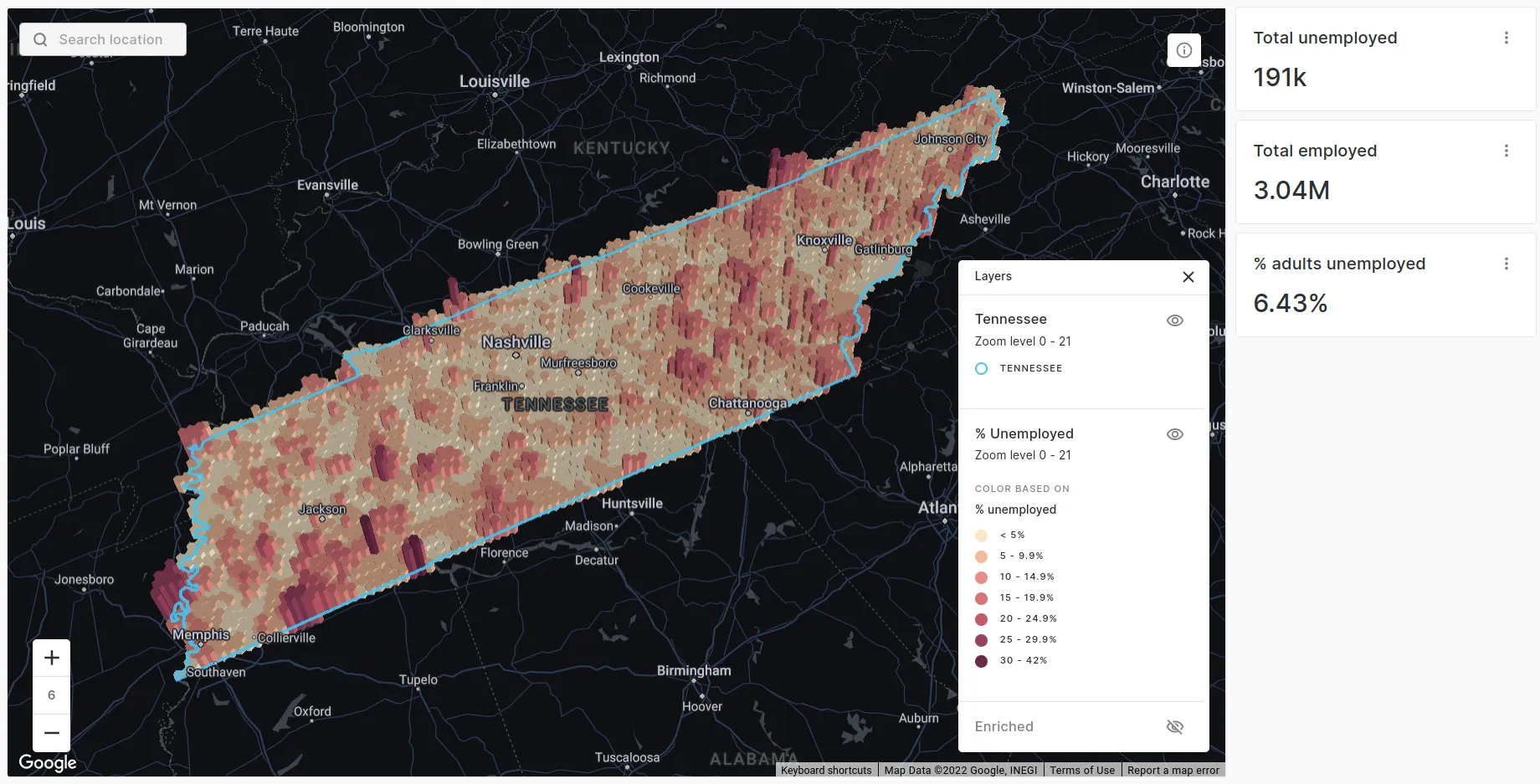
The reason we can’t conclude anything from this map is because the data is in the wrong geometric format. Census block groups are a type of irregular zone; their size and shape is incredibly variable and can be influenced by numerous factors from population size to demographic characteristics and even political gain. This size and shape variation renders the map really quite difficult to interpret. Conclusions can be much more easily drawn from a map which uses regular zones, such as H3 - a global hexagonal grid designed for performant analysis of big spatial data (check out our blog post dedicated to this here).

Converting unemployment data to H3
Open the map in full screen here (recommended for mobile viewers).
Much better! This map immediately tells us a story. Straight away we can see the highest numbers of unemployed residents can be found around the urban areas of Nashville Memphis and Knoxville with fewer unemployed people in rural areas. Whilst this effectively mimics the urban density patterns of Tennessee this is exactly what we are interested in as we want to know the number of available jobseekers. In other use cases we may be more interested in the percentage of unemployed residents, which tells a different story (see below).
Converting data to a regular grid like H3 with CARTO couldn’t be easier! Our Analytics Toolbox contains a wide range of enrichment tools in the Data module which are designed for aggregating data from one layer to another. The DATAOBS_ENRICH_GRID tool is specifically designed for enriching data with inputs from CARTO’s Analytics Toolbox however as it has wider applicability today we’ll use the ENRICH_GRID function which can be used to aggregate any dataset to a spatial index such as H3.
The code to enrich a grid (example for this case study below) may look complex but it’s essentially two subqueries (one loading the grid layer - here using H3_POLYFILL - and the second loading your input data which is the same query as above). You can find further guidance on enrichment functions here.
/*Call the enrichment function*/
/Call the enrichment function/
CALL
carto-un.carto.ENRICH_GRID( ‘H3’,
’’'
/Subquery 1: Select grid features - here we use H3 polyfill to generate H3 cells with a resolution of 7 across Tennessee/
with aoi as (SELECT * FROM carto-data.ac_lqe3zwgu.sub_usa_tiger_geography_usa_state_2019 WHERE do_label = ‘Tennessee’)
SELECT H3id as H3 FROM unnest(carto-un.carto.H3_POLYFILL(
(SELECT st_union_agg(geom)
FROM aoi), 7)) H3id
‘’’,
‘H3’,
R’’’
/Subquery 2: Input data - here we use the same query as above/
SELECT
do_geo.geom, do_data.geoid, do_data.employed_pop, do_data.unemployed_pop
FROM
carto-data.ac_lqe3zwgu.sub_usa_acs_demographics_sociodemographics_usa_blockgroup_2015_5yrs_20142018  do_data
INNER JOIN
carto-data.ac_lqe3zwgu.sub_carto_geography_usa_blockgroup_2015 do_geo
ON do_geo.geoid = do_data.geoid
WHERE do_data.geoid LIKE ‘47%’
‘’’,
‘Geom’,
/Fields to be aggregated and aggregate methods/
[(’employed_pop’, ‘sum’),(‘unemployed_pop’,‘sum’), (’total_pop’,‘sum’)],
/Output project location/
[’outputproject.outputedataset.outputtablename’] );
Next steps: unemployment and a wider context
Of course understanding unemployment rates is just one piece of the puzzle when locating a new distribution center. It’s important to contextualize this within other key factors, such as:
- Proximity to major transport infrastructure
- Population in-situ
- Unemployed population
Proximity to major transport infrastructure
It is necessary for distribution centers to be close to major transport infrastructure (i.e. stations and major highways) for speed of goods transfer and to minimize disruption to local infrastructure. The locations of these can be extracted from the BigQuery publicly available OpenStreetMap project (details on using this amazing and FREE global geospatial resource here). For the sake of simplicity, let’s say that we want our distribution site to be within 5 miles of both of these types of infrastructure - we can achieve this by using H3_BOUNDARY to temporarily convert our H3 cells to a geometry type and the spatial predicate ST_DISTANCE to filter our enriched hexagonal cells as follows:
…WHERE st_distance(carto-un.carto.H3_BOUNDARY(hex.H3, station/motorway.geom))
Note: here we’re just using as-the-crow-flies distances for simplicity but CARTO’s Routing module in our Analytics Toolbox includes a range of tools to calculate distances along transport networks to provide a more realistic picture.
Population in-situ
Typically distribution centers are located away from densely populated areas where they could cause - and be negatively impacted by - high levels of traffic. We’ve already extracted this data from the American Community Survey in the enrichment process above, so we’re good to go!
Unemployed population
As the average American drives 16 miles to work we want to know the total population within a 16 mile radius of each H3 cell so we can work out where the highest potential number of employees can be found. We’ll use the H3_KRING function to achieve this; this function returns a ring around each H3 cell with a specified number of neighbors (here we’ll be using 10 which equals approximately 16 miles).
Let’s bring all of this together!
/Load the layers/
WITH
hex AS (SELECT * FROM yourproject.yourdataset.yourenrichedlayer),
stations AS (SELECT * FROM yourproject.yourdataset.osmstations),
motorways AS (SELECT * FROM yourproject.yourdataset.osmmotorways),
/Filter by low population and distance from stations & motorways/
filtered AS (SELECT hex.* FROM hex, stations, motorways
WHERE
  total_pop < 1000
  AND st_distance(carto-un.carto.H3_BOUNDARY(hex.H3),stations.geom) < 8000
  AND st_distance(carto-un.carto.H3_BOUNDARY(hex.H3),motorways.geom) < 8000),
/Create a k=10 rings/
kring AS (SELECT * FROM hex,
  UNNEST(carto-un.carto.H3_KRING(hex.H3,
      10)) AS kH3id)

/Finally, join the K-ring data to their origin (center) H3 cells and sum the unemployed population in each ring/
SELECT filtered.H3 AS H3,filtered.total_pop_sum AS total_pop,
SUM(kring.unemployed_pop_sum) AS unemployed16mile
FROM filtered
LEFT JOIN kring
ON ring.kH3id = filtered.H3
GROUP BY filtered.H3, total_pop
Open the map in full screen here (recommended for mobile viewers).
The hexagons remaining on the map above are locations within 5 miles of a major highway and stations with red cells having a higher unemployed population within 16 miles. We can see that this significantly narrows down our search area for a potential distribution site. There are small potential pockets around Memphis and Knoxville and a much larger area running eastwards of Nashville. So if I were planning on placing a distribution center somewhere in Tennessee I’d probably think about exploring options in this area.
And do you know what? That’s exactly what Amazon thought too.
Delivering Amazon: Mt. Juliet’s Distribution Center
Mt. Juliet is a city about 17 miles - or a 25-minute drive along Interstate 40 - east of Nashville. Take exit 229 and you’ll be greeted with Amazon’s new distribution center (shown as a pink dot on the map below). Having opened in late 2021 at 3.6 million square feet it is the fourth largest distribution center in the United States and is the largest operated by Amazon.
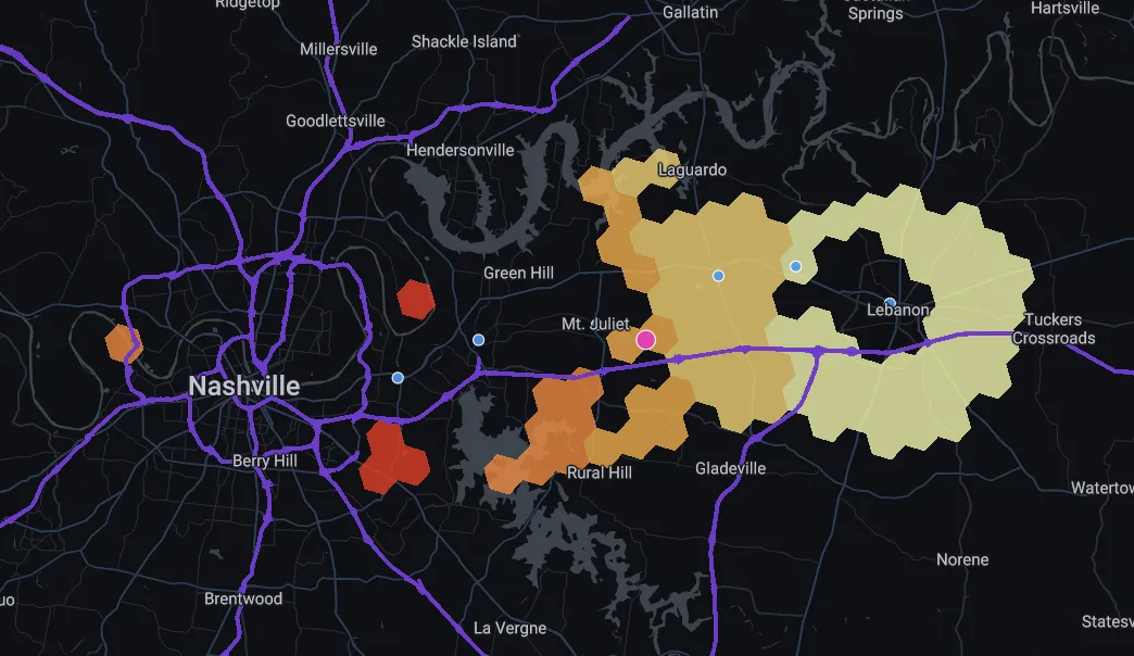
Beginning with 1 000 employees - and with plans to ramp up to 3 000 - the site being located close to a large unemployed population is clearly of symbiotic benefit both to Amazon and local residents.
What’s next?
Location planning for distribution centers is clearly far more complex than the three factors we’ve boiled it down to today. Analysts may also want to consider route optimization and catchment planning supply chain management and how locations can impact fleet management strategies. Read more about how you can use CARTO to help you optimize your logistics operations here.
Keen to have a go yourself? Why not sign up for our free 14-day trial and find out the power of Location Intelligence first hand.