A Look Back at 18 Months of COVID Grants & Maps


18 months ago, on the same day that the World Health Organization (WHO) declared COVID-19 a pandemic, CARTO announced that it would be making its platform available for free to public and private sector organizations fighting against the coronavirus outbreak via our grants program.
Much has happened since then with the world still grappling with the devastating effects of the virus. During this time we have approved hundreds of grants and collaborated with a number of local and national public bodies to support them in their pandemic related decision making and we have chosen to highlight just a few of the inspiring use cases in this post. Our grant program is still running and we would invite individuals and organizations continuing the fight against COVID-19 to apply.
Tracking the Outbreak
At the start of the pandemic many maps and visualizations focused on the spread of the virus, where cases were rising the fastest both at a local and national level. In these early days these maps helped spread awareness during a time when large parts of the world were under strict lockdown measures. Thanks to the historic response by the scientific community many have since switched to tracking vaccination progress.
The Humanistic GIS Lab at University of Washington Seattle maintained their Novel Coronavirus (COVID-19) Infection Map from January 2020 until July 2021 and served more than 1.8 million users. During this time they received many positive comments on their integrative approach of collecting and visualizing global COVID-19 case data especially during the early phase of the pandemic.
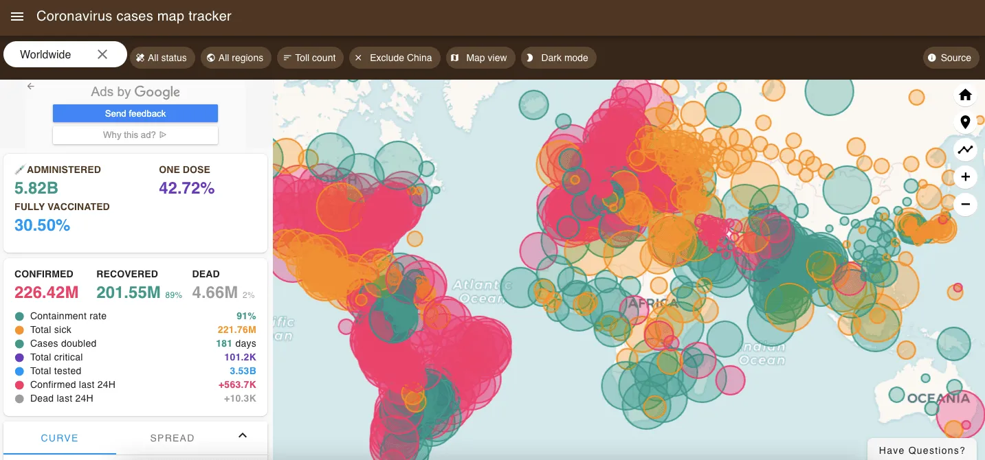
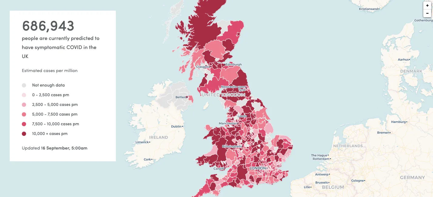
The Coronavirus cases map tracker by Visa List has evolved to include vaccination progress and graphs tracking the overall curve and spread along with detailed statistics about each country.
Slowing the Spread
Before vaccines were made widely available, a well-functioning Test Trace and Isolate system was a key element of the response to help reduce transmission of the virus. Towards the end of last year we looked at the COVID Response Evaluation Dashboard developed by i-sense to evaluate the performance of the ‘Find Test Trace Isolate Support’ system in the UK by unifying publicly available data. To read about it in more detail click here.
Critical to slowing the spread is the ability to effectively communicate guidelines and restrictions with large sections of the population. COVID-19 has rapidly spread in linguistically diverse countries. Organizations supporting the response need to develop communication strategies that cater to the needs of marginalized language speakers in these locations. That’s why Translators without Borders produced a map to help organizations prioritize their use of limited resources and better prepare for multilingual communication.
Community Support
Throughout the pandemic , communities around the world have come together to support each other with individuals, local groups, and businesses ensuring the most vulnerable in the population were helped.
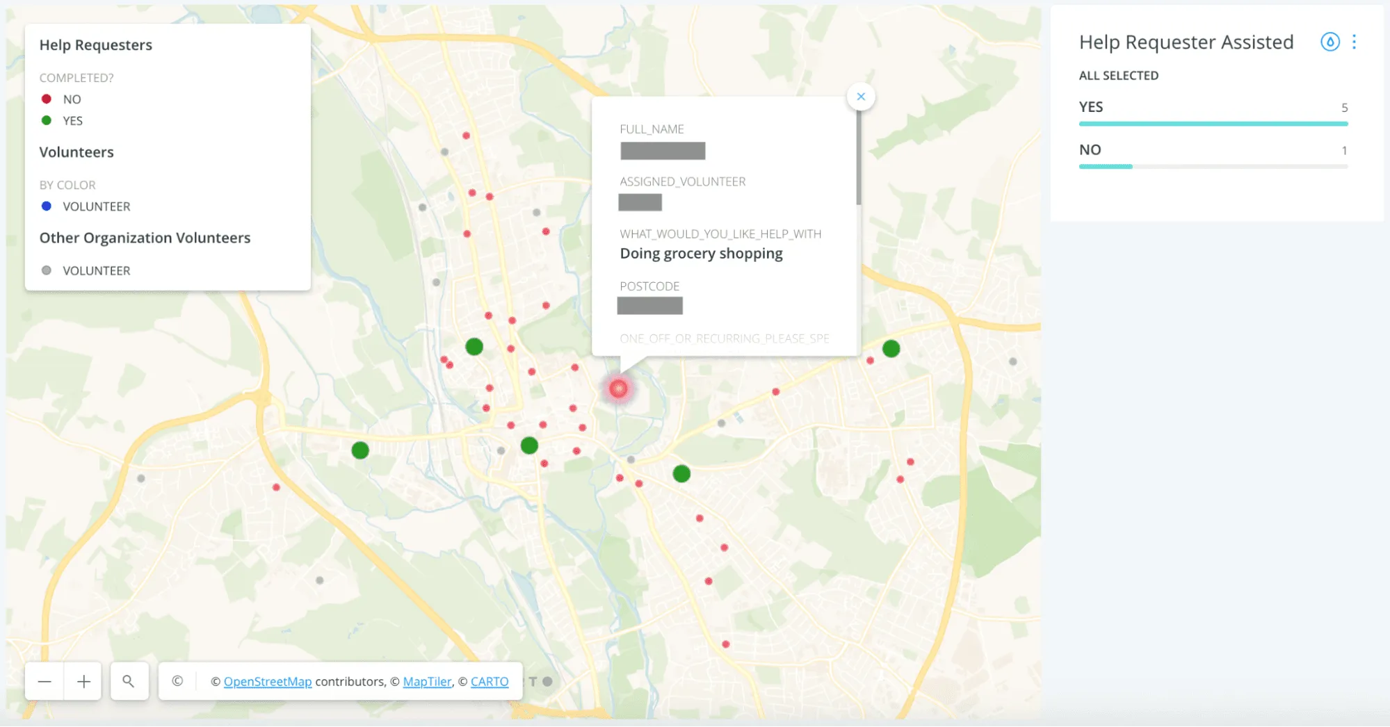
#StudentsAgainstCorona built a platform to make it easier for volunteers community groups and those in need to connect with each other and for local authorities to source individuals or groups of volunteers matching specific criteria and locations. Their work was also featured on BBC World News.
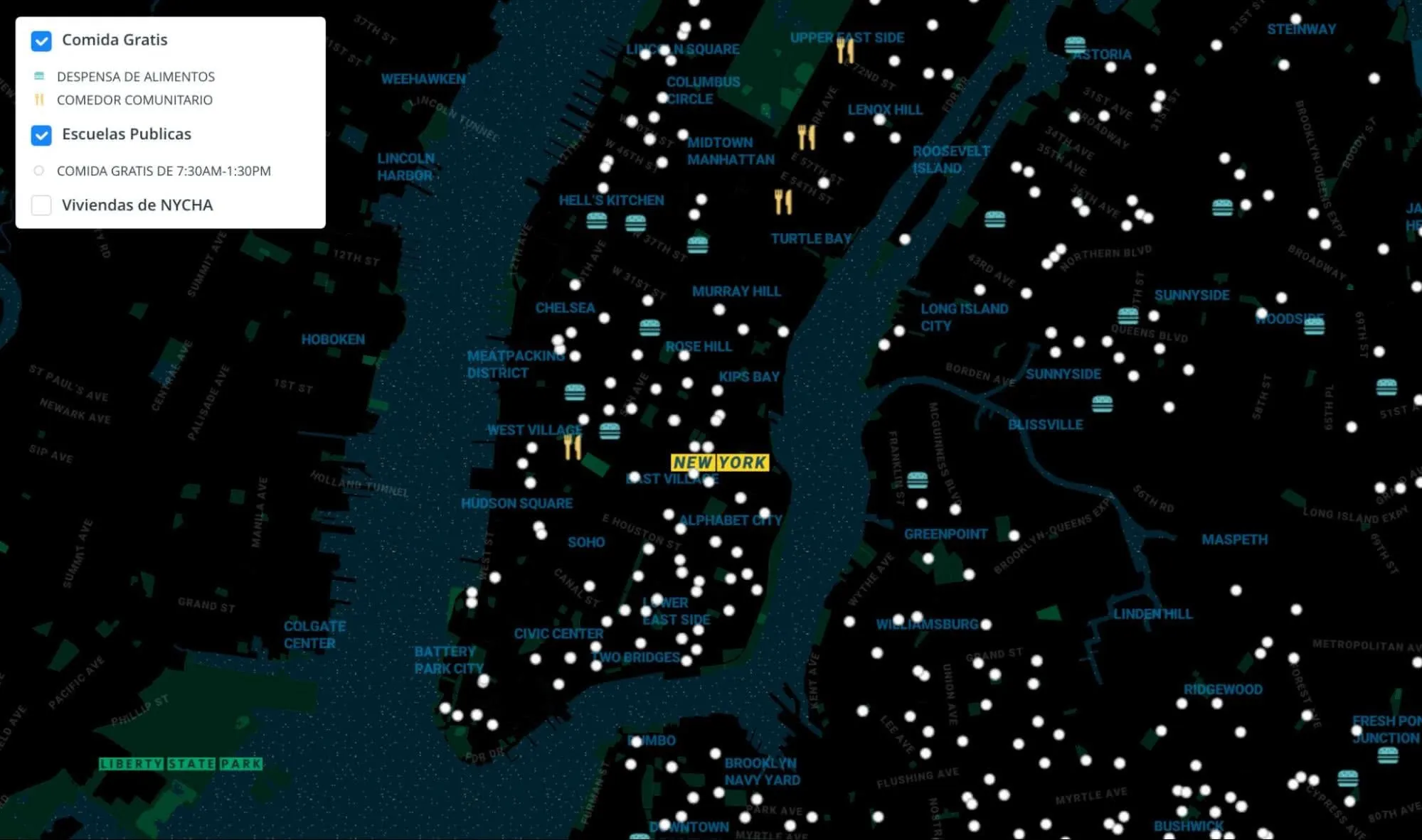
Inspired by the NYC FoodHelp map, Territorial Empathy redesigned it for the COVID-19 crisis. Born out of a request from the LatinX community of Sunset Park Brooklyn the map tells community members where they can find community kitchens food banks and school meal pick up locations (available from 07:30 - 13:30). Each location has an interactive popup with more information about each site.
Food by Ward by the Toronto Food Policy Council, shows the unequal distribution of food assets across the city of Toronto and addresses the barriers communities face when trying to find or start food programs.
Symptom & Vaccine Analysis
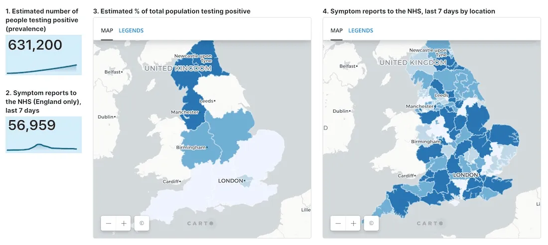
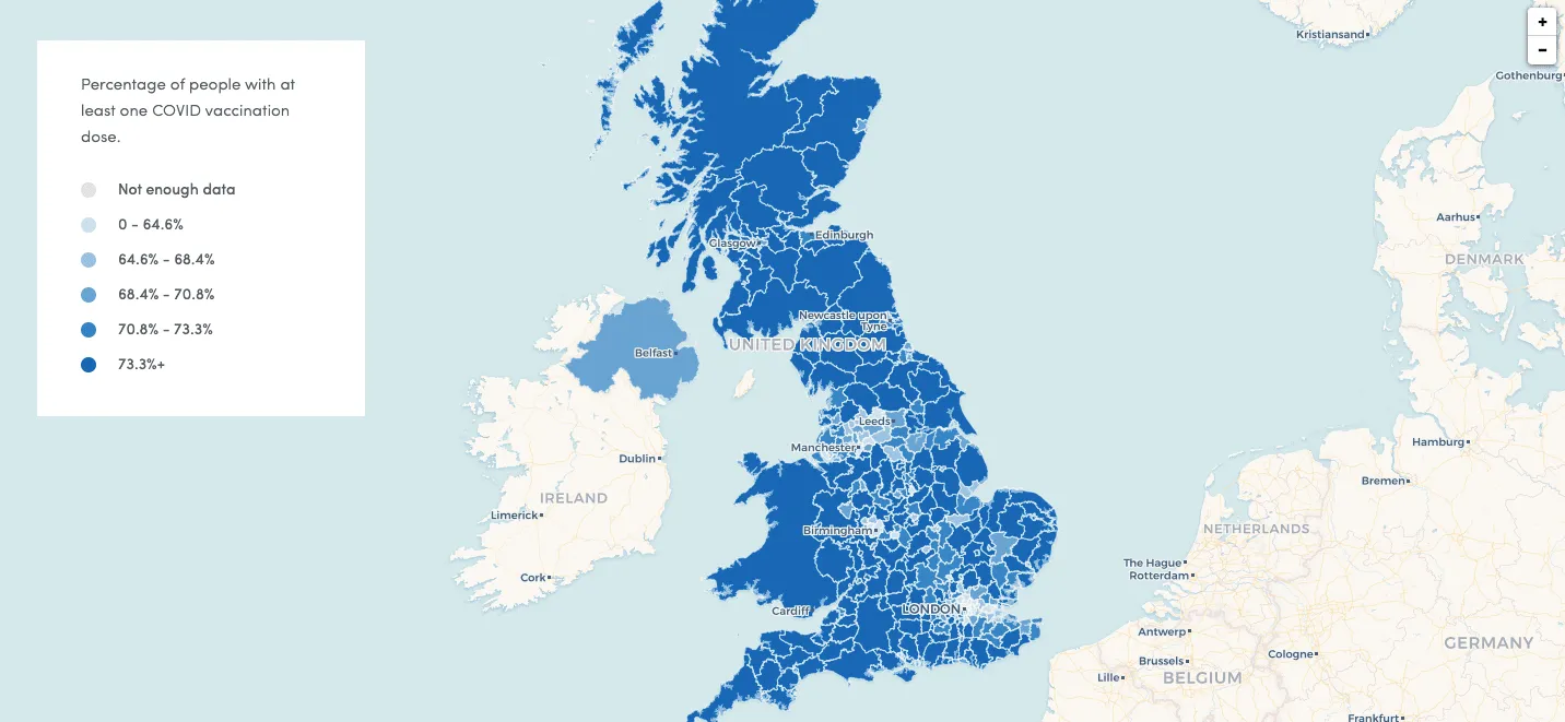
The ZOE COVID Symptom Study app is a not-for-profit initiative that was launched at the end of March 2020 to support vital COVID-19 research. The app was launched by health science company ZOE with scientific analysis provided by King’s College London. With over 4 million contributors globally, the Study is the world’s largest ongoing study of COVID-19 and is led by ZOE Co-Founder Tim Spector. During their research they have used CARTO to analyze data from the app with the most recent findings available on their website.
The team have also visualized the vaccination progress in the UK with the following map showing the percentage of people in each region who have received at least one COVID vaccination sourced from official government data. Darker colors indicate higher vaccination rates than light colours. There is also the ability to click on a region for a breakdown of 1st & 2nd vaccine dose rates.
Analyzing the Impact
Alongside the dramatic loss of human life, the economic and social disruption caused by the pandemic has been widespread.
The Territorial Justice Laboratory of the Federal University of ABC in partnership with the Union of Housing Movements Central of Popular Movements University of Michigan and the Gaspar Garcia Center for Human Rights undertook a research project to better understand water access issues and who is most affected by them.
The general objective of the project was to understand and give visibility to the problems of access and lack of water in low-income communities in different regions of São Paulo and how these problems can aggravate the health risks experienced by people especially during the COVID-19 pandemic.
The research was carried out in 2 stages with the first stage involving a questionnaire on water access which was distributed to leaders and residents of the communities. The results of this stage were visualized on a map in order to better understand the spatial distribution of issues with water access.
To support Chicago-area housing and community development practitioners as they think through the need for housing and place-based interventions the Institute for Housing Studies (IHS) at DePaul University created a new analysis to highlight the potential economic impacts of the COVID-19 crisis on households with workers in occupations most vulnerable to mass layoffs.
The analysis highlights the risk that the COVID-19 related economic crisis will likely disproportionately impact workers of color and renter households particularly already cost-burdened renter households and renter households that are low income.
The Center for Strategic and International Studies (CSIS) in the US used CARTO for a range of visualizations during the pandemic including analyzing trade restrictions G20 countries’ fiscal response and immunization disruption.
Protecting Mental Health
The pandemic has placed a massive burden on already strained mental health systems around the world. The Place-Based Longitudinal Data Resource (PLDR) by the University of Liverpool in the UK brings together datasets that track changes in the determinants of health and health outcomes in places over time. These are used by researchers local government the National Health Service (NHS) and the third party sector to understand what works to improve public health what doesn’t and what can cause harm. As part of this work they have created indices that have been very popular in the UK and used by many governmental agencies to better plan response to the COVID-19 pandemic and areas with poor quality mental health.
Known as the Small Area Mental Health Index (SAMHI) and Small Area Vulnerability Index (SAVI) the team have used CARTO to map these indices alongside other location data points.
The SAMHI is a composite annual measure of population mental health for each Lower Super Output Area (LSOA) in England. The SAMHI combines data on mental health from multiple sources (NHS-Mental health-related hospital attendances Prescribing data – Antidepressants QOF - depression and DWP - Incapacity benefit and Employment support allowance for mental illness) into a single index.
The SAVI is an empirically informed measure of COVID-19 vulnerability for each Middle Super Output Area (MSOA) in England. The SAVI index investigates the association between each predictor (proportion of the population from Black Asian and Minority Ethnic (BAME) backgrounds living in care homes living in overcrowded housing and having been admitted in the past 5 years for a long-term health condition) and COVID-19 mortality using a multivariable Poisson regression whilst adjusting for the age profile of each area and accounting for the regional spread and duration of the epidemic.
Mapping platforms such as CARTO have come to the forefront during the past 18 months and as can be seen in this post have been used for a wide range of use cases in the response to the COVID-19 pandemic. As work continues to minimize the ongoing impact of the virus the ability to quickly analyze and visualize relevant location data is of increasing importance.
Want to get started? Sign up for a free account