Visualize Waze Traffic Data using Google BigQuery & CARTO


Over 140 million monthly active drivers use Waze every day to save time and navigate roads and freeways more easily. Waze users (aka Wazers) can log accidents potholes slow downs and speed traps on the app. This adds up to many billions of rows of extremely useful urban planning and traffic data. Since 2014 Waze has made this data freely available for government partners as part of their Waze for Cities Program. In 2019 Waze began to store this data in Google Cloud making it accessible via BigQuery which can easily be imported into CARTO via our BigQuery connector. This tutorial will show how to import Waze data and use CARTO Builder to easily create visualizations and map dashboards with that data.
Importing Data from Waze Into CARTO
Each Waze for Cities partner gets access to the data sources that are relevant to their area. For this tutorial, I’ll be demoing Waze data for Madrid Spain. The 3 tables I have access to are the following:
Linestrings
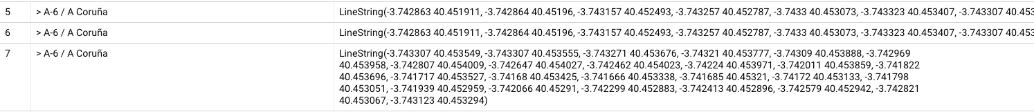
`waze-public-dataset.partner_AyuntamientodeMadrid.view_irregularities_clustered`
This dataset contains linestrings that show me where slowdowns occur, types of slowdowns, and speed of traffic relative to normal.
`waze-public-dataset.partner_AyuntamientodeMadrid.view_jams_clustered`
This dataset contains linestrings that tell me where the traffic jams happened and the speed of traffic at that spot. Some of the rows include start and end nodes but not all of them.
Points
`waze-public-dataset.partner_AyuntamientodeMadrid.view_alerts_clustered`
This dataset contains, points that show me Waze alerts as points for reports such as road closures, accidents, weather hazards, and jams.
In order to explore the datasets better, I sampled 100 rows with a query like this:
SELECT *  geo as the_geom FROM `waze-public-dataset.partner_AyuntamientodeMadrid.view_jams_clustered`
-- Your dataset will be different from this one
 LIMIT 100
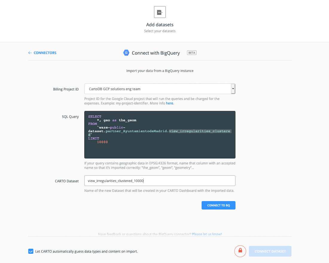
CARTO’s geometry column is called the_geom so setting the column alias of geo as the_geom allows CARTO to more easily import that data correctly and place those geometries on the map.
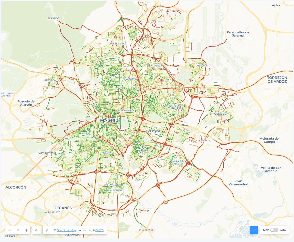
Now I can see a map of traffic jams like so:
Running Waze Onboarding Queries in CARTO
Waze for Cities offers a nice variety of onboarding documentation to their partners. Part of that documentation includes several highly useful SQL queries for querying interesting sets of data from the Waze data. CARTO and BigQuery use slightly different SQL dialects. CARTO uses PostgreSQL while BigQuery uses Standard SQL. They are very similar but do have some differences. Below are some of the results of these Waze onboarding queries shown in Builder:
Flood Alert Points
Here’s the query for pulling all of the Waze flood alerts for Madrid into Builder:
SELECT
  DATE(ts) AS date
  country
  city
  street
  type
  subtype
  geo as the_geom
FROM
`waze-public-dataset.partner_AyuntamientodeMadrid.view_alerts_clustered`
-- Your dataset will be different from this one
WHERE
  subtype = 'HAZARD_WEATHER_FLOOD'
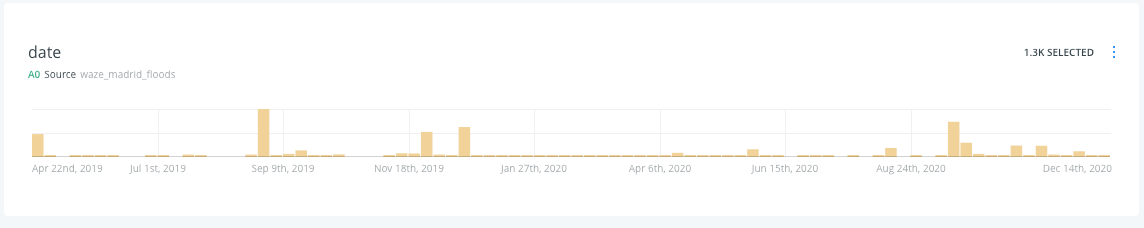
Once I imported the dataset into Builder I only had to add a date widget to the map with one click:
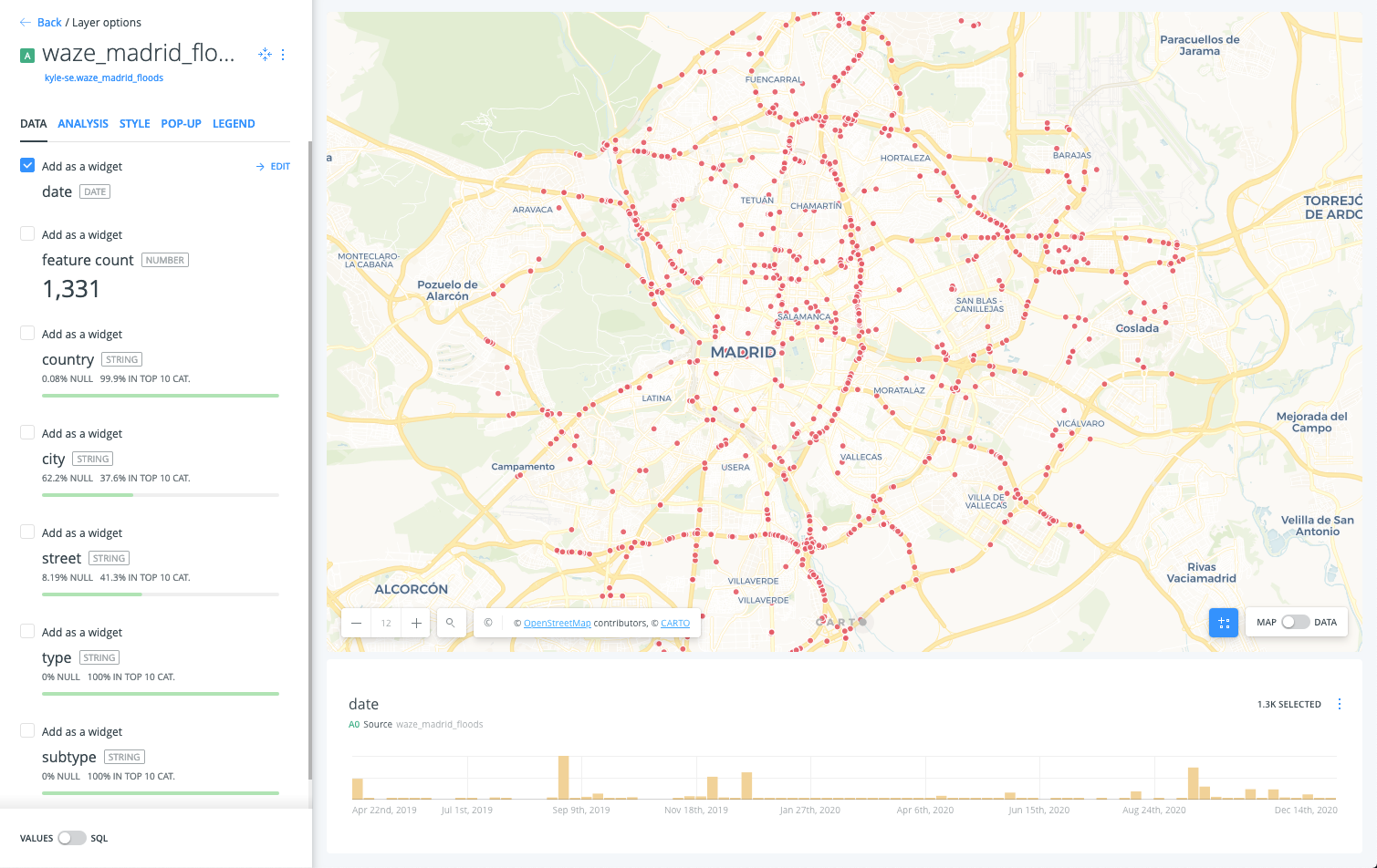
That allows me to see that most floods in Madrid tend to happen in the fall:
Here’s the embedded map for exploring:
Average Speed by Road
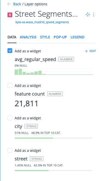
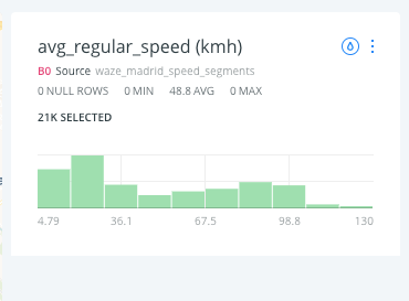
The query below allows me to calculate the average regular moving speed by road segment (there are 20,000 unique roads in my dataset):
SELECT
 country
 city
 street
 geoWKT
 avg(regularSpeed) as avg_regular_speed -- kmh
FROM
`waze-public-dataset.partner_AyuntamientodeMadrid.view_irregularities_clustered`
-- your dataset will be different than this one
GROUP BY 1 2 3 4
I can’t group by a geography in BigQuery so I have to use the well known text column which is conveniently provided in the Waze dataset. In order to parse that data in CARTO I need to use the PostGIS function ST_GeomFromText and st_transform to reproject it into Web Mercator (the standard projection CARTO uses for maps). This query allows me to achieve that:
SELECT cartodb_id city street avg_regular_speed
st_transform(ST_GeomFromText(geowkt 4326) 3857) as the_geom_webmercator
FROM
– Insert table name from when you imported from BigQuery
I then use Builder’s style by value functionality and I’m able to see the roadway speed reflected in the feature color on the map:
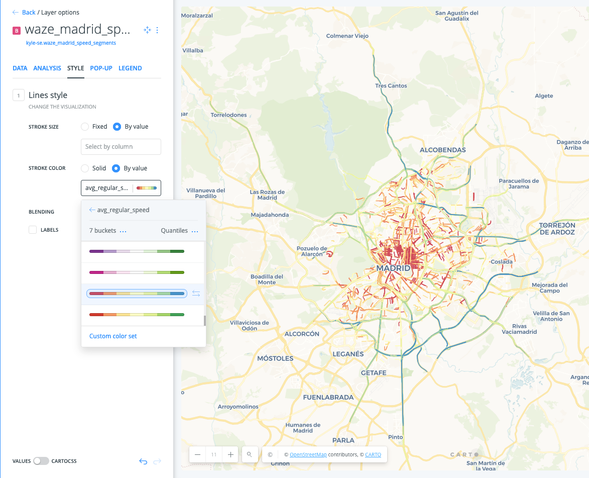
I tab over to the Legend tab and with two clicks I’m able to automatically setup a legend that matches my style by value colors in the previous step:
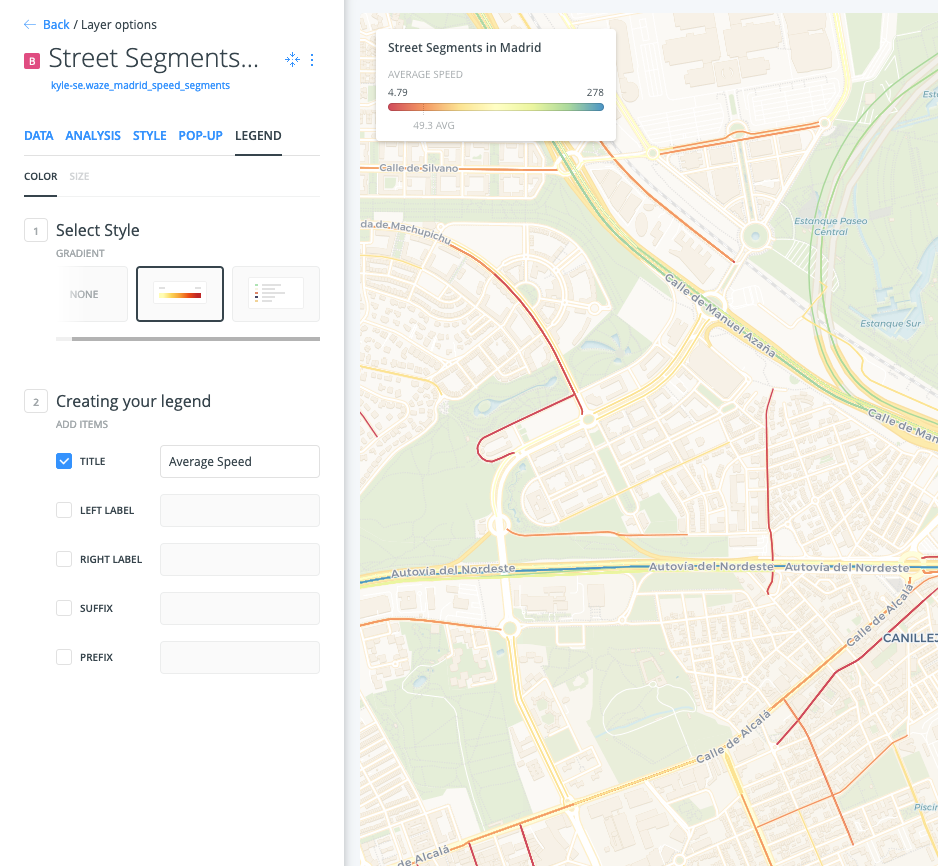
It’s amazing how the story of Madrid’s traffic flow pops out so easily. That’s the beauty of easy geospatial visualization. To allow the user to filter by speed I also set up a histogram filter widget for the average speed by clicking the checkbox:
Here’s the final result:
Streets by Traffic Jam Length
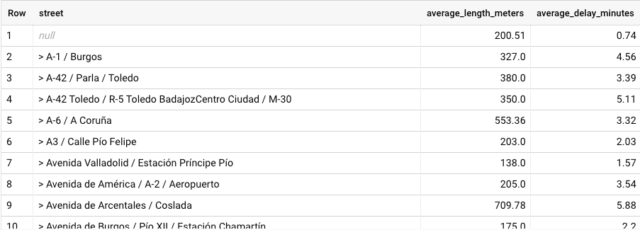
The next example I want to show focuses around calculating the average traffic jam length and duration by street. I can do this with this fairly simple query:
SELECT
street
round(avg(length) 2) as average_length_meters
round(avg(delay)/60 2) as average_delay_minutes
FROM waze-public-dataset.partner_AyuntamientodeMadrid.view_jams_clustered
– Your dataset will be different
GROUP BY 1
order by street
And it gives me results like so:
The challenge here is that I don’t have a geometry column to be able to visualize this in Builder. If I add the geowkt column, I hit a bit of a problem.
SELECT
street
geoWKT
round(avg(length) 2) as average_length_meters
round(avg(delay)/60 2) as average_delay_minutes
FROM waze-public-dataset.partner_AyuntamientodeMadrid.view_jams_clustered
– Your dataset will be different
where street is not null
GROUP BY 1 2
order by street
Because the jams are generally unique (it might be on the same street but a different part of the street) this query results in multiple duplicate rows for each street.
This is a challenge of doing calculations (e.g. max min average) while using group by and wanting to get a geometry to display on a map. If I show all of these on a map they will be a bunch of stacked up traffic jams vs. being able to visually show which streets have the worst traffic jams on average.
There is one potential way to be able to visually show differences in average traffic jam while also being able to show the street segment on the map. I need to calculate the average jam length for the street and get the geometry for the longest jam. This would allow the user to still see the street while also understanding how traffic varies between streets.
To sort of solve this I created one subquery to calculate the average length and delay by street and then another to get the geometry for the longest jam. I join them together and the query comes out like so:
with street_and_avgs as (
SELECT
street
round(avg(length) 2) as average_length_meters,
round(avg(delay)/60 2) as average_delay_minutes,
FROM waze-public-dataset.partner_AyuntamientodeMadrid.view_jams_clustered
– Your dataset will be different from this one
where street is not null
GROUP BY 1
order by street
), street_and_longest_segment as (
select yt.street yt.geoWKT
  from waze-public-dataset.partner_AyuntamientodeMadrid.view_jams_clustered yt
  where length =
      (select max(length) from waze-public-dataset.partner_AyuntamientodeMadrid.view_jams_clustered st where yt.street = st.street)
      order by street
)
select distinct a., b.
from street_and_avgs a
join street_and_longest_segment b
on a.street = b.street
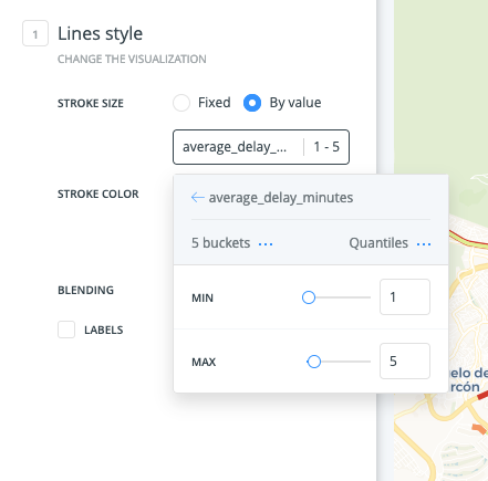
When I pulled the results into Builder and style by average delay time it looks like so:
If you go back to the first example you’ll notice how some of the roads with the longest traffic jam delays also have some of the fastest average speeds. This would indicate that when things are flowing smoothly, traffic moves quite fast. But that drivers also take the risk of getting caught in the jams.
Of course one big caveat with this is that I’m only showing the longest jam segment for these streets. This longest jam segment generally seems to cover the whole street segment but in a few cases it arbitrarily cuts off like so:
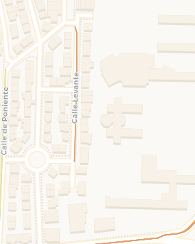
One way to alleviate this oddity would be to join the streets + average delay time to the geometry for that segment from OpenStreetMap (also in BigQuery). That way it would show the whole segment for all of the roads instead of using the longest jam as a proxy.
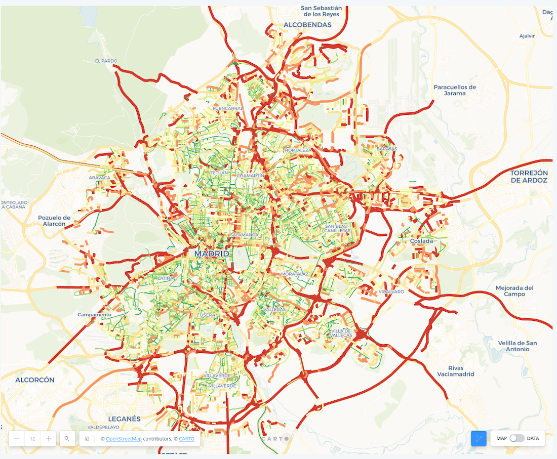
Styling the line segment width by average delay makes the visual even more striking:
The jammed up streets stand out even more now:
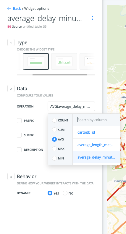
The last thing to do is add a few histogram widgets to allow the user to filter the jams by average length and delay time. I also added some formula widgets for average delay and max delay:
Bonus: CARTO BigQuery Tiler for Waze Alert Points
In mid 2020 we released our BigQuery Tiler which allows for the easy creation of map tilesets with data stored in BigQuery. Tilesets can render millions or billions of points faster than conventional raster or vector map tiles can. Every zoom level of a tileset is pre-rendered which allows for faster rendering. Just for the fun of it I plugged all of the Waze alert points into the BigQuery tiler like so:
CALL cartobq.tiler.CreatePointAggregationTileset(
–SQL to use as the source (uses geom as the name for the geography)
‘’’(select geo as geom from waze-public-dataset.partner_AyuntamientodeMadrid.view_alerts_clustered)’’’,
– Your dataset will be different from this one
– Name and location where the Tileset will be stored.
– Replace MYORGANIZATIONNAME.maps.nyc_tress_tileset with
– YOUR destination where to store the Tileset.
  ‘cartodb-gcp-solutions-eng-team.kyle_data.waze_alerts1’
–Options on how to generate the Tileset
‘’’{
    “zoom_max”: 16,
    “type”: “quadkey”,
    “resolution”: 8,
    “placement”: “cell-centroid”,
    “properties”:{
      “aggregated_total”: {
        “formula”: “count(*)”
        “type”: “Number”
      }
    }
}’’’);
I had to alias geo as geom as that’s what the CreatePointAggregationTileset function knows how to read. Et voila:
I can now explore aggregations of the Waze alerts much more quickly.
Resources to get started
If you are a government agency and want to get access to Waze data you can apply here the program is free and available to governments in the countries where Waze operates. When you are given access to Waze data you will be given an onboarding guide with a variety of excellent queries to get started. To get started using CARTO Builder please check out these links:
- Getting Started with CARTO Builder
- CARTO Help/Tutorials
- BigQuery functions: Geography functions in Standard SQL
Want to get started?