


23 of the best maps, visualizations & analysis from 2023


Welcome to our round-up of the stand-out analysis, maps and data visualizations created with CARTO throughout 2023!
2023 was a huge year for geospatial! We’re seeing a real shift in the industry, with the modernization of the geo data stack moving at an ever-faster pace. This means bigger data, more advanced analytics and greater levels of transparency and openness. All of this means the maps and data visualizations you are all producing just keep getting better!
If you feel inspired by these creations, make sure you sign up to a free 14-day trial of CARTO!
So, here’s our round up of 23 of our favorite maps created in 2023! In no particular order… 🥁🥁🥁
As we see the data science and geospatial industry continuing to become more integrated, spatial analysis is becoming increasingly sophisticated. Here are some of our favorite examples!

This map (explore in full-screen here) is the result of Space-time hotspot analysis of vehicle collisions in NYC, allowing users to identify clusters of collisions which are significant both spatially and temporally. Try changing the “Time of day” parameter to see how the spatial patterns change throughout the day!
By examining both spatial and temporal dimensions in your data, you can uncover trends, optimize operations, and make more informed decisions. Want to recreate this map? Check out the full tutorial here!
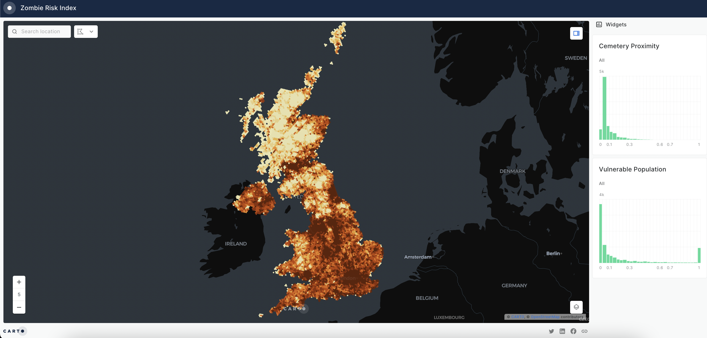
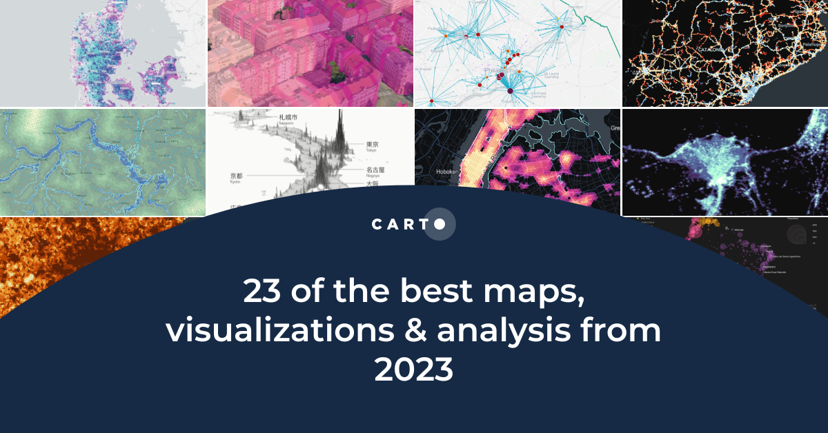
Do you have your zombie apocalypse plan sorted? If not, our Senior Solutions Engineer Simon Wrigley is here to help! Using CARTO Workflows (see below), he combines the urbanity level (high density urban = high risk, rural/remote = low risk), the vulnerable population (aged 70+) and the proximity to the closest cemetery from OpenStreetMap (zombie supply) to create an overall zombie risk index! Open this map in full-screen here.
In this video, watch Matt Forrest (CARTO Field CTO) build a Telco propagation model which uses machine learning to understand the best location for a new cell tower. This analysis incorporates data on demographics, elevation - even tree coverage! You can explore the final output of Matt’s analysis here.
Cannibalization analysis evaluates the impact of a new location or business on existing nearby locations. It helps answer questions such as “To what extent will placing a new 5G tower in this location reduce churn in this area?” or “If I start selling a chocolate bar from store X, how will it affect the sales in store Y?”
The map above (open in full-screen here) examines the impact of stocking a CPG product in a new Point of Sale (POS). The more overlap between the catchments of new and existing merchants, the larger and darker the point representing it is. You can also see the blue lines connecting each potential POS to the existing merchants it is “cannibalizing.”
Want to try this yourself? Check out our full guide to cannibalization analysis here!
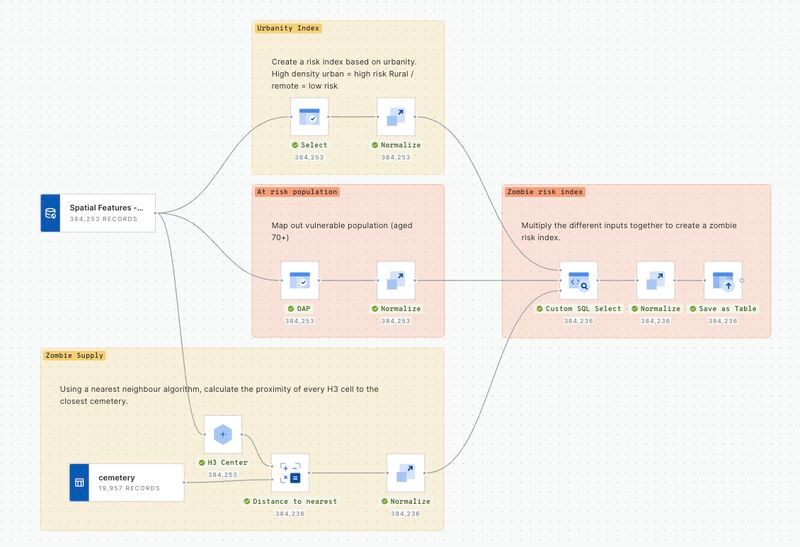
In this visualization (open in full-screen here), cell towers across Colorado are visualized by the number of residents living within 1km of them; cell towers with a higher population have larger, darker symbols. A series of widgets are used to help users pinpoint data most relevant to them, such as the pie chart widget to filter data points by operator. This information is really important for optimizing network planning and resource allocation.
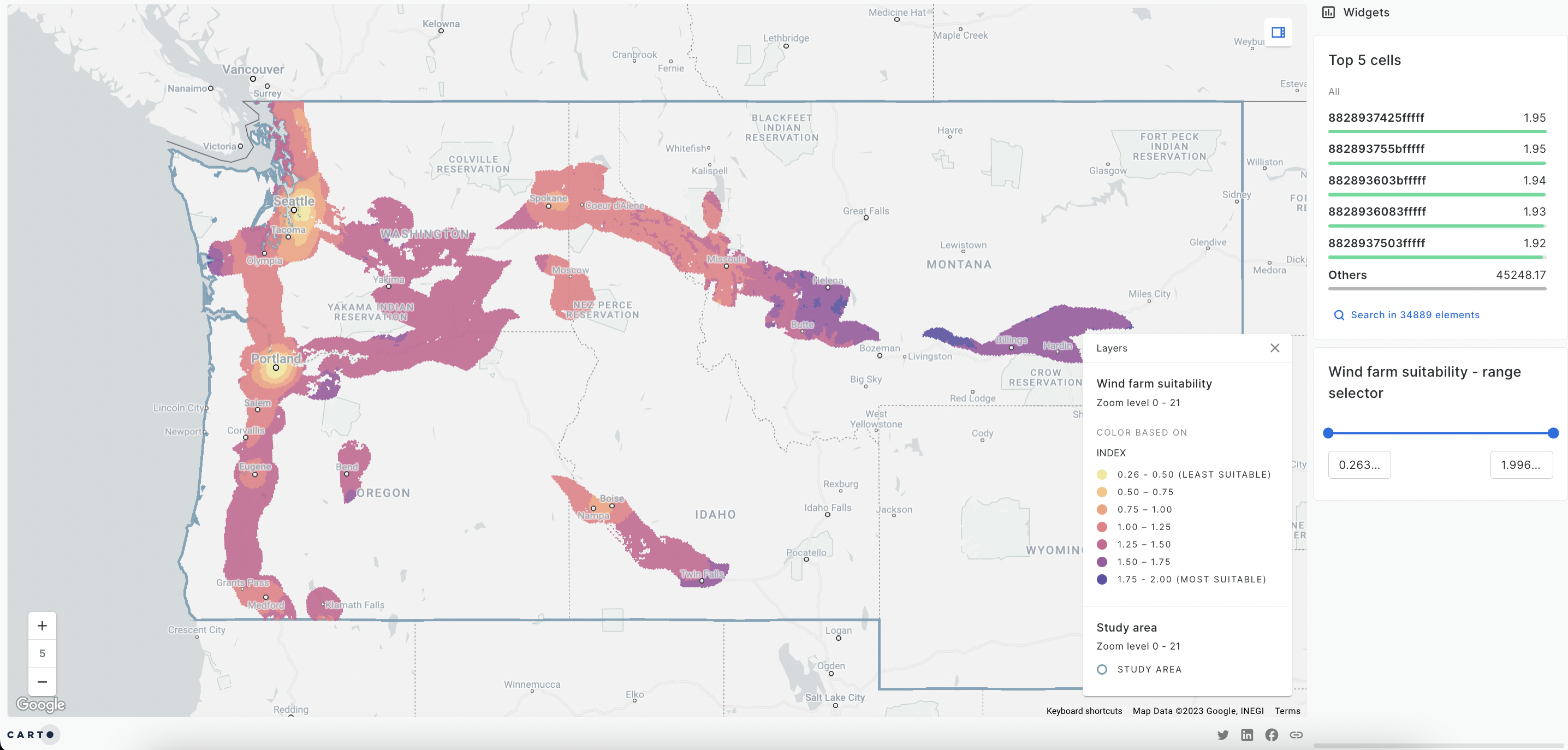
With a global goal of reaching net zero by 2050, an additional 70-80 GW of wind power will need to be installed annually. However, finding the ideal location for a wind farm is challenging… and that’s exactly what this map explores!
The locations highlighted are all within 25 miles of a >=400KV powerline & 15 miles of a motorway or trunk level highway, but do not fall within a protected area. The dark purple areas on this map (open in full-screen here) are the optimal locations for a wind farm, with high wind speeds but a small local population.
Want to recreate this analysis? Check out this webinar to watch this analysis in action!
—
Interested in learning more about how your organization's Data Science & GIS setup compares to other organizations? Download your free copy of the State of Spatial Data Science here!

As spatial data becomes bigger and bigger, an important skill for anyone working with geospatial data is handling large data effectively, turning noise into insight. Here are some of the best examples to inspire you!
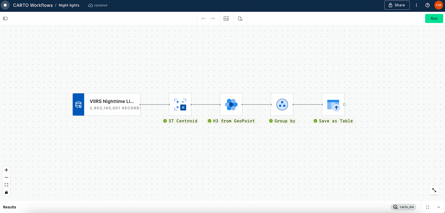
In this visualization (explore the interactive version here), Global Night Light Data - sourced from the Colorado School of Mines, via the CARTO Spatial Data Catalog here - have been transformed into a H3 Spatial Index, allowing for speedy rendering of over 4 million individual cells! You can see how this was achieved with a simple workflow below.

This map (explore in full-screen here) explores flood risk across Britain. The population, number of buildings, elevation and distance to water courses have been calculated for each of the 362,627 H3 cells on this map. Zoom-based rendering means more detail - such as 40.4 million individual buildings - appears as you zoom in, making this a great tool for decision-making at local to national scales.
This map (open in full screen here) leverages tilesets - a method of breaking data down into pre-rendered “chunks” - in order to visualize a massive amount of data; 1.1 million buildings, to be exact! Each building has been extruded to its physical height, meaning this map is perfectly to scale.
You can watch a tutorial for creating this tileset on our YouTube channel.

This custom application utilizes CARTO + Deck.gl in a simple Typescript structure, accessing data through a cloud-native data warehouse connection without the need for ETL or replication. Dynamic Tiling allows the user to visualize and seamlessly interact with 1.4 million Points of Interest in the US, while SQL Parameters enable querying directly inside the application.
This application really exemplifies the power of tilesets, displaying 481 million building footprint polygons globally!
Learn more about custom app development with CARTO in this blog.
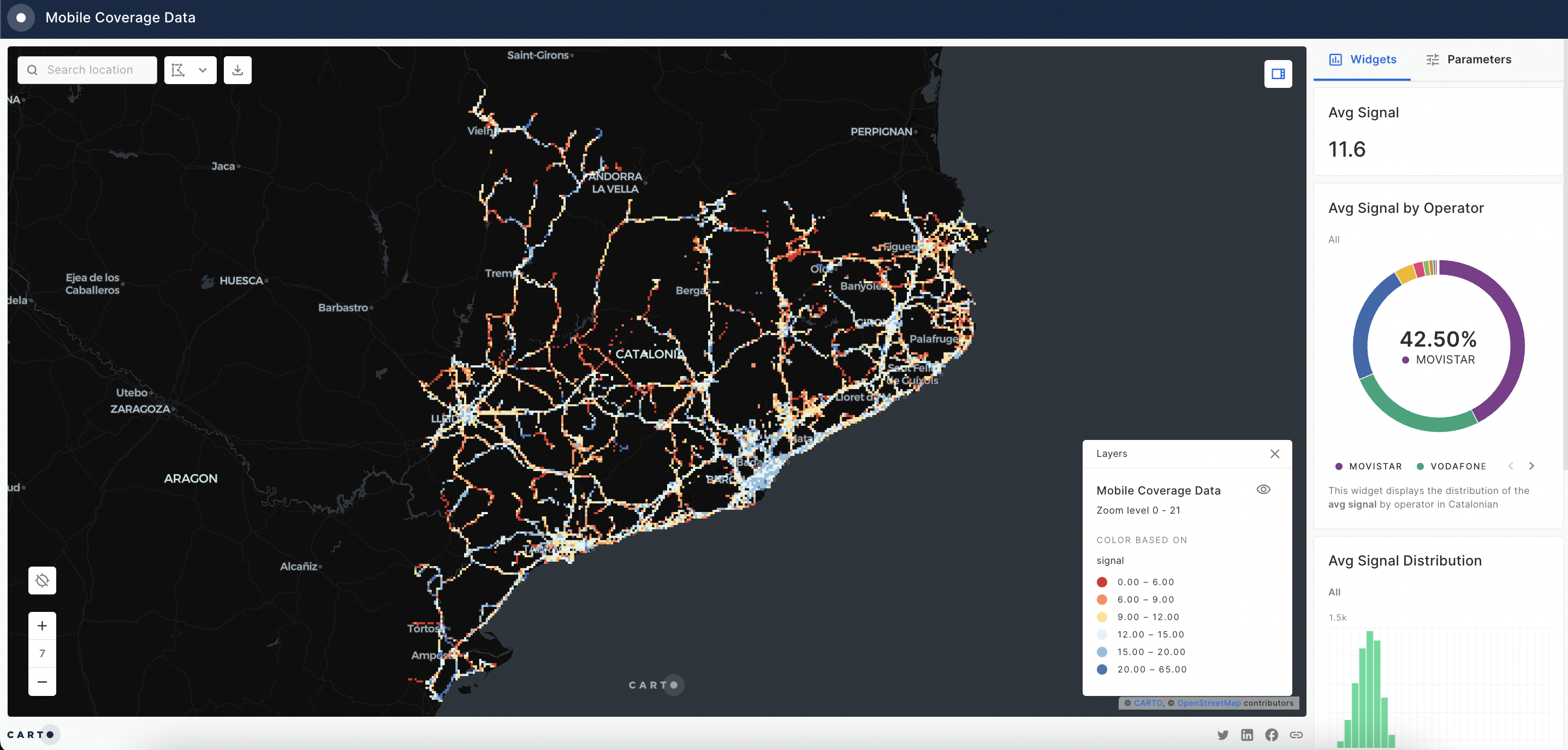
This map (open in full-screen here) leverages a Quadbin Spatial Index to visualize mobile signal strength across Catalonia. As the user zooms in, the resolution of the index changes, revealing hyper-local levels of detail. SQL Parameters also allow the user to adapt the visualization by date and operator.
Want to recreate this map? You can access this data via the Google Data Marketplace.
—
Interested in using Spatial Indexes like H3 & Quadbin to scale your analysis? Get started today by downloading a free copy of our ebook - Spatial Indexes 101!
.png)
What’s the point of crafting the most sophisticated analysis if no one can understand it? In this section, we celebrate some of the most impactful spatial data visualizations of the year!

The map above (open in full-screen here) visualizes every earthquake in the USA since 2019. You can really see the strong spatial patterns of this hazard, with many more earthquakes occurring to the east of the US around the San Andreas Fault. A key element of this map is the time series widget to enable an animation of these events occurring through time (click play to watch this in action!).
This tool empowers catastrophe analysts to identify high-risk zones, assess the frequency and intensity of seismic activity, and make informed decisions crucial for developing comprehensive strategies to mitigate the financial impact of earthquakes on insured portfolios.
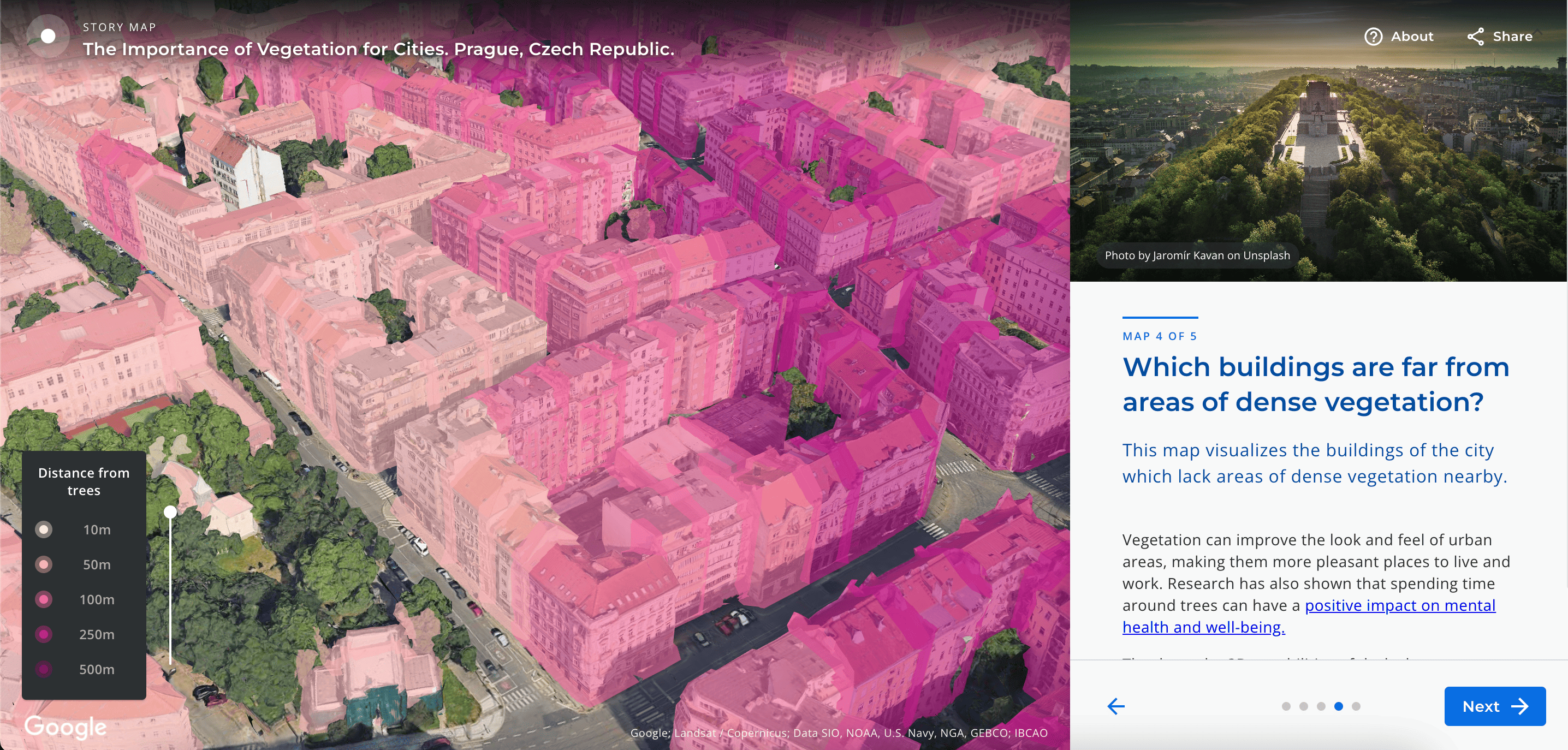
Photorealistic 3D mapping has been transformative for data visualizations in 2023.
Google Maps Platform's integration of photorealistic data in over 2500 cities across 49 countries adds a new level of detail and impact to 3D visualizations. This is illustrated in this project (open in full-screen here) - the result of a collaboration between CARTO, Google Maps Platform, and deck.gl. The story map explores the relationship between urban vegetation, land surface temperatures and the urban heat island - all visualized in stunning photorealistic 3D tiles.
Learn how you can integrate this technology into your visualizations here!
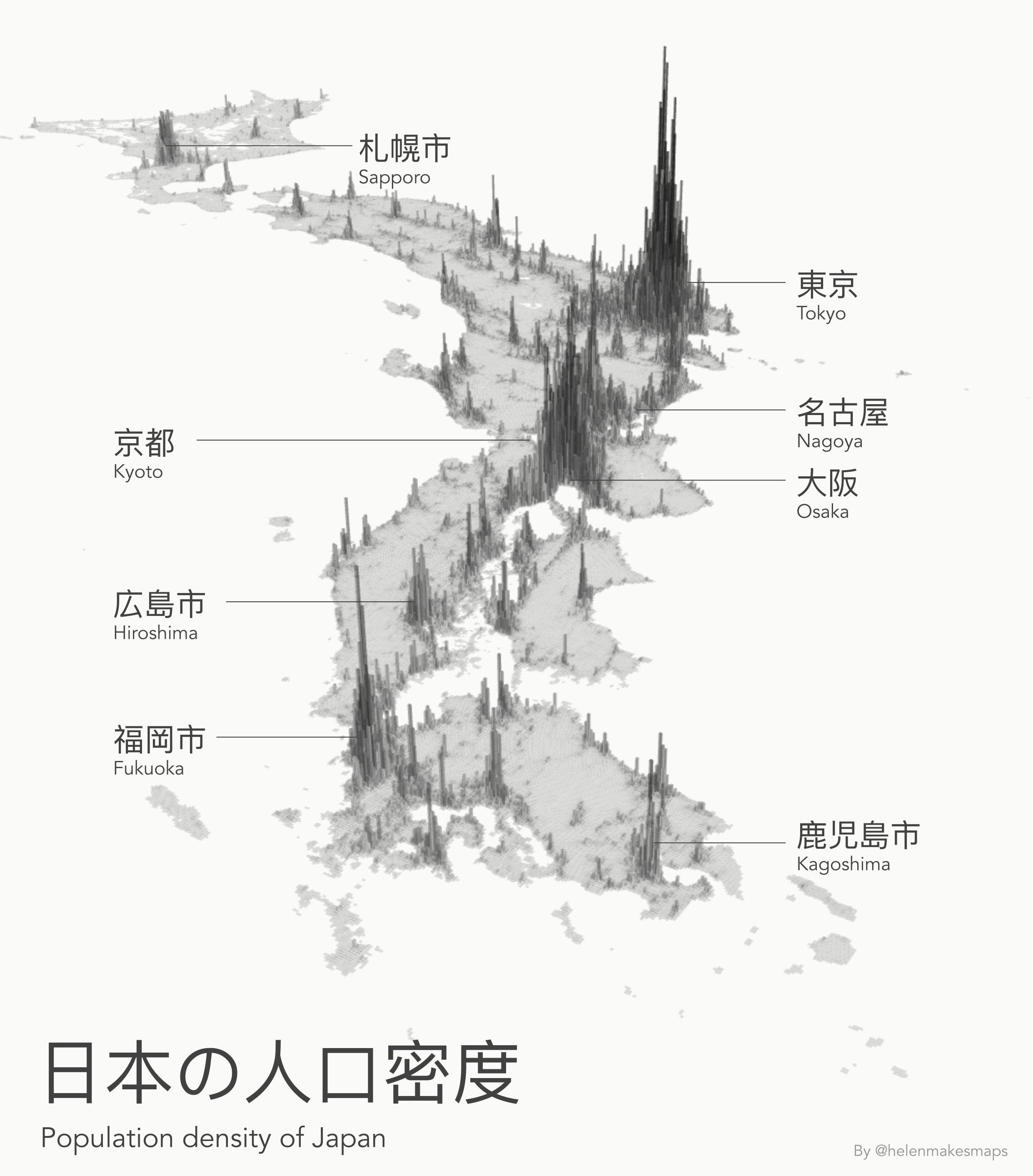
Sometimes the simplest visualizations are the best. Our Geospatial Advocate, Helen McKenzie, created this super minimalist visualization of Japan’s population density using WorldPop data from our Spatial Data Catalog, aggregated to a Quadbin grid - you can follow this methodology for any country in the world with this video. All of the basemap information has been switched off in CARTO Builder, allowing you to really focus on the data.
Explore the interactive version of this map here!
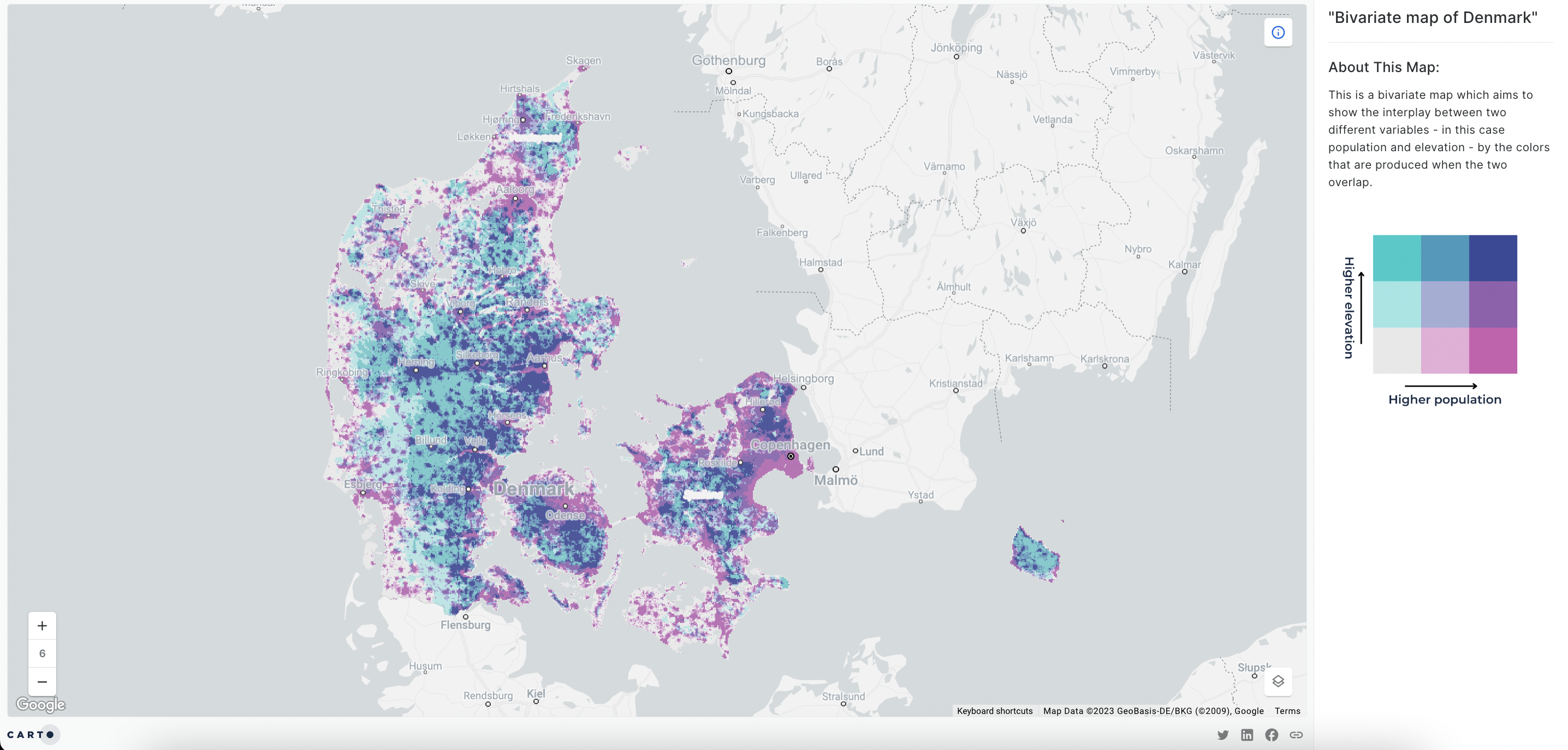
Bivariate maps aim to show the interplay between two different variables - in this case population and elevation - by the colors that are produced when the two overlap. In this case (open in full-screen here), where both population and elevation are relatively high, a dark navy color is displayed. When either variable is significantly higher, a turquoise or pink color can be seen.
This concept is made easier for the user to understand through the use of the Map Description panel - new to CARTO for 2023! This panel allows users to use text and media to communicate additional contextual information about each map.
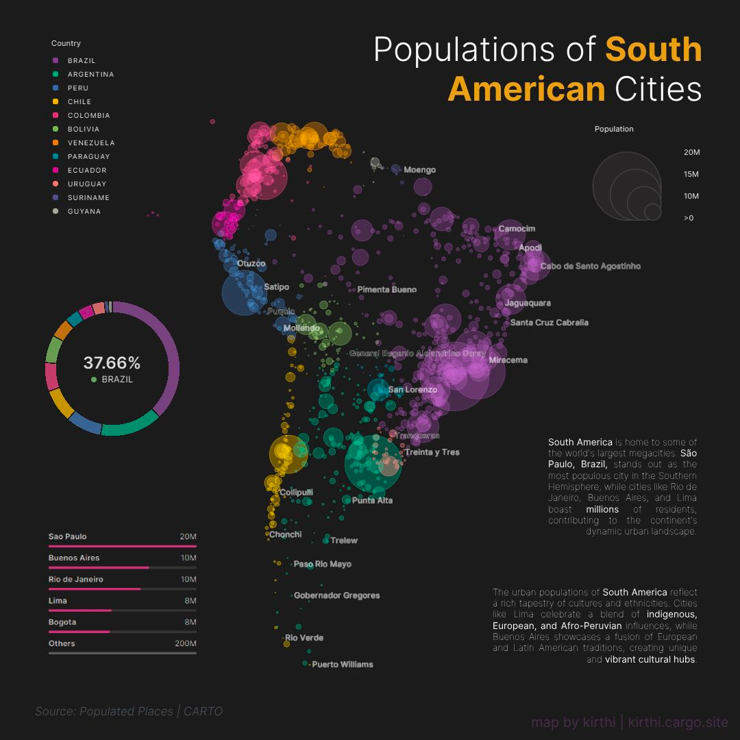
Created for the #30daymapchallenge, Kirthi Balakrishnan from HR&A Advisors designed this stunning map which shows the population of different cities across South America. We love the minimalist design, with the basemap removed in CARTO Builder. The use of the pie chart and category widgets gives this map a more “infographic” feel.
“Democratizing Geospatial” is all about putting analytical capabilities in the hands of the end user. Maps are increasingly empowering end users to interact with and analyze data in a controlled way, dramatically shortening the time-to-insight. Learn more about how geospatial is becoming more democratic here.
This visualization (open in full-screen here) shows the geography of road traffic accidents across Great Britain. The data has been transformed from 101,000 individual road accident points into a H3 Spatial Index - making it far easier to interpret the spatial patterns within the data. Users can select different values from the SQL Parameters panel - including severity, vehicle involvement, casualty type and population normalization - to build an “accident index” which is relevant to their precise requirements.
This analysis is based on Road Safety Data from the UK’s Department for Transport, combining data on 101,000 accidents, 184,000 involved vehicles and 128,000 casualties.
Human mobility data provides valuable insights across a wide range of use cases, such as enabling telco companies to optimize network coverage and capacity planning.
This visualization (open in full-screen here) - using Footfall data (available on our Spatial Data Catalog here) from our data partners Unacast - allows users to explore human mobility at a massive scale, and select which time periods are included in the visualization via the Parameters panel.
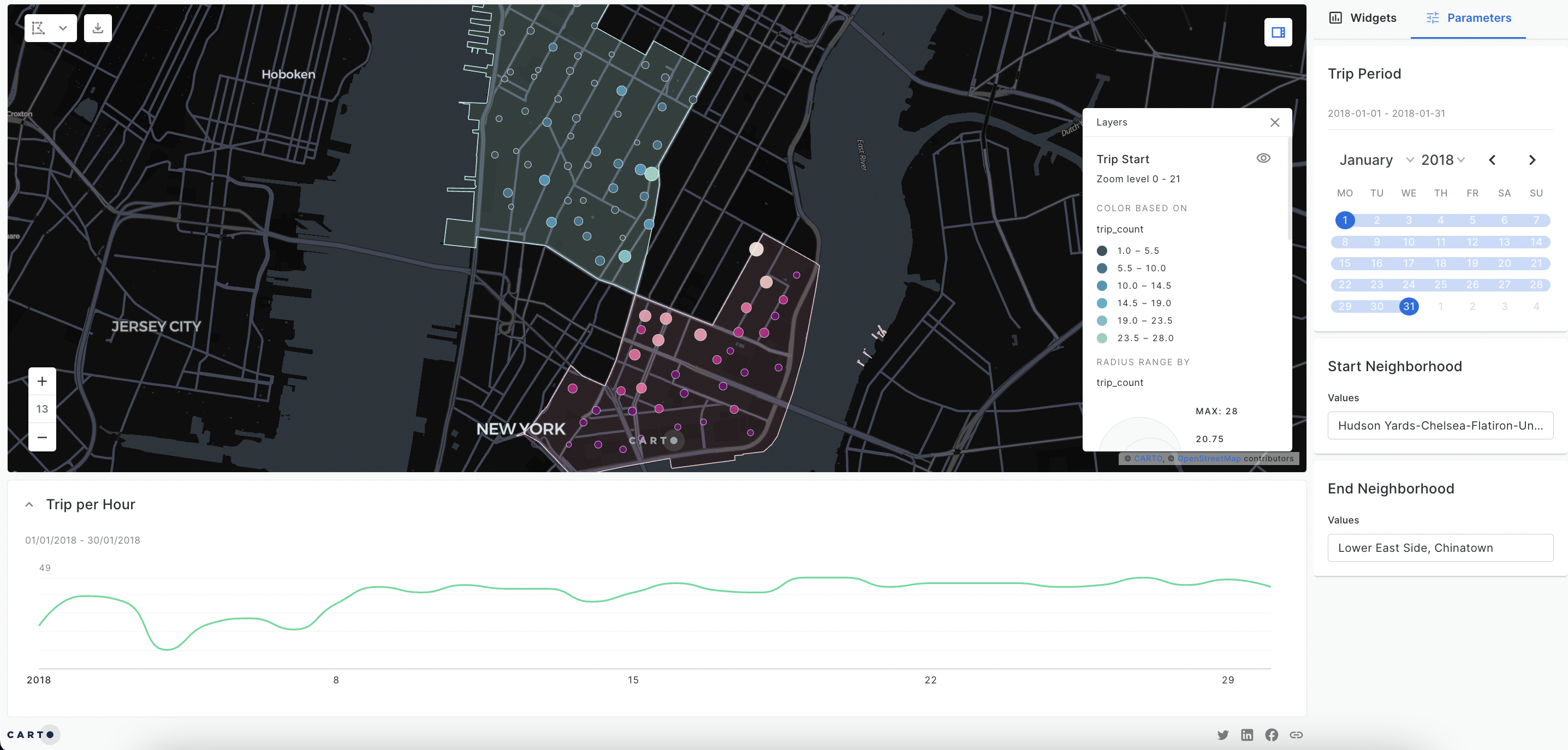
This CARTO Builder dashboard (open in full-screen here) visualizes the spatial and temporal distribution of Citi Bike trips, providing important insights for optimizing bike availability, planning maintenance schedules and determining pricing structures. In this visualization, the end-user can filter Citi Bike trips by those which start or end in particular neighborhoods, or that occur on specific dates.
Want to recreate this analysis? Check out the full tutorial here!
This map (open in full-screen here) is a fantastic example of SQL Parameters in action! The user can change the size of each station catchment from 0 to 20 minutes; doing so will recalculate not only the catchment buffers, but the demographic data each buffer contains.
This approach is incredibly powerful for use cases where the end user is likely to have shifting requirements. Allowing them to adapt the parameters feeding into the analysis saves a huge amount of time, as well as being a great way to engage stakeholders!
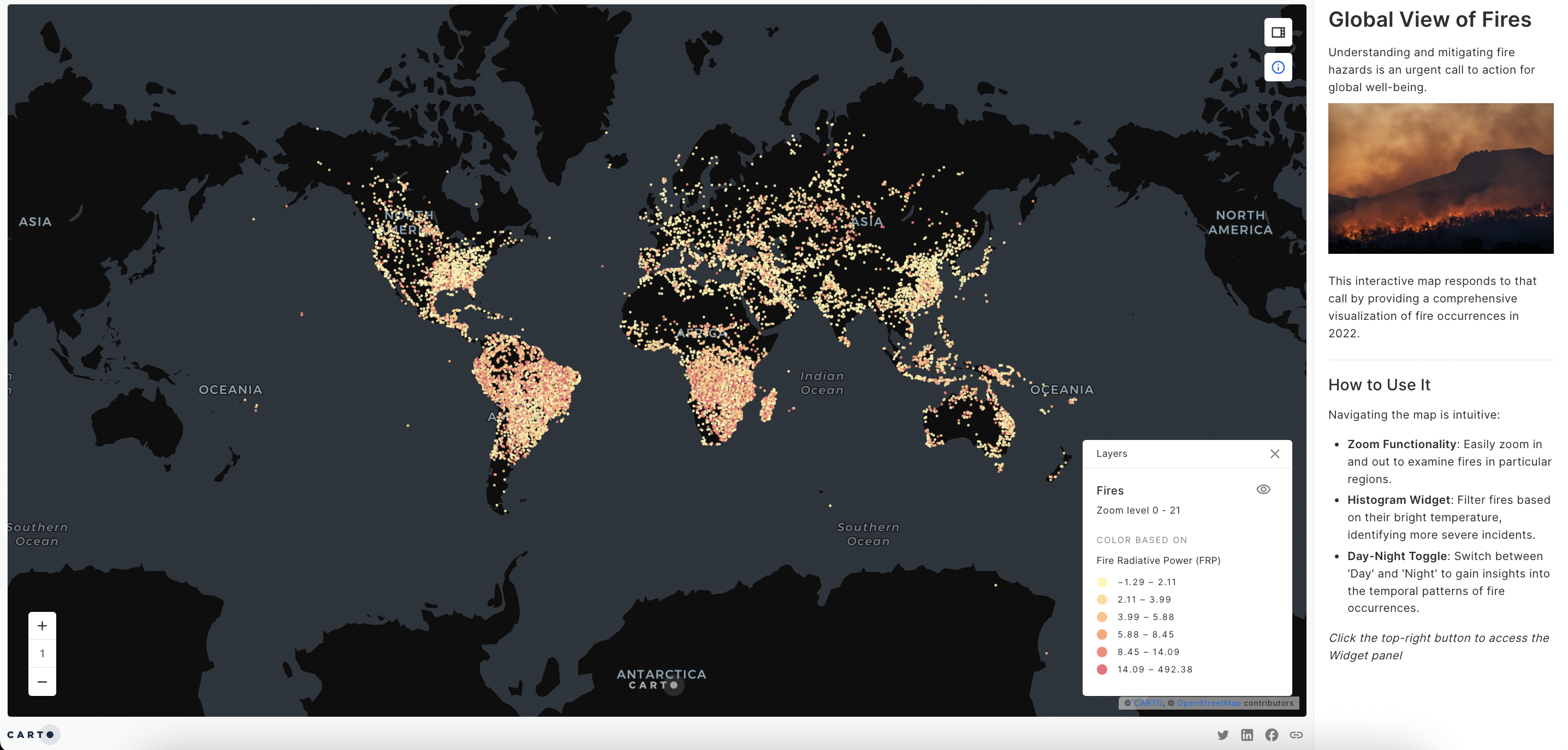
2023 has seen extremely high levels of wildfire activity around the world. Being able to understand the spatial patterns behind wildfires is fundamental for insurance risk assessments, implementation of effective mitigation measures, and enhancement of disaster preparedness in wildfire-prone regions.
This map (open in full-screen here) visualizes this data on a global scale, with in-built parameters and widgets which allow users to filter the most relevant data.

This map allows users to explore 4G LTE coverage for Verizon, T-Mobile, and AT&T in Washington state. The visualization emphasizes gaps in network service in order to inform strategic decisions for telecom providers in addressing connectivity challenges in diverse terrains and identifying opportunities for network deployment.
The user can use parameters and widgets to filter the coverage data based on the demographics of the areas served, such as population density and income level.
2023 has been a big year for music, and no event is bigger than Taylor Swift’s Eras Tour. Whilst the tour is set to generate $4.6 BILLION for the US economy, not everywhere is set to benefit. In this map, our Geospatial Advocate Helen McKenzie explores which areas are most in need of a Taylor Swift concert. Users can use SQL Parameters to build their own “Blank Spaces” index, weighting locations by the size of the local fan base, distance to the nearest concert venue and how much the local economy is in need of a boost.
Want to try this out yourself? Sign up to this webinar to watch how this map was created!
—
We hope you enjoyed our round-up of some of our favorite maps of 2023! Make sure you sign up for a free 14-day CARTO trial so you can have a go at creating one yourself! Not sure where to start? Request a demo from one of our geospatial experts!


.jpg)


.png)
