

Venue Suitability Analysis for the Eurovision Song Contest with CARTO


On the 26th July it was announced that the United Kingdom would be hosting 2023’s Eurovision Song Contest. No fewer than 13 cities are expected to bid for the honor of hosting the show, and a fierce competition is predicted as cities and venues aim to prove their suitability for the event. And - as is often the case at CARTO - we thought “we could make a map for that.”
So welcome to our run-down of the top 10 most suitable event venues in the UK for the Eurovision Song Contest! This was decided by the most ruthless judge of all: Spatial Data Science.
We’ve created a multi-criteria site suitability assessment of music venues across the UK. Following the announcement of the results (with - we promise - far less preamble than in the actual contest) we’ll show you how you can repeat this analysis for any site suitability assessment - even for those less glamorous occasions!
Scoring venues with Location Intelligence
So what makes for a successful Eurovision Song Contest venue? Like with so many events, a lot of it comes down to transport and logistics. If you can’t get the performers, audience members, staff and containers of glitter to the venue, then you don’t have a show.
For our analysis. we explored four key criteria for evaluating how suitable a venue is:
- Capacity. The audience size has varied hugely in recent years from 3,500 attendees at 2021’s event in the Netherlands (thanks COVID!) to 38,000 fans at Copenhagen’s Parken Stadium in 2001. However, if there’s one phrase that rings true for Eurovision. it’s “Bigger is Better.” We used Wikipedia to access venue capacities across the UK and only included venues with capacities greater than 10,000.
- International Access. With competitors. staff. fans and press flying in from all over Europe (and… Australia) ease of access to international airports is crucial. We took advantage of CARTO’s 11.000 dataset-strong Spatial Data Catalog and used the freely available Natural Earth’s Airports dataset for this.
- Internal Access. Similarly. huge numbers of visitors will descend on the event venue to enjoy and work at this event. In order to make the event sustainable - as well as to minimize disruption to local transport infrastructure - we’ve scored venues in close proximity to rail stations the highest. The locations for these were extracted from Google BigQuery’s public OpenStreetMap dataset.
- Accommodation. A large number of hotels will be needed close to the successful venue - ideally within walking distance. We’ve used our data partner Safegraph’s excellent Places dataset to work out the number of hotels within a 1,200m (an approximate 15-minute walk) from each venue. This is a premium dataset point of interest available via our Spatial Data Catalog.
This list could easily be extended or altered depending on the focus of your site suitability assessment. Check out the Use Cases section of our blog for inspiration on suitability analysis and Site Selection for activities ranging from electric vehicles to targeted radio broadcasts.
We scored each venue against each of these indicators and combined these into a final overall score which leads us to our top 10 venues…
Our winner is… Principality Stadium Cardiff!
Twelve points go to Principality Stadium! Capable of hosting enormous crowds of 74,500 it’s the third largest venue in the country (behind Wembley and Old Trafford). It’s got fantastic transport links, with Cardiff Central Station just over the road and Cardiff Airport only 8.9 miles (14 kilometers) away. It also boasts a city center location allowing it to benefit from 49 hotels with a 15-minute walk.
The top 10 venues are…
- Principality Stadium, Cardiff
- Wembley Stadium, London
- Murrayfield Stadium, Edinburgh
- Old Trafford, Manchester
- Manchester Central Convention Centre, Manchester
- Manchester Arena, Manchester
- Twickenham Stadium, London
- Celtic Park, Glasgow
- Easter Road Stadium, Edinburgh
- Ibrox Stadium, Glasgow
Explore the top 10 on the map below! Play around with the different layers, dynamic widgets and bespoke popups made possible through our data visualization & analytics suite, CARTO Builder!
Open this in a full window here (recommended for mobile users).
How did we do this?
How long do you think it took all this analysis to run? Hold on to your swivel chair/beanbag. Three seconds. That’s IT!
Thanks to the power of Spatial SQL and CARTO being cloud-native, we were able to perform all of this analysis in just three seconds, and in just ONE SQL query! Not only is SQL a quick and easy way of performing site suitability analysis it’s incredibly iterative; you can add take away and change variables and datasets and have your new results in just three seconds.
Ready to learn how? Make sure you sign up for CARTO’s 14-day free trial so you can analyze along with us!

The analysis
The SQL code for this analysis is quite long because it wraps up a lot of different functions into just one query. However, it’s actually quite simple code and repeats a lot of the same functionality for the different variables we’re looking at - so don’t be put off! There are 5 key steps to this code:
Step 1: Load the requisite datasets. Here we’re using venues, hotels, stations and airports. Give each of them an alias; this makes things SO much easier than having to type (ok let’s be honest - copy & paste) the full qualified name out each time.
Step 2: Count hotels within 1200m. Here we use a LEFT JOIN to join the hotels to the venues, using the spatial predicate (i.e. relationship) ST_DISTANCE() to specify this join should only occur where hotels are within 1,200m of the venue. The COUNT() function is used to count where this join occurs, creating a field “hotels_count”. As this is an aggregate function all other fields also must be aggregated either using GROUP BY or ST_UNION_AGG() for geometries.
Step 3: Calculate distances to airports and stations. The MIN(ST_DISTANCE()) function is used to calculate the distance from the venue to the closest transport facilities, giving us the new fields “station_distance” and “airports_distance.”
Step 4: Min-max normalization. We have our four suitability indicators - hooray! To be able to combine these into one overall suitability score, we first need to normalize them so they are all comparable. We’ll be using a min-max method here which gives the optimum venue a score of 1 (e.g. the venue with the greatest capacity) and the least suitable venue (e.g. the smallest) a score of 0. All other venues have decimal values between 0 and 1 relative to the range of the data. The basic syntax for this is “(Data value - range minimum)/data range.”
Step 5: And finally! That’s the hard part done! Now we just need to add those four individual scores together to give us an overall venue suitability score out of 4. We’ll also give each venue a rank so we can focus on just the top 10 for our visualization.
And here’s what that looks like!
/*Step 1: Load the requisite datasets*/
WITH stations AS (SELECT * FROM cartodb-gcp-marketing-team.eurovision2023.osm_stations),
airports AS (SELECT * FROM carto-data.ac_lqe3zwgu.sub_natural_earth_geography_glo_airports_410 where gps_code LIKE 'EG%'),
venues AS (SELECT * FROM cartodb-gcp-marketing-team.eurovision2023.Music_venues where capacity > 10000),
hotels AS (SELECT * FROM cartodb-gcp-marketing-team.eurovision2023.safegraph_accommodation),
/Step 2: Count hotels within 1200m/
hotelcount AS (SELECT ST_UNION_AGG(venues.geom) AS geom, venues.name, venues.city, venues.capacity, venues.imagelink, venues.imagecredit, COUNT(hotels.geom) AS hotels_count
FROM venues
LEFT JOIN hotels ON ST_DISTANCE(venues.geom, hotels.geom) < 1200
GROUP BY venues.name, venues.capacity, venues.city, venues.imagelink, venues.imagecredit),
/Step 3: Calculate distances to airports and stations/
distances AS (SELECT ST_UNION_AGG(venues.geom) AS geom, venues.name, venues.city, venues.capacity, hotelcount.hotels_count, hotelcount.imagelink, hotelcount.imagecredit,
ROUND(MIN(ST_DISTANCE(venues.geom, stations.geom)), 0) AS station_distance,
ROUND((MIN(ST_DISTANCE(venues.geom, airports.geom))/1000), 2) AS airports_distance
FROM venues, stations, airports
LEFT JOIN hotelcount ON venues.name = hotelcount.name
GROUP BY venues.name, venues.capacity, venues.city, hotelcount.hotels_count, hotelcount.hotels_count, hotelcount.imagelink, hotelcount.imagecredit),
/Step 4: Min-max normalization/
minmax AS (SELECT *,
ROUND((distances.capacity-(SELECT MIN(distances.capacity) FROM distances))
/(SELECT MAX(distances.capacity)-MIN(distances.capacity) FROM distances), 3) AS capacity_norm,
1-ROUND((distances.station_distance-(SELECT MIN(distances.station_distance) FROM distances))
/(SELECT MAX(distances.station_distance)-MIN(distances.station_distance) FROM distances), 3) AS station_dist_norm,
1-ROUND((distances.airports_distance -(SELECT MIN(distances.airports_distance ) FROM distances))
/(SELECT MAX(distances.airports_distance )-MIN(distances.airports_distance ) from distances), 3) AS airports_dist_norm,
ROUND((distances.hotels_count-(SELECT MIN(distances.hotels_count) FROM distances))
/(SELECT MAX(distances.hotels_count)-MIN(distances.hotels_count) FROM distances), 3) AS hotels_norm
/Step 5: And finally!/
SELECT *,
ROUND(capacity_norm+station_dist_norm+airports_dist_norm+hotels_norm, 3) AS overall_score,
RANK() OVER(ORDER BY capacity_norm+station_dist_norm+airports_dist_norm+hotels_norm DESC) AS RANK
FROM minmax
ORDER BY overall_score DESC
LIMIT 10
The Visualization
Now it’s time to visualize all your hard analytical efforts!
At CARTO, we always advise you to craft a visualization like you’re telling a story. Think about the journey your user will go on; what is the main question they want answering? Start with answering that. In this case, that’s “which is the most suitable venue for this event?” We help them quickly answer that by cutting out the data noise and just showing the 10 most suitable sites colored and sized by their rank. This is aided by the use of a categorical widget which dynamically compares the scores of in-view venues.
The follow-up question will then probably be “and why is that venue so suitable?” That question can be answered by allowing users to toggle on/off the data which formed this analysis (stations airports and hotels).
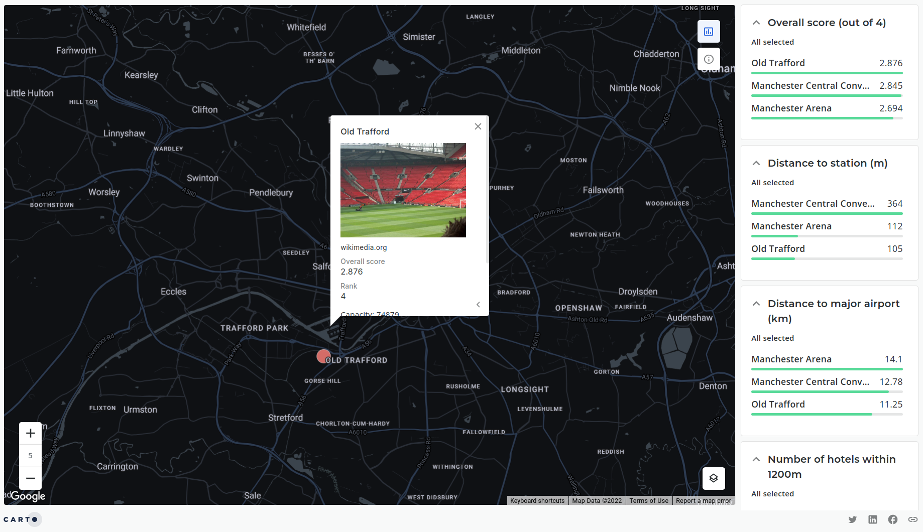
Additionally considering the content of the popups for each layer is a great way to help users get the information they require. You can choose from a series of popup design options and select the variables you’d like to display or do something custom with HTML. For example our venues dataset includes a field called “imagelink” which can be used to display an image from the web using <img…> (see below).
<div class=“CDB-Popup CDB-Popup–highlightFirst”>
 <dl>
   <div><dd>{ {"{ {name"} }} }</dd></div>
   <div>
     <dd><img width=“200” src="{ {"{ {imagelink"} }} }"></dd>
     <dd><small>{ {"{ {imagecredit"} }} }</small></dd>
   </div>
   <div><dt>Overall score</dt><dd>{ {"{ {overall_score"} }} }</dd></div>
   <div><dt>Rank</dt><dd>{ {"{ {rank"} }} }</dd></div>
   <div> Capacity: { {"{ {capacity"} }} }</div>
   <div>Hotels within 1200m: { {"{ {hotels_count"} }} }</div>
   <div>Closest station: { {"{ {station_distance"} }} }m</div>
   <div>Closest airport: { {"{ {airports_distance"} }} }km</div>
 </dl>
</div>
Find out more about creating custom interactions here.
Thanks for reading!
We hope you enjoyed learning about how Spatial Data Science can be used to quickly and efficiently perform Site Suitability analysis! Not all assessments will be as glamorous as this one but the concepts and methods are transferable. Interested in learning more about Spatial Data Science and logistics? Check out our guide to CARTO for logistics and the supply chain here.


