COVID, mapped: The analytics behind an epidemic


One of the defining elements of the COVID epidemic has been how quickly the situation seems to change. One moment things feel positive with the number of infections slowing or even dropping then within days the infections start to climb again. The volatility of such patterns necessitates fast and dynamic strategy planning and decision making which in turn is dependent on accurate local and temporally detailed data. Being able to visualize this data quickly easily and in a way not requiring specialist skills or software is absolutely crucial to this process.
CARTO has teamed up with ZOE - a nutritional science and healthcare company who have been tracking COVID data since 2020 - to develop a blueprint for this process.

The ZOE COVID Study
On March 24th 2020 the ZOE COVID Study was launched with the release of the ZOE COVID Symptom Study App. Participants - of which there have been over 4 million - are able to share a daily update on their health. This includes their vaccination symptoms and treatment - or lack of these. This has helped to shape policy and uncover key findings about COVID for example revealing that anosmia - i.e. a loss of taste - is a key predictive symptom of the virus.
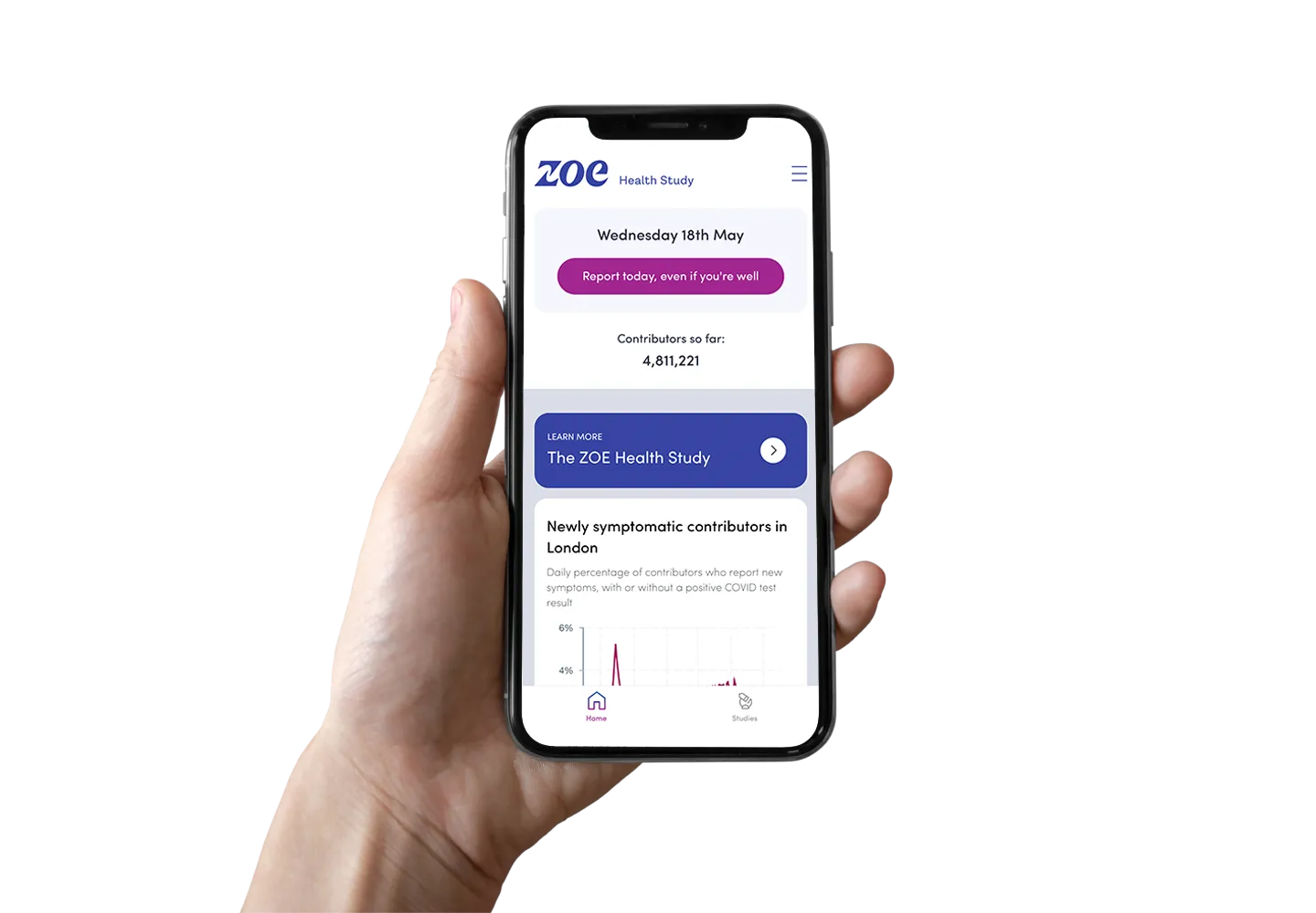
Image courtesy of ZOE.
As part of CARTO’s commitment to provide free access to our spatial analytics and visualization software to organizations combating COVID we have been working with ZOE to create a series of visualizations to act as a blueprint for future epidemic tracking. Read the full list of beneficiaries and see some of their incredible work here.
Epidemic tracking with Location Intelligence
The system that we developed consisted of the following three visualization components to track the epidemic:
- COVID infection and vaccination rates
- Omicron spread tracker
- Local vaccination predictions
Keep reading to see these visualizations in action discover insights and find out how they were created!
COVID infection and vaccination rates
Being able to spatially visualize an epidemic like COVID is essential. As the virus is transmitted through human contact seeing where this is happening - in spatial and temporal detail - is crucial for putting in place actionable strategies to limit the spread. Visualizing this in conjunction with key virus-curbing measures - such as vaccination rollout - gives invaluable insight on where these measures are being taken up by the general public and how much impact they are having.
Open map in full screen here (recommended for mobile users).
The visualization above (produced in May 2022) depicts COVID case rates and vaccination percentage side-by-side for easy and direct comparison. The average rate changes as the map view shifts - or as geographic filters such as region and Upper Tier Local Authority (UTLA) are activated - allowing the user to easily compare geographies or focus on specific areas of interest. We can see from these maps that there aren’t really any current spatial patterns in infection rates (unlike when the virus was newer - keep reading to learn more!) but that vaccination rates do tend to be higher in rural areas.
Make this map
In order to recreate this map you’ll need the following data:
- Vaccination and infection rates (which can be calculated as the raw number of infections divided by the area’s population divided by 100 000). The data for our blueprint was obtained from ZOE but many governments and health departments publish this data such as coronavirus.data.gov.uk in the UK.
- Related geographic boundaries. In the UK the most detailed COVID data is released at Middle Super Output Area (MSOA) level which is a small administrative zone with between 5 000 and 15 000 residents. CARTO provides many administrative geography boundaries directly from our Spatial Data Catalog otherwise most government statistical bodies make this data available such as the UK’s Office for National Statistics Open Geography Portal.
- Regional boundaries. These are helpful for allowing users to filter the data to regions of interest. In this instance we’ve used Eurostat Nomenclature of Territorial Units for Statistics (NUTS) regions available from our Spatial Data Catalog here and Upper Tier Local Authorities.
The health and related geographic boundaries can then be joined by their identifier code (often called “geoid”) and then joined again to the regional boundaries using a Spatial Predicate (an expression which joins two layers to each other based on a specified spatial relationship such as if they intersect or share a boundary - see this list for more details).
Once this simple pre-processing is complete users can quickly and easily visualize the data using our intuitive cloud-native visualization platform CARTO Builder. Add dynamic formula category and histogram widgets to empower users to quickly reach insights and filter data.
Omicron spread tracker
The second visualization in this series - the Omicron spread tracker - lets users view the spread of this strain of COVID over time as well as filter the data to specific time periods. Viewers can identify origins hotspots and rates of transmission. This is key for understanding how to allocate healthcare resources and deploy COVID-curbing measures.
Open map in full screen here (recommended for mobile users).
We can see from this time series animation that Omicron originated in December 2021 in some of England’s larger cities including London Birmingham Manchester and Bristol. It then spread across the country peaking in May 2022. It then began to fall - beginning in the south west - throughout the remainder of the year.
Make this map
As with the previous visualization local data on Omicron infections is required along with the relevant geographic boundaries. The data requires a field with the type DATETIME which can be used in conjunction with the CARTO Builder Time Series widget to animate the map and line graph over time.
Local vaccination predictions
The final visualization in this series predicts local vaccination rates. Due to privacy concerns many health authorities cannot release vaccination data at very localized levels. However having vaccination rates at more local granular levels is important for planning targeted vaccination and healthcare resources such as identification of vulnerable residents vaccination marketing campaigns and staff allocation.
The final part of this study involved downscaling the source data from ZOE to a 100mx100m grid with each cell including a prediction of the % residents vaccinated. You can explore a sample of this analysis on the map below focused on Charlestown northwest of Manchester. The map on the left shows predicted % vaccinated which you can compare with the map of population density on the right.
Open map in full screen here (recommended for mobile users).
We can see from this map that the higher the population density (yellow and orange areas on the map to the right) the lower the predicted vaccination rate. This mirrors the nation-wide trend explored earlier - that vaccination rates tend to be lower in denser more urbanized areas.
Make this map
A machine learning model was employed to downscale the ZOE data to a Quadkey grid where each cell measures 100x100m. Quadkey is a type of global hierarchical grid designed to perform efficient geospatial analytics at scale - read more about this here. The model takes advantage of the CARTO Spatial Features data suite - a global dataset including demographic and points of interest (POI) data.
The tool “Enrich Grid” from the Data module of CARTO’s Analytics Toolbox was used to enrich the Zoe MSOA polygons with the Quadkey Spatial Features data. CARTO’s suite of enrichment tools make aggregating and disaggregating data between geographies simple and fast eliminating the need to write long sections of complex code with multiple steps. The result of this enrichment process is that each that each MSOA now includes data fields containing vaccination rate population density and number type of and distance to POIs.
Once the enrichment was complete a machine learning model was created. An XGBoost model was trained to predict the vaccination % in the Zoe source data based on the population density and POI data. This model was then used to predict the vaccination % in the 100x100m Quadkey grid resulting in a much more detailed geographic representation of vaccination rates.
Finally this data was visualized in CARTO Builder using the split screen option to mirror different datasets at the same extent for ease of comparison.
Conclusions
Location Intelligence is fundamental to driving actionable insights for health planning. Being able to know where and why infections are falling and growing - and relating this to measures aimed at curbing infections - is key to this. This is dependent on having accurate timely and geographically detailed data. Additionally visualizing this data in an intuitive way so that non-technical decision makers can quickly derive insights from it can guide strategies which are geographically and temporally dynamic. This is crucial for tackling ever-evolving health crises.
This work has been made possible through the European Union’s Horizon programme. CARTO has been working with this programme to democratize access to Spatial Data Science with the next generation of our spatial data platform. Want to know more? Check out our work on energy efficiency electric vehicles and retail centers! ZOE is currently looking at other major diseases beyond COVID as the ZOE Health Study. Find out more about their work here.
Ready to start your Spatial Data Science journey? Sign up to our two-week free trial to explore our Data Observatory and try your hand at cloud-based Location Intelligence.